

A Miami Beach rental, built as a design-led address.
Mast Capital brought us in to brand a luxury rental residence in Miami Beach. We ran the full arc: discovery, positioning, naming, visual identity, print and digital collateral, and the signage that fronted the construction site. The result reads less like a rental listing and more like an address with a point of view.
Workstreams held under one brand platform.
Short, soft, international name buyers remember.
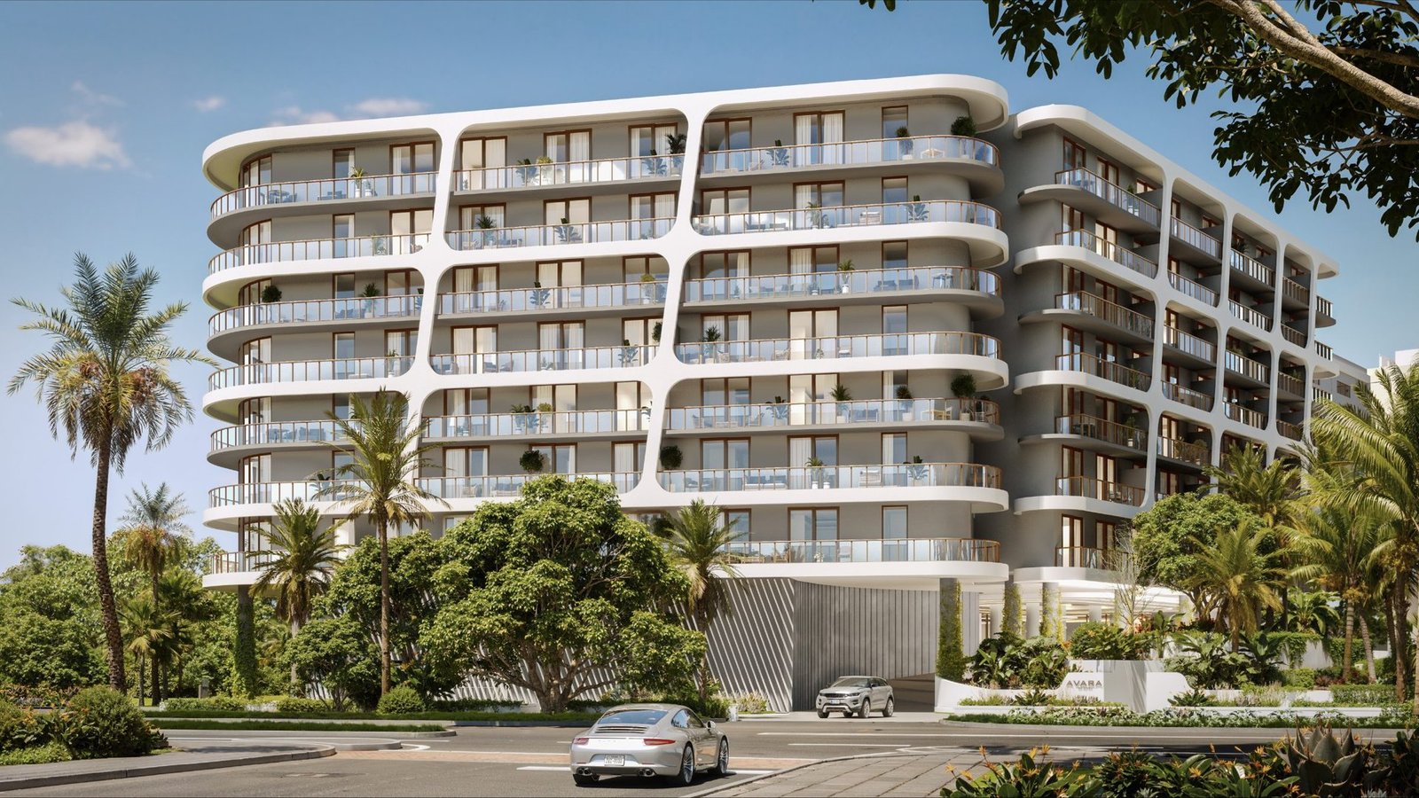
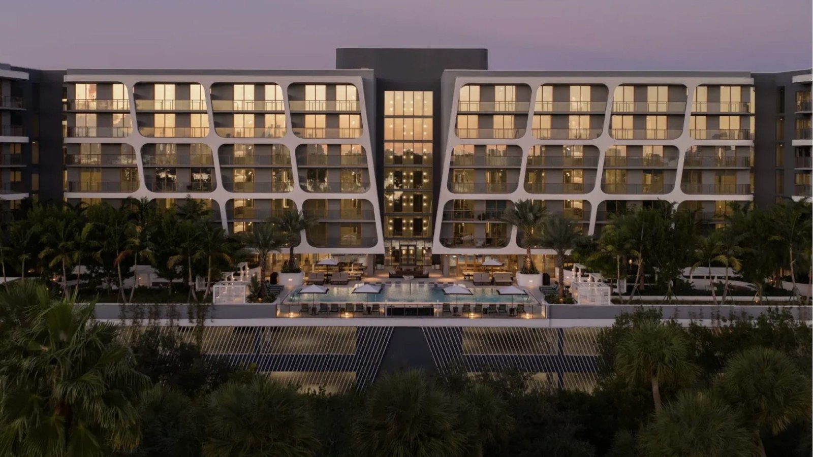
Framing motif pulled from the building's own facade.
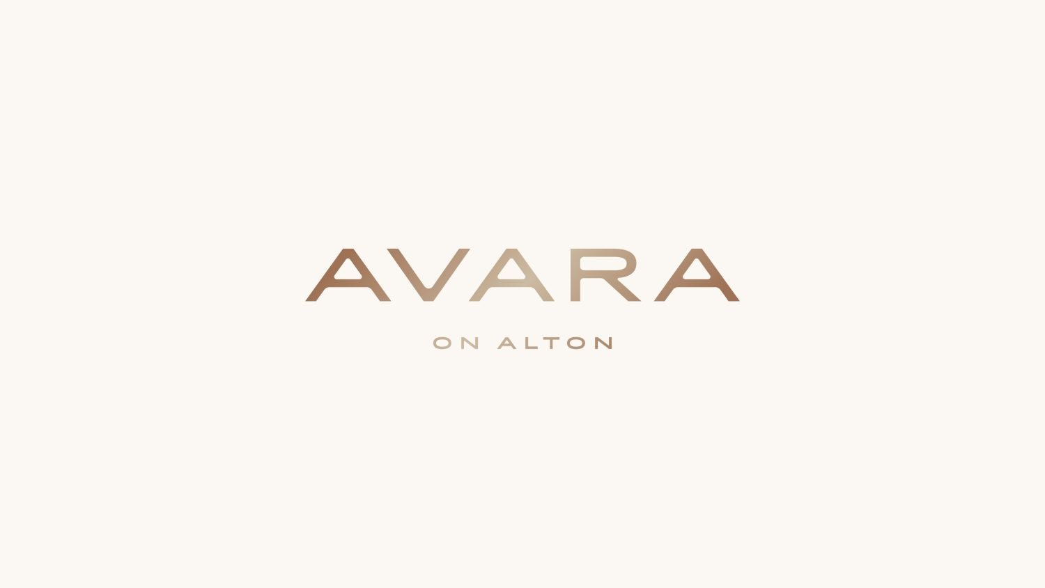
Palette tones: cream, copper, sand, ink.
Mast Capital brought us in to make a rental feel like an address.
Avara on Alton is a luxury rental residence in Miami Beach, a market with real estate's loudest competition. The brief was simple to state, hard to execute: a brand that frames Avara as a sophisticated, design-led home rather than a rental you move through.
The character of the city, its culture, creativity and easy, sunlit pace, had to live inside the identity. Every touchpoint, from the signage on the site fence to the brochure in a leasing office, had to feel like one object.
A rental, in a market where rentals get skimmed, not remembered.
Rentals rarely earn the brand treatment of ownership stock.
Buyers browse quickly. Floor plans and amenity lists blend together. A rental has to work harder to be remembered than a condo.
Miami Beach is crowded with hotel-feel brands.
Palm-leaf gradients and sans-serif wordmarks everywhere. The city's design IQ demanded something quieter and more intentional.
Strategy, naming and collateral usually live in different hands.
The result is a brand that splinters. We ran all five streams in one room so the signage, brochure and ad speak with one voice.
One name, one motif, one palette.
Discovery, positioning and the name
Discovery first, name last. The positioning places Avara as a design-led home rather than a rental, drawing its tone from Miami Beach's culture and creative energy. Avara: short, soft, easy to say in any language.
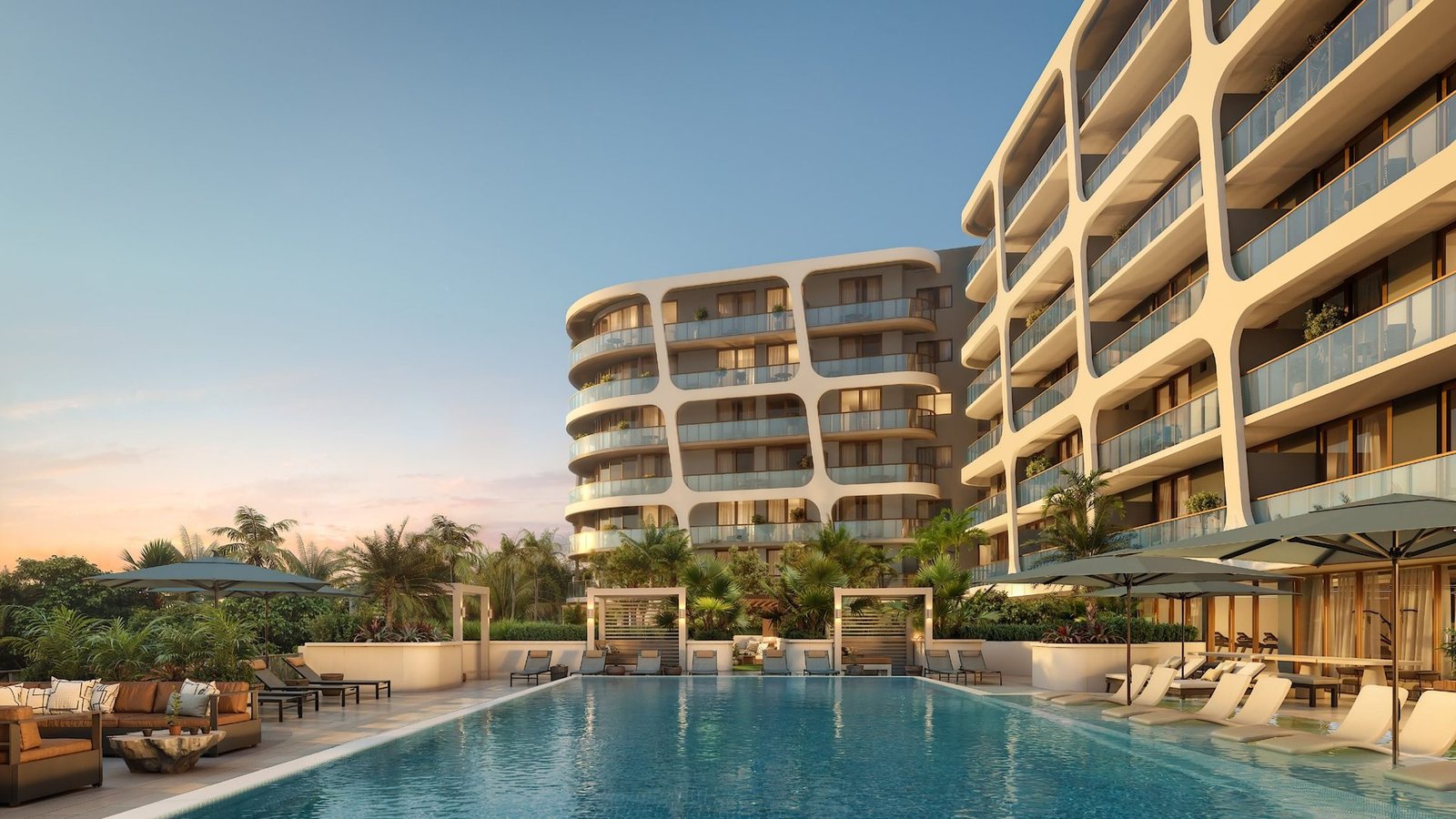
A wordmark drawn from the building
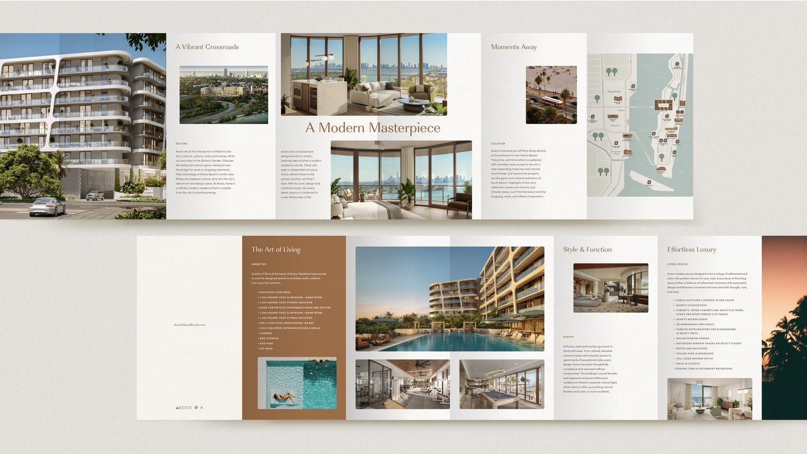
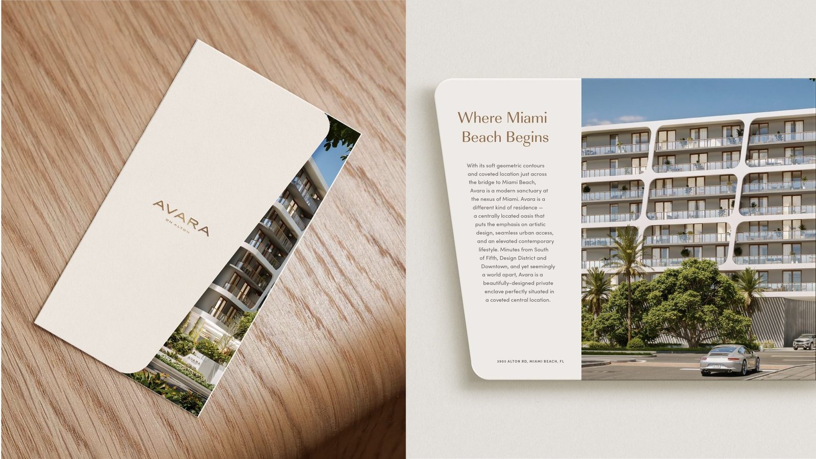
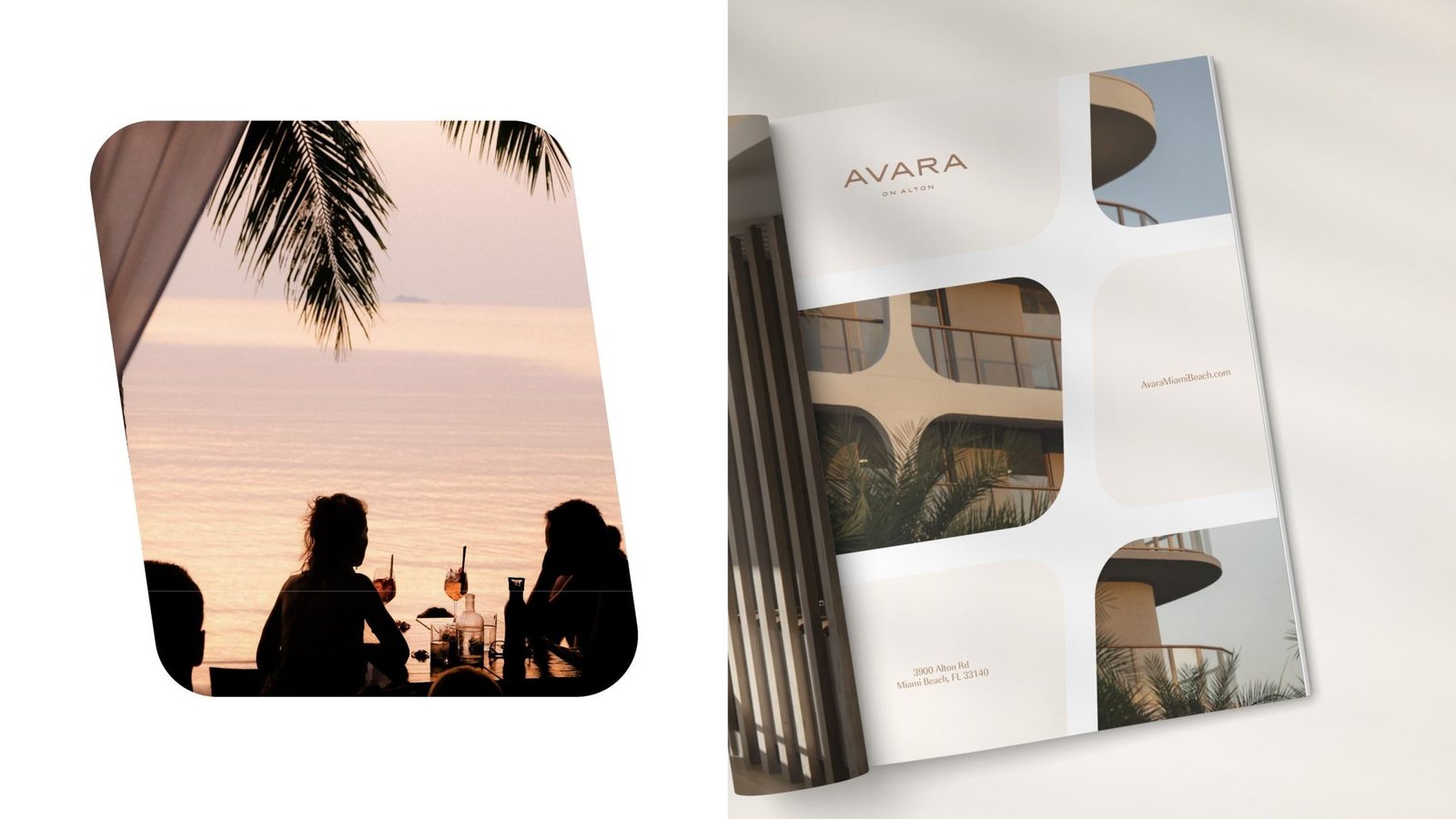
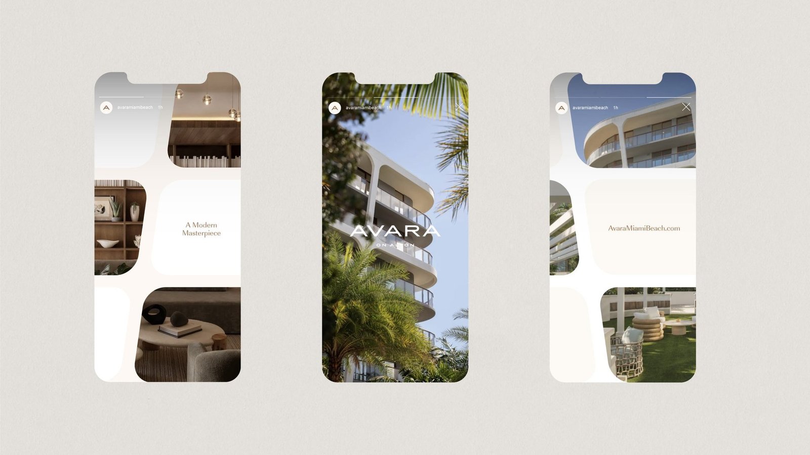
The identity takes its cue directly from the architecture. The facade's sculpted, rounded window frames become a cropping device that recurs across photography, print and screens.
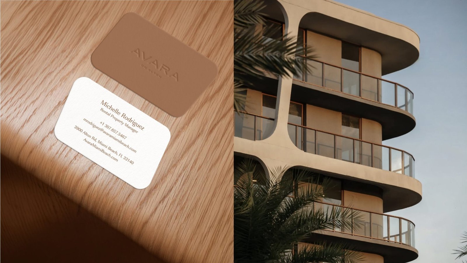
A palette the lobby could live inside
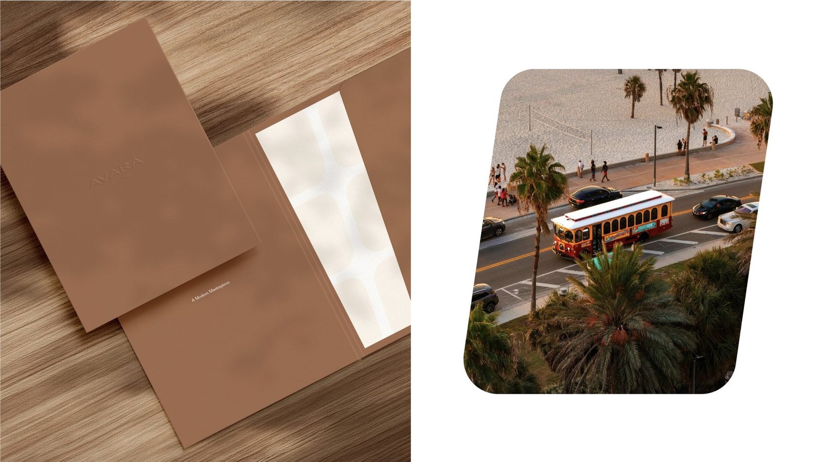
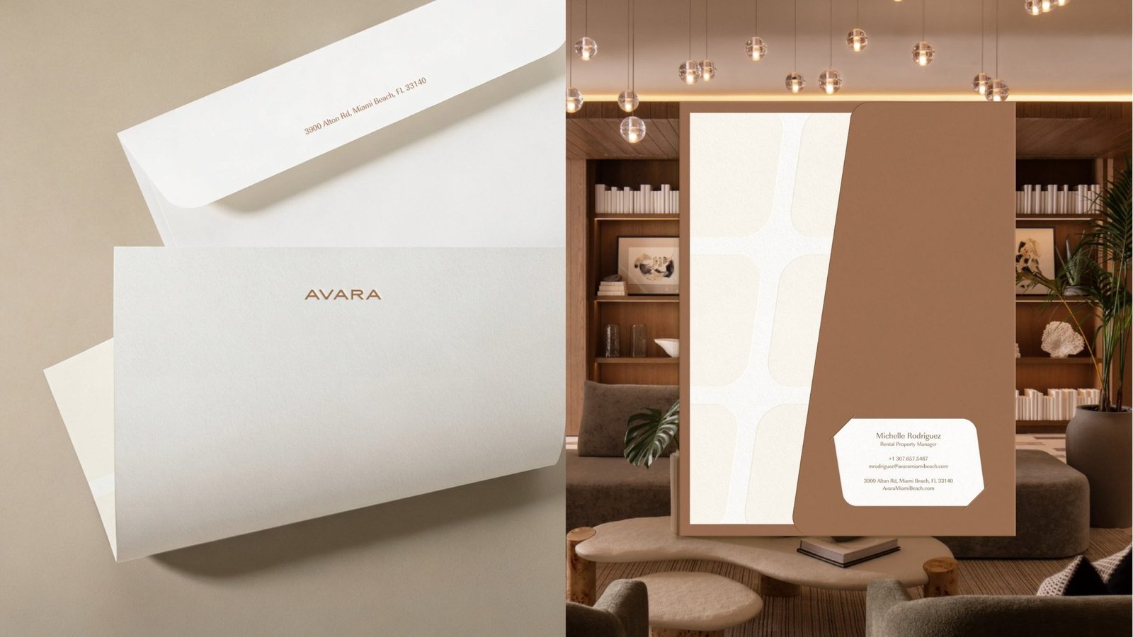
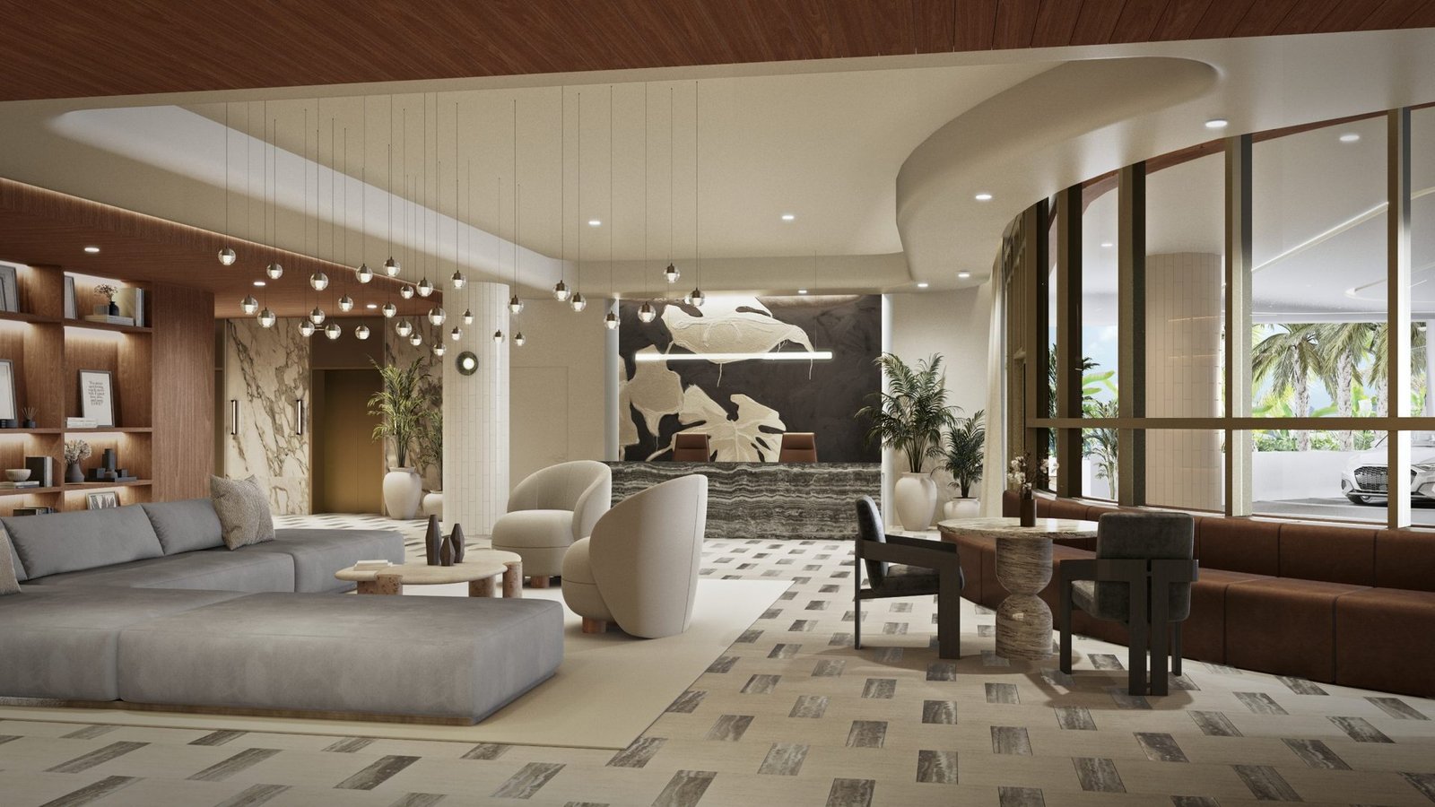
Warm cream, copper brown and soft sand. The palette echoes sand, timber and the building's pale curves. Copper card stock pairs with cream envelopes, carrying the brand on paper into the experience on site.
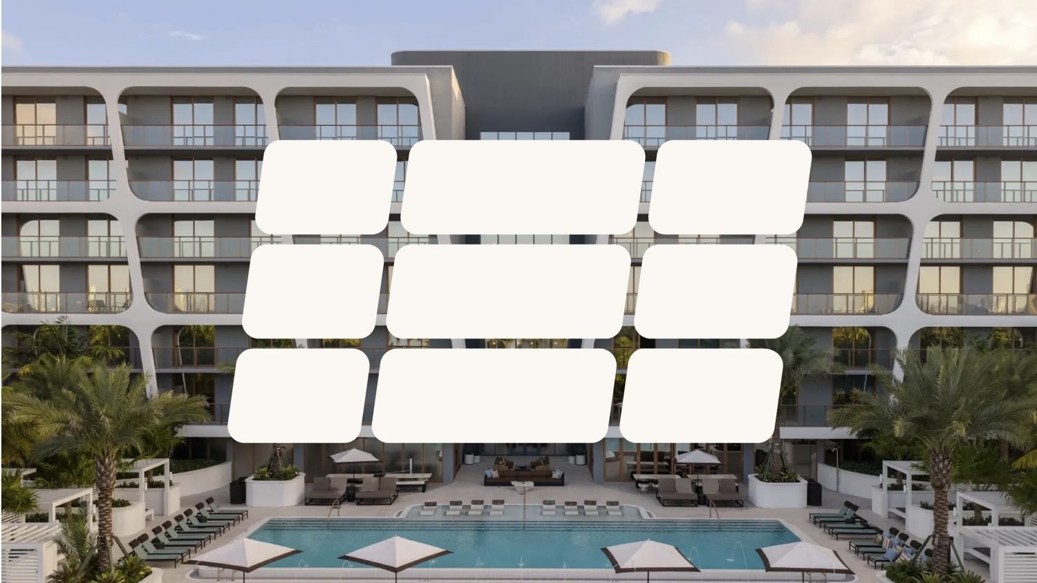
Collateral, marketing and site signage
Brochure, floor plan sheets, business cards, stationery, envelopes. Lifestyle advertising and mobile templates. Site signage for the Miami Beach construction fence. One motif, every surface.
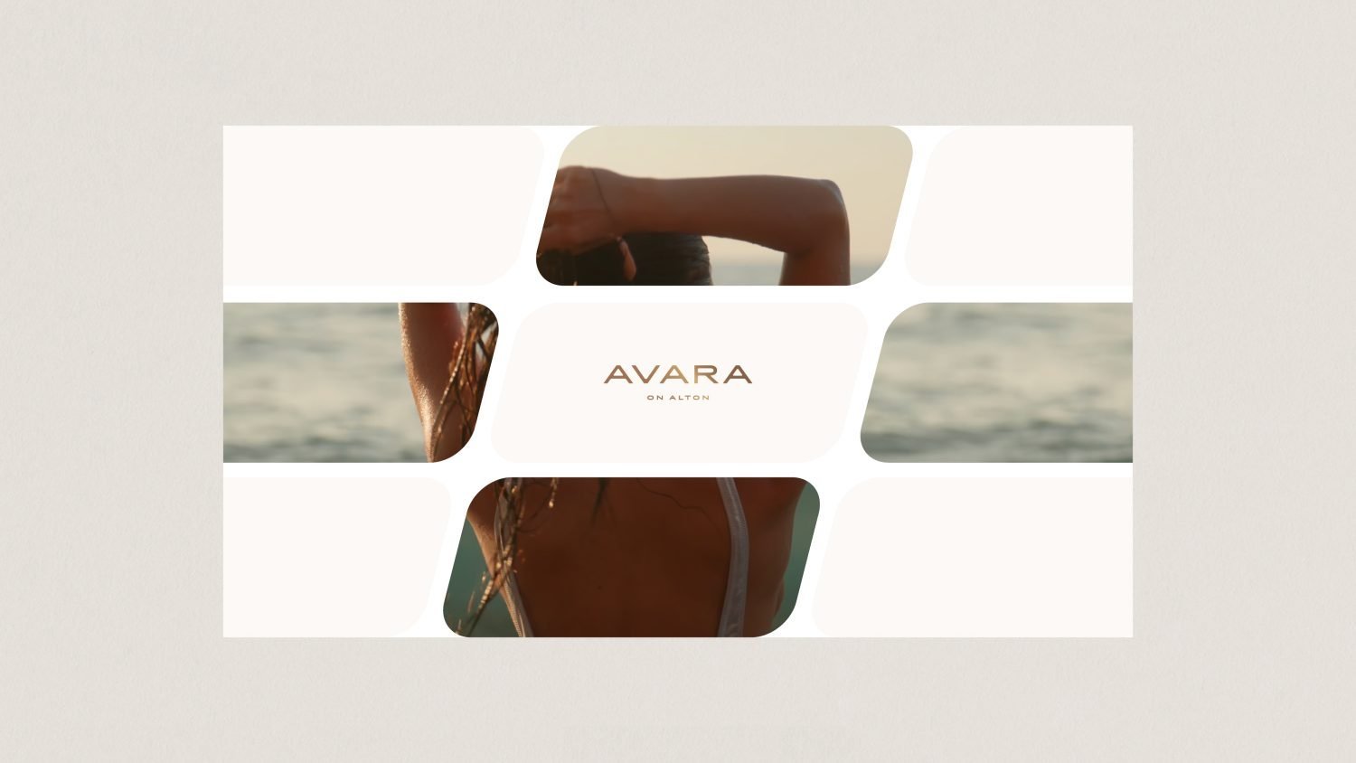
A single system, carried across every touchpoint.


From a project brief to a brand with voice.
Have a project worth a brand of its own?
We find the one truth about the product that nobody else is leading with, name it, and build the system that carries it from brochure to hoarding.
See the full Real Estate practice.