

A twin-tower address, repositioned as the key to envy.
ASBL Loft sits in Hyderabad's Financial District, surrounded by the city's IT and finance addresses. The product was ready. The brand was the gap. We built the positioning, identity and brochure that turned a G+45 twin-tower residence into a landmark buyers want to be seen inside.
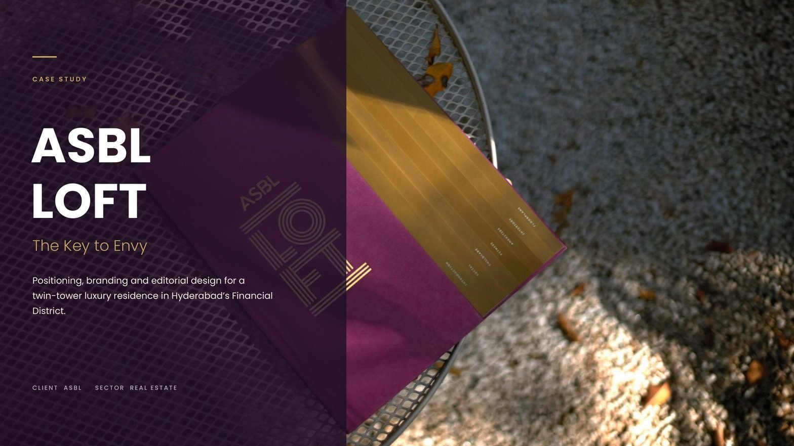
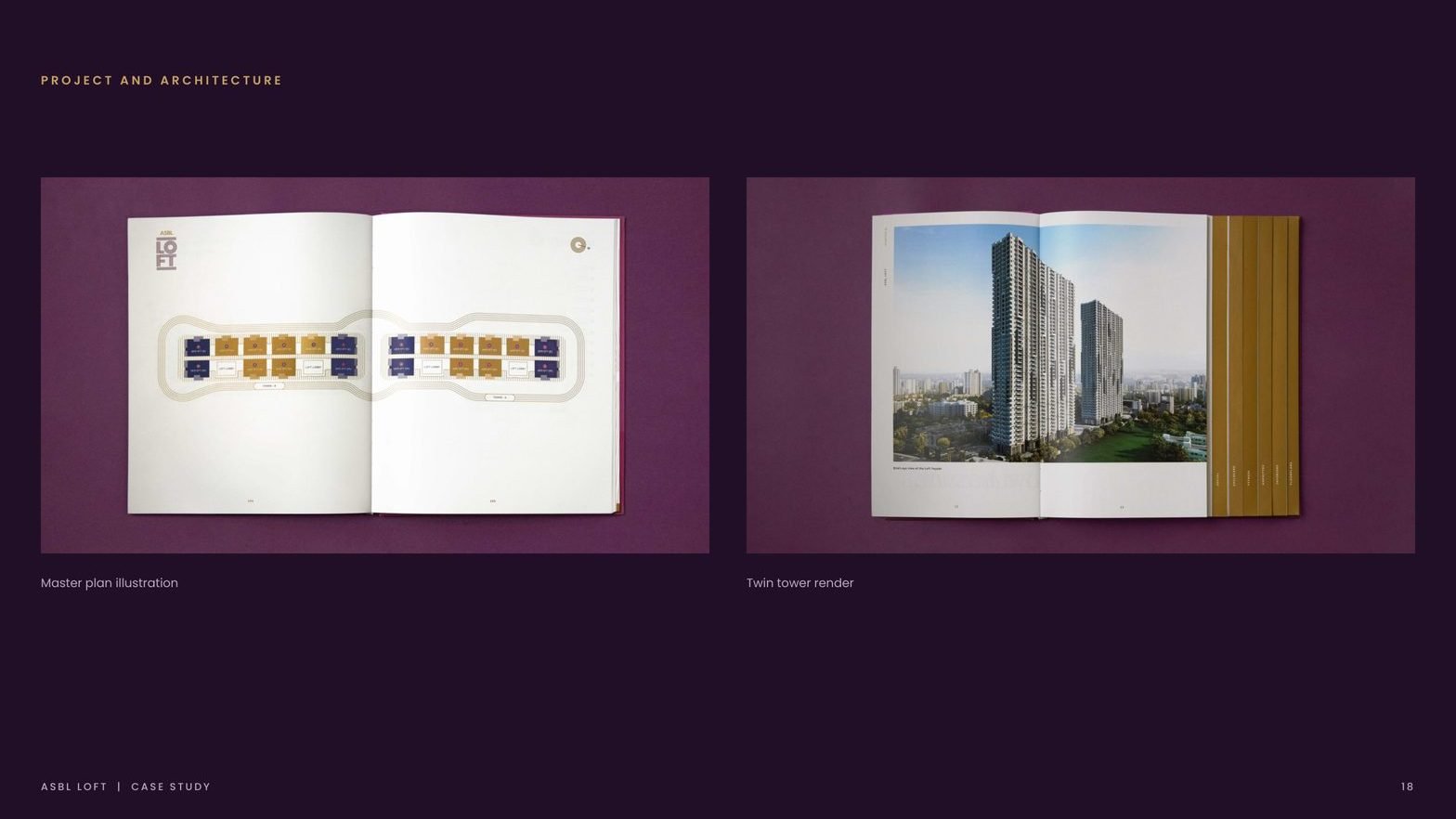
Towers framed as one landmark on the Hyderabad skyline.
Storeys, with a brochure that reads like an editorial title.
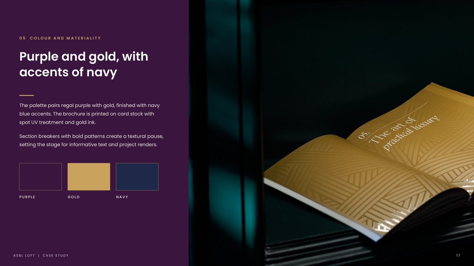
Palette discipline: regal purple, gold and navy accents.
Positioning line that carries every single touchpoint.
ASBL builds for Hyderabad's working elite. The brand had to match.
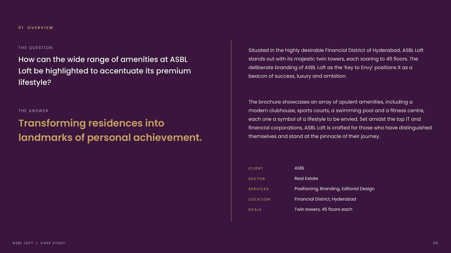
Situated in the highly desirable Financial District, ASBL Loft stands out with its majestic twin towers, each soaring to 45 floors. The buyer is a professional at the top of their journey, surrounded by India's leading IT and financial corporations.
The product was premium. The communication was not. The brochure, identity and site collateral needed to look like they belonged in the same world as the amenities: modern clubhouse, sports courts, swimming pool, fitness centre.
In a district of luxury launches, every brochure looks the same.
Every luxury launch promised the same amenity list.
Clubhouse, pool, courts, lobby ran the room. Nothing in the collateral told buyers why this project, this tower, this address.
The sales story stopped at square footage.
A home became a line item: 3 BHK, 4 BHK, plot area. Nothing in the brand positioned the purchase as the moment a career becomes a landmark.
The editorial system did not match the architecture.
A G+45 twin-tower landmark needed collateral with verticality, rhythm and restraint. The old assets were horizontal, generic and loud.
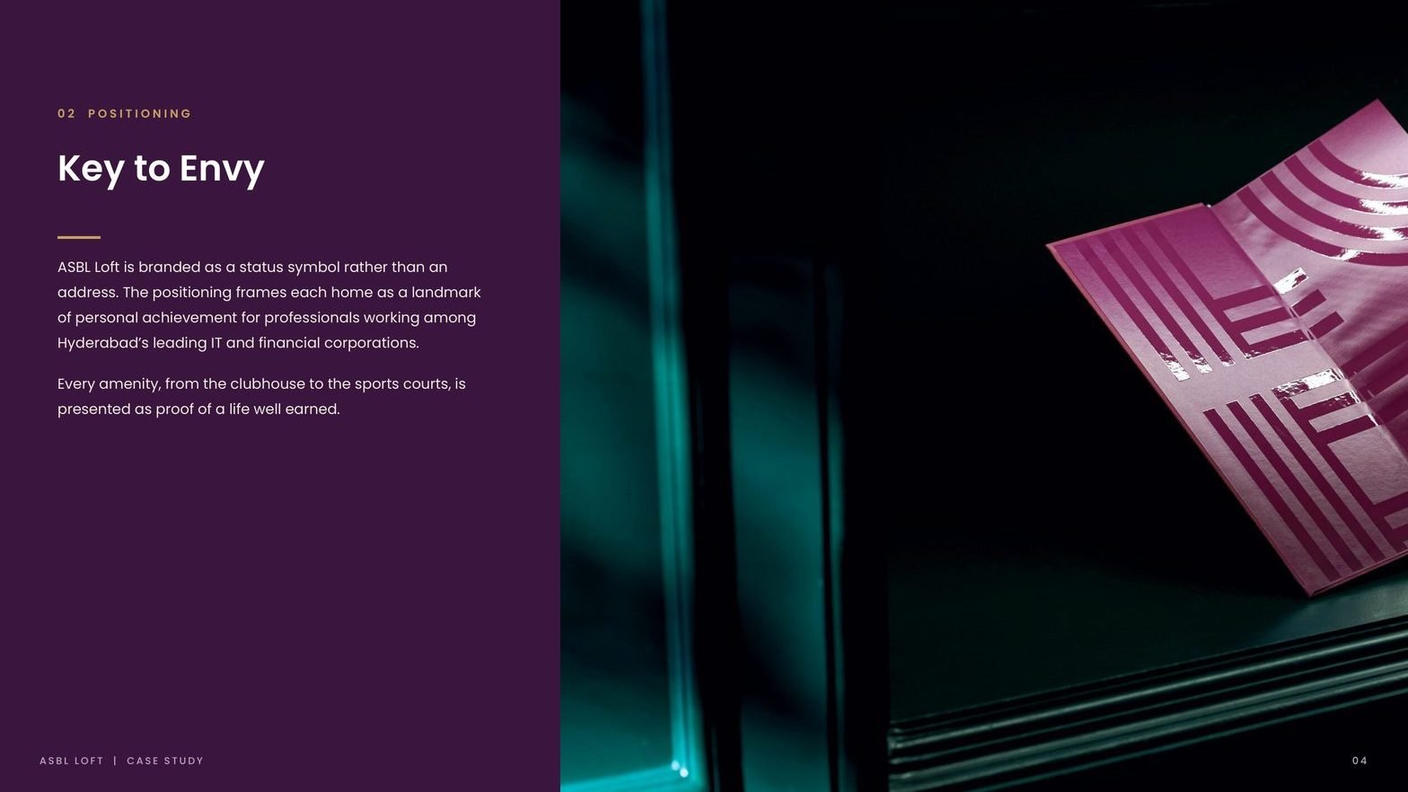
One line, carried from brochure cover to site signage.
Positioning: The Key to Envy
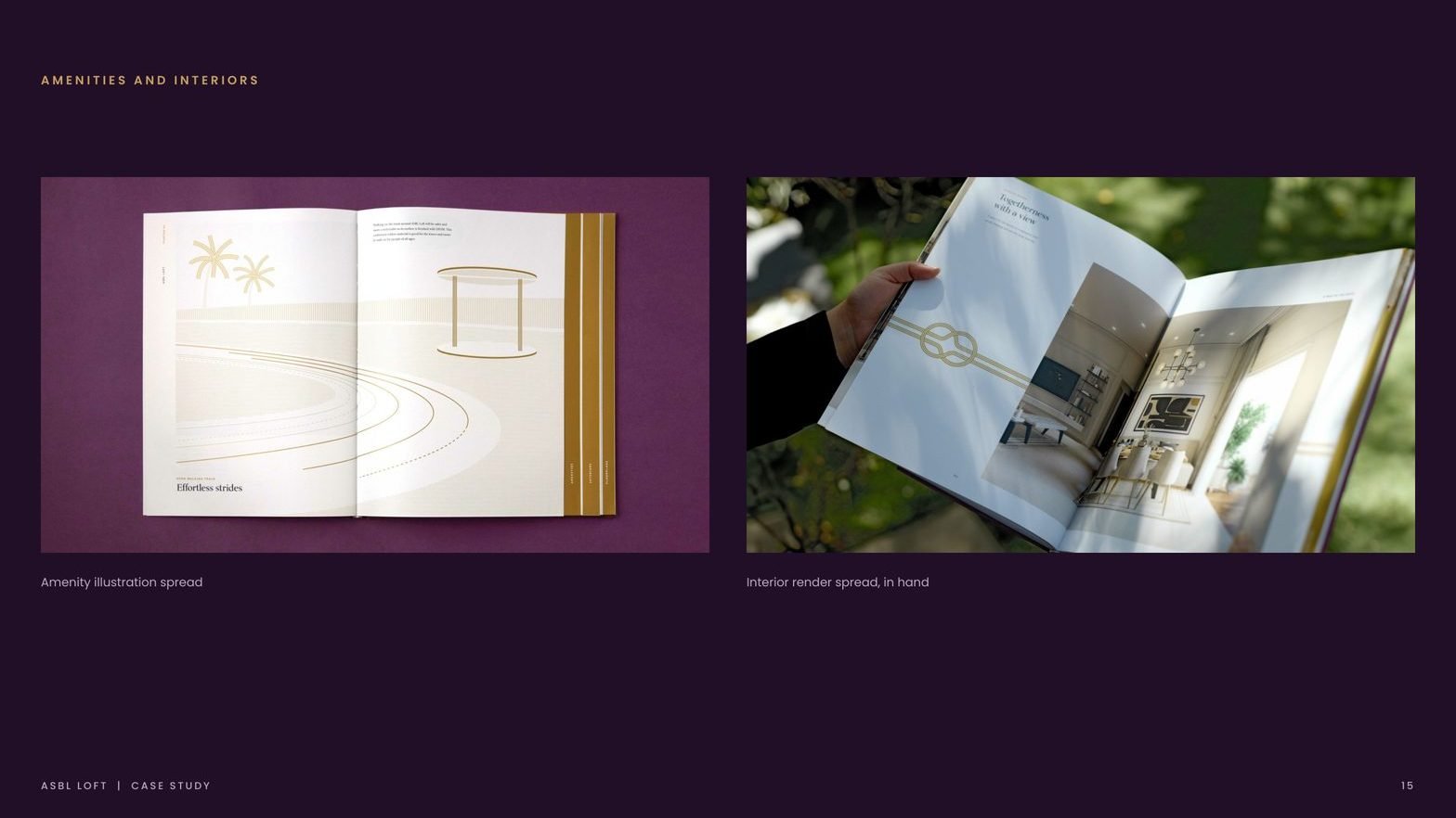
We branded the address as a status symbol rather than a floor plan. Every amenity, from the clubhouse to the sports courts, is presented as proof of a life well earned. The single line sits on every touchpoint, from brochure cover to site signage.
Identity drawn from verticality
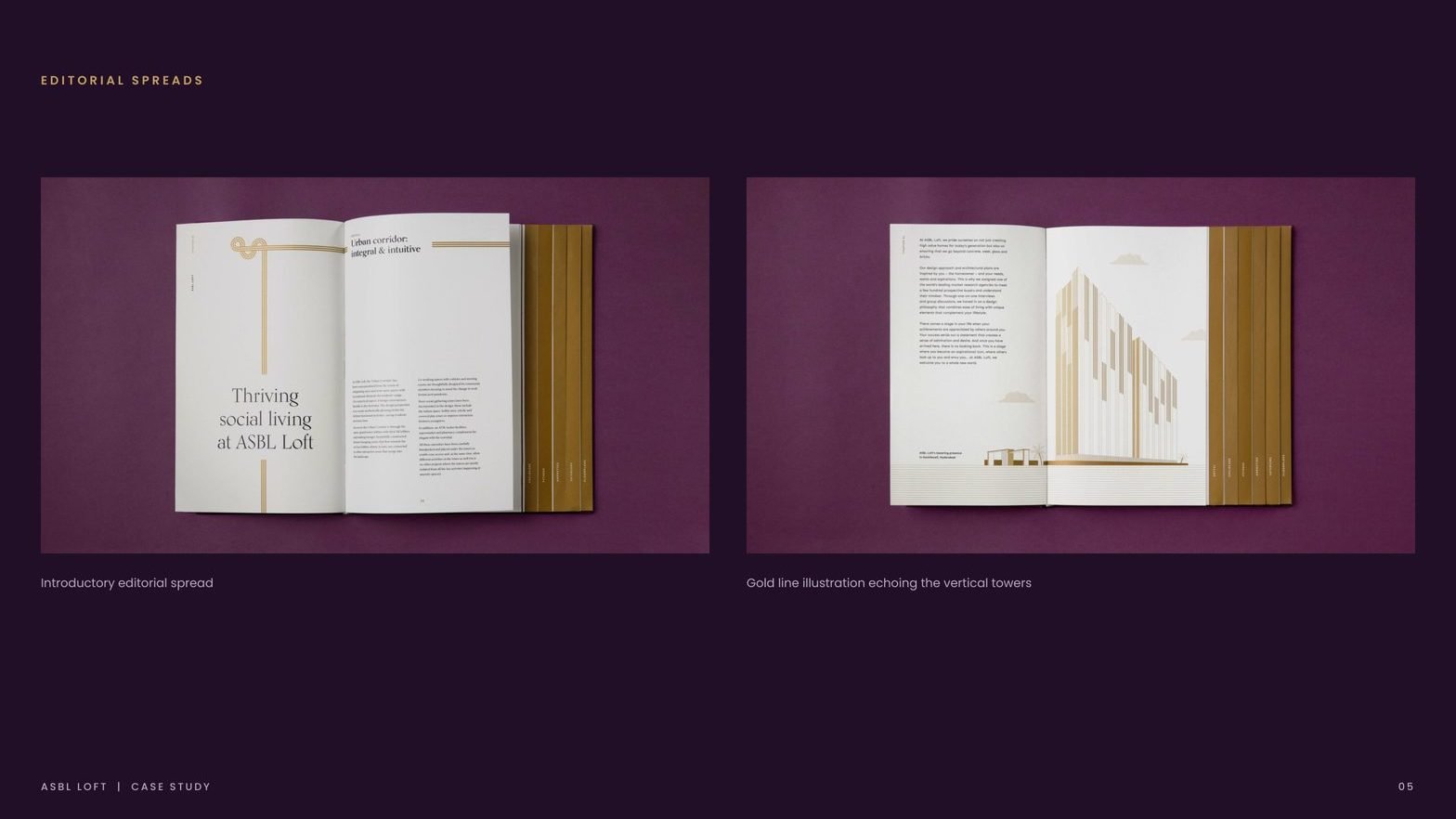
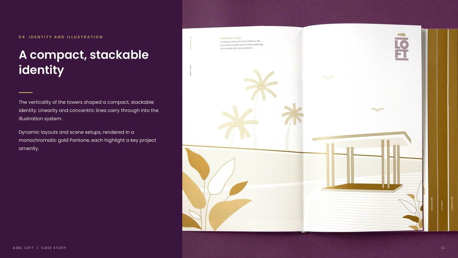
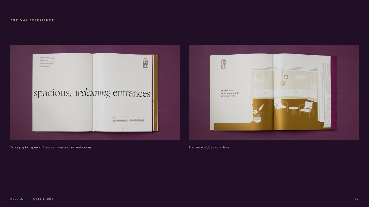
The twin towers shaped a compact, stackable wordmark. Linearity and concentric lines carry through into the illustration system. The identity scales from monogram on a stationery piece to a ten-foot gold Pantone on the sales office wall.
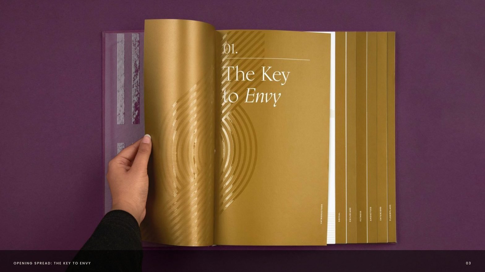
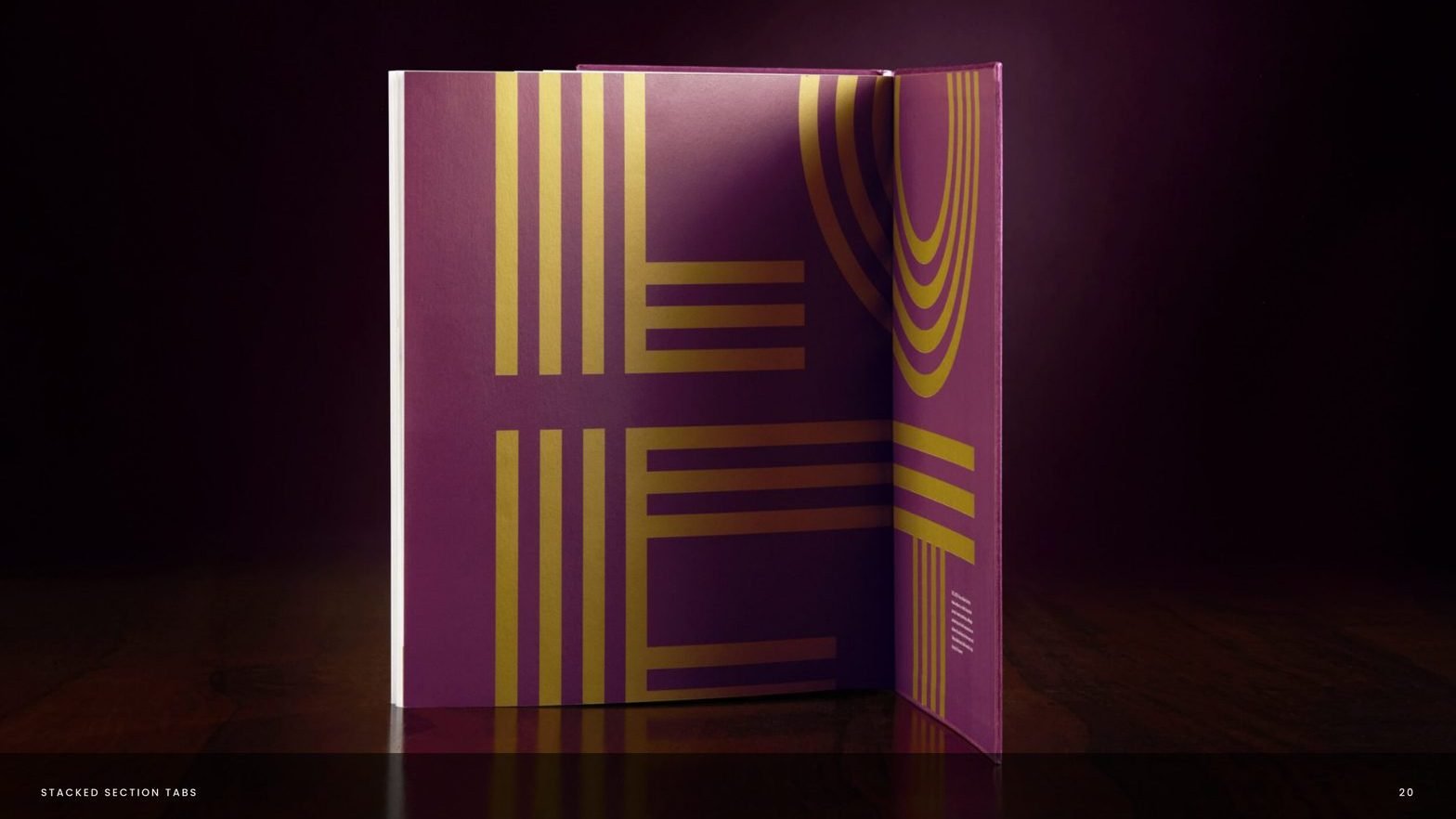
Editorial system, tabbed by USP
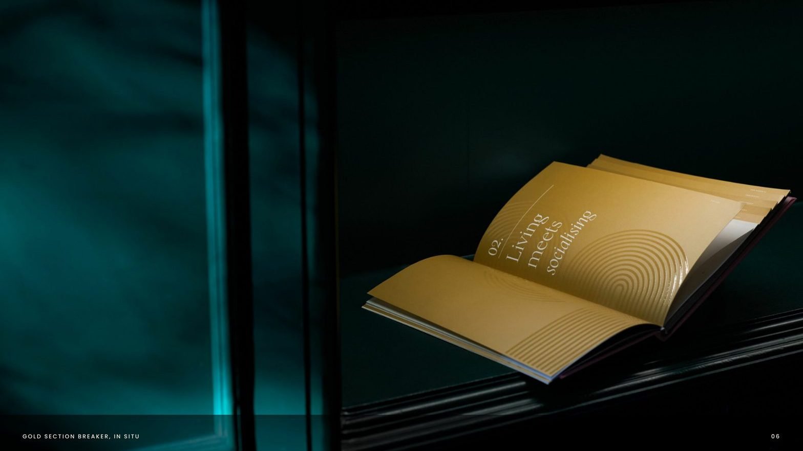
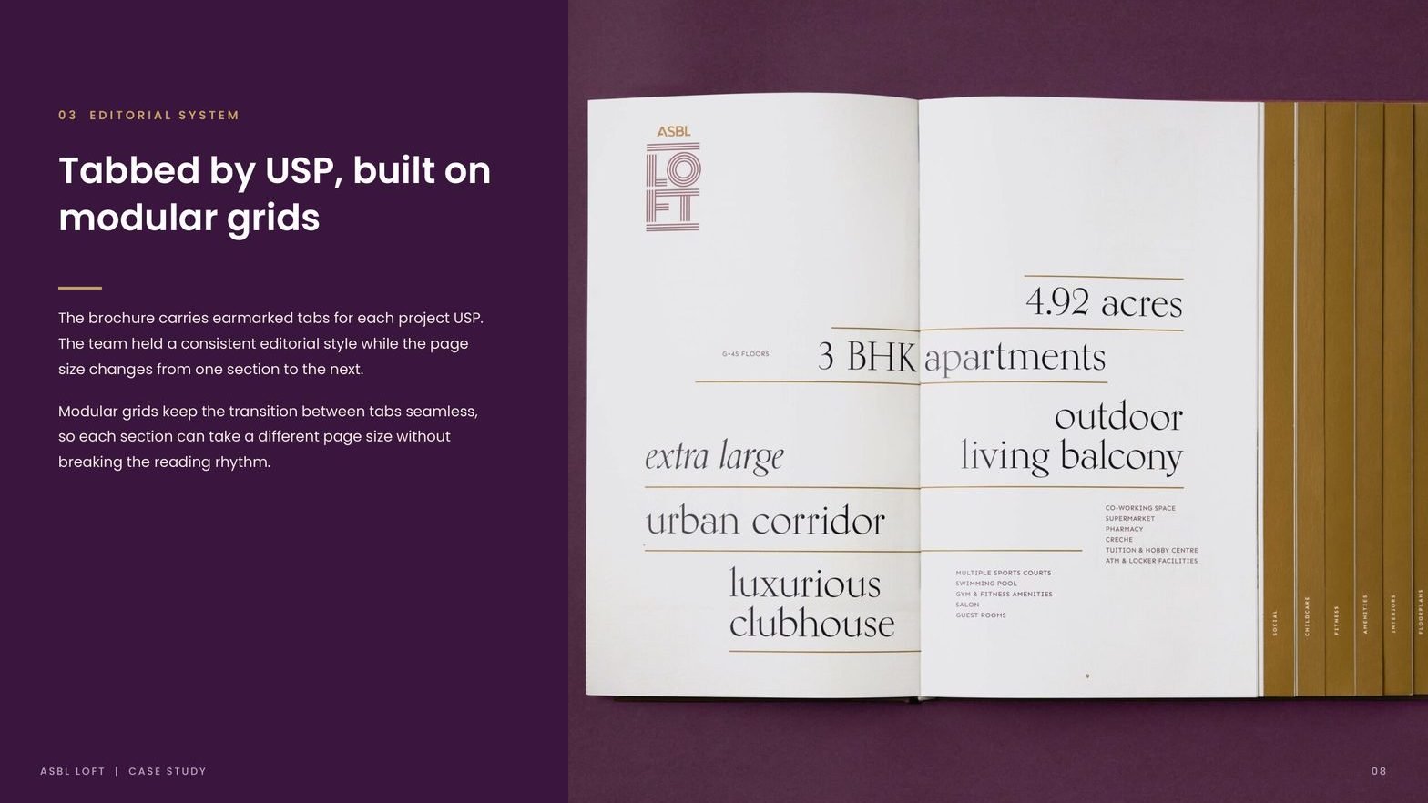
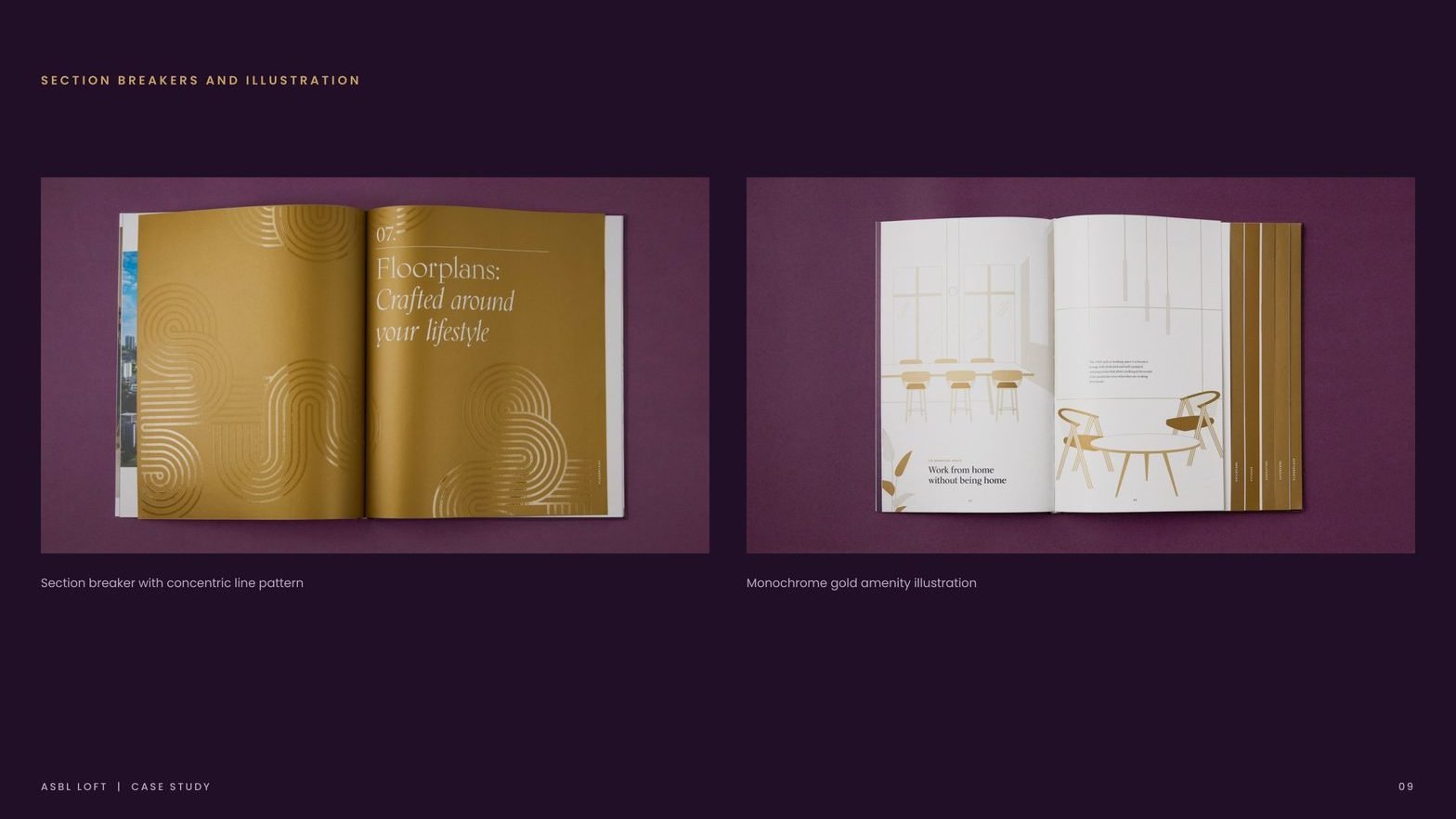
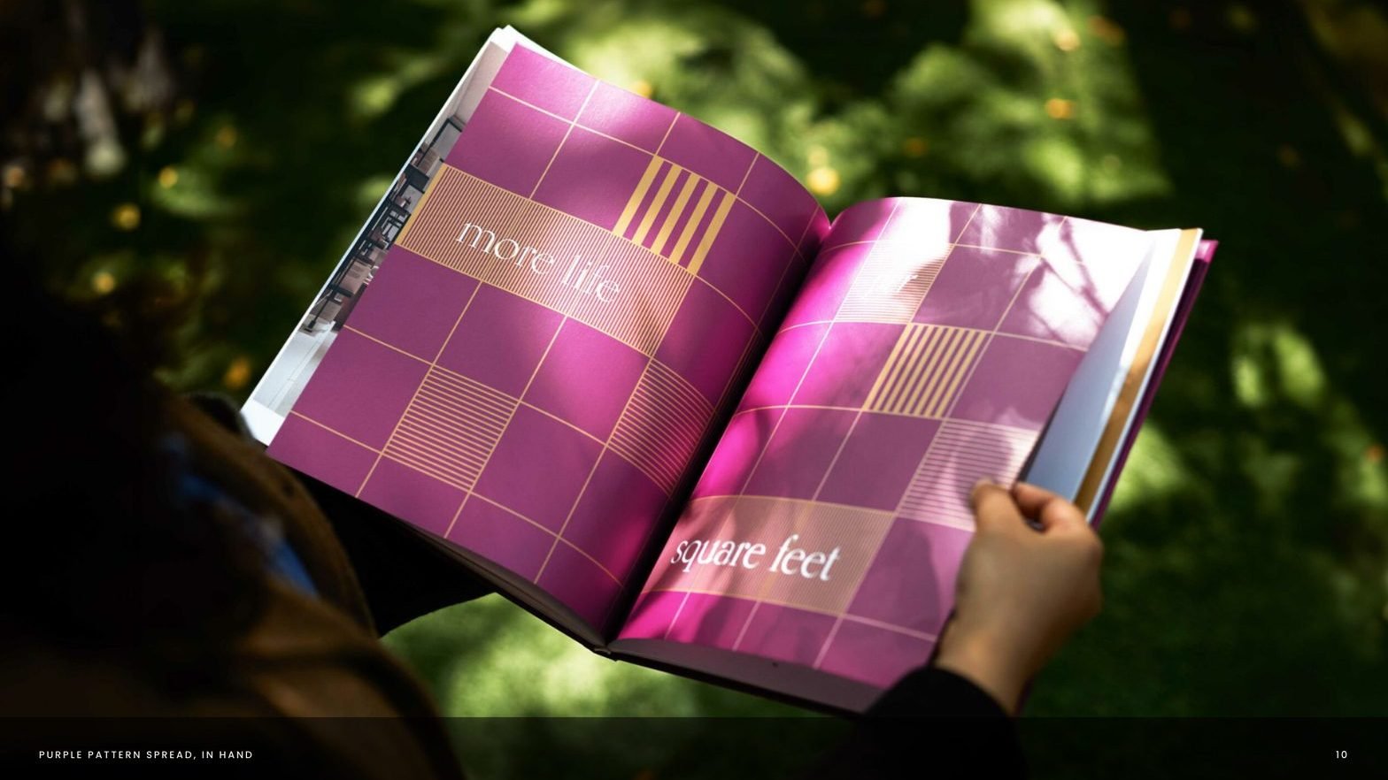
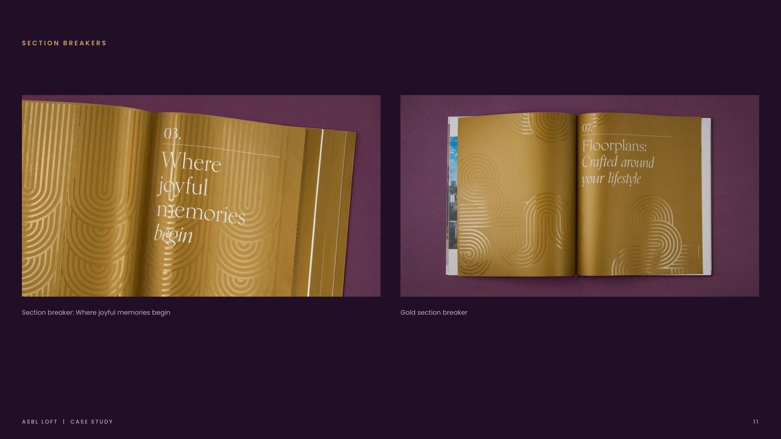
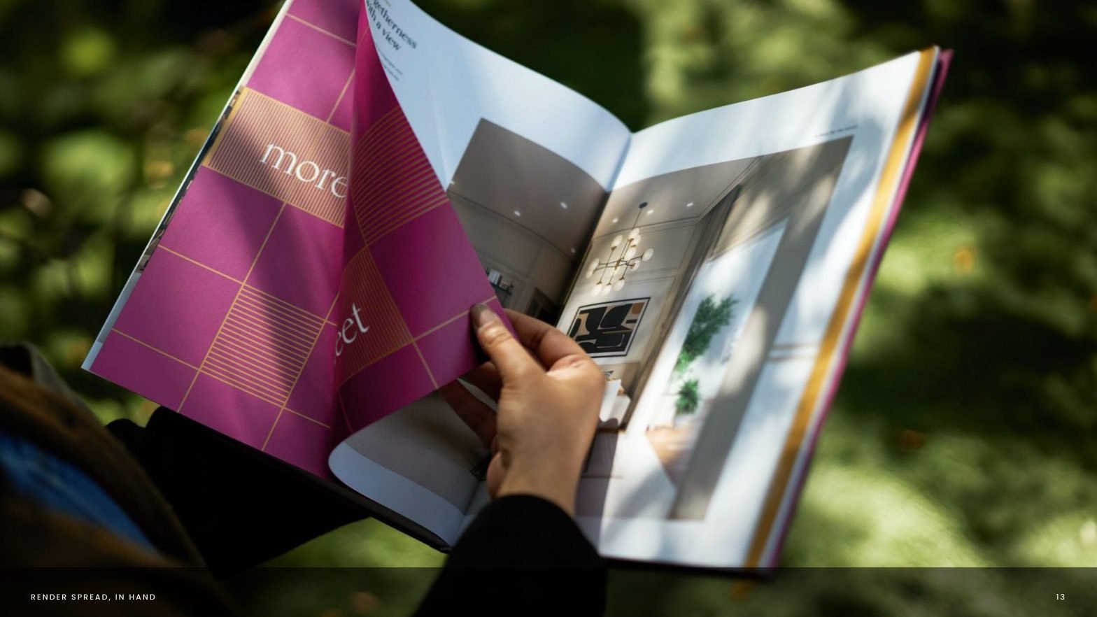
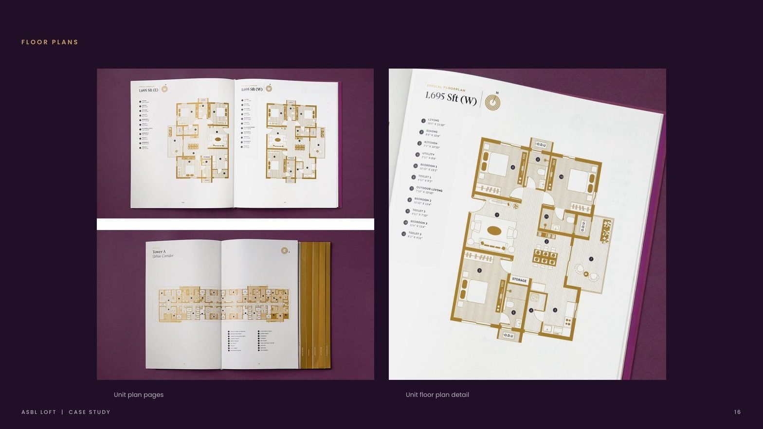
The brochure carries earmarked tabs for each project USP. Page size changes section to section while modular grids keep the reading rhythm intact. Section breakers in bold pattern work give the book a textural pause.
Palette and print discipline
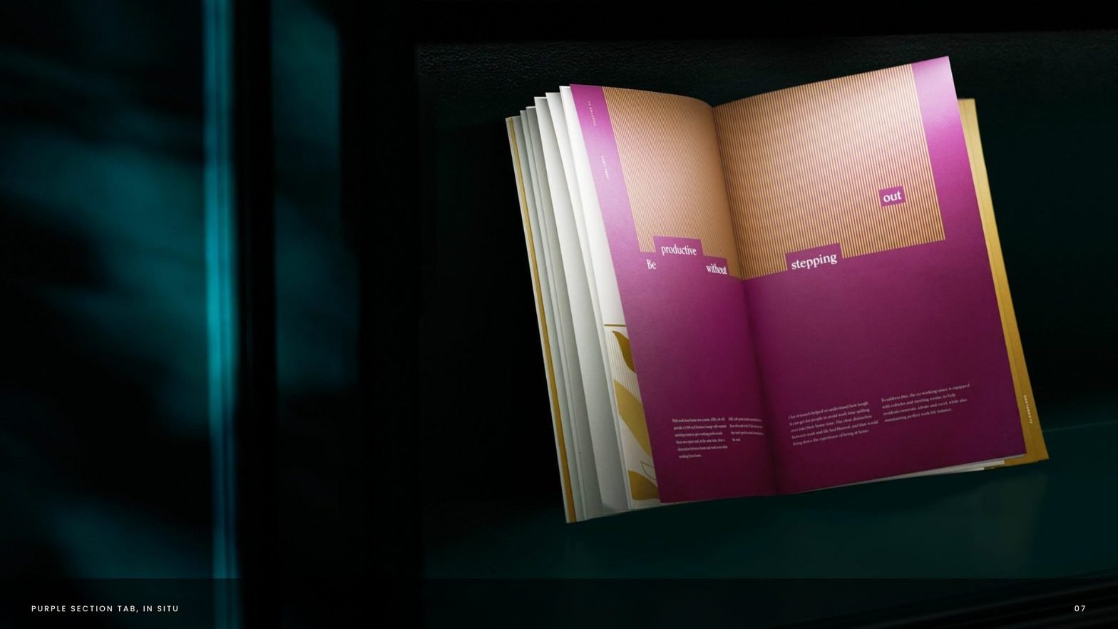
Regal purple, gold and navy accents. Card stock with spot UV treatment and gold ink. Dynamic layouts rendered in a monochromatic gold Pantone, each highlighting a key project amenity.
A single system, carried across every touchpoint.

From a project brief to a brand with voice.
Have a project worth a brand of its own?
We find the one truth about the product that nobody else is leading with, name it, and build the system that carries it from brochure to hoarding.
See the full Real Estate practice.