

Not a home. A getaway for life.
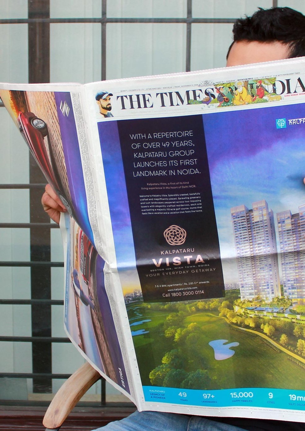
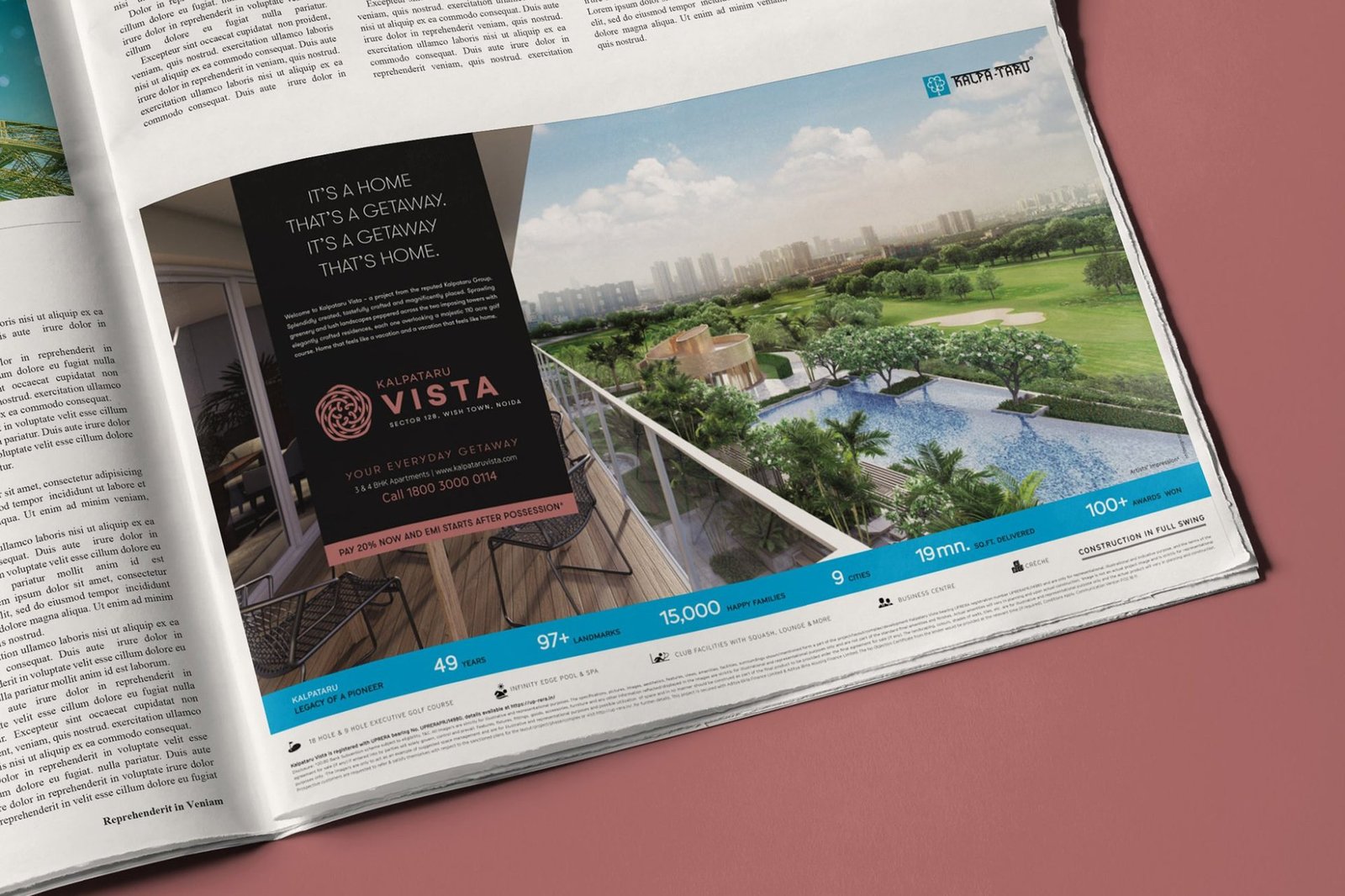
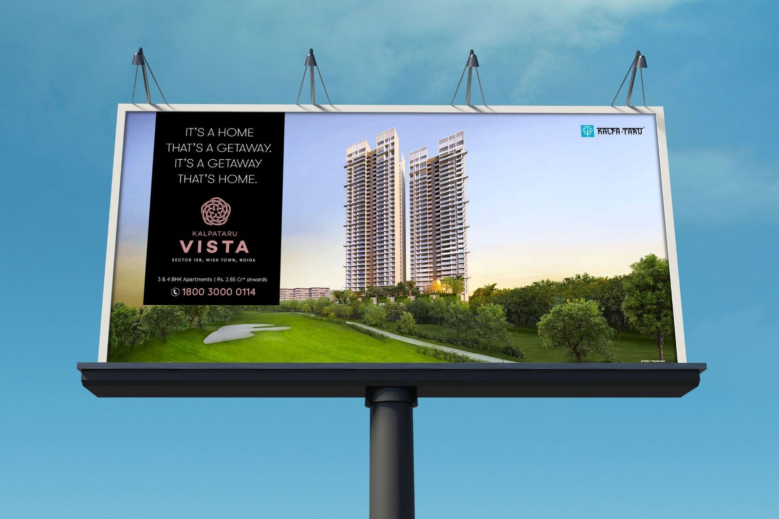
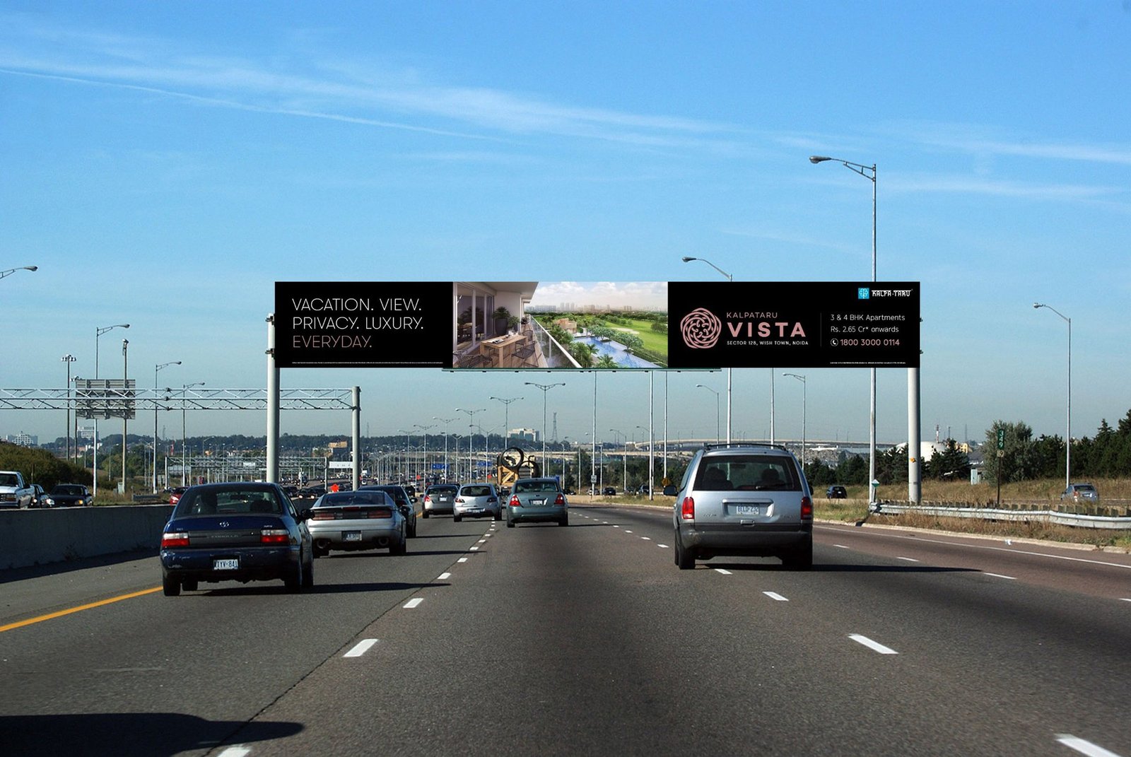
Kalpataru Group's first residential launch in Noida sat beside one of India's most renowned golf courses. The product was built. The positioning was not. We branded Kalpataru Vista as The Everyday Getaway and ran it from newspaper jacket to airport display, holding one line across every exposure.
Iconic towers framing the development.
Acres of golf course and landscape in view.
Residences per floor across 3 and 4 BHK layouts.
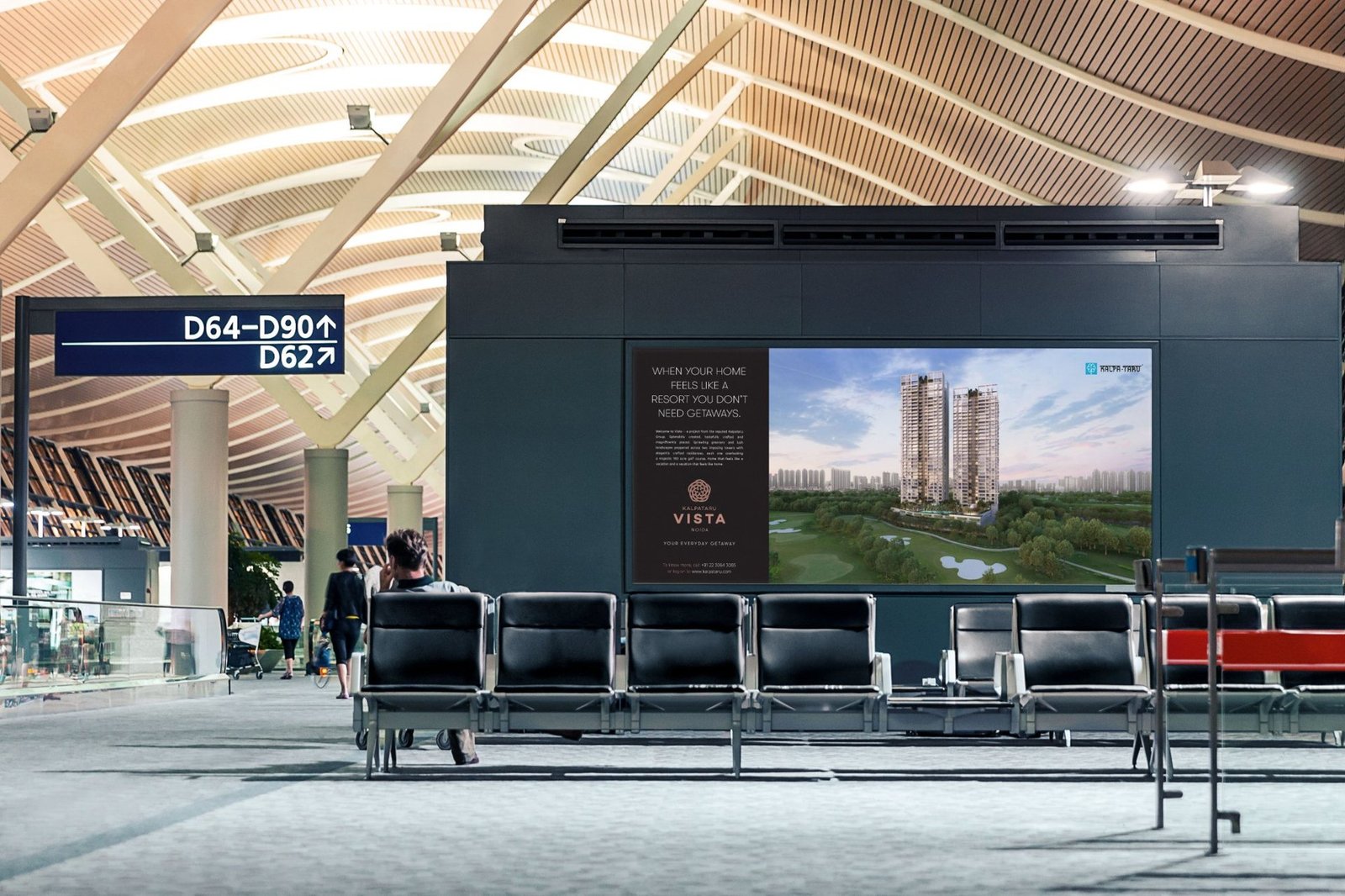
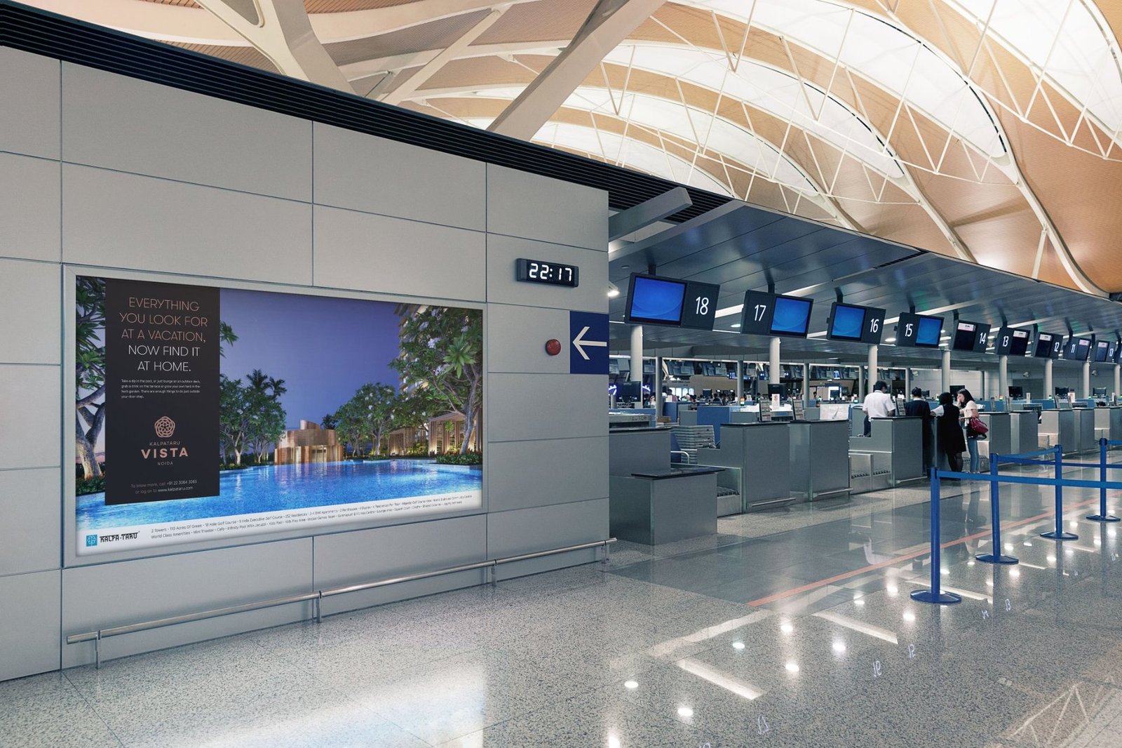
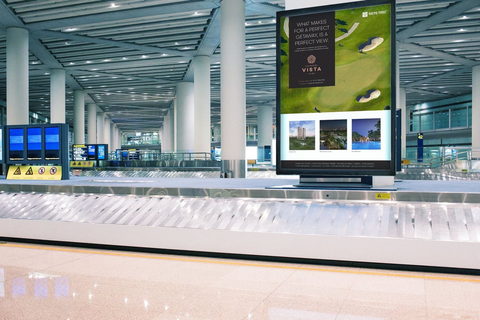
Line carried from newspaper jacket to airport gantry.
Kalpataru's first Noida launch, next to a landmark golf course.
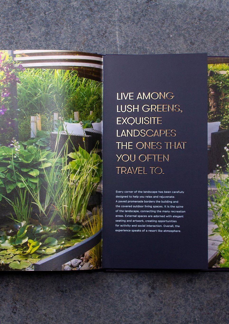
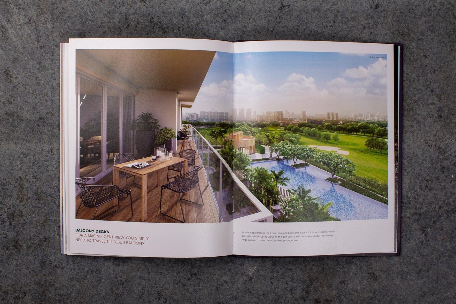
The strongest asset in the brief was the site: residences nestled amongst the finest landscaping, with a lush golf course across the fairway. The nearest neighbours sit on the far side of manicured greens.
In a market where density is rising and open ground is shrinking, space and privacy are the new benchmarks of luxury. We built the positioning around that shift, then carried it into every touchpoint.
Luxury launches that all talk about the same amenities.
Every launch competes on the same claims.
Bigger towers, grander lobbies, longer amenity lists. A buyer scrolling three brochures cannot tell them apart. We had to break the pattern without raising the volume.
The strongest asset was almost invisible in the brief.
The project sits next to a landmark golf course, with privacy and open ground that money cannot easily replicate. The old collateral mentioned it. The new brand had to lead with it.
Press, outdoor and airport ran as separate campaigns.
Newspaper jacket on Sunday, billboard on Tuesday, airport the week after. Without one line connecting them, the exposures do not compound.
The Everyday Getaway, held with discipline.
The insight: space is the new luxury
In a world of increasing density, open space and privacy are becoming the benchmarks of luxury. Vista enjoys splendid isolation. The nearest neighbours are on the far side of manicured fairways and greens.
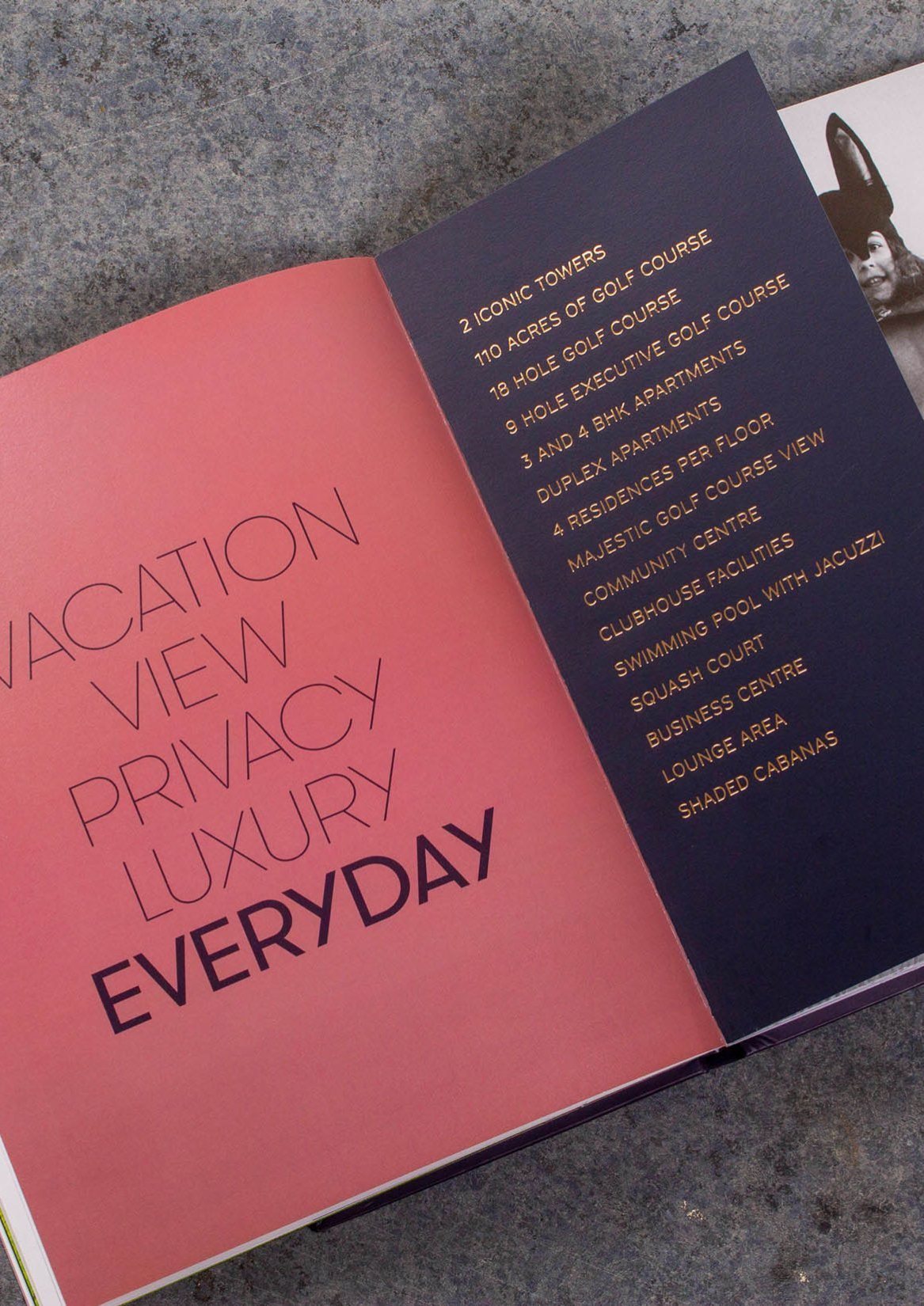
The positioning: a home that feels like a vacation
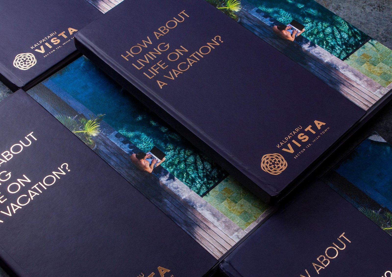
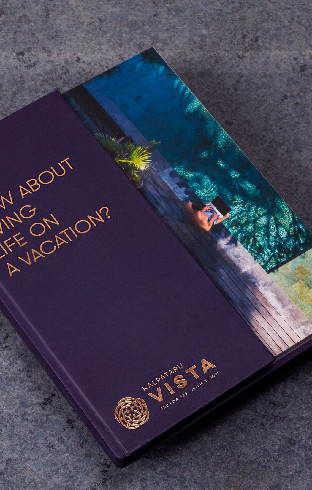
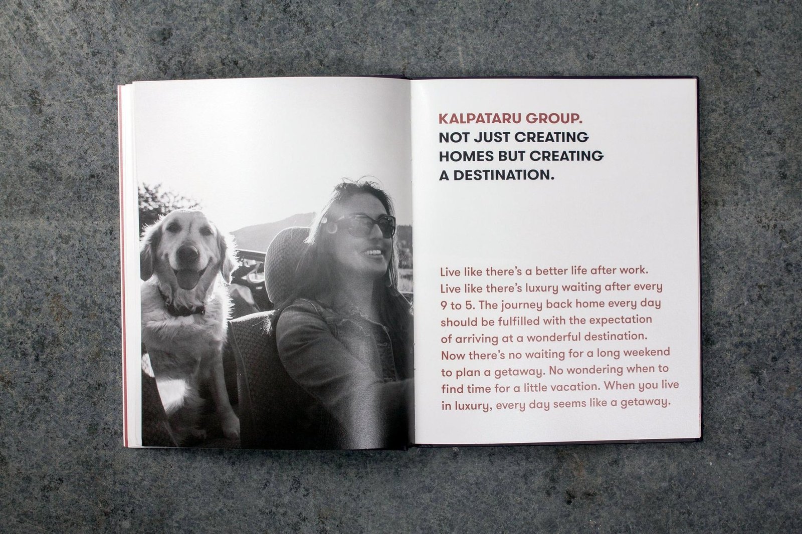
We positioned Vista as a home that feels like a vacation, and a vacation that feels like home. The idea took the name The Everyday Getaway. Simple enough to live on a billboard, specific enough to mean something inside the brochure.
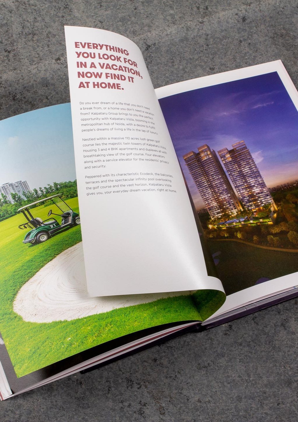
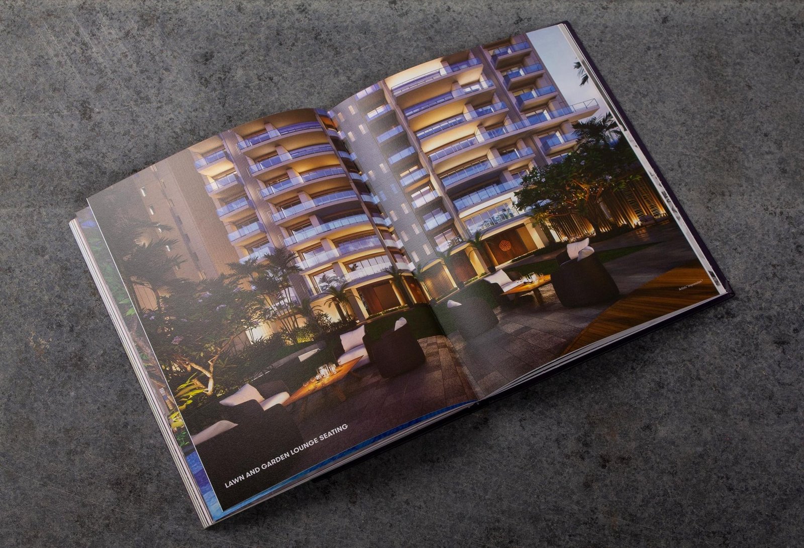
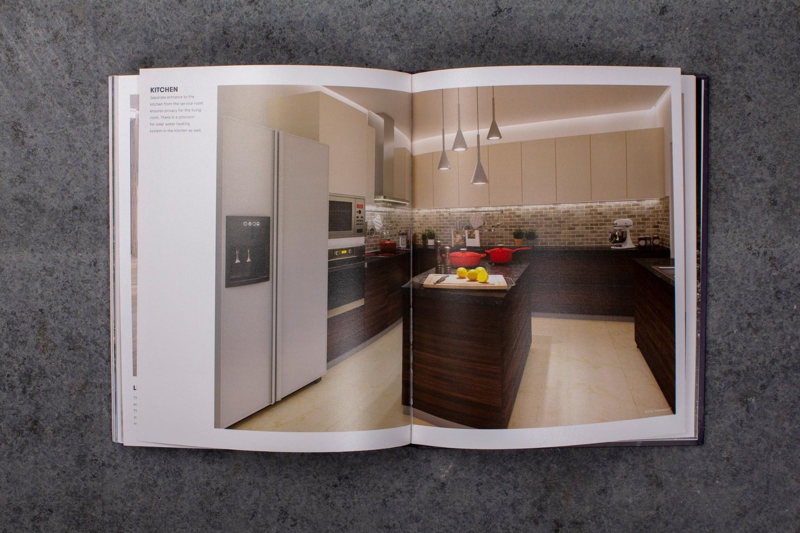
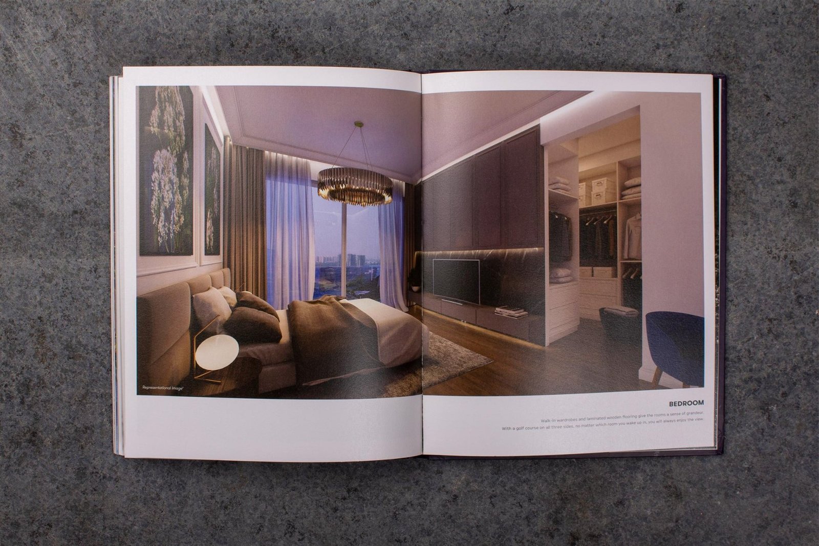
Identity and brand book
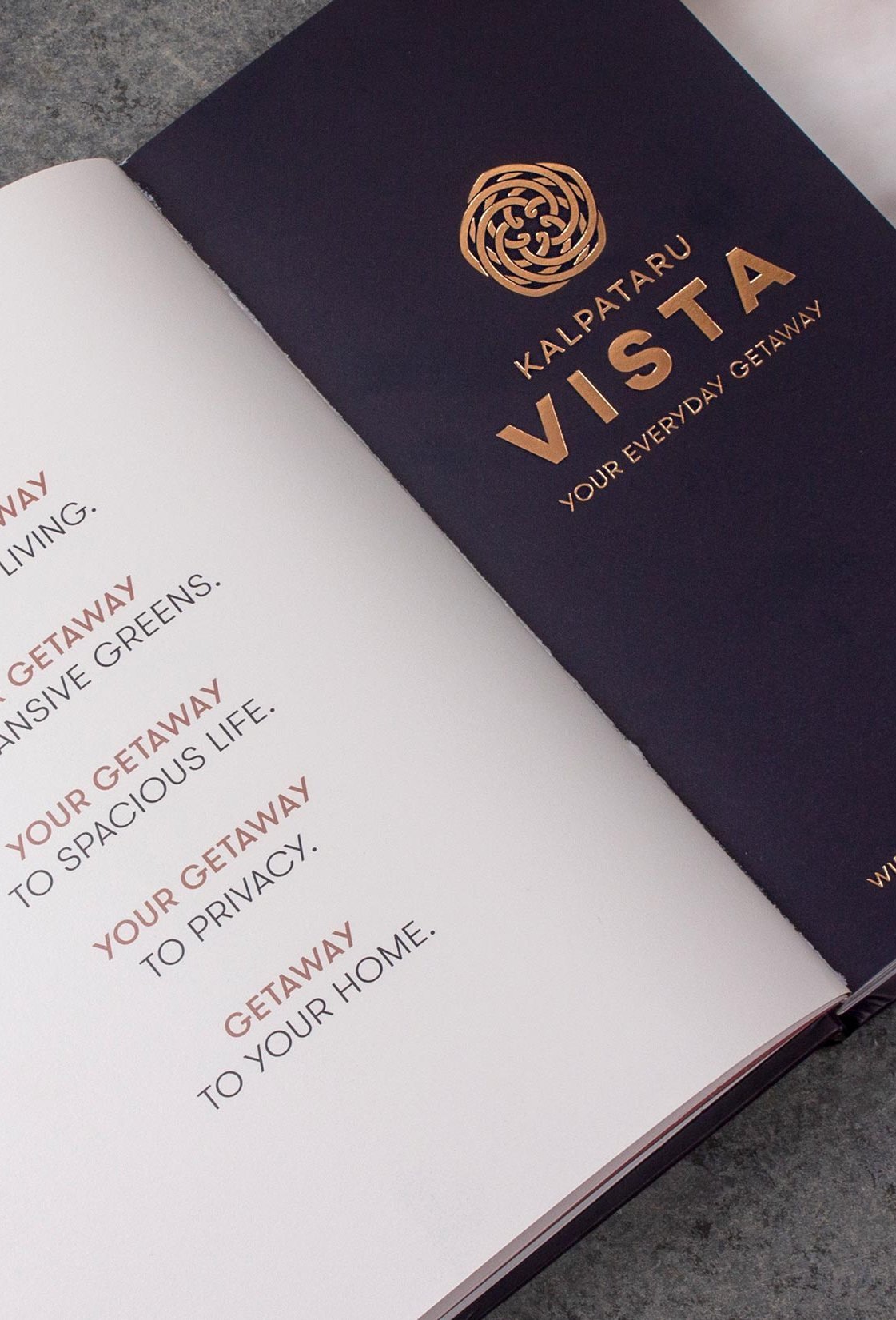
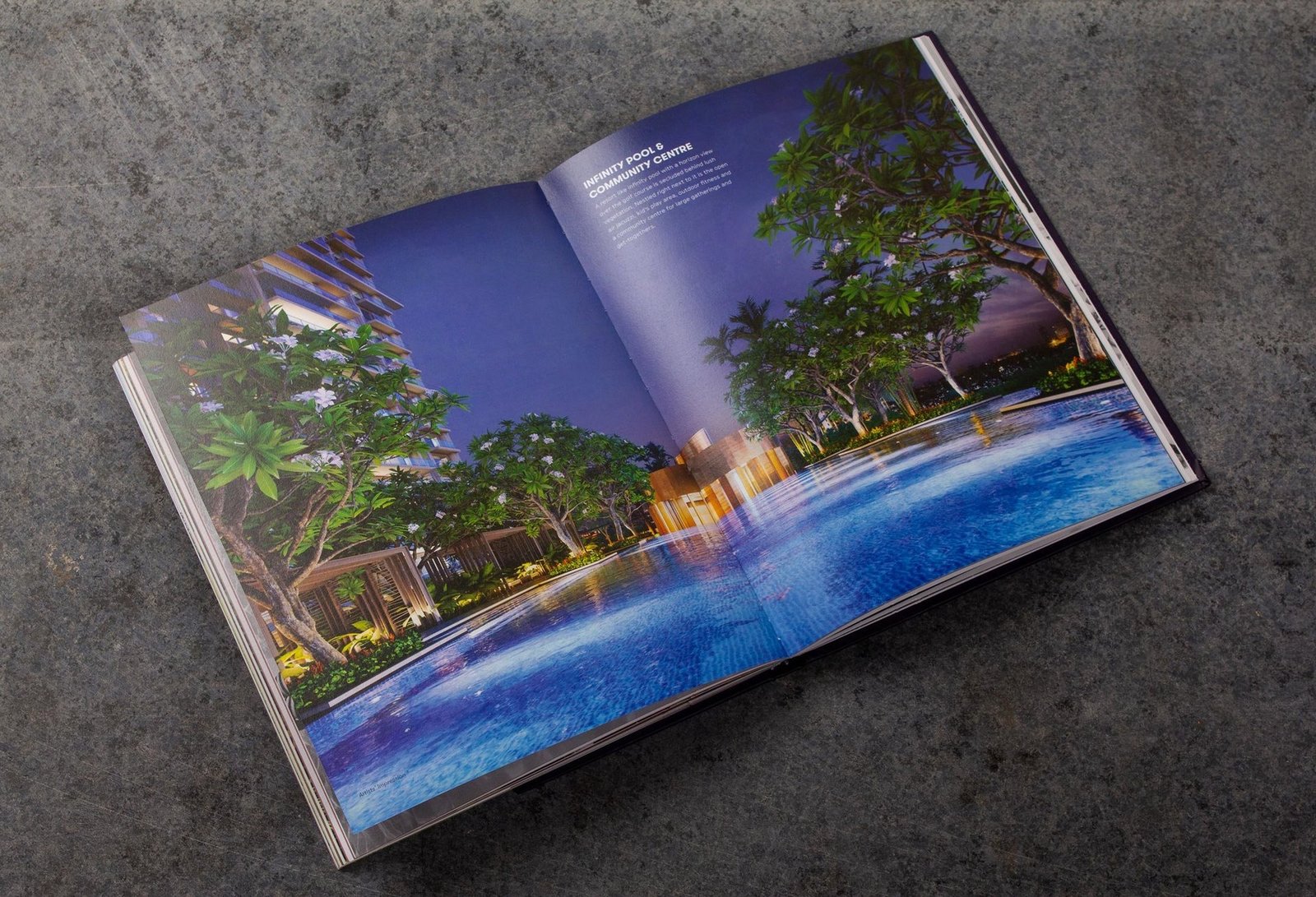
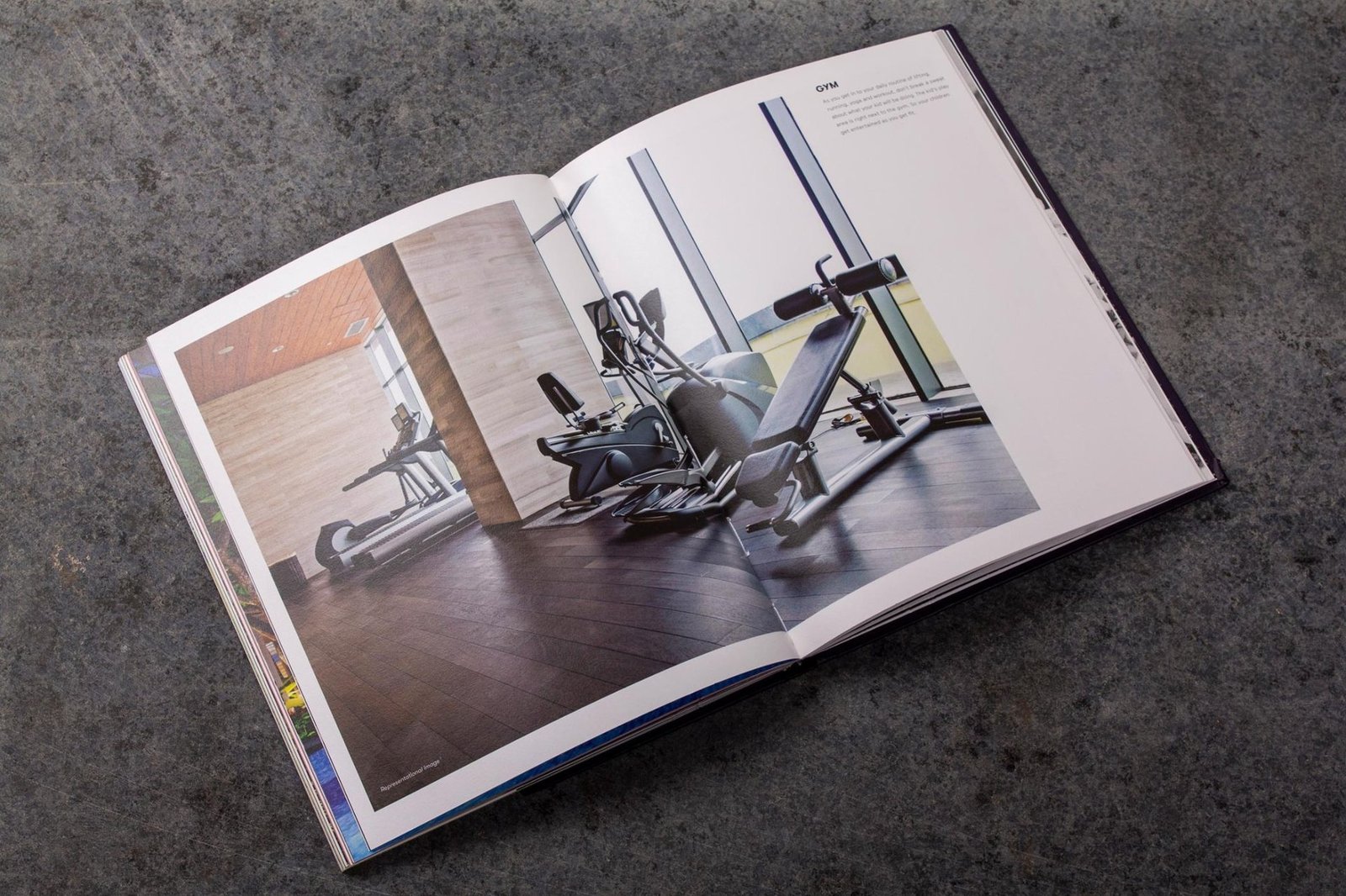
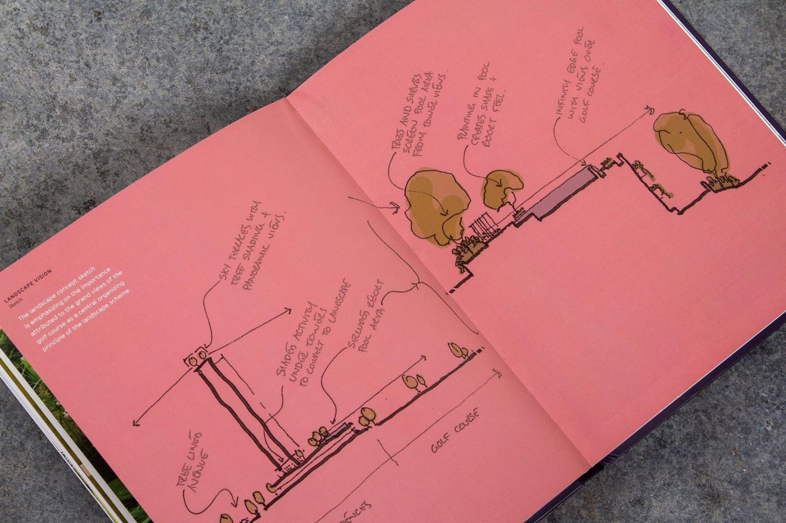
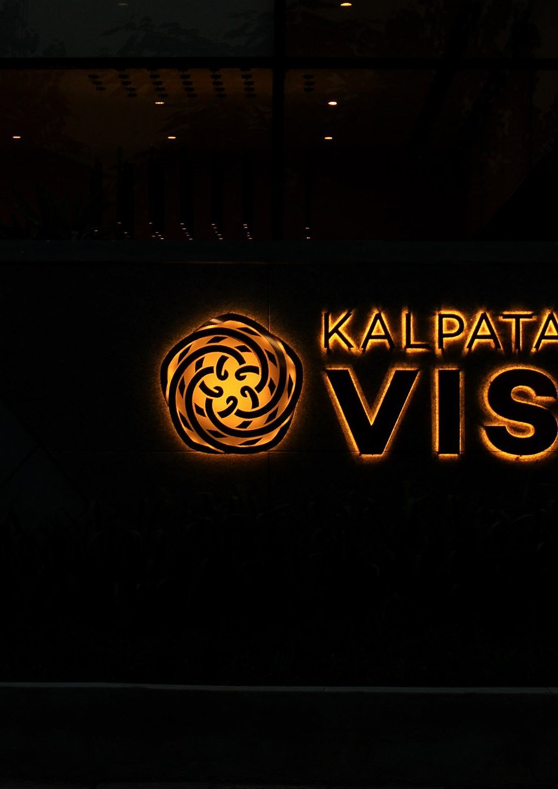
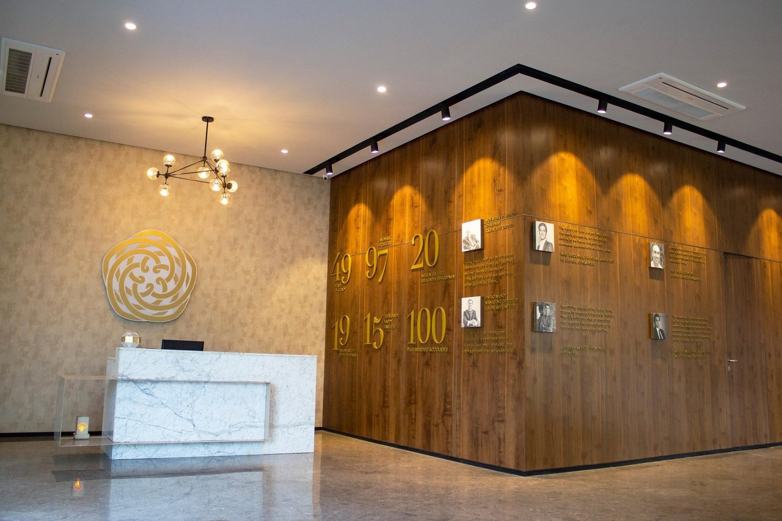
Deep navy and gold with a coral accent. A rose emblem drawn as a monogram. A coffee-table brand book that reads like a lifestyle title, not a sales brochure. Every touchpoint carries the same quiet confidence.
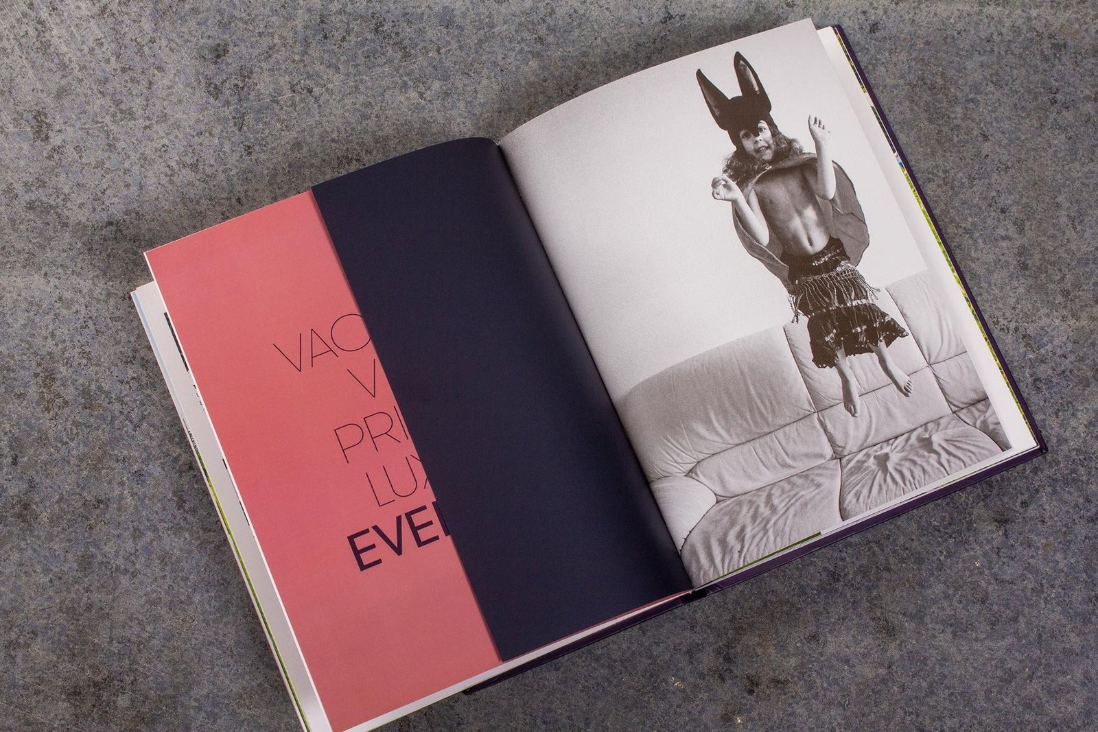
Own every touchpoint on the way to the getaway
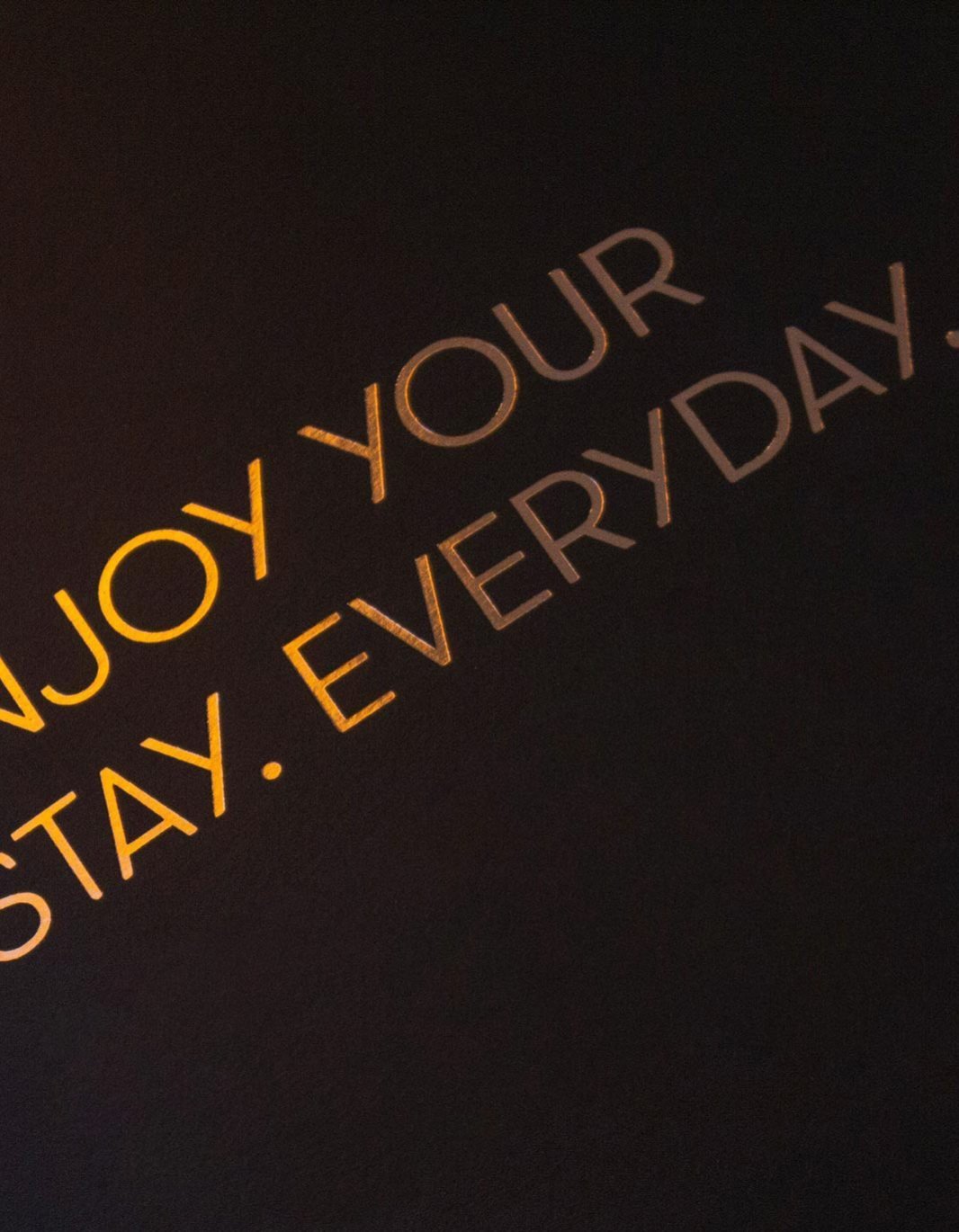
Newspaper jackets, press ads, billboards, expressway gantries, airport displays, site hoarding, sales office. One line everywhere. Vacation. View. Privacy. Luxury. Every day.
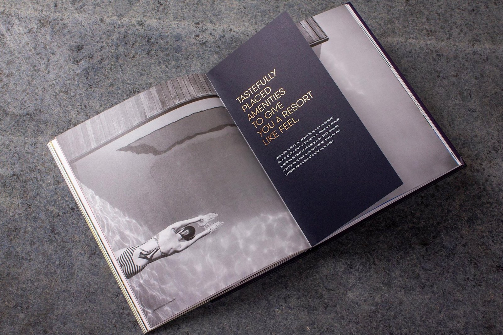
A single system, carried across every touchpoint.


From a project brief to a brand with voice.
Have a project worth a brand of its own?
We find the one truth about the product that nobody else is leading with, name it, and build the system that carries it from brochure to hoarding.
See the full Real Estate practice.