

Not built space. A natural habitat.
Adani Realty's Lushlands needed a brand that separated it from category conventions of scale and spectacle. The land already held the brand. We built the positioning, identity and brochure that let it speak.
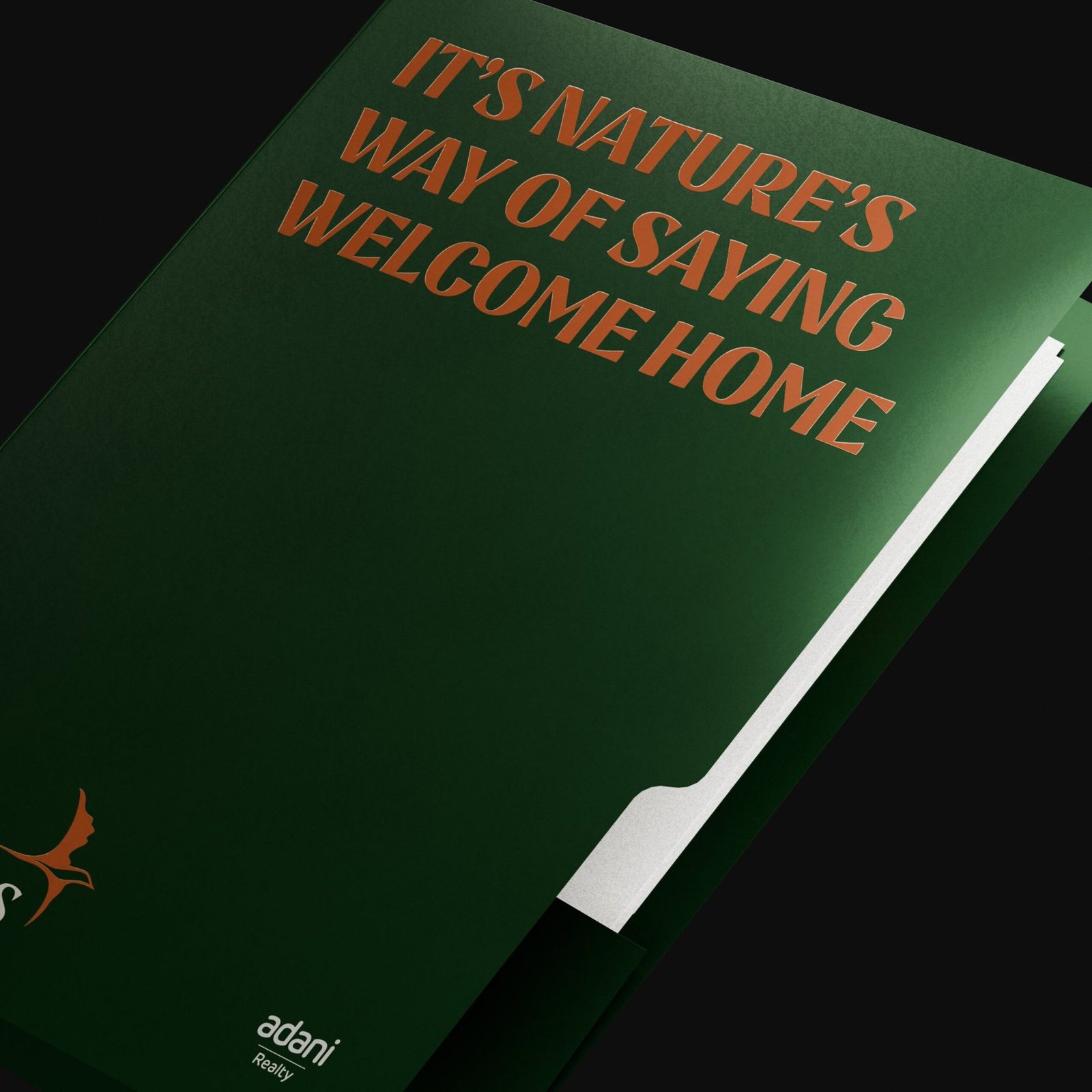
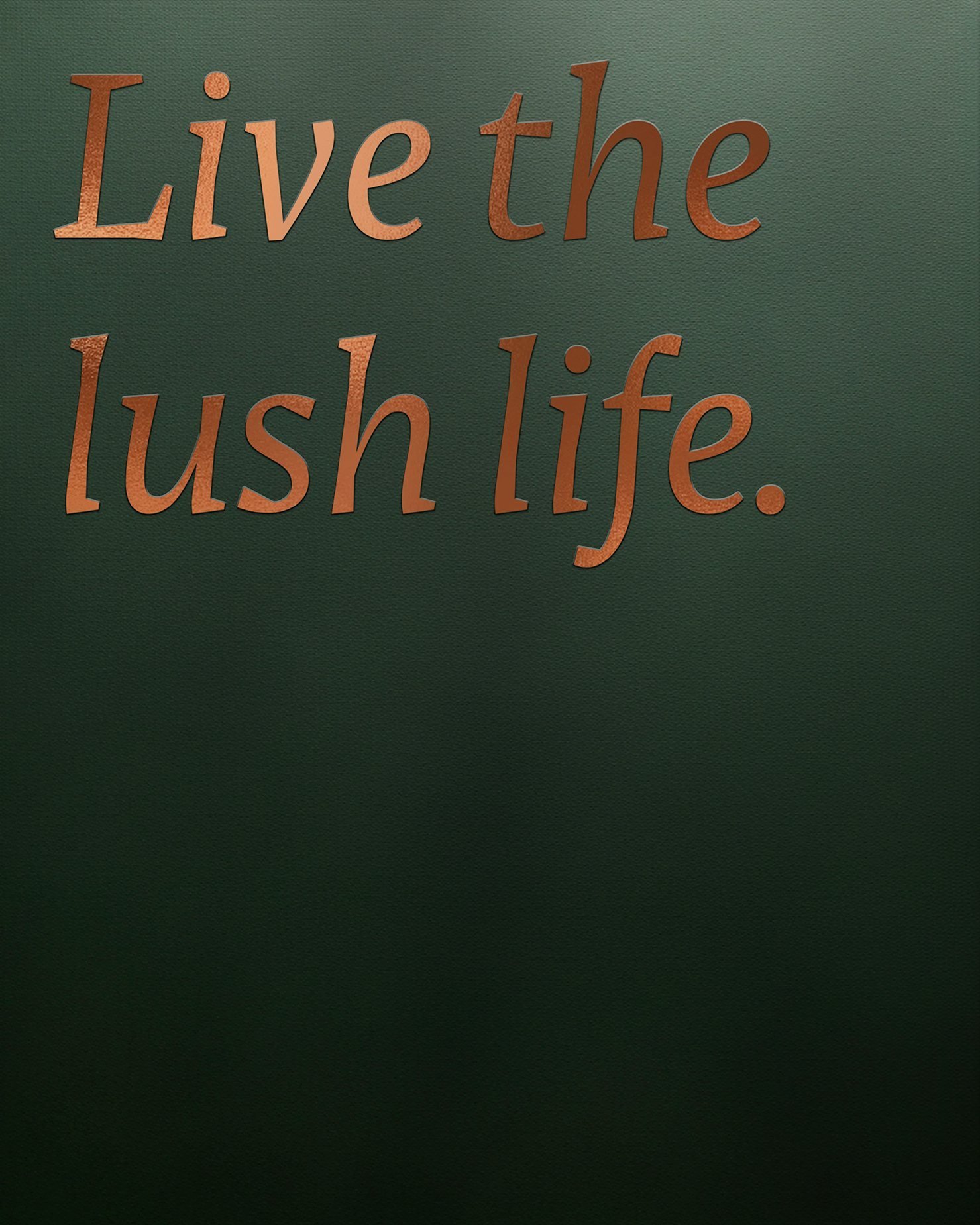
Platform line carried across every touchpoint.
Workstreams held under one brand world.
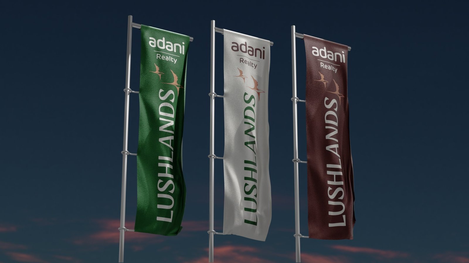
Signature colours that do all the heavy lifting.
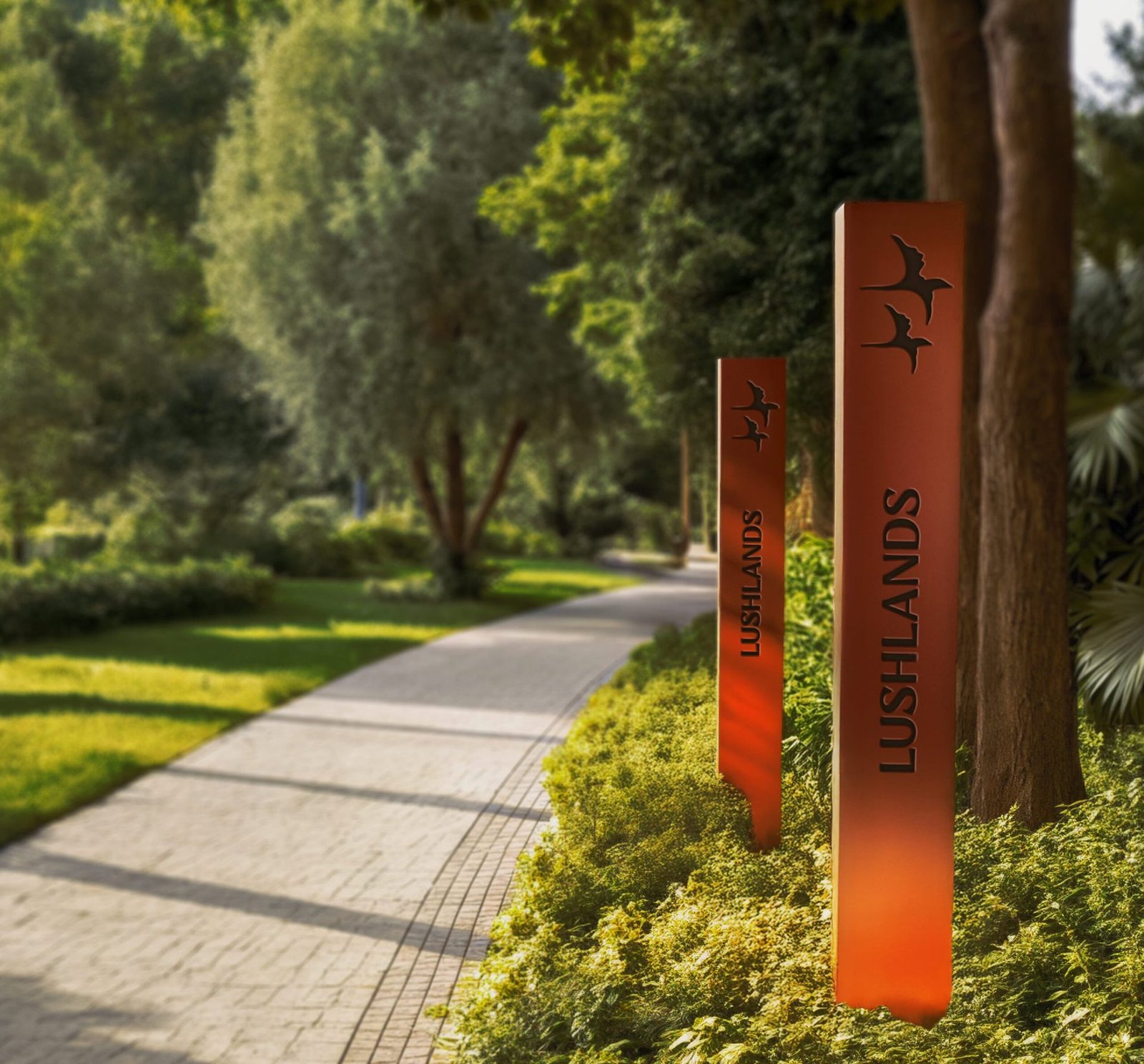
Bird in flight, the recurring mark of the brand.

Adani Realty needed a residence brand that read as sanctuary, not spectacle.
Lushlands was never imagined as a typical residential project. The brief was for a brand that could sit alongside Adani's scale without inheriting its volume, and speak to a homeseeker who wants sanctuary rather than show.
The insight came from the site itself: a forested ravine, flowing water, tiered greens and the hush of trees. The land already held the brand. The job was to find the one positioning that would let it speak.
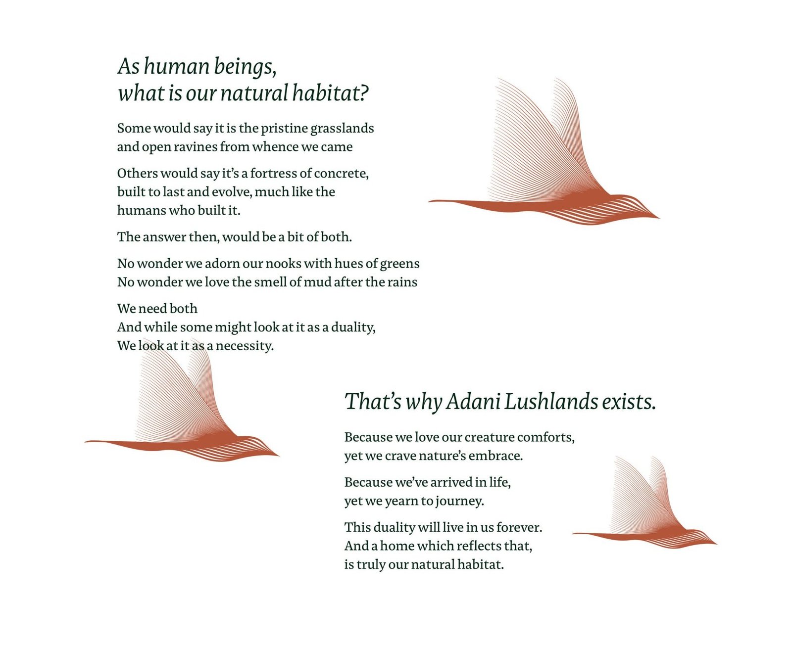
The luxury category has run out of new words.
Every launch competes on scale and skyline.
Lobbies, towers, amenity lists. The industry's standard play is to shout louder. Lushlands needed to do the opposite without losing presence.
Nature was in every brochure, led by none.
"Lush greens" is a line everyone writes. The land here was closer to a sanctuary than a landscape. The brand had to name the difference.
Launch collateral reads like a sales deck.
Specifications first, feeling second. For a brand built around calm, the brochure had to behave like a walk through the land, not a product sheet.
A visual language that was grown, not constructed.
Positioning: Your Natural Habitat
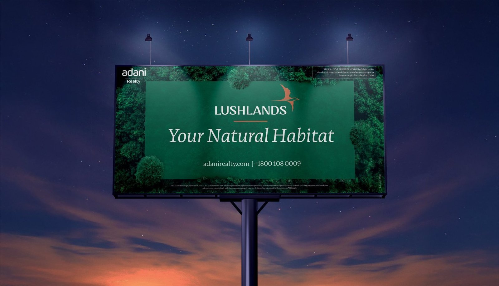
Not just built space, a natural habitat. The line reframes luxury around reconnection rather than excess, and gives the brand a voice that holds without raising. It leads every touchpoint from brochure cover to site hoarding.
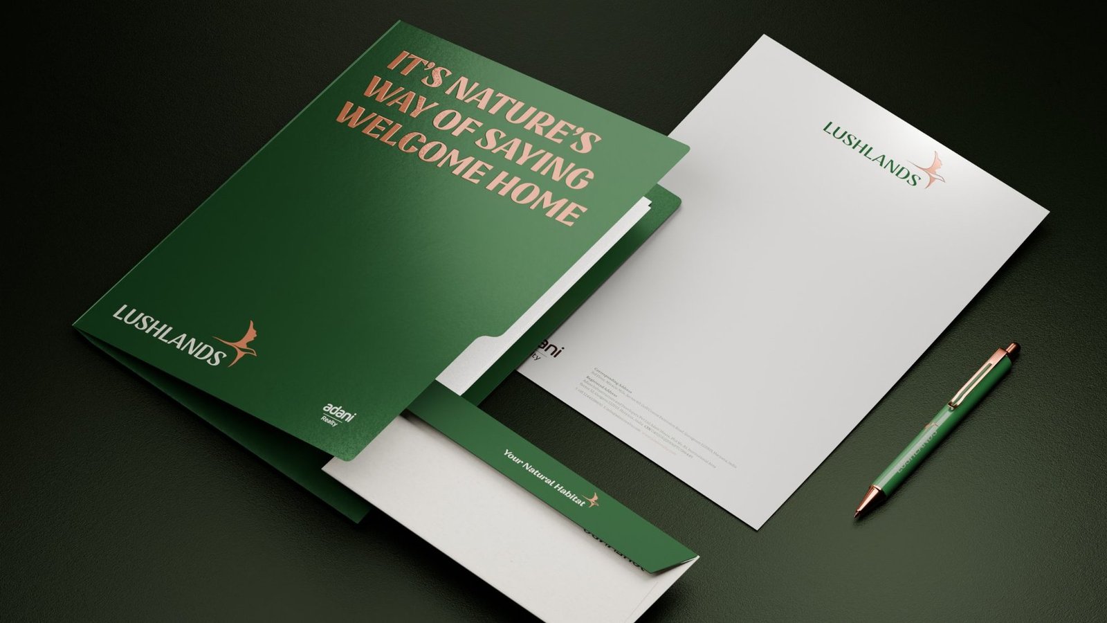
Identity: deep forest green, burnished copper, a bird in flight
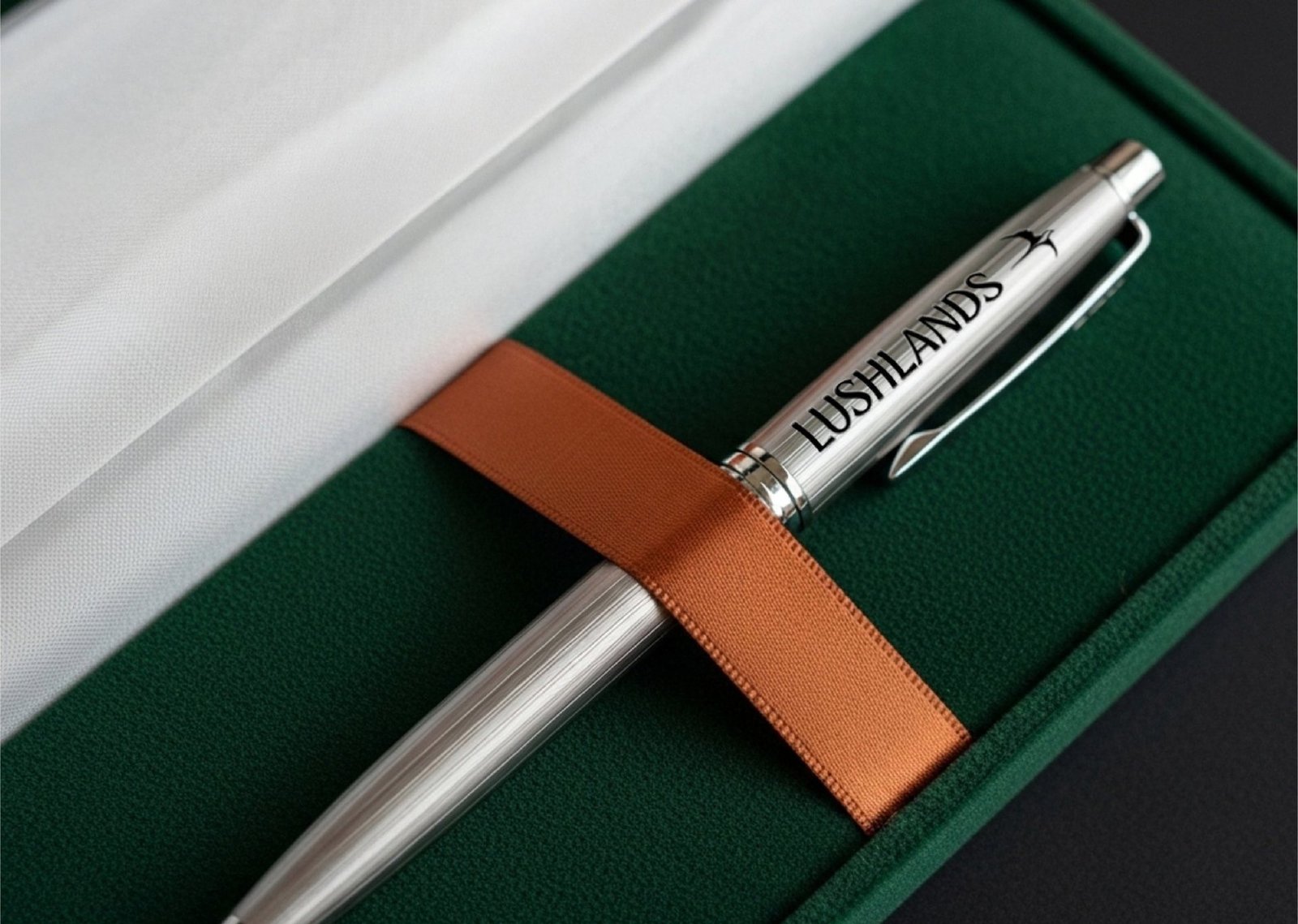
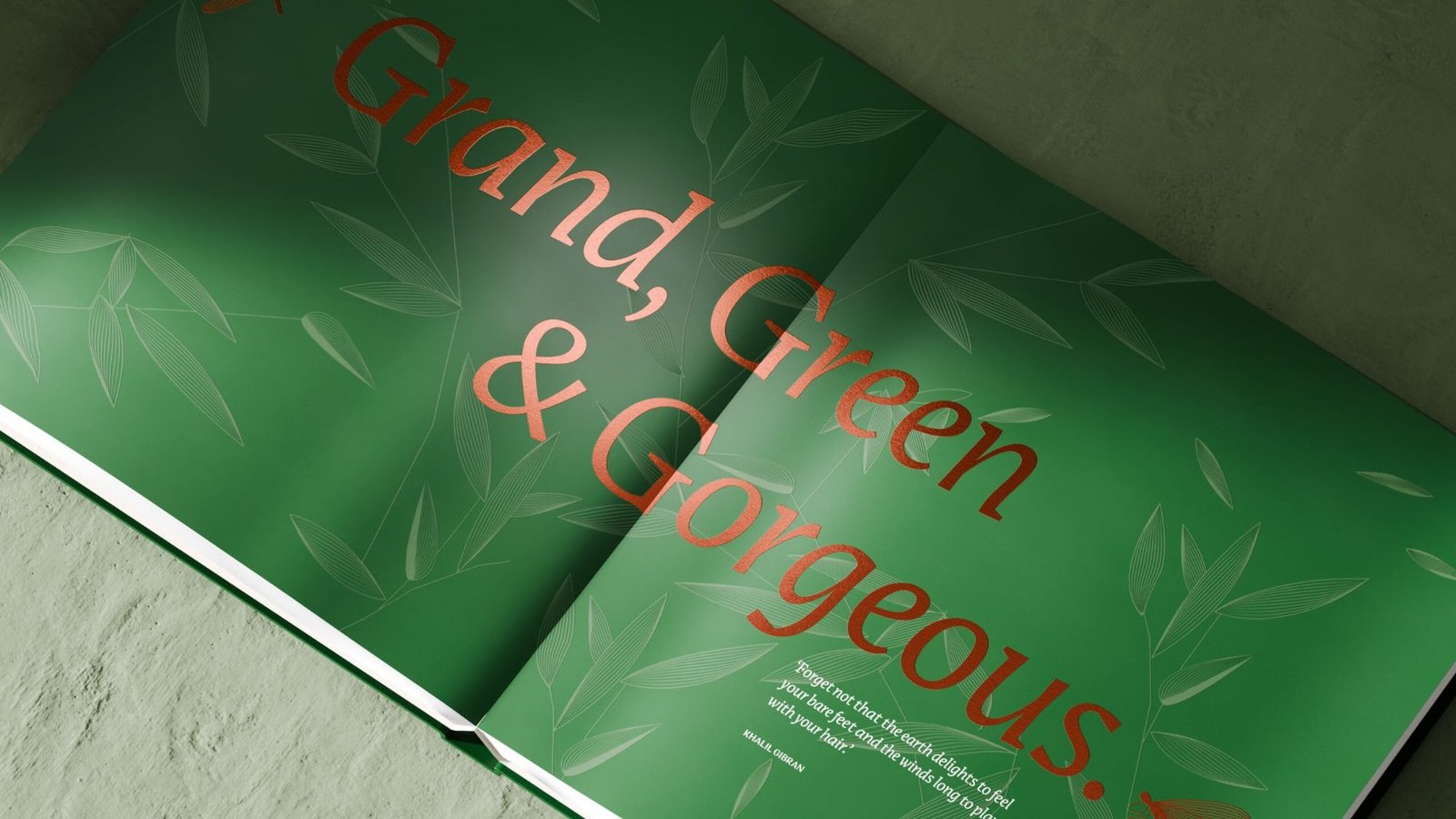
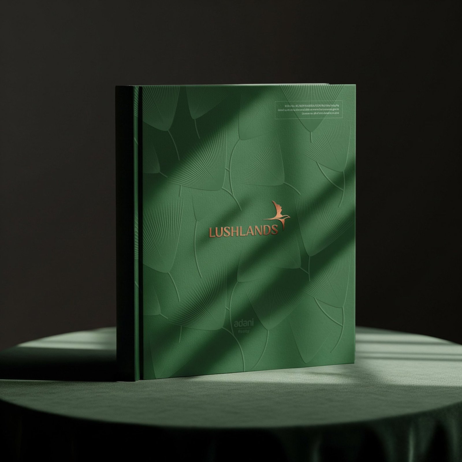
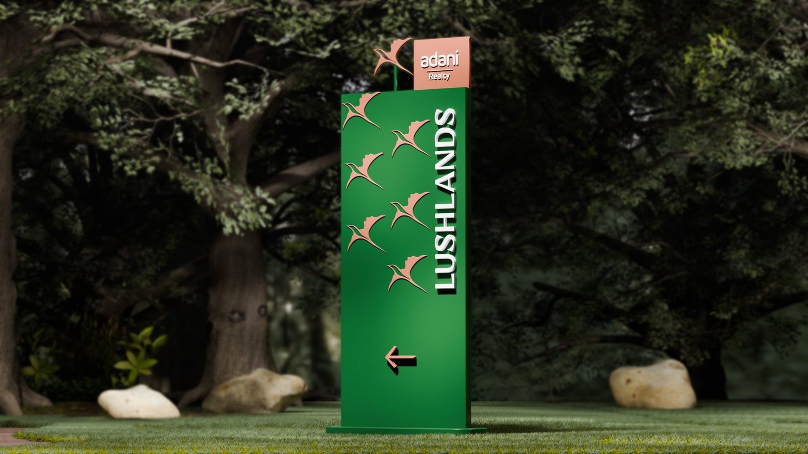
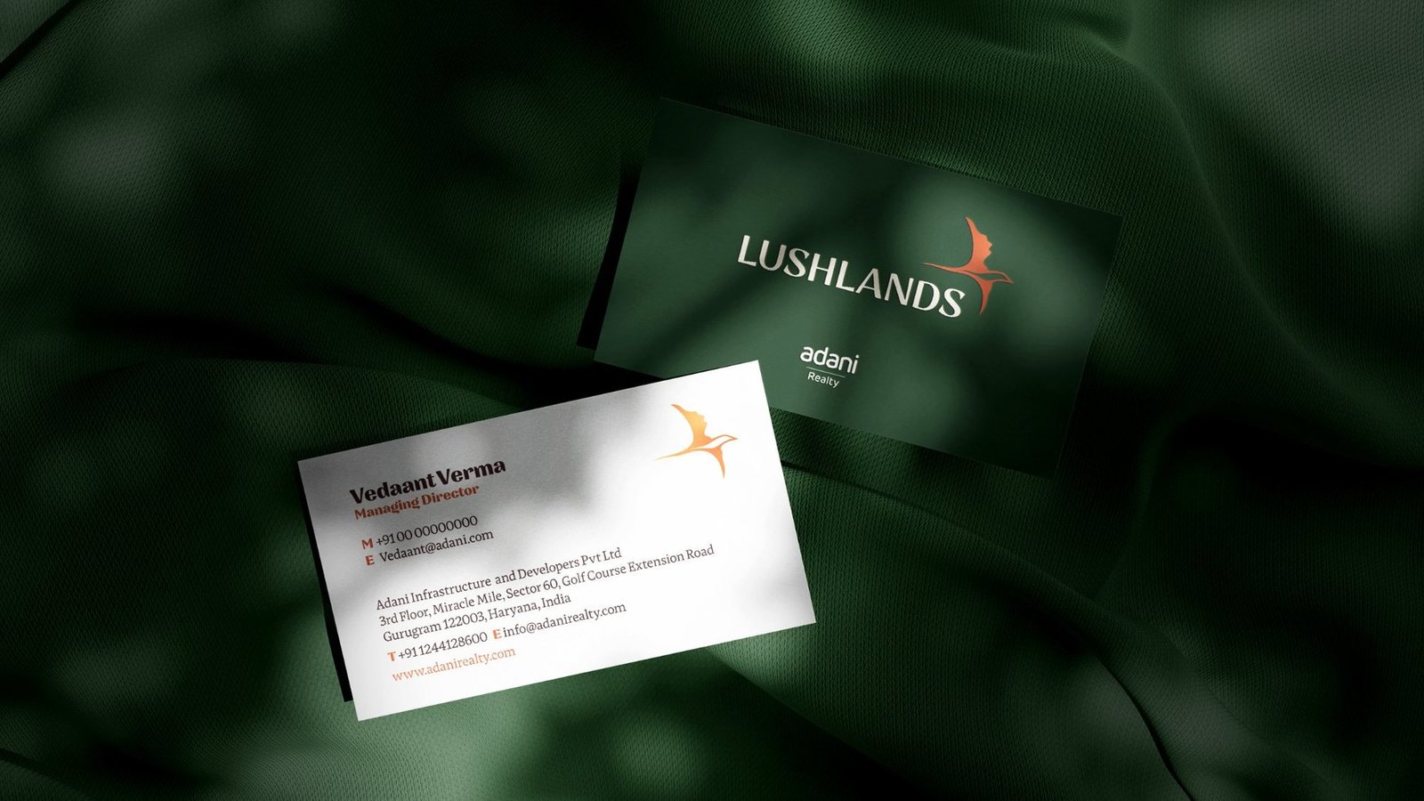
Every element mirrors the experience of walking through the space: layered, quiet, elevated. Deep forest green carries the canopy. Burnished copper brings warmth and earth. A bird in flight marks a place where nature still moves freely.
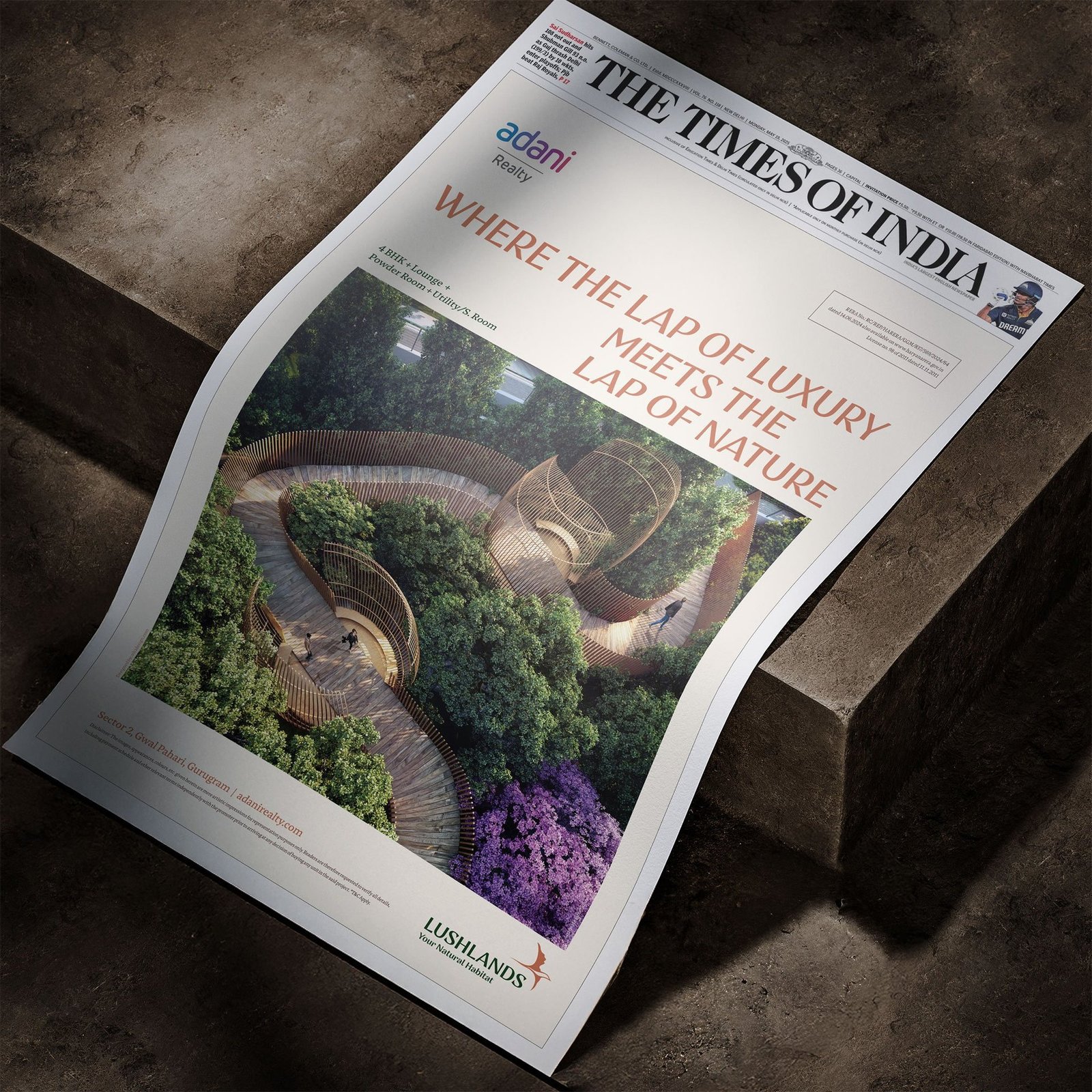
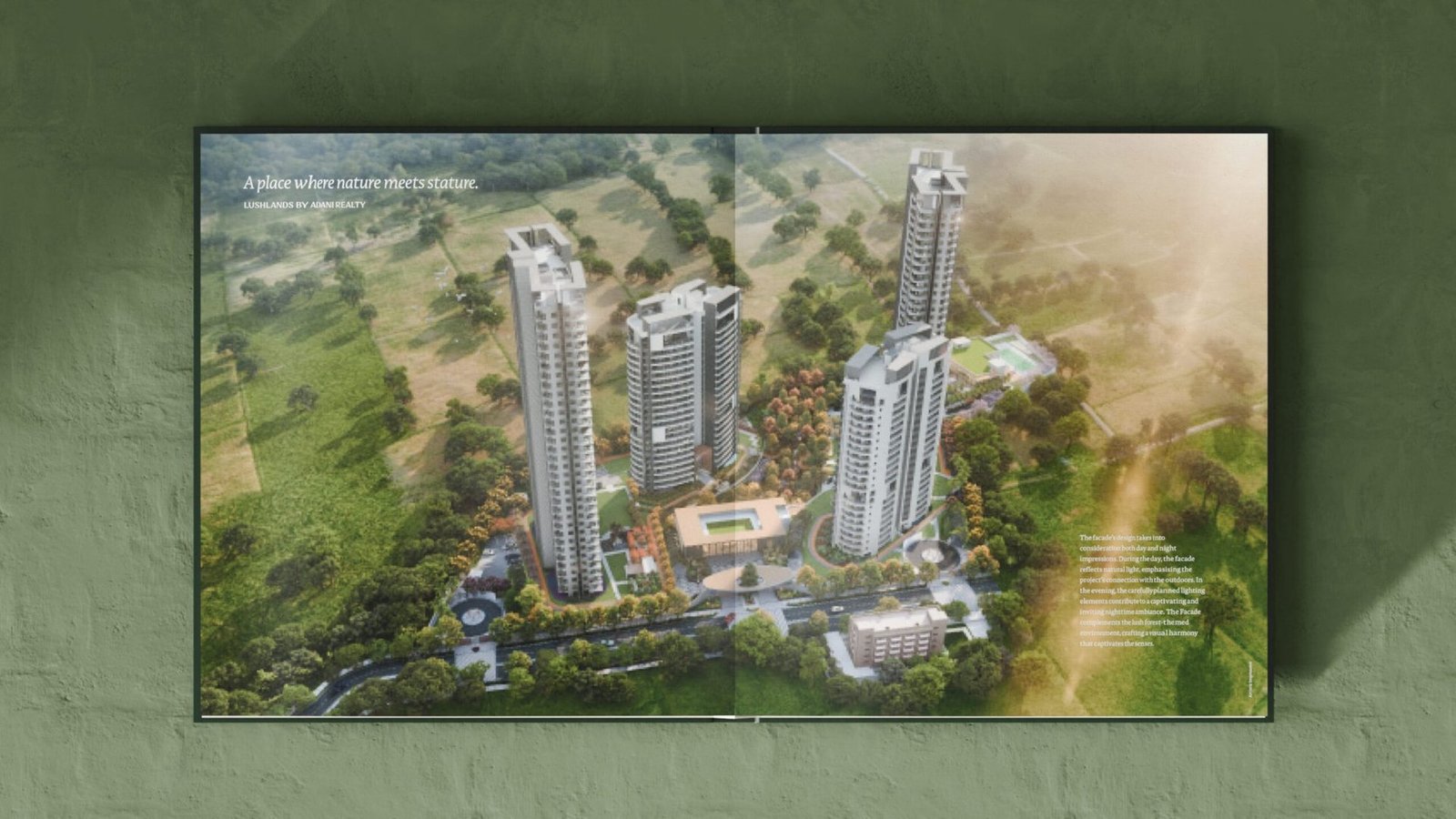
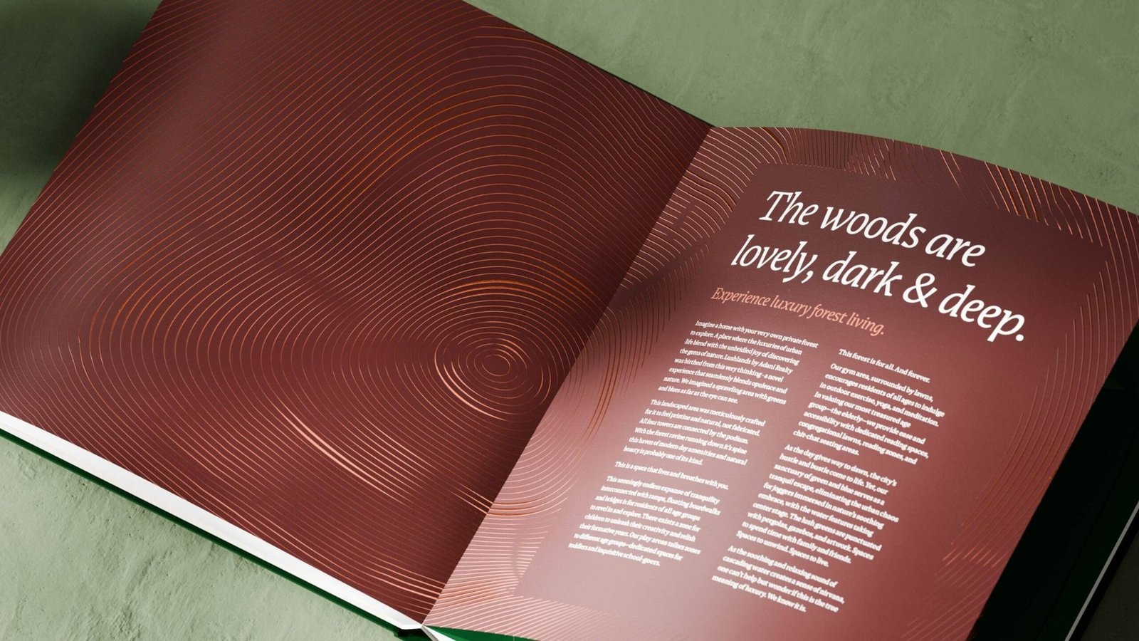
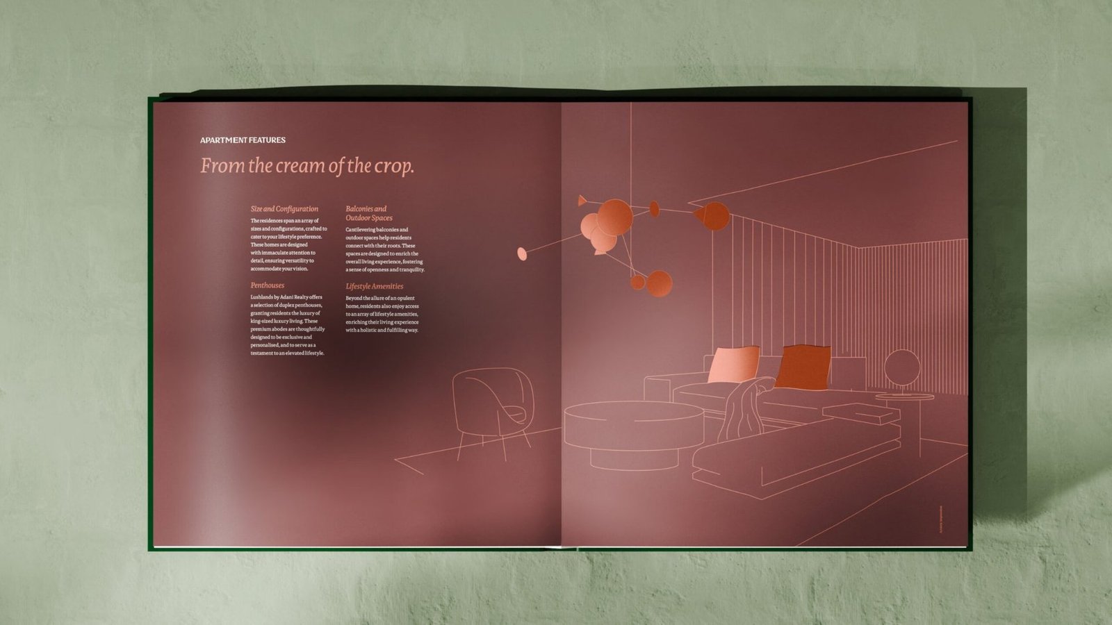
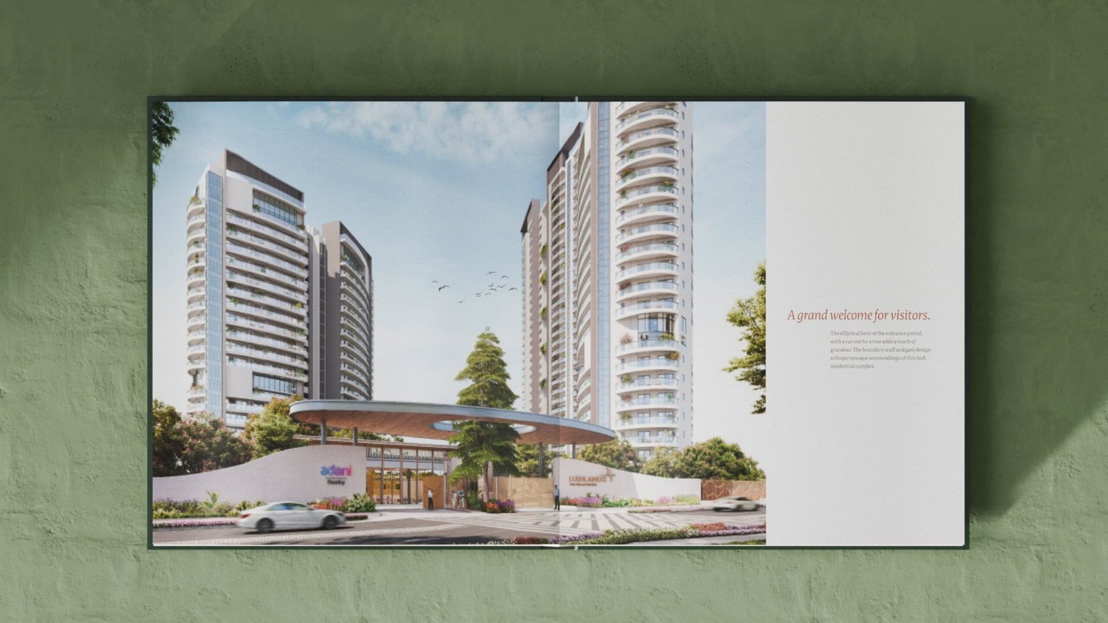
Brochure as a walk through the land
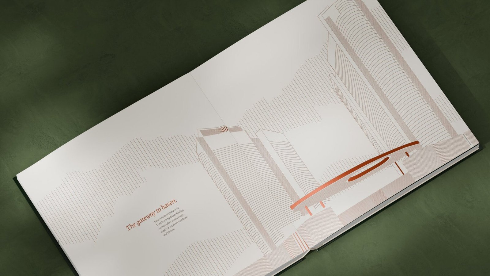
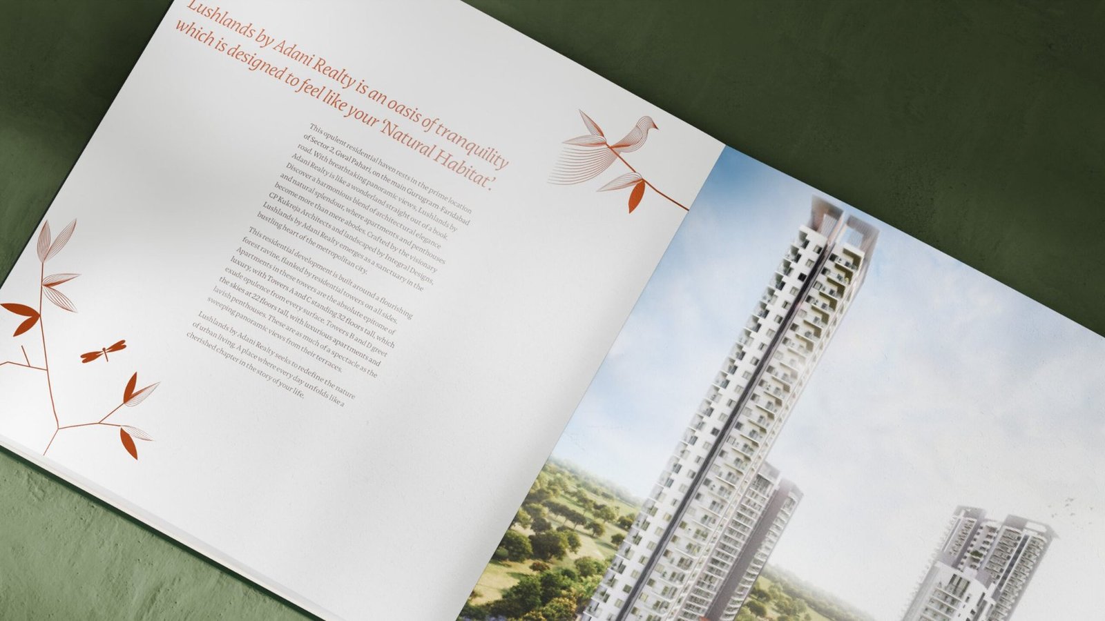
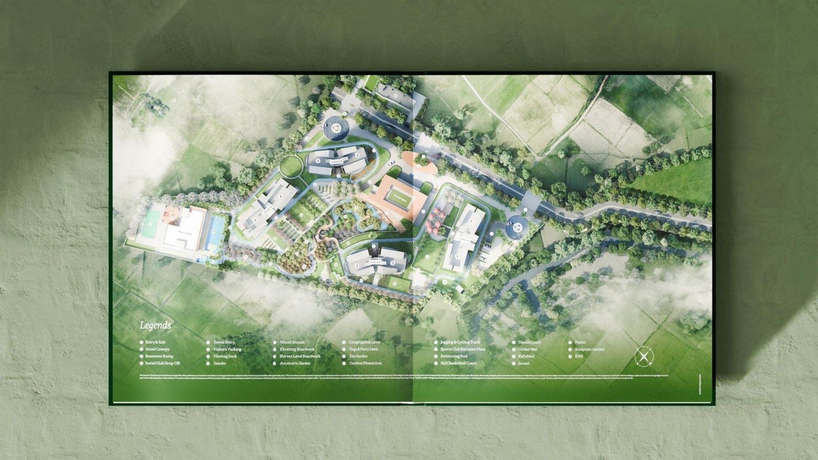
Rather than a catalogue of specifications, the brochure unfolds like a walk through Lushlands. Botanical patterns, line-drawn architecture and copper accents pace the reader from first impression to final page.
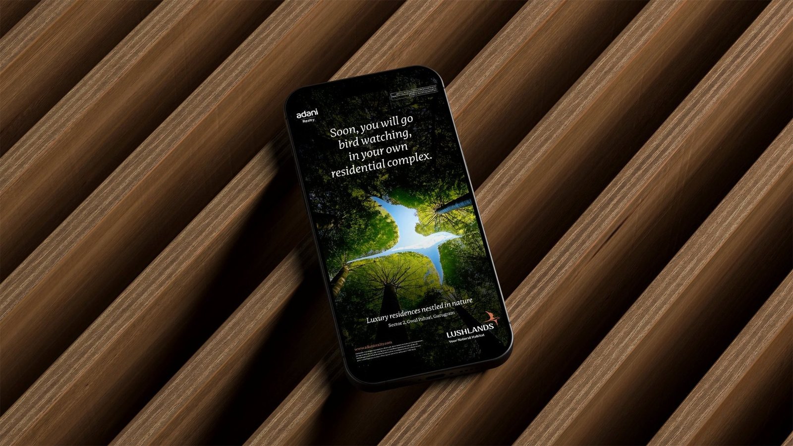
Launch communication: taking the habitat to the city
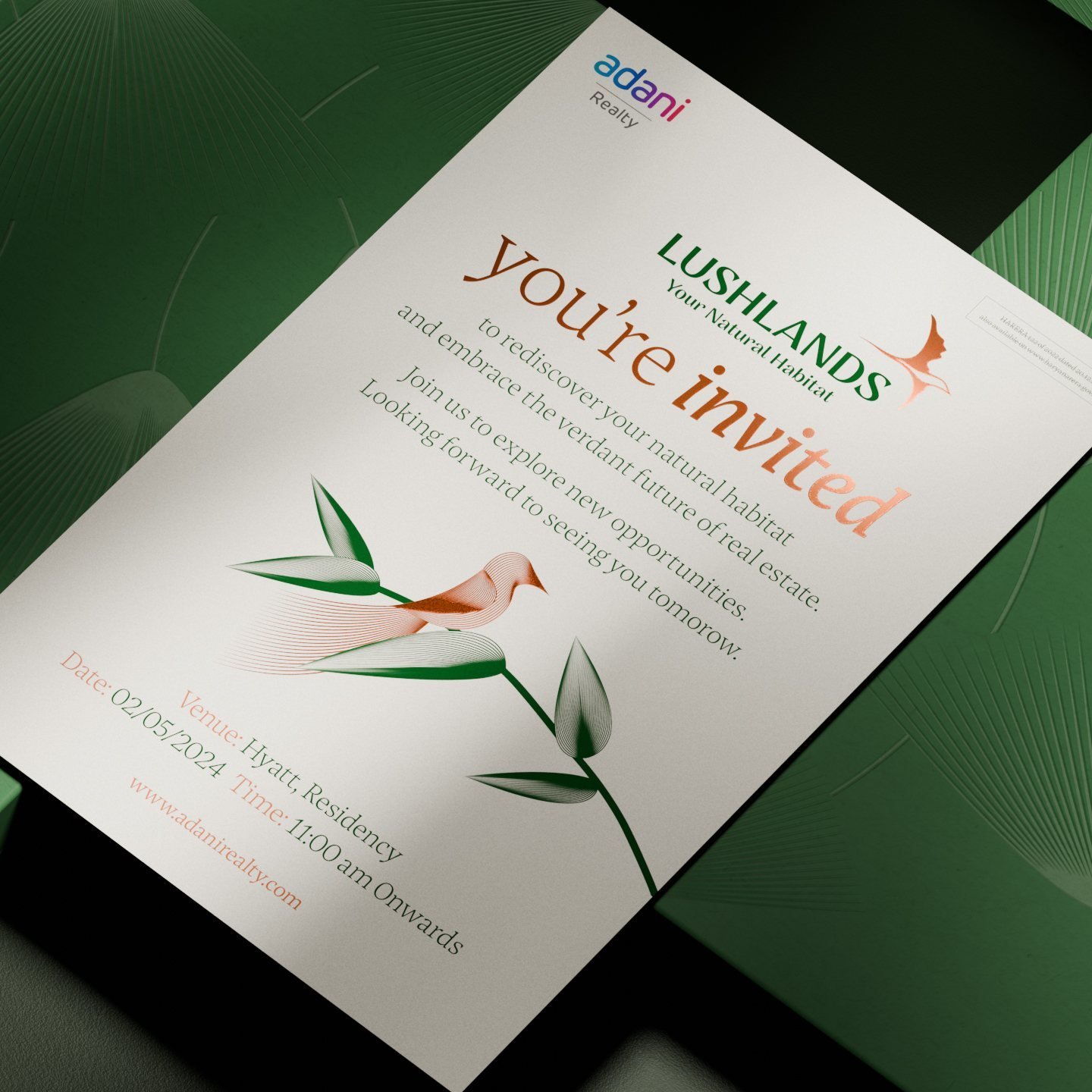
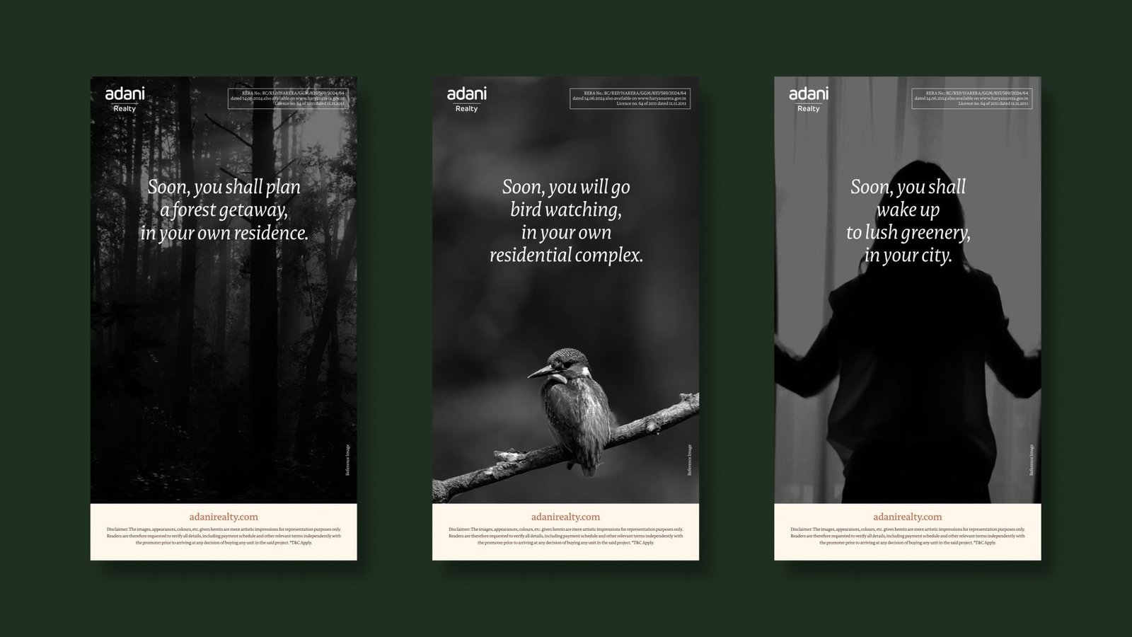
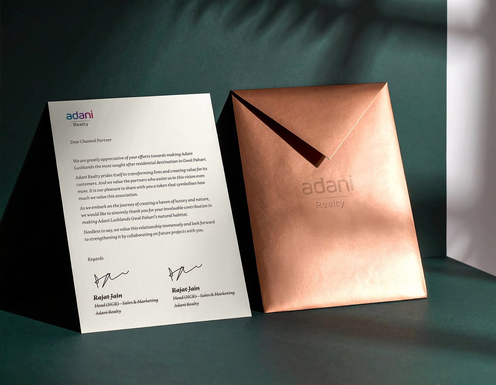
Across out-of-home, invitations and press, the platform line leads. Dark skies, green canopies and the copper bird let Lushlands stand apart in a crowded real-estate media landscape without once needing to shout.
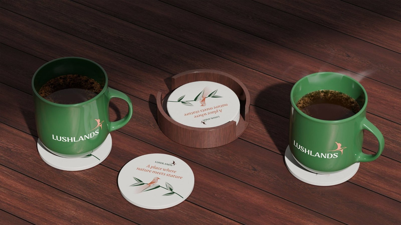
A single system, carried across every touchpoint.


From a project brief to a brand with voice.
Have a project worth a brand of its own?
We find the one truth about the product that nobody else is leading with, name it, and build the system that carries it from brochure to hoarding.
See the full Real Estate practice.