

Where there is more to home, there is more to life.
Grava Residences launched into a market where every brand competed on scale. My Home Group needed a platform that stood apart without shouting louder. We repositioned luxury from possession to experience, and built the collateral that carried the idea.
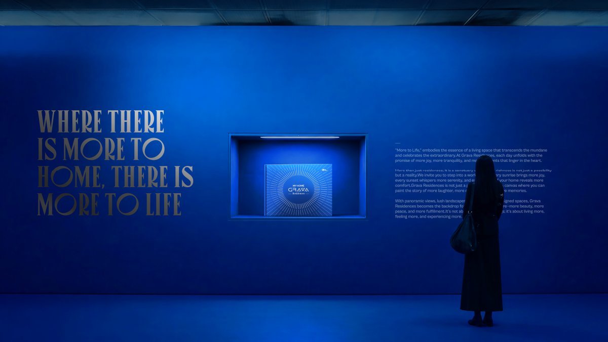
Pillars: space, vistas, landscape.
Line that leads every surface: More to Life.
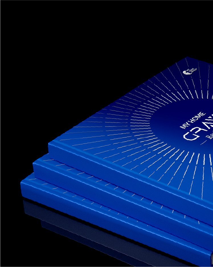
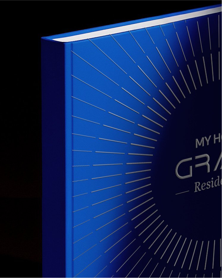
Brochure editions: cobalt, gold, silver.
Workstreams held under one brand platform.
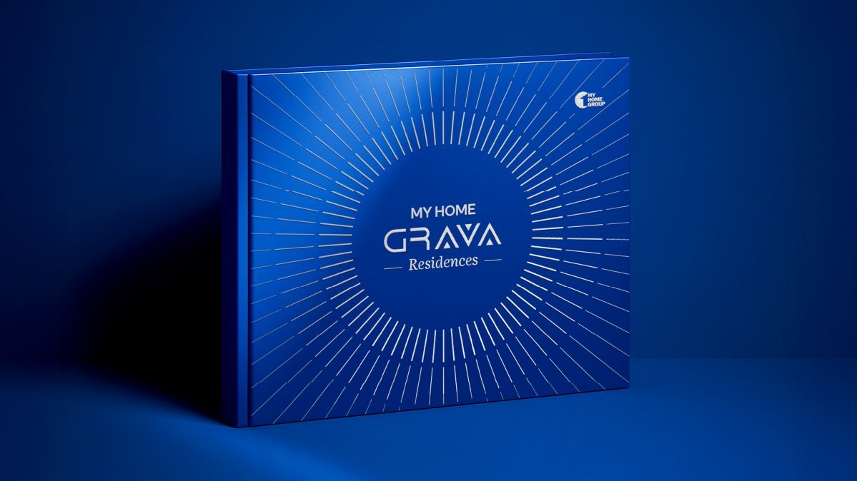
A product worth more than the square footage it sells.
Grava Residences entered a market where nearly every launch competes on the same claims: bigger towers, grander lobbies, longer amenity lists. The product itself offered spacious residences, panoramic vistas and carefully crafted landscapes.
The old positioning sold square footage. We rewrote it to sell what that space makes possible. Space to live, gather, grow. Vistas as an everyday luxury. Landscape as an extension of the home.

Every launch sells scale. Nobody sells feeling.
The luxury field reads as one long specification sheet.
Height. Lobby. Amenity count. Every buyer sees the same chart, and nobody wins memory. We had to make the brand a feeling, not a figure.
Brochures that read as asset lists, not stories.
Specifications are what buyers eventually compare. Stories are what they first remember. The old collateral had the chart, not the opening page.
Positioning, brochure and advertising on different clocks.
One team wrote the line, another built the book, a third ran the OOH. The idea diluted at every handoff. We held all three under one roof.

One idea, held with quiet confidence.
The reposition: possession to experience
Grava stops selling square footage and starts selling what that space makes possible. More to Home. More to Life. Three pillars sit under the line: space as room to live, vistas as a daily luxury, landscape as an extension of the home.
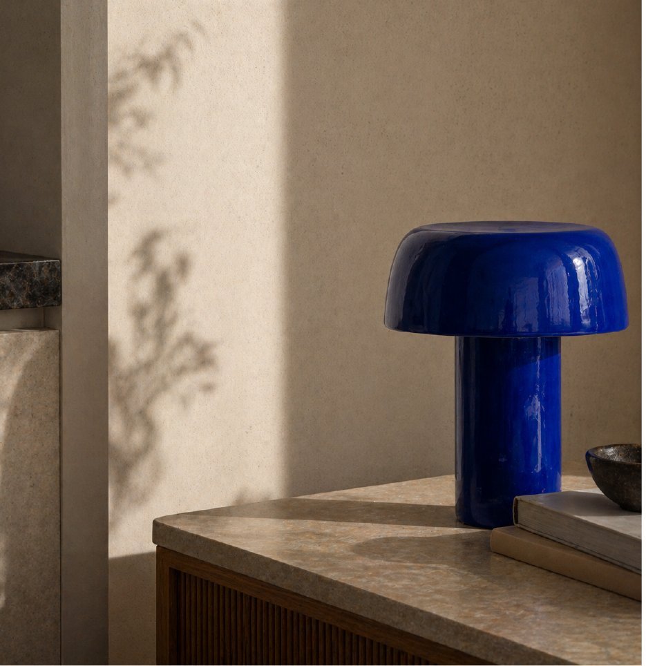
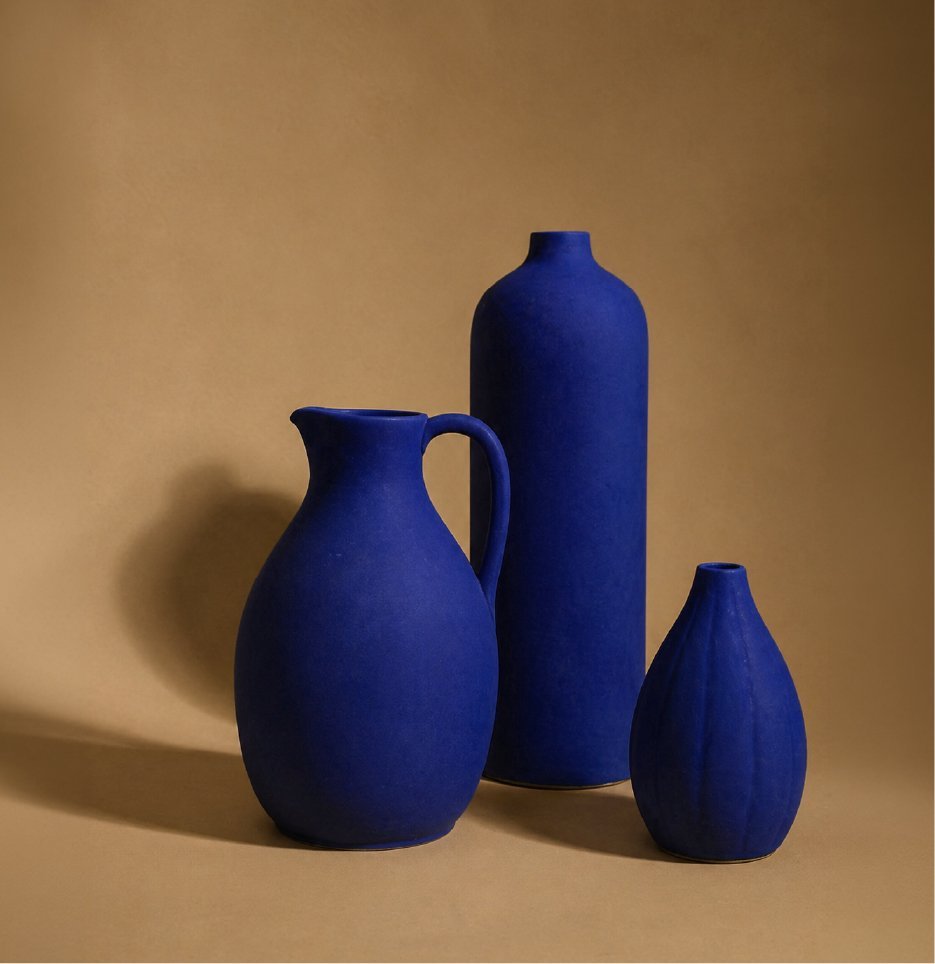
Identity in cobalt, gold and silver
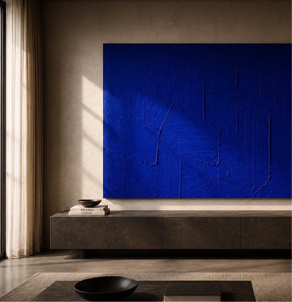
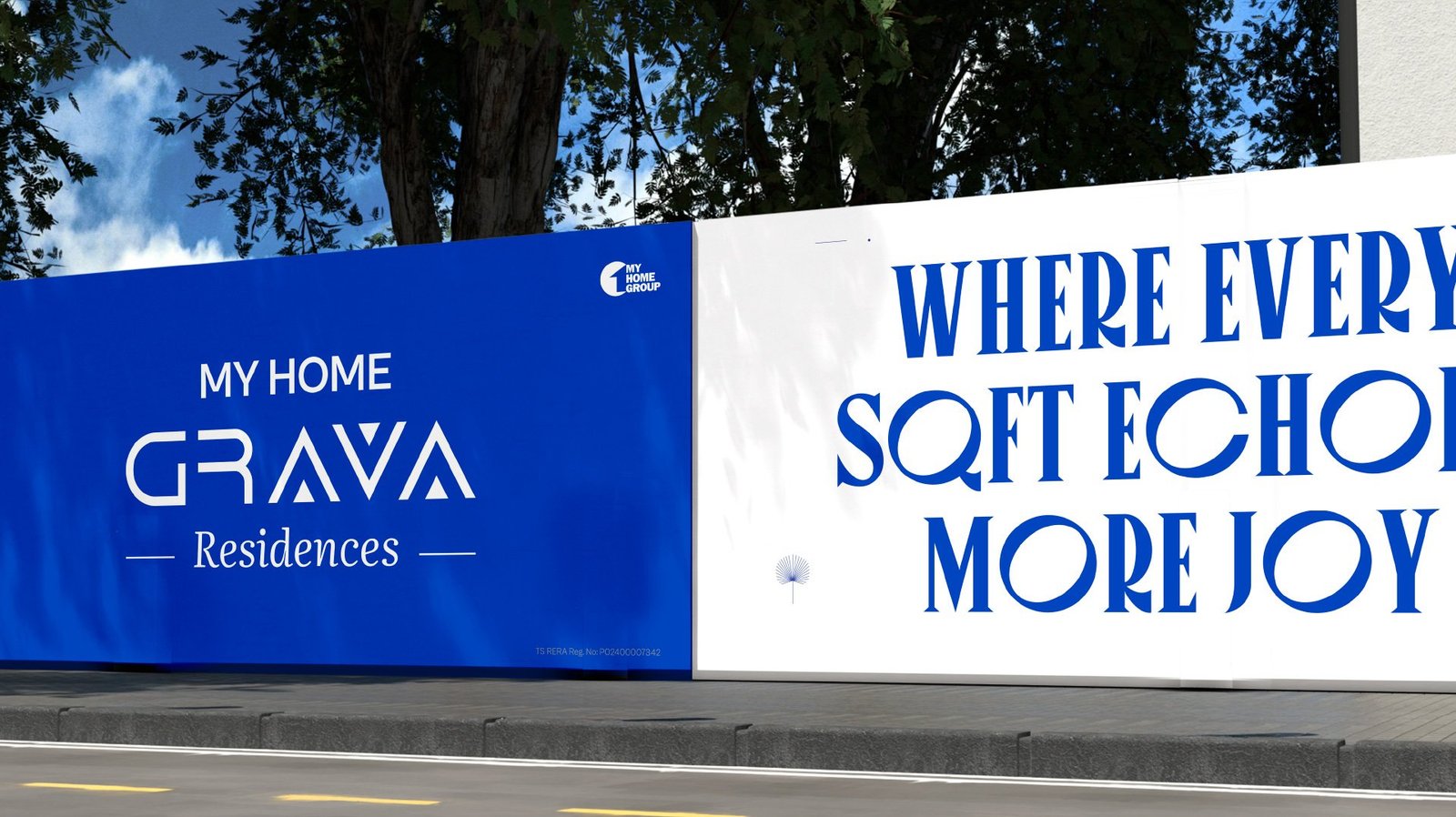
A single line, set in a tall display face, becomes the signature of the brand. Cobalt blue carries the authority. Gold sits as the accent of restraint. Silver fills the quiet space between them.
Brochure as a reading experience
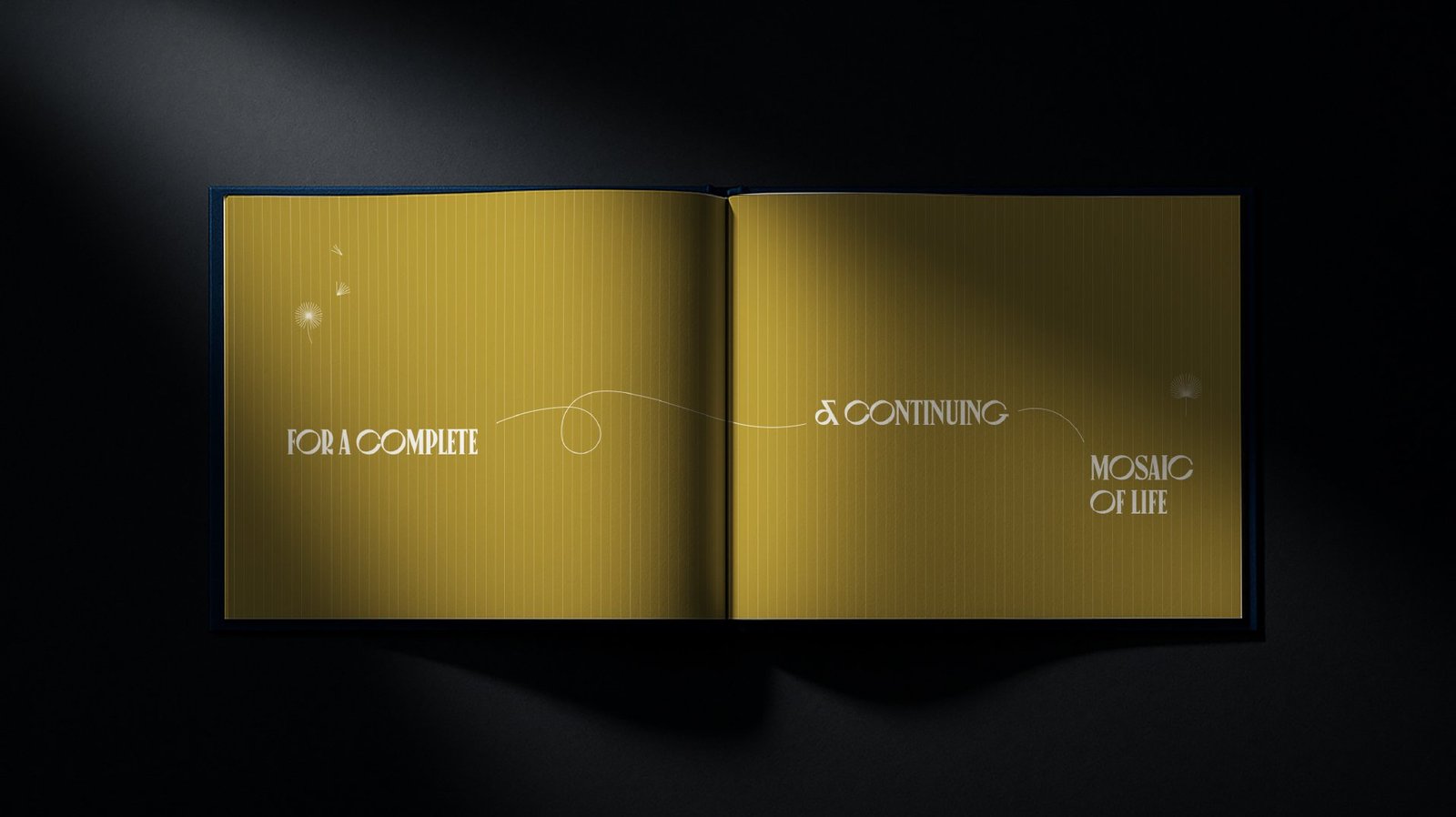
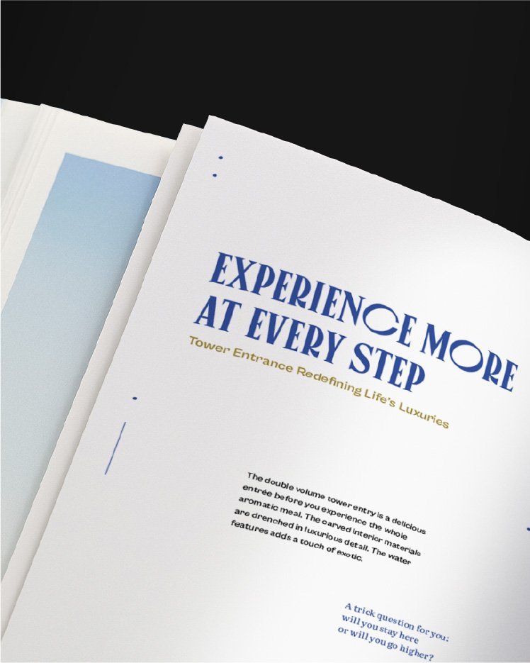
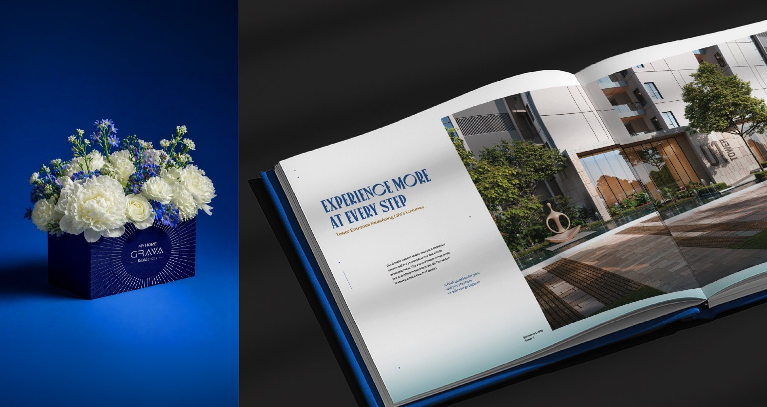
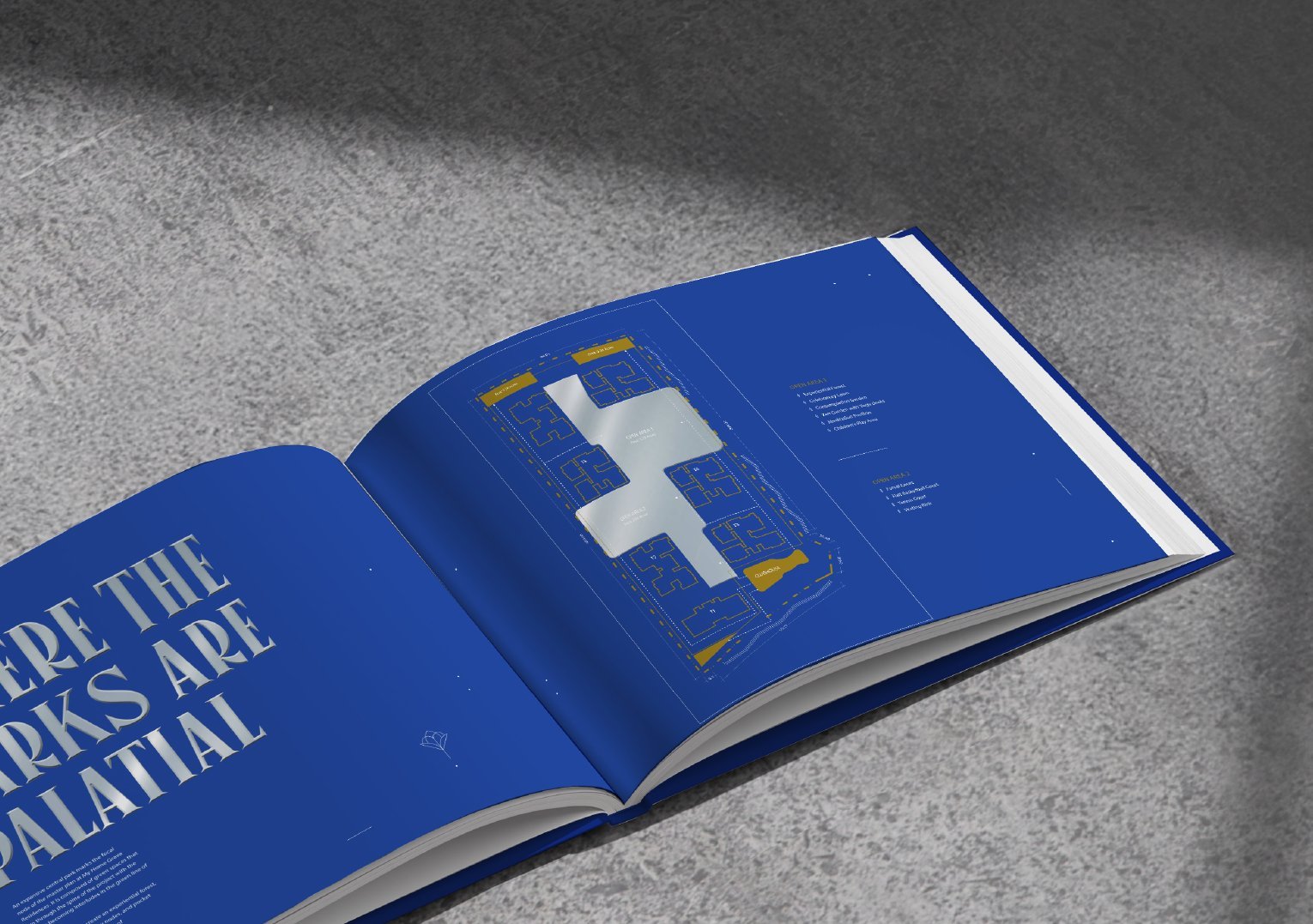
The brochure translates More to Life into a slow, considered reading experience. A manifesto opens the book. Spreads pair architecture with poetic headlines. Three editions, a presentation box and a welcome kit turn sales collateral into an object buyers want to keep.
Advertising: lead with feeling, not scale
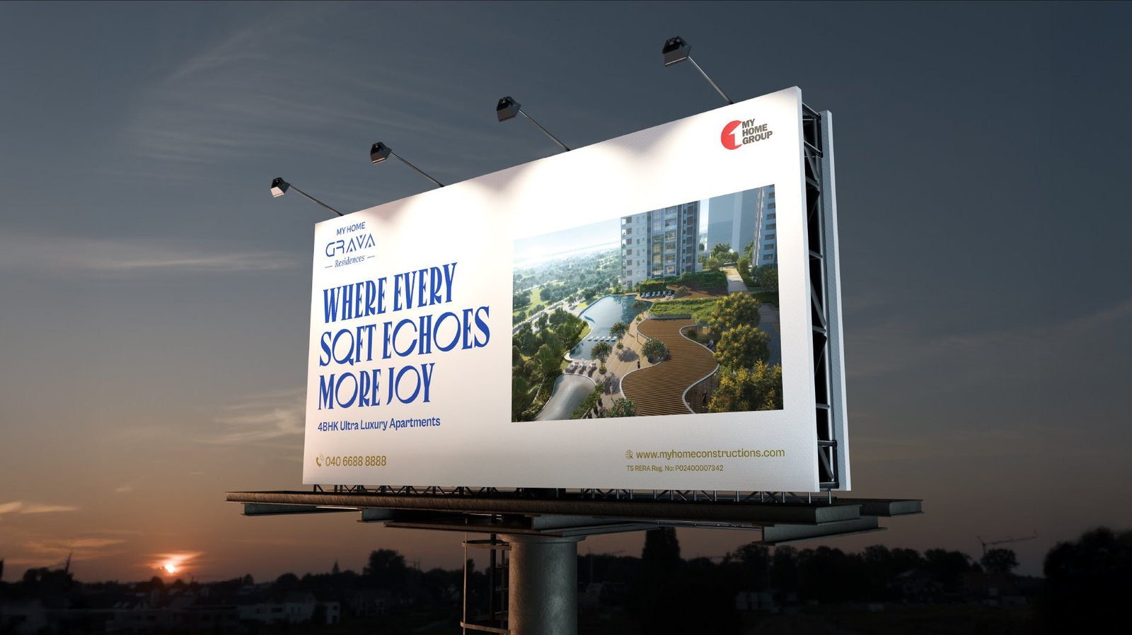
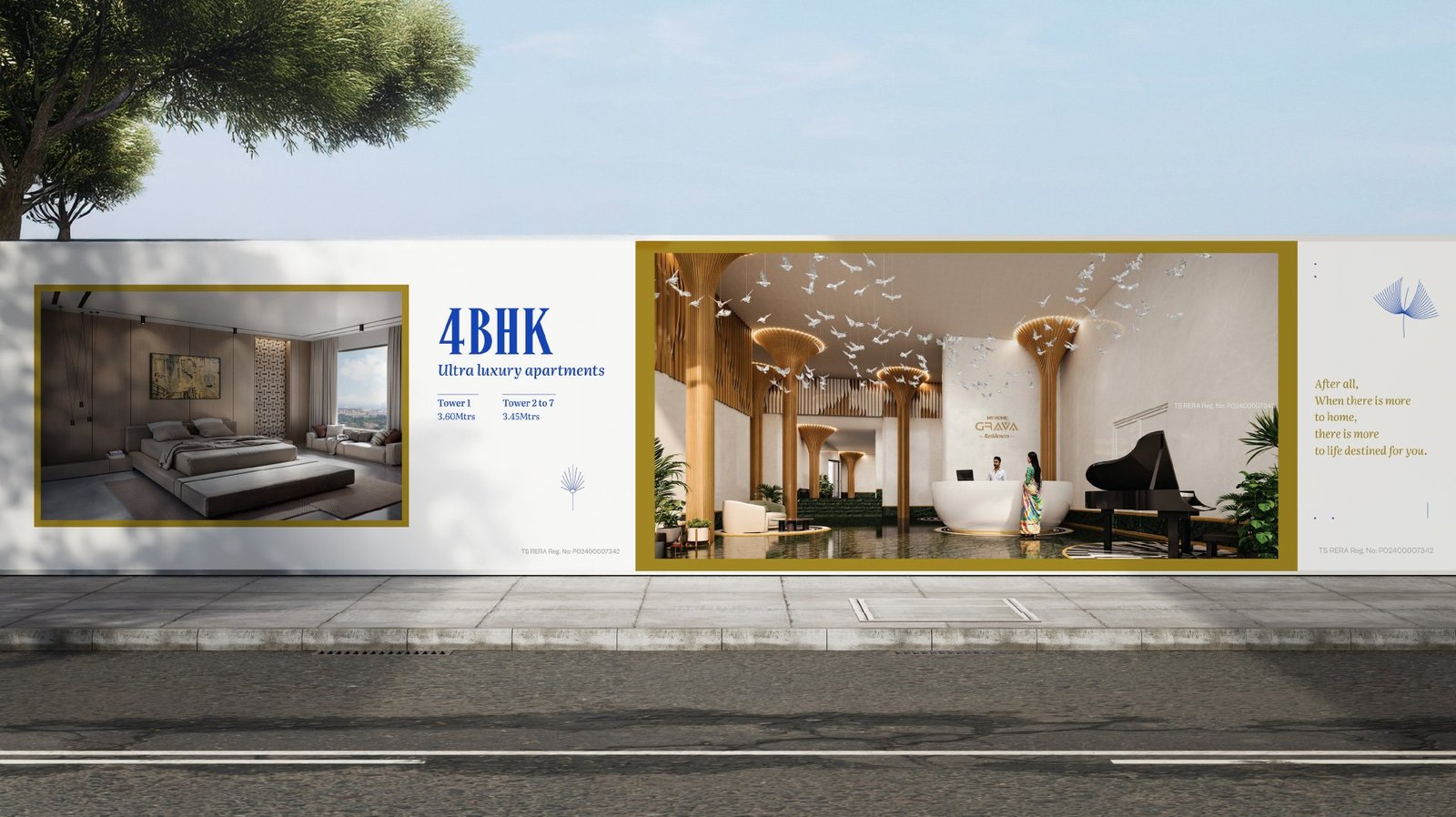
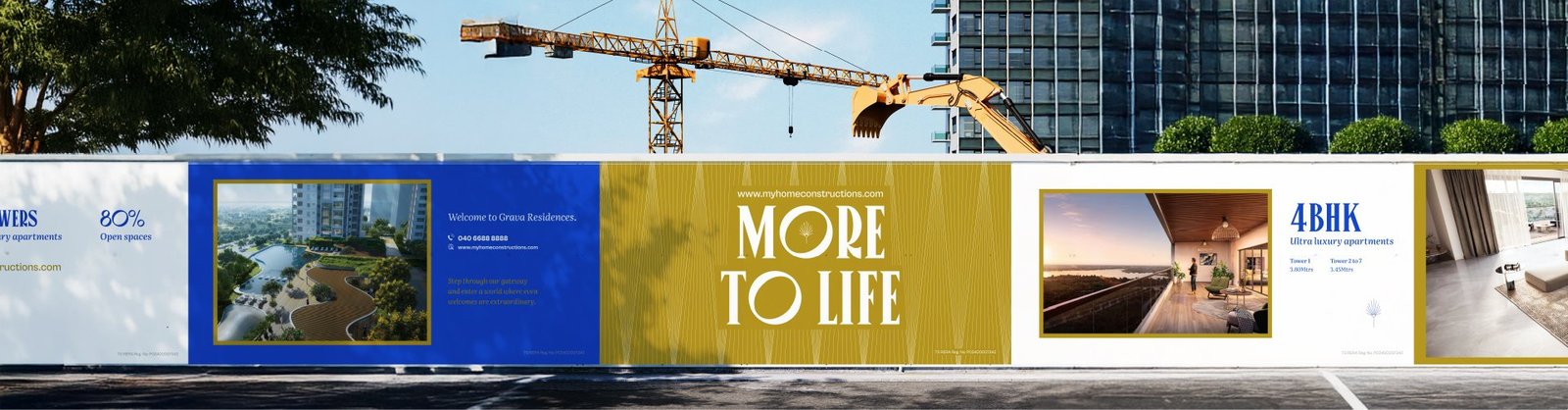
Out of home carries the same calm confidence into the city. Billboards and site hoardings lead with feeling rather than scale, backed by the cobalt identity and generous views of the residences.

A single system, carried across every touchpoint.



From a project brief to a brand with voice.
Have a project worth a brand of its own?
We find the one truth about the product that nobody else is leading with, name it, and build the system that carries it from brochure to hoarding.
See the full Real Estate practice.