

A boutique address, built for stature and growth.
A mixed-use office and retail development in Kokapet, the premier business district of West Hyderabad. We named it, built the identity, and designed the editorial that carried the brand from brochure cover to site hoarding.
Acre plot, boutique scale by design.
Sides open, light and air across the floor plate.
Parking basements, built for scale of use.
Storeys high, with rose-gold detailing throughout.
A commercial address for big business and ambitious startups.
Kokapet is the premier business district of West Hyderabad, and the field is crowded. One Golden Mile had to be both quietly boutique and visibly ambitious: the address a founding team would pick to signal where they are headed.
The product gave us the raw material. A two-acre plot, three sides open, four parking basements, fifteen storeys. The brand had to turn those numbers into a name, a mark and an editorial system that read as a destination.

A boutique address, in a district built for scale.
The project came to us without a name.
No name means no identity, no brochure, no hoarding story. The naming had to come first and set up everything downstream in one word.
Small plot, big ambition.
Two acres in a district of larger plates. The brand had to argue that the address is more intentional than its neighbours, not smaller than them.
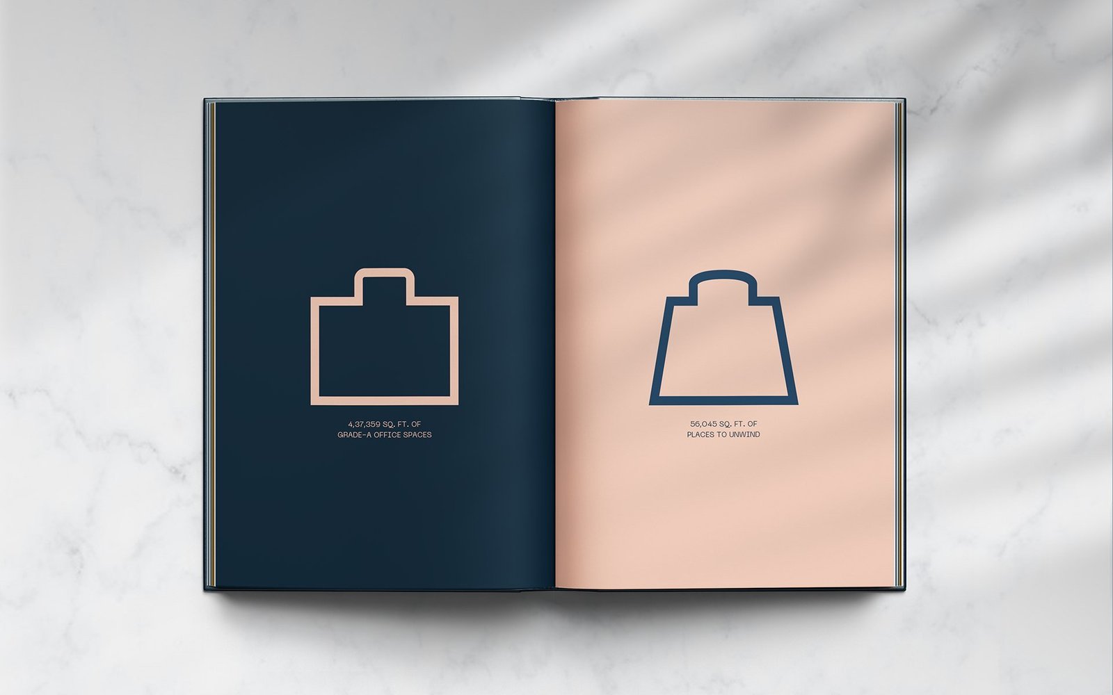
Office and retail, under one roof.
The system had to hold both tenancies. Flexible enough for a flagship retail unit downstairs, calm enough for a corporate tenant upstairs.
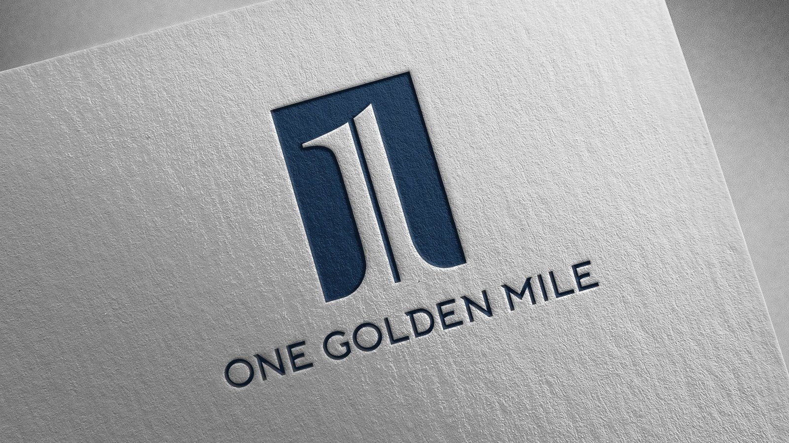
One monogram, carried from brochure cover to business card.
Naming: One Golden Mile
The name sets expectations before the brochure opens. One. Singular, boutique, intentional. Golden. The rose-gold accent that runs through the architecture. Mile. A destination, not a corner. The name does half the brand's work on its own.

Identity: a mark built to signal stature
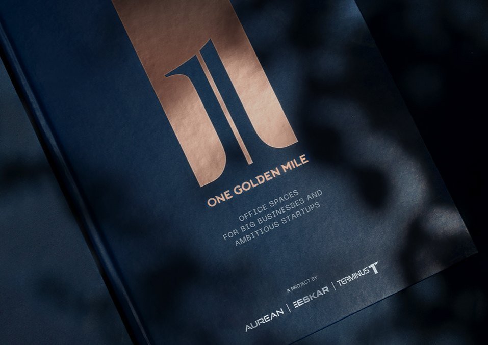
The monogram, set in rose gold on a deep navy field, rises as two vertical forms from a shared base, divided by a striking central stripe. That stripe becomes the brand's most useful asset across the entire brochure.
Editorial: a brochure that behaves like the building
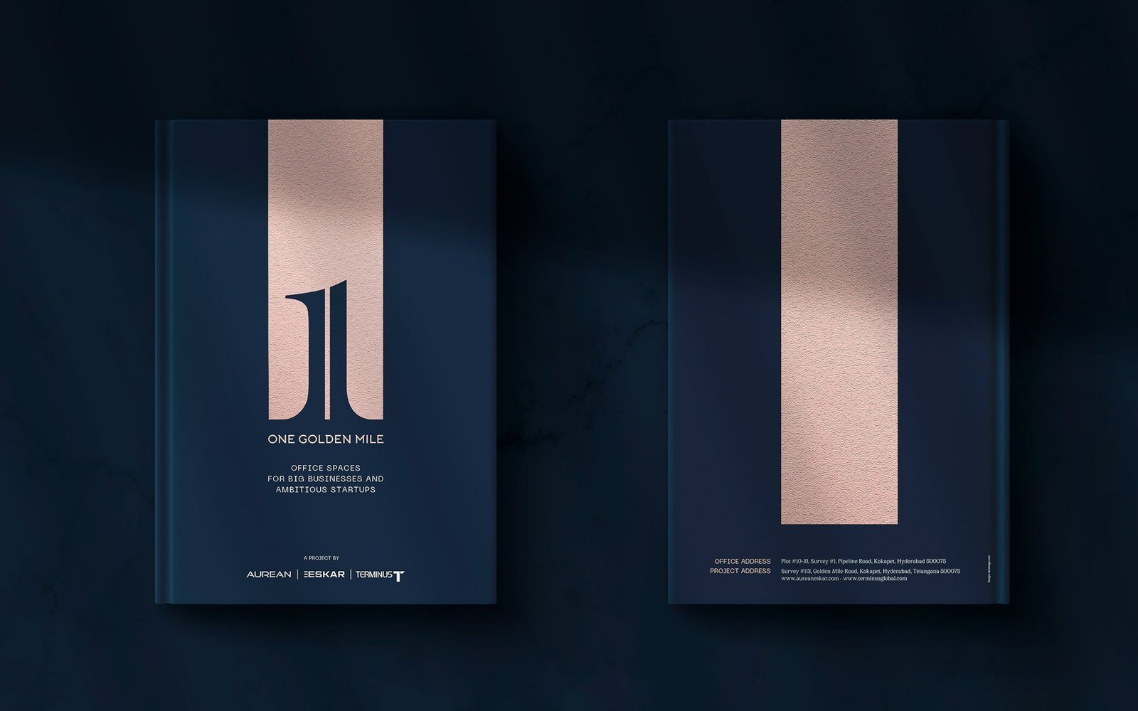
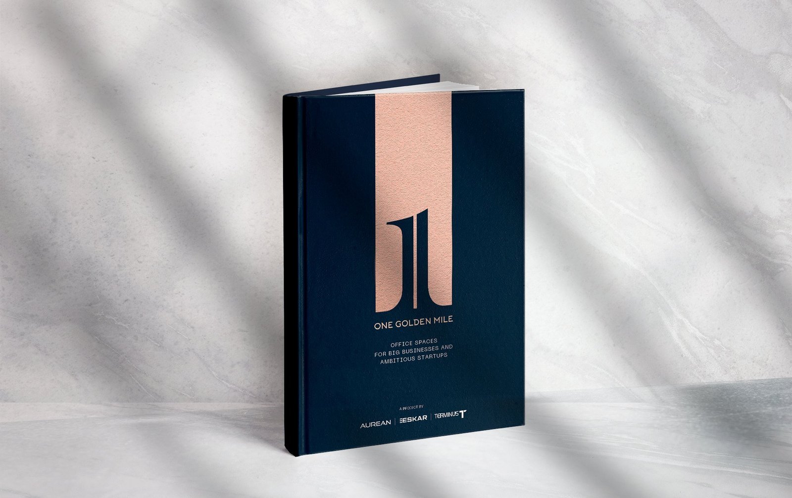
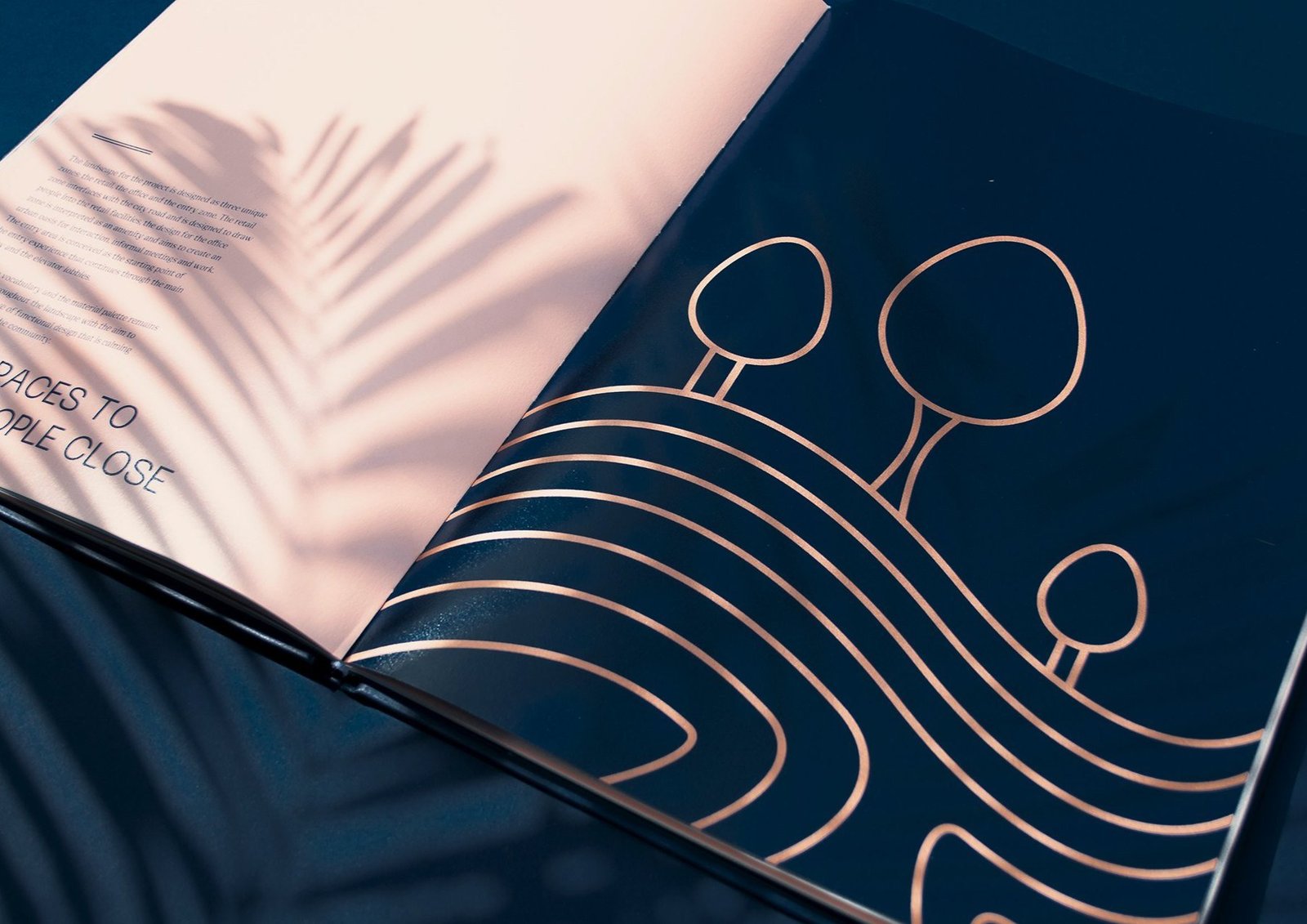
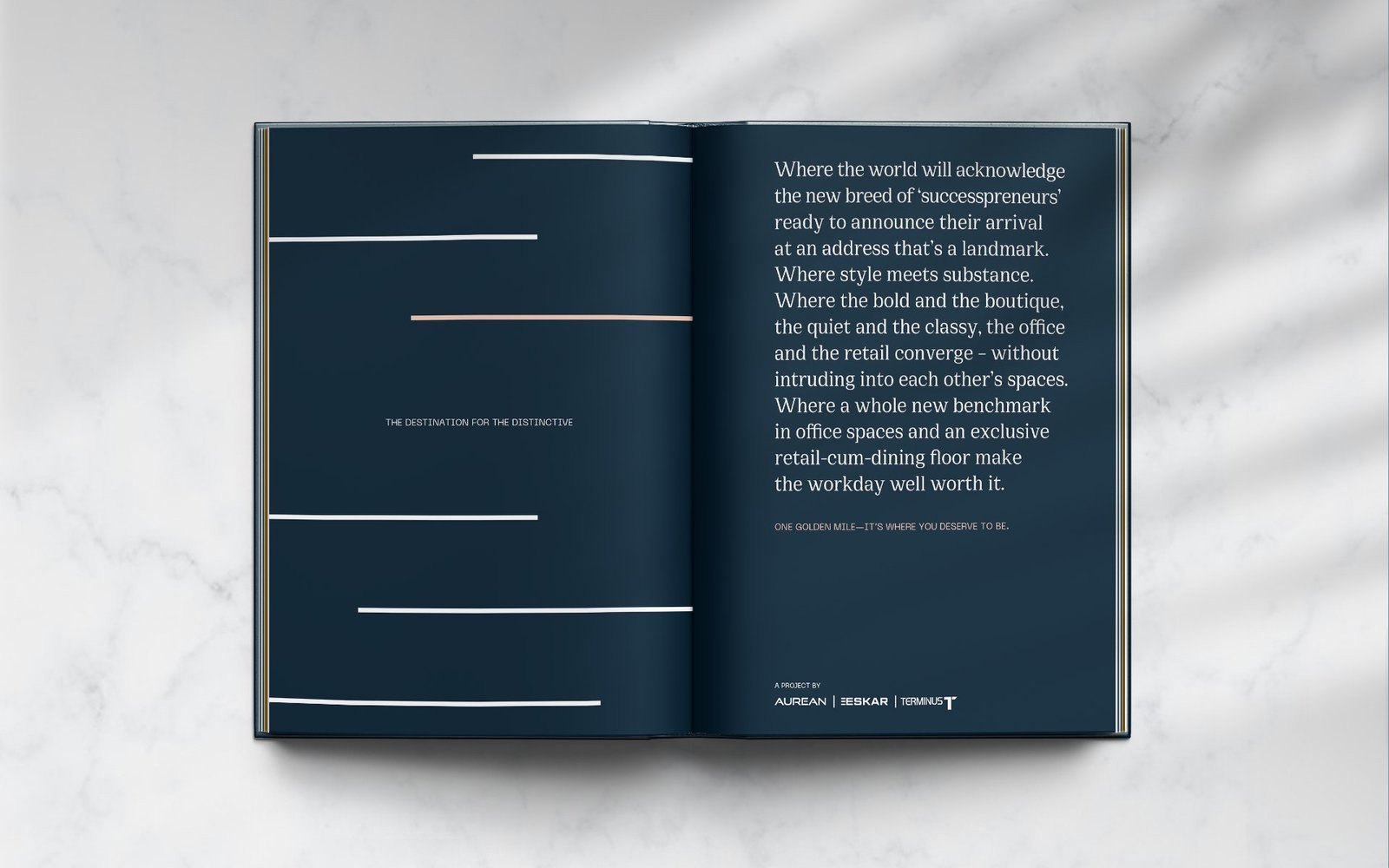
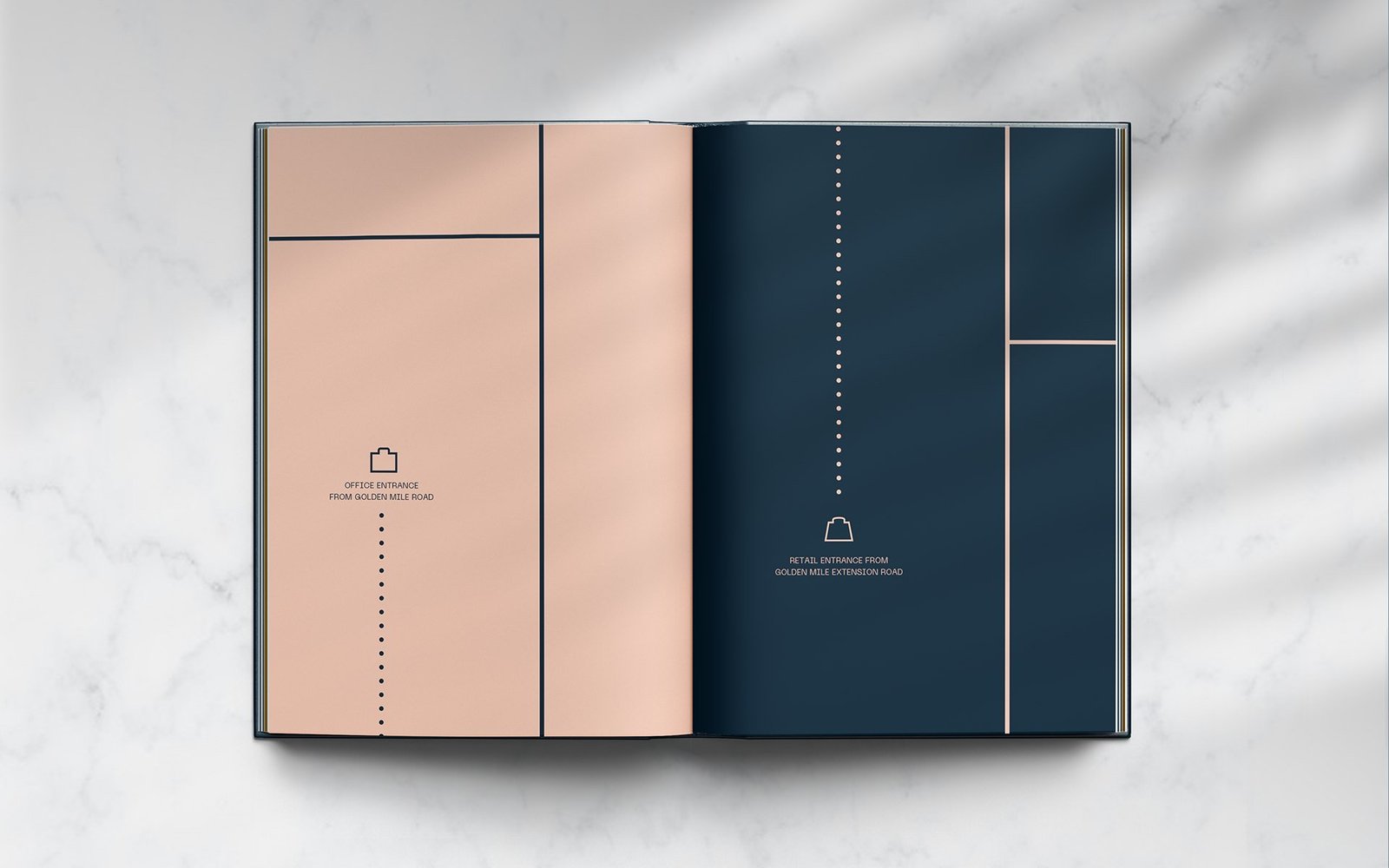
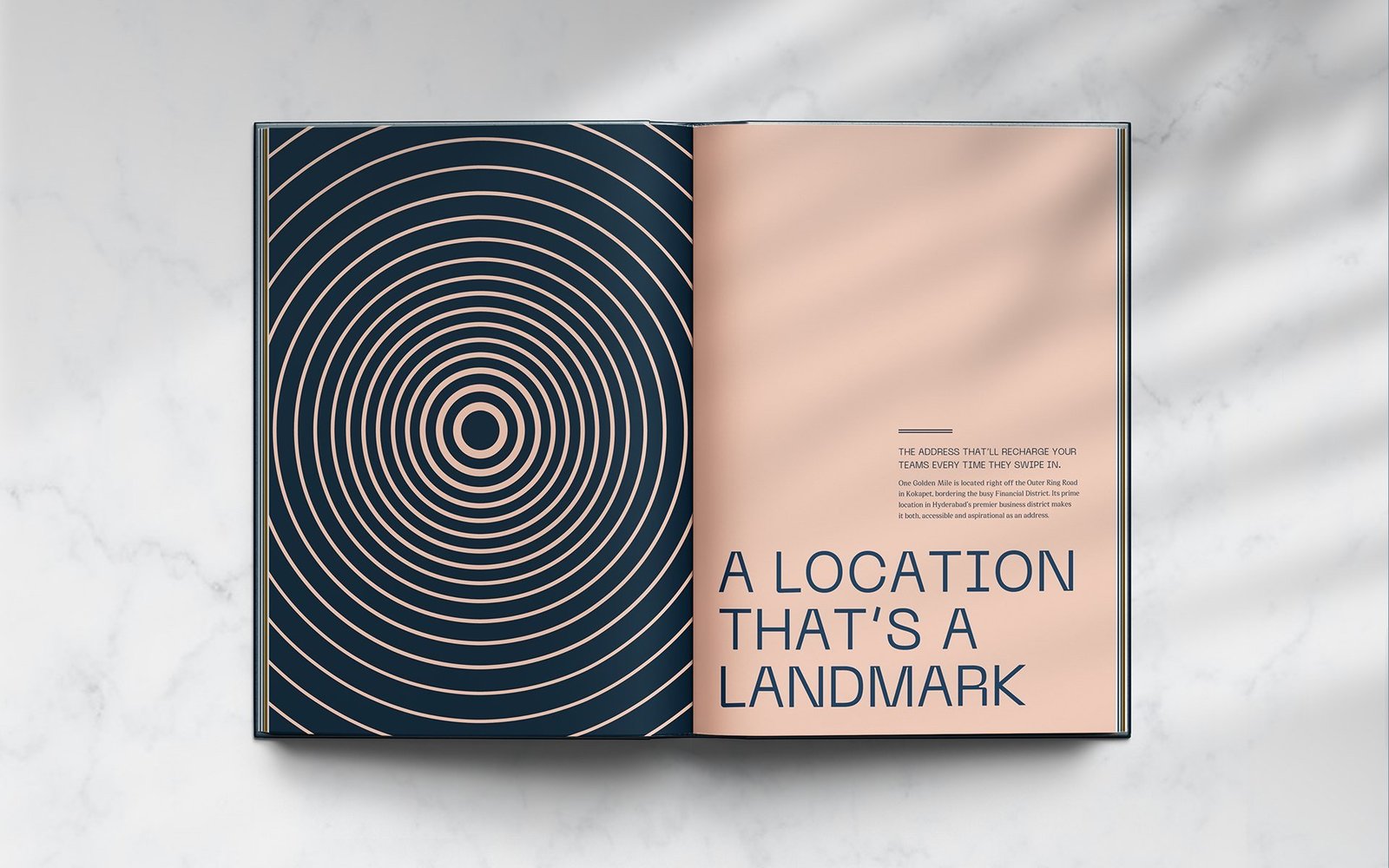
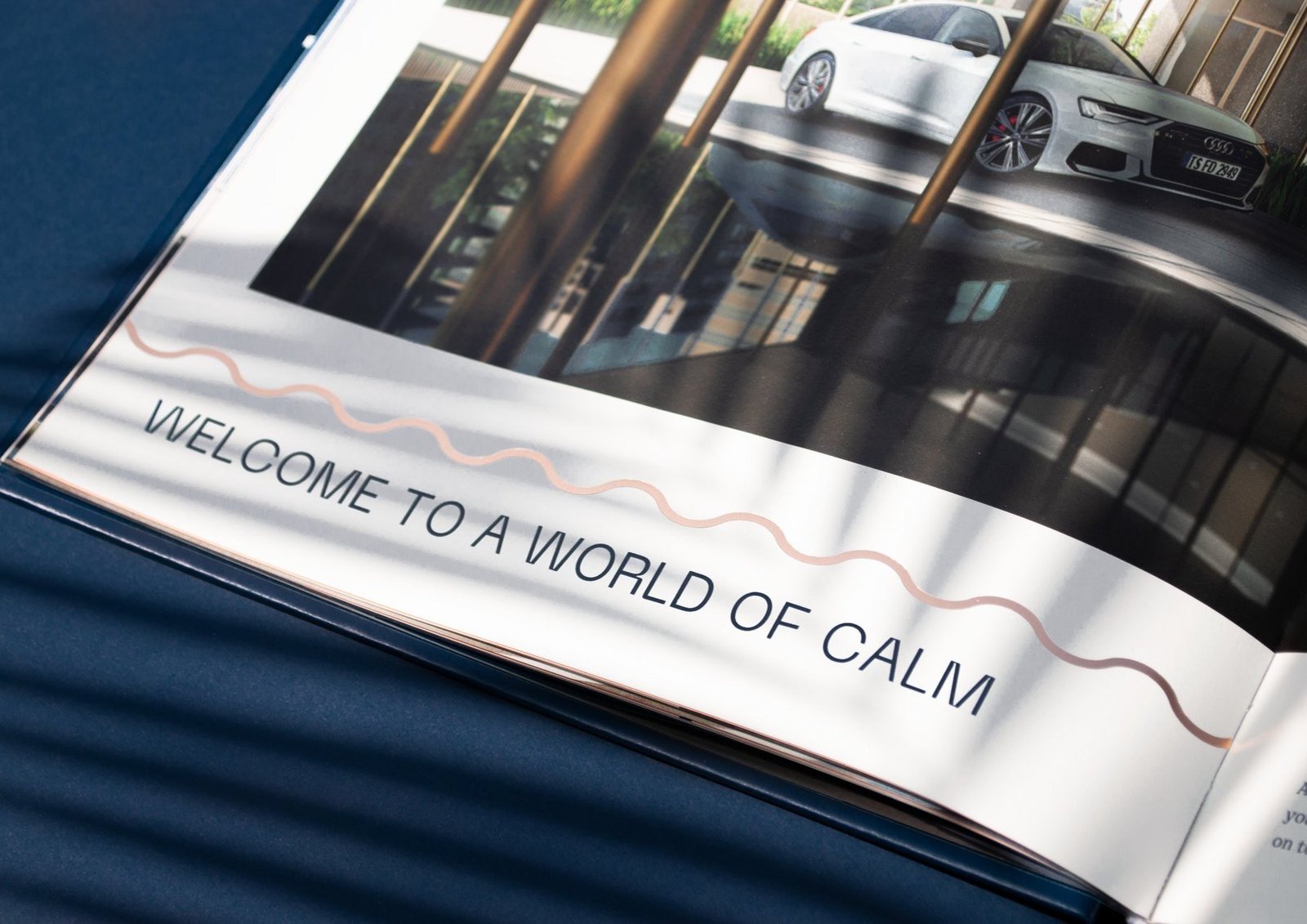
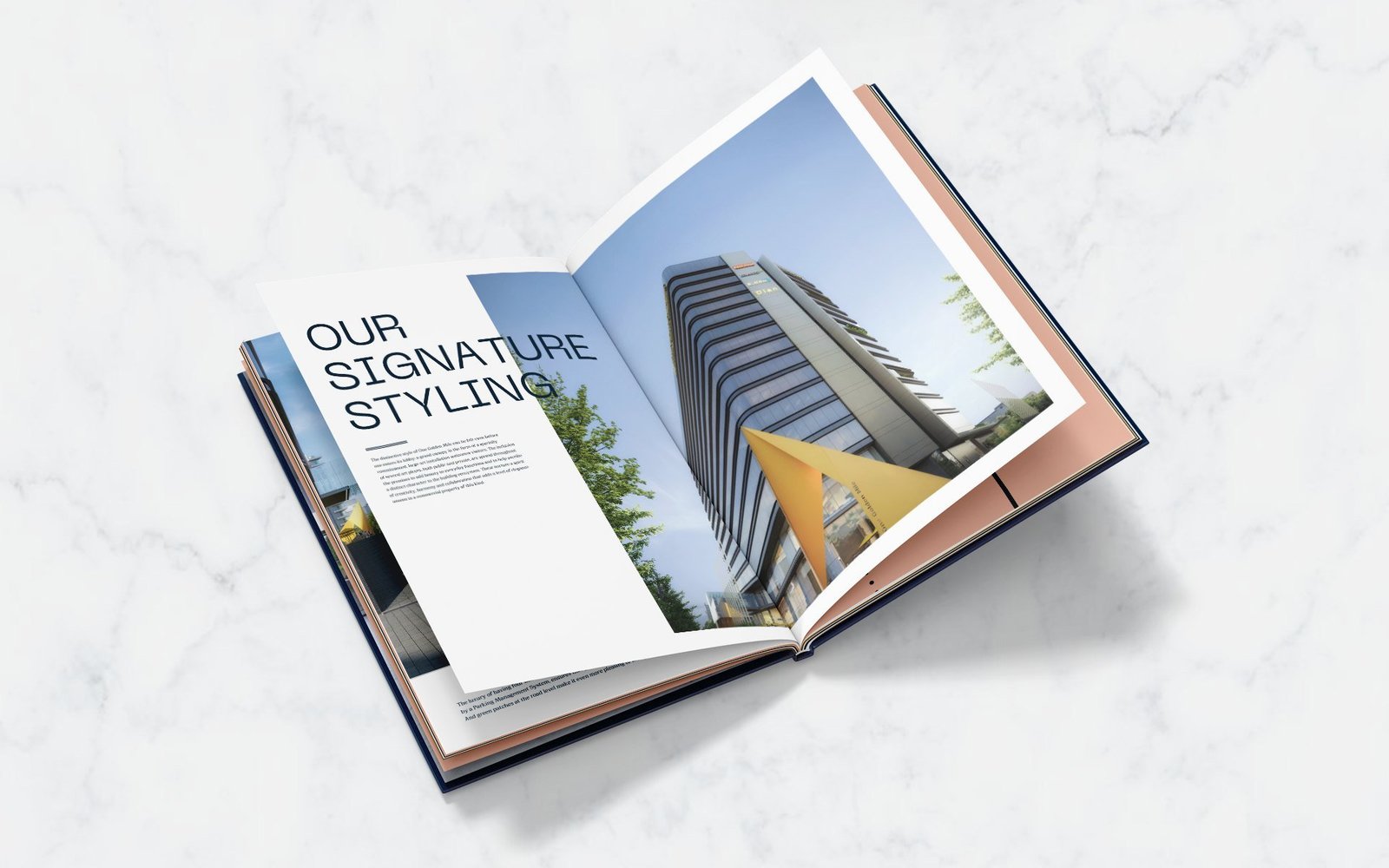
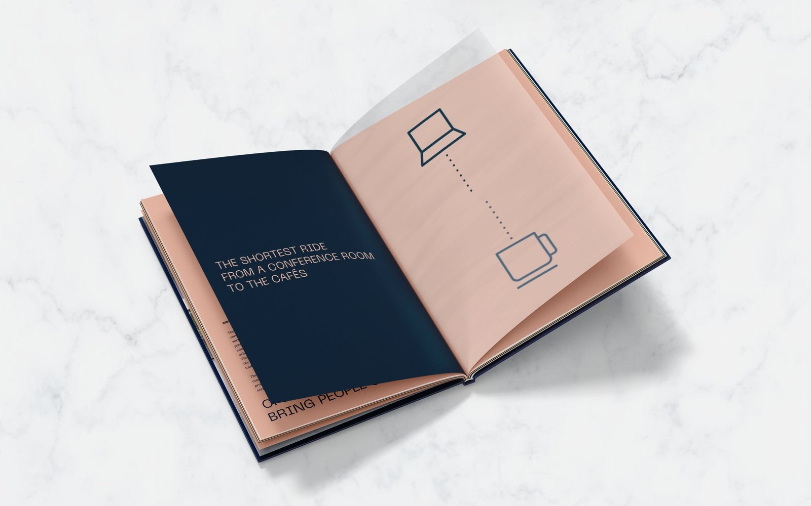
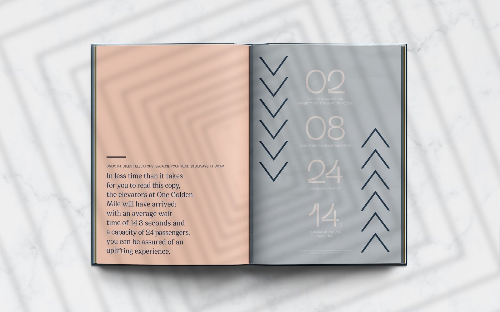
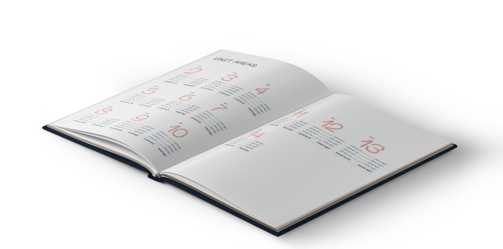
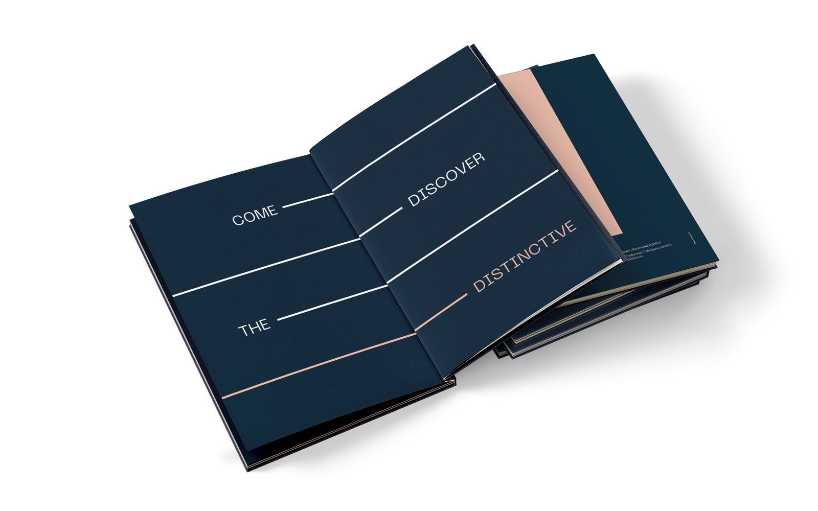
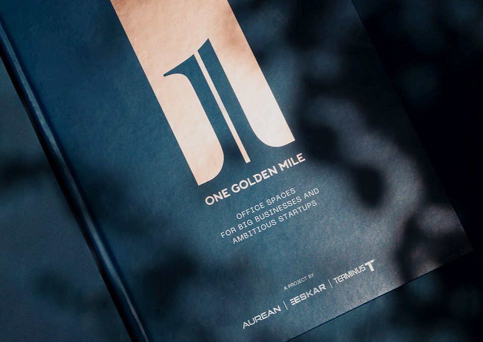
A navy hardbound volume with a rose gold monogram and a full-height stripe running down the cover. Inside, the stripe organises every spread, separating text from imagery, framing section openers.
Hoarding, stationery and the brand in the world
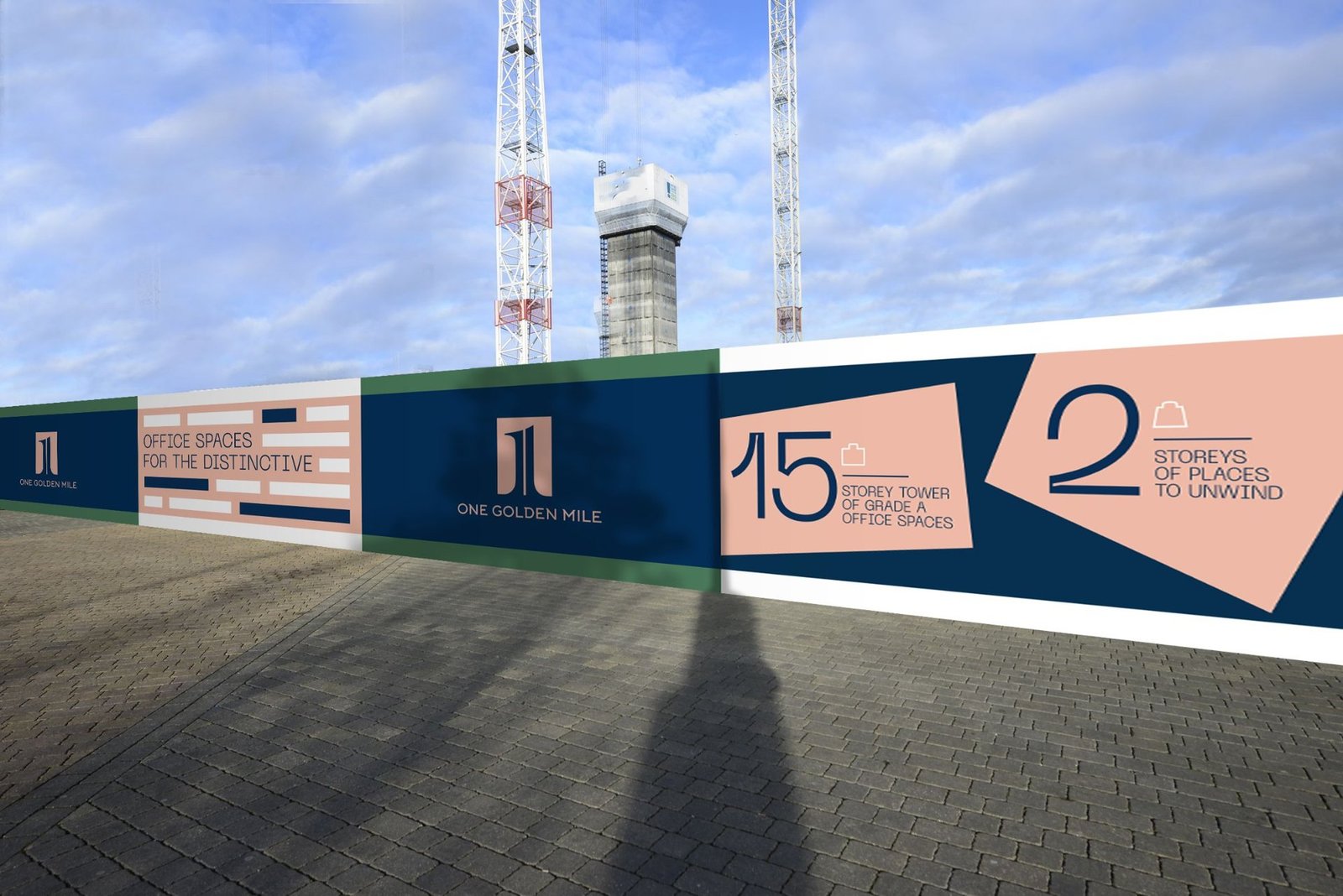
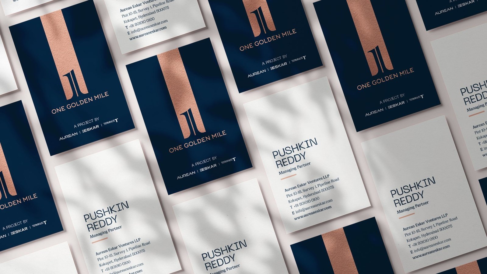
On site, the hoarding puts the navy field, the monogram and oversized numerals to work. Vertical business cards carry the navy and blush split. The address has presence long before the building is complete.
A single system, carried across every touchpoint.


From a project brief to a brand with voice.
Have a project worth a brand of its own?
We find the one truth about the product that nobody else is leading with, name it, and build the system that carries it from brochure to hoarding.
See the full Real Estate practice.