

Jin Jiji. An Indian craft gin for the global shelf.
A premium Indian dry gin designed to wear its origin proudly, with packaging that uses the gin's botanicals and India's ornamental traditions as a visual language fluent anywhere.
An Indian gin that earns its place on the world map.
Peak Spirits set out to capture the richness and diversity of Indian botanicals in every sip, and needed packaging with the same ambition: unmistakably Indian at first glance, yet fluent in the visual language of premium international spirits.
The answer became a label that wears its origin proudly, turning the gin's ingredients and India's ornamental traditions into a premium identity.
A label grown from the land.
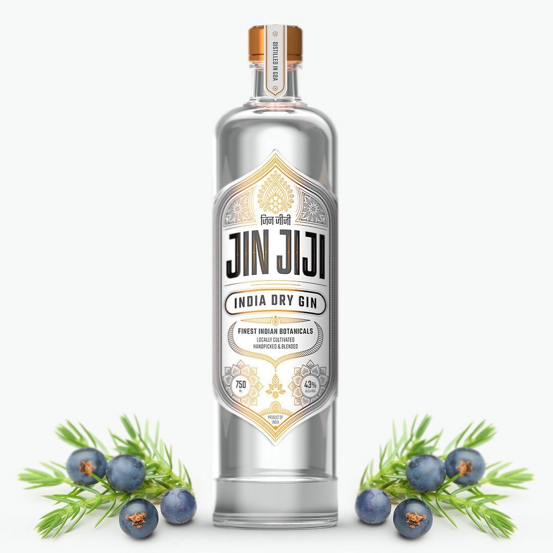
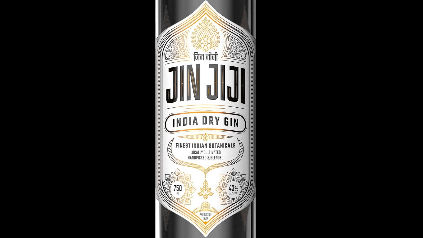
The front label sets the wordmark inside an ornate, symmetrical frame of botanical line work in warm metallic tones. The white field keeps the pack clean and lets the clarity of the gin show through the glass.
Devanagari meets Latin.
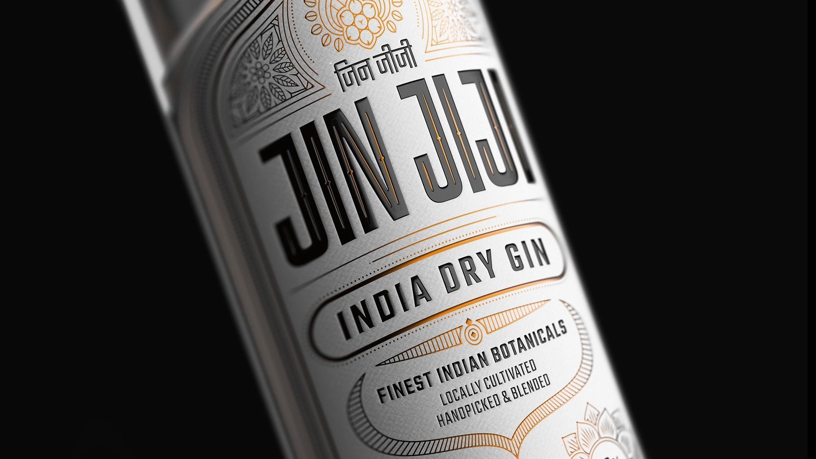
The bilingual logo lockup sits at the heart of the label. Devanagari and Latin letterforms share one unit, giving Jin Jiji a voice that belongs to India and still travels comfortably to any market.
Ten botanicals, ten emblems.
The spirit is copper pot distilled in Goa. Translating each ingredient into a motif lets the label explain the liquid without extra copy and gives the brand an ownable visual vocabulary.










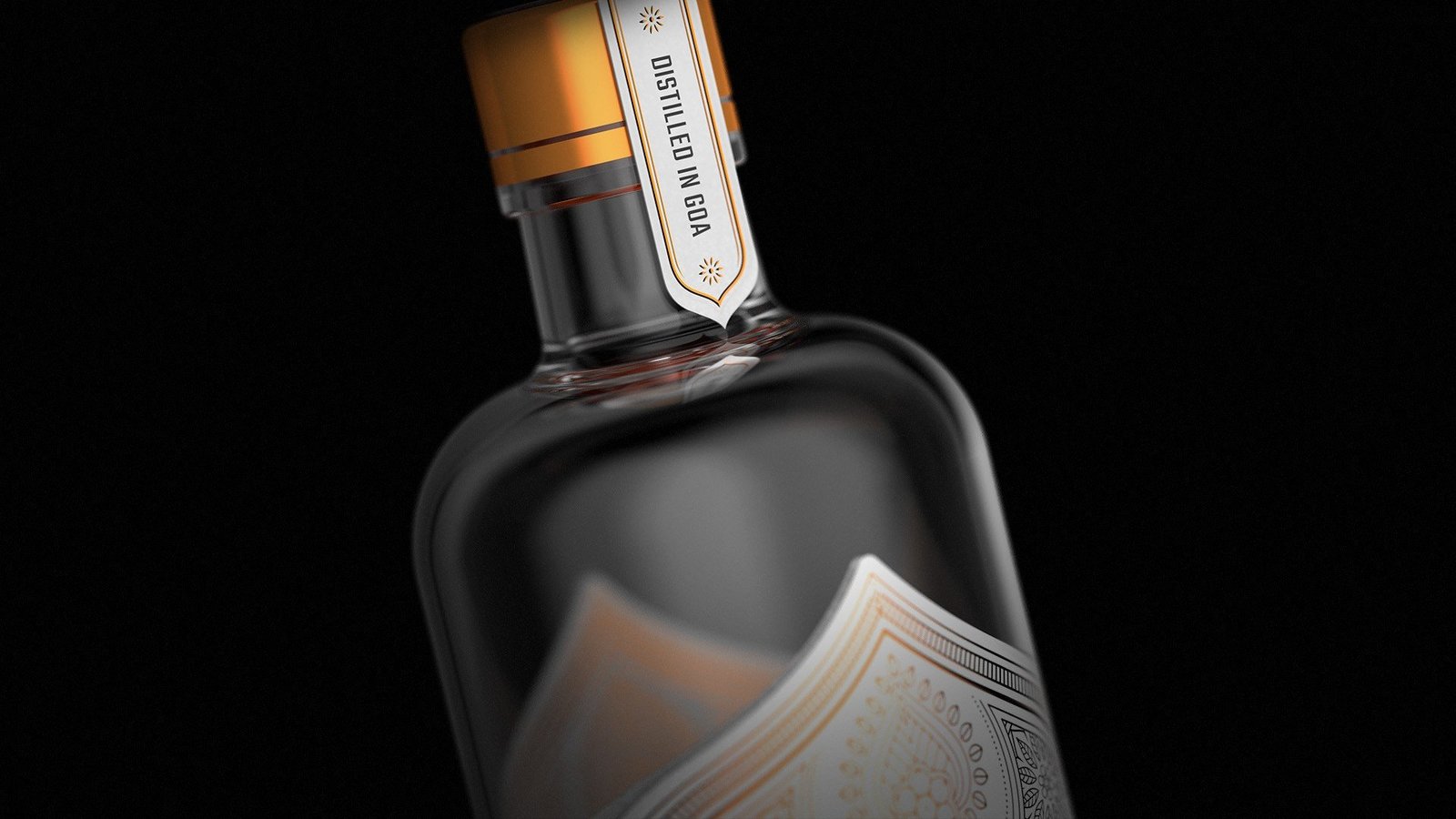
Borrow nothing from European gin. Build an Indian vocabulary.
Origin as the premium cue
Rather than borrowing the visual codes of European gin, the pack makes Indian heritage the luxury signal and gives the brand a reason to stand out on an international shelf.
Ingredients as identity
Turning botanicals into motifs creates an ownable vocabulary that explains the product at a glance and rewards the drinker who looks closer.
A system, not a single label
The same architecture of frame, motifs and bilingual wordmark flexes across white and dark editions, leaving Peak Spirits room to extend the range.
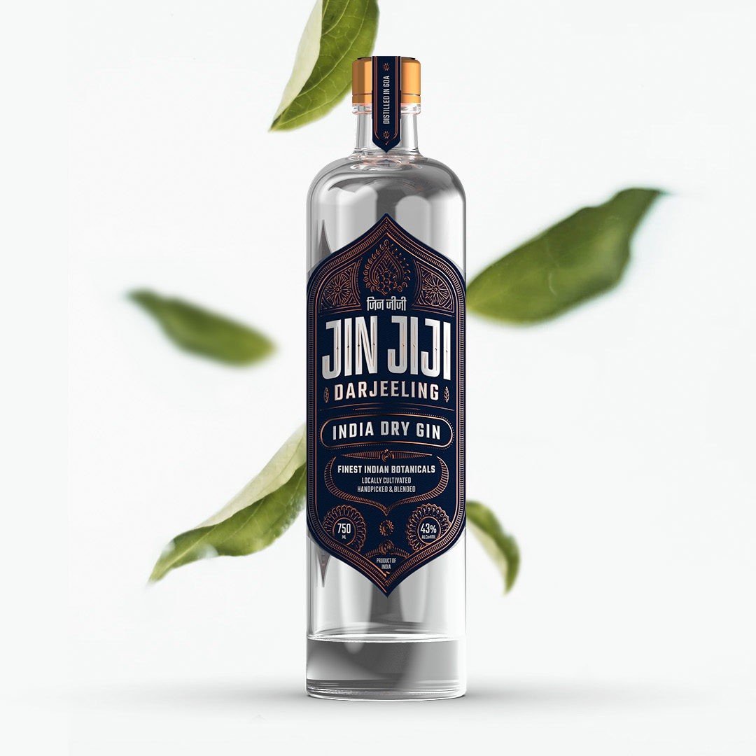
A darker expression.
A second edition flips the palette to deep midnight with copper detailing. The Darjeeling variant keeps the same architecture of border, motifs and wordmark, showing the system can stretch into a range without losing identity.
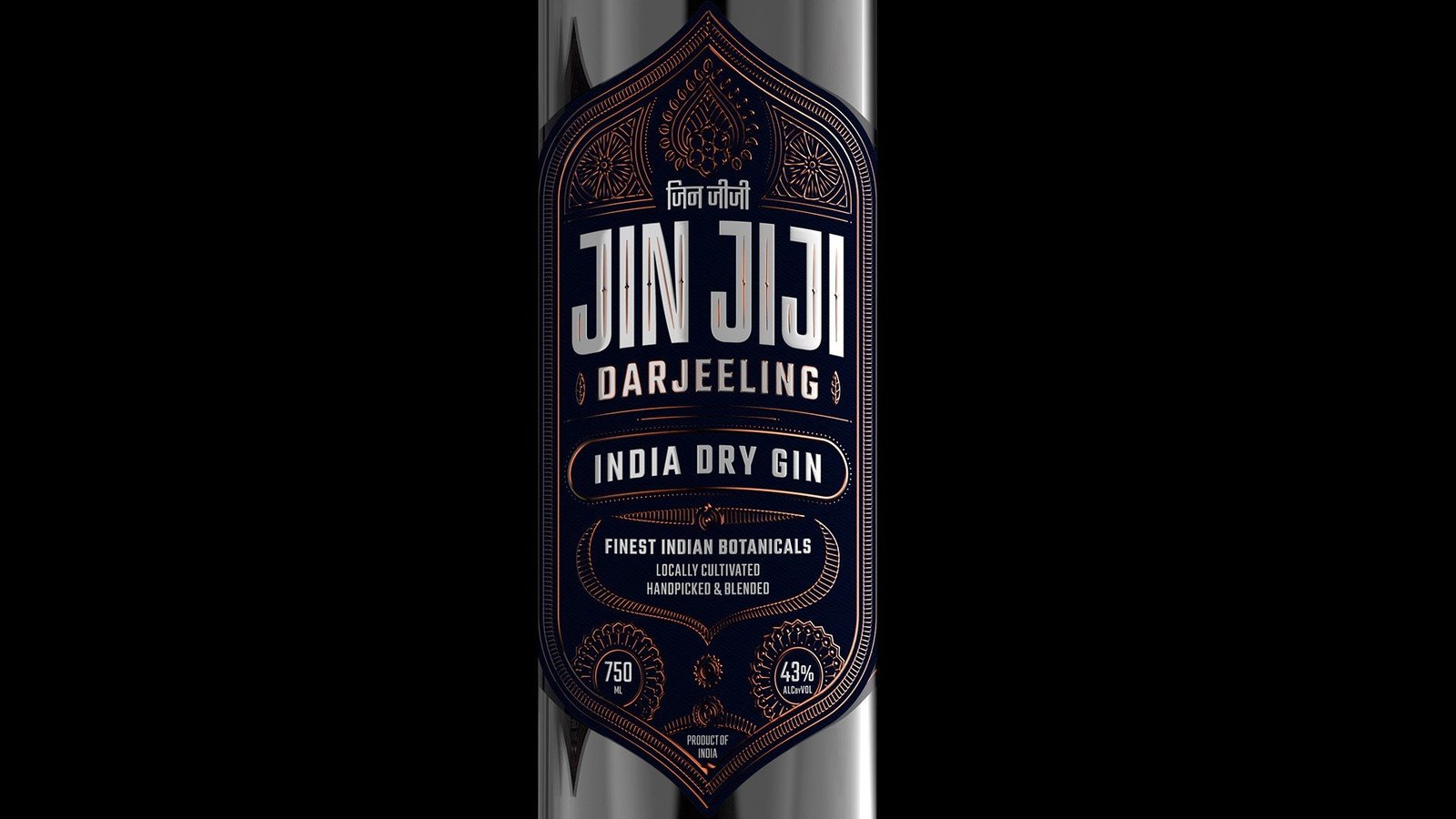
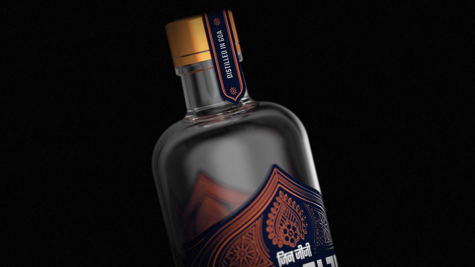
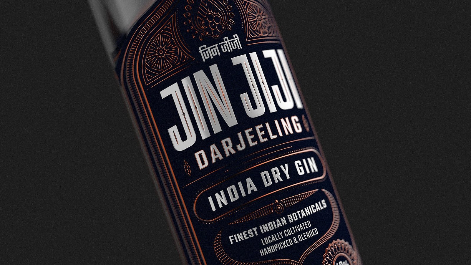
Built for the back bar.
Bold, centred typography keeps the name legible from across the room, while the fine detailing does its work up close. The system is designed to work equally hard on a crowded shelf and in hand.
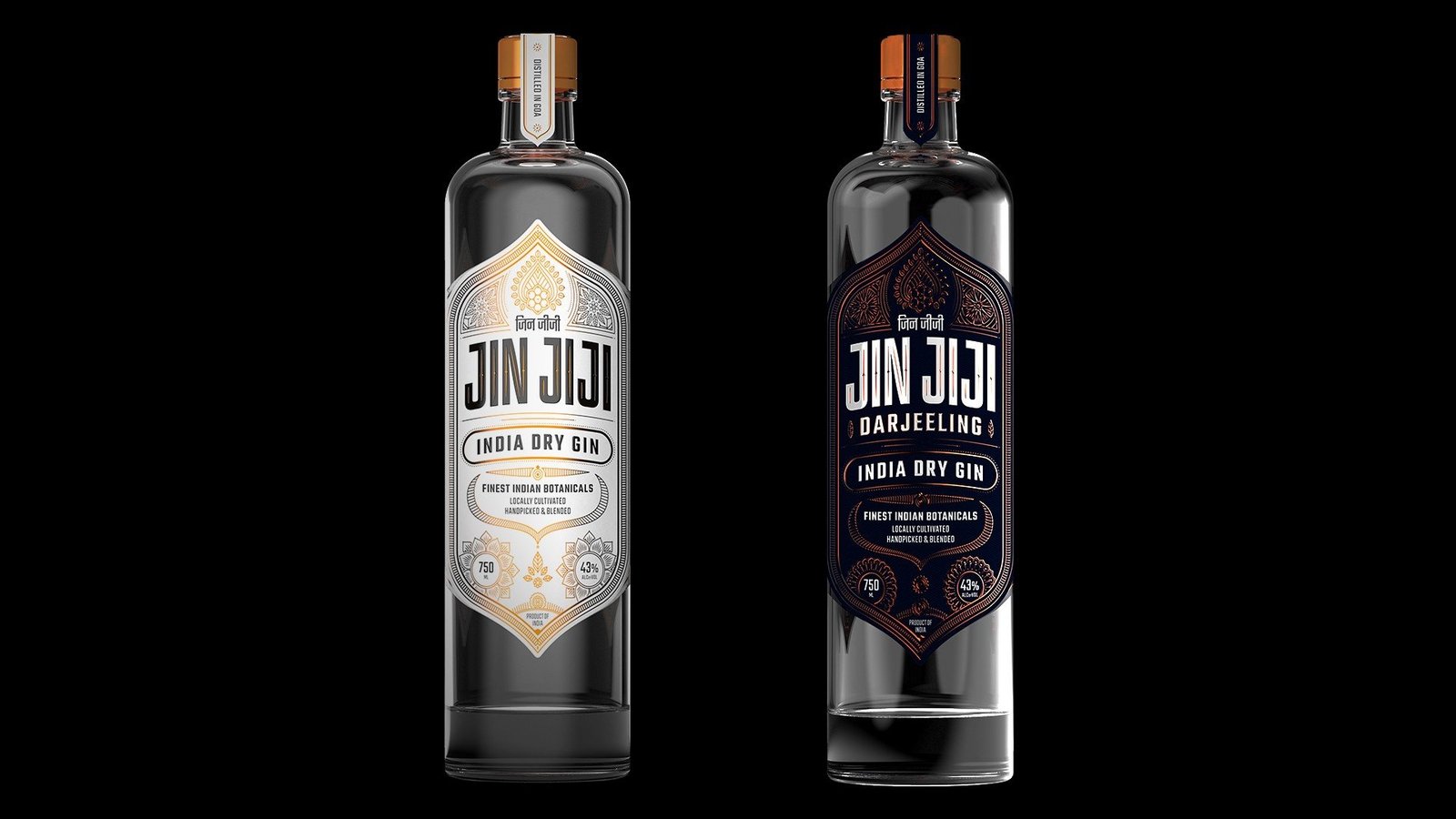
Two editions, one design language.
Side by side, the white and dark editions share one design language, ready to grow into a family of Indian craft spirits.
A packaging system that doubles as a brand asset.
The label does the work on the shelf and leaves room to grow the range without starting over.