

Boca Raton
The Residences at The Boca Raton. Our legacy. Yours to live.
Naming, positioning, identity and collateral for the first private residences on a century-old Florida landmark, built to carry the resort's equity forward and give ownership a voice of its own.
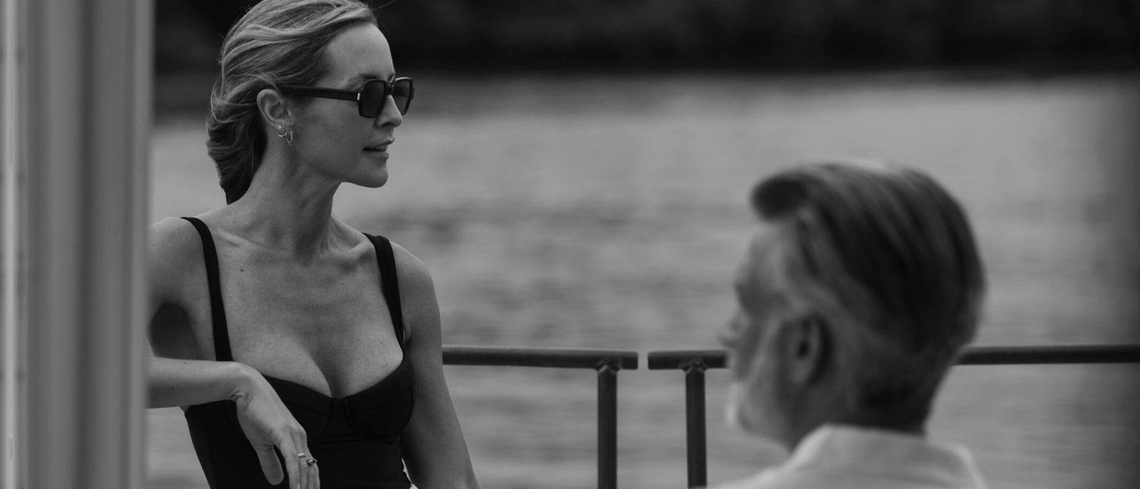

One hundred years of leisure, opened to ownership for the first time.
For a century, The Boca Raton has been one of the defining names in American resort hospitality. Its first residential offering needed a brand that felt inseparable from that heritage, yet stood on its own as a place to live rather than a place to visit.
The work extends a long-running creative partnership with BDT & MSD Partners, this time across naming, brand strategy, visual identity and the full collateral system for the residences.

Preserve the resort's equity. Give ownership a voice of its own.
Borrow where it matters
A century of equity in The Boca Raton name is an asset, not a problem. The residences had to inherit that trust without feeling like a hotel suite with a deed.
A separate voice for ownership
The challenge was giving buyers a brand that signalled a place to live rather than a place to visit, with its own crest, palette and tactile language.
Production as positioning
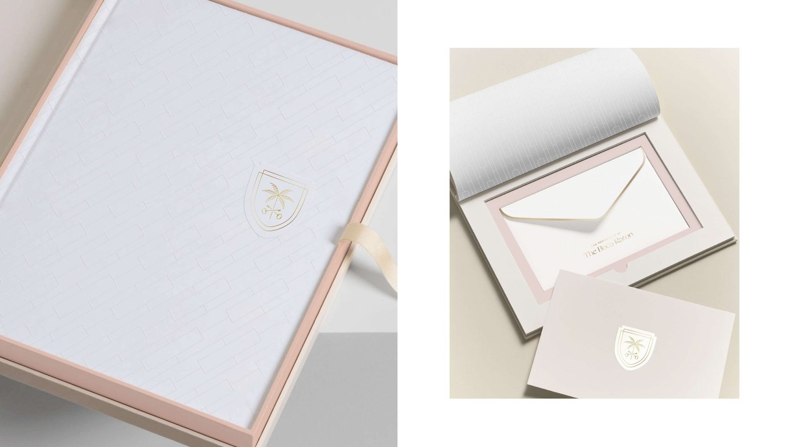
Blind embossing, gold foil and textured ivory stocks make every touchpoint feel crafted. The restraint reads as quiet confidence rather than performance.
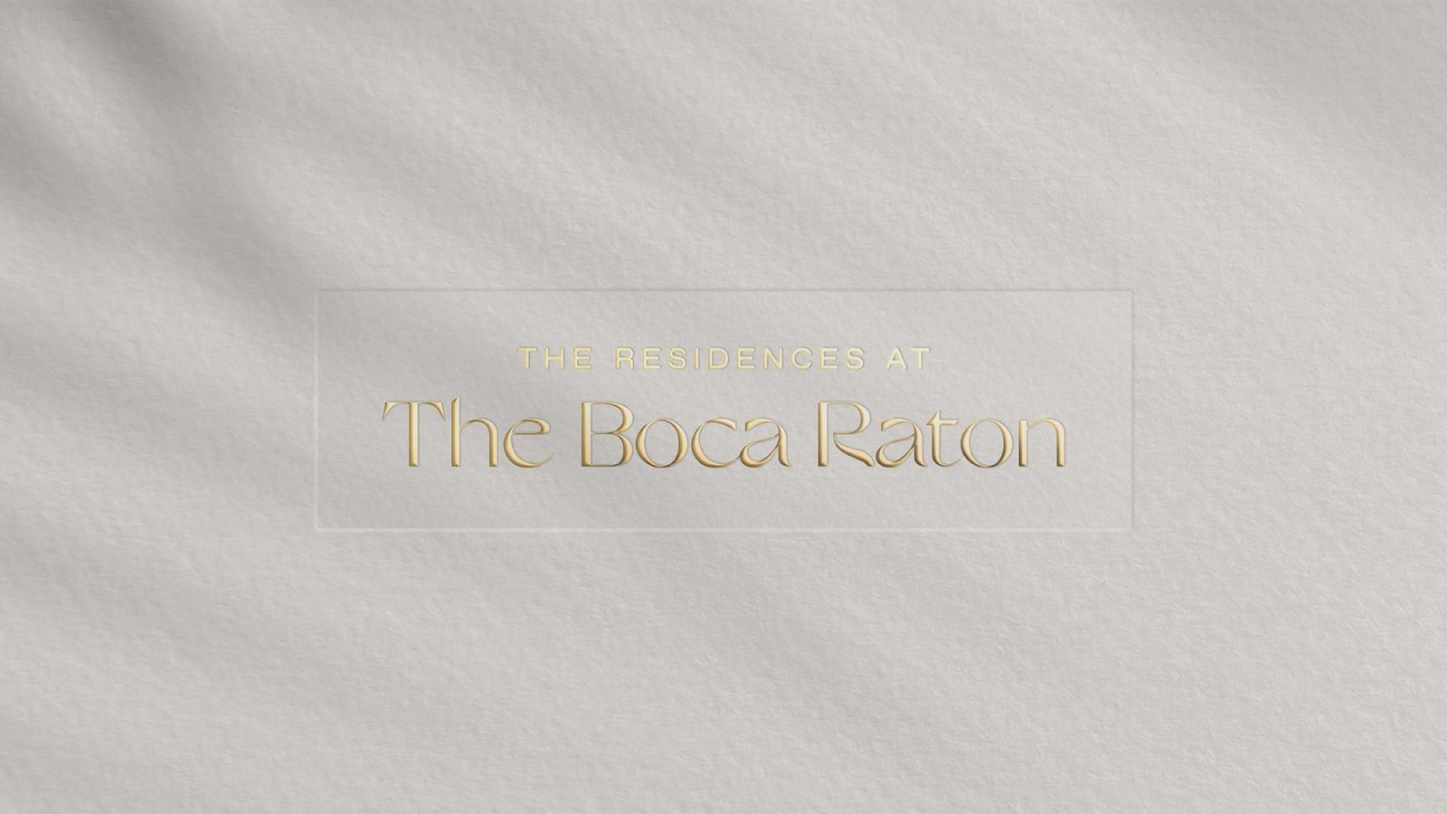
A wordmark that sits quietly beside the parent brand.
A blind-embossed lockup in a fine serif, built to sit quietly alongside the parent brand without competing with it. The relationship is clear: part of the family, not a copy of it.
Production as positioning.
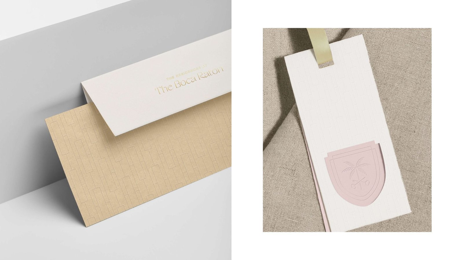
Ivory linen with blush edging. Kraft and ivory envelopes with debossed wordmark. Textured ivory bags with ribbon handles paired with sales brochures set against blush tissue. The system makes every delivered piece feel considered.
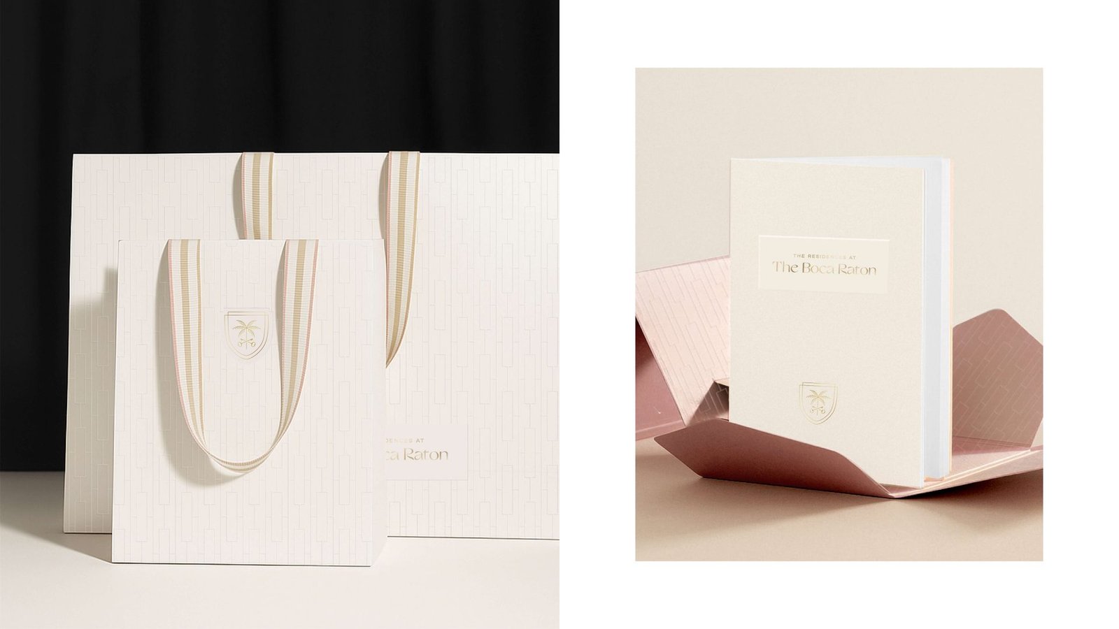
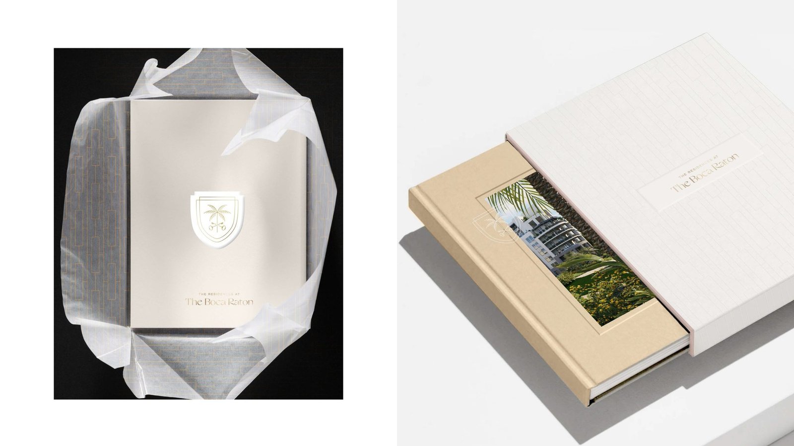
A sales toolkit built like a book.
A tissue-wrapped sales book and slipcased volume with an inset photography window carry the brand into one-to-one buyer moments. The weight and finish of the book match the price of what it is selling.
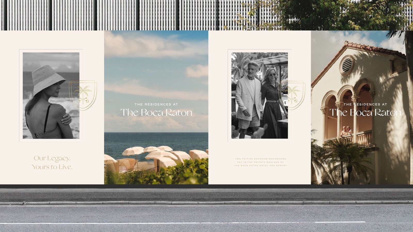
Our legacy, yours to live.
Large-format construction hoarding pairs black-and-white lifestyle photography with the campaign line and residences lockup, planting the brand on site long before anyone moves in.
A century of legacy, carried forward.
A highly considered residential brand that borrows the resort's equity where it matters and steps away where ownership needs its own voice.
Want a brand that honours a legacy and sells today?
Book a Growth AuditShell Bay
Pentastar Aviation. A 60th year that looks the part.
A 15-month brand transformation from logo to every touchpoint, taking a 60-year private aviation operator from a reputation built on service to a visual identity that matches it.


A reputation on the ground. A visual identity to match it in the air.
Pentastar Aviation reached its 60th year with a reputation built on service, yet its visual identity no longer reflected the premium experience clients received on the ground and in the air. The milestone created the right moment for a complete reset.
A 15-month programme began with the logo and cascaded outward into photography, print, digital and every customer-facing detail. The goal: make Pentastar unmistakable in a category where most operators look alike.
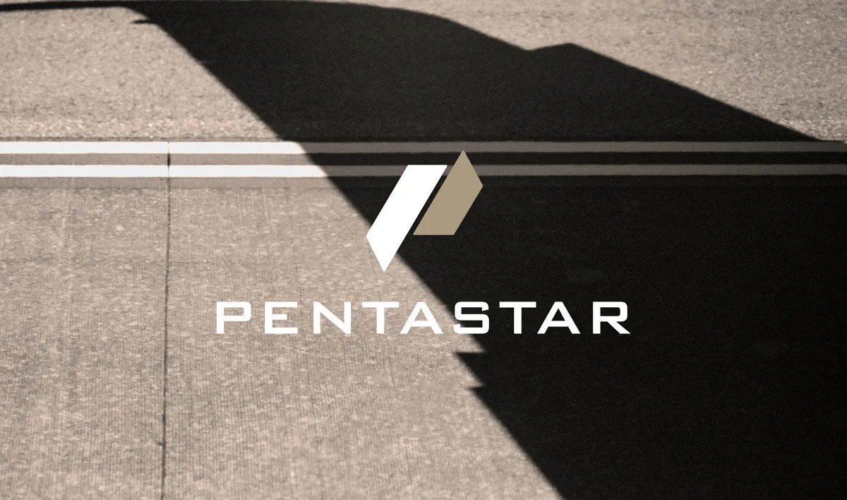

A mark built for forward motion.
Two parallel, angled forms in navy and gold suggest lift and acceleration while staying calm and controlled. Wide-tracked capitals give the wordmark an architectural, aviation-grade presence that holds at any scale.
Private aviation looks the same everywhere you look.
Lookalike operators
Most private aviation brands lean on the same stock photography, the same navy palette and the same tagline tropes. The brief was to stand apart without raising its voice.
Discretion as the price of entry
Luxury buyers value trust and discretion over flash. The identity had to feel confident and calm, not loud or performative, and had to earn its premium through restraint.
A 60th year worth marking
Tying the launch to the anniversary gave the change a story, an internal rallying point and a natural PR moment the company could own.
Quiet luxury, engineered.
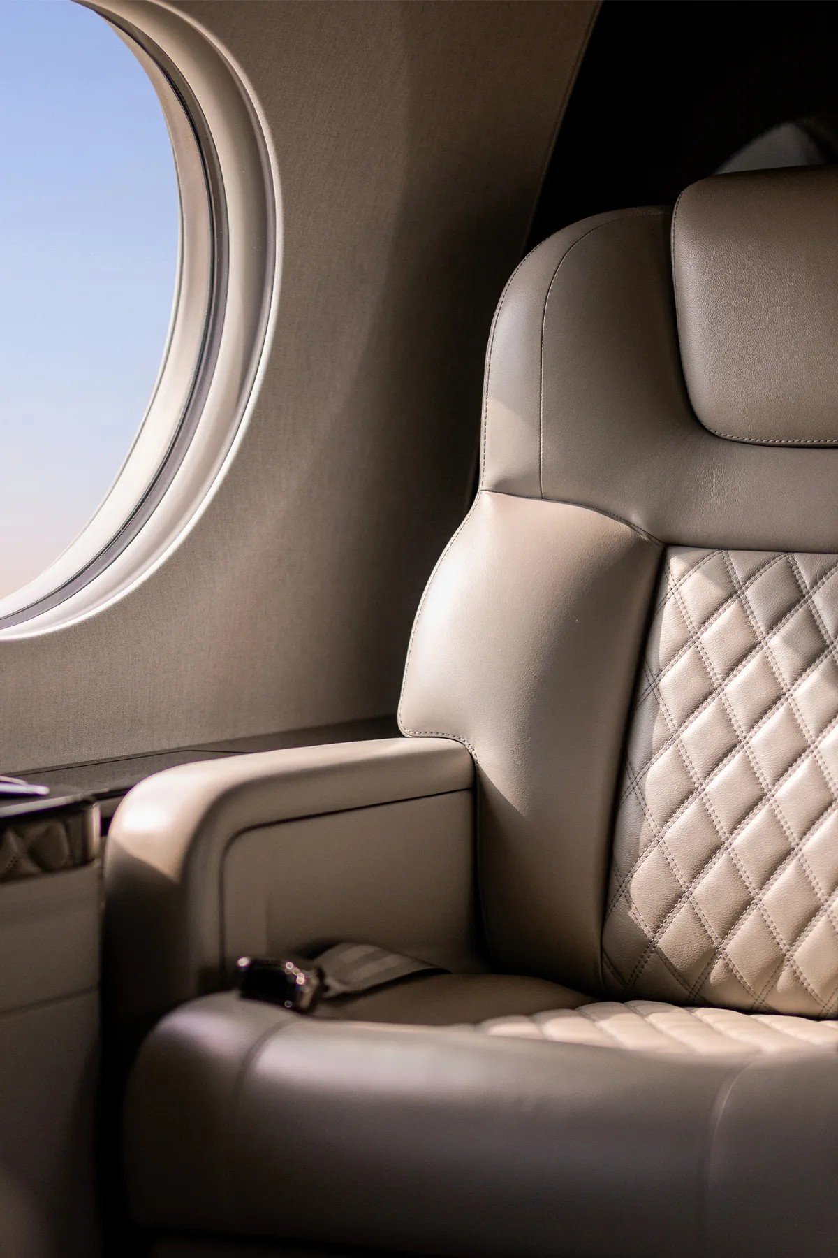
The refreshed identity borrows its cues from the cabin itself: deep navy, warm metallic gold and soft neutral leathers. The result feels confident rather than flashy, matching the discretion private aviation clients expect.
Every detail, carried through.
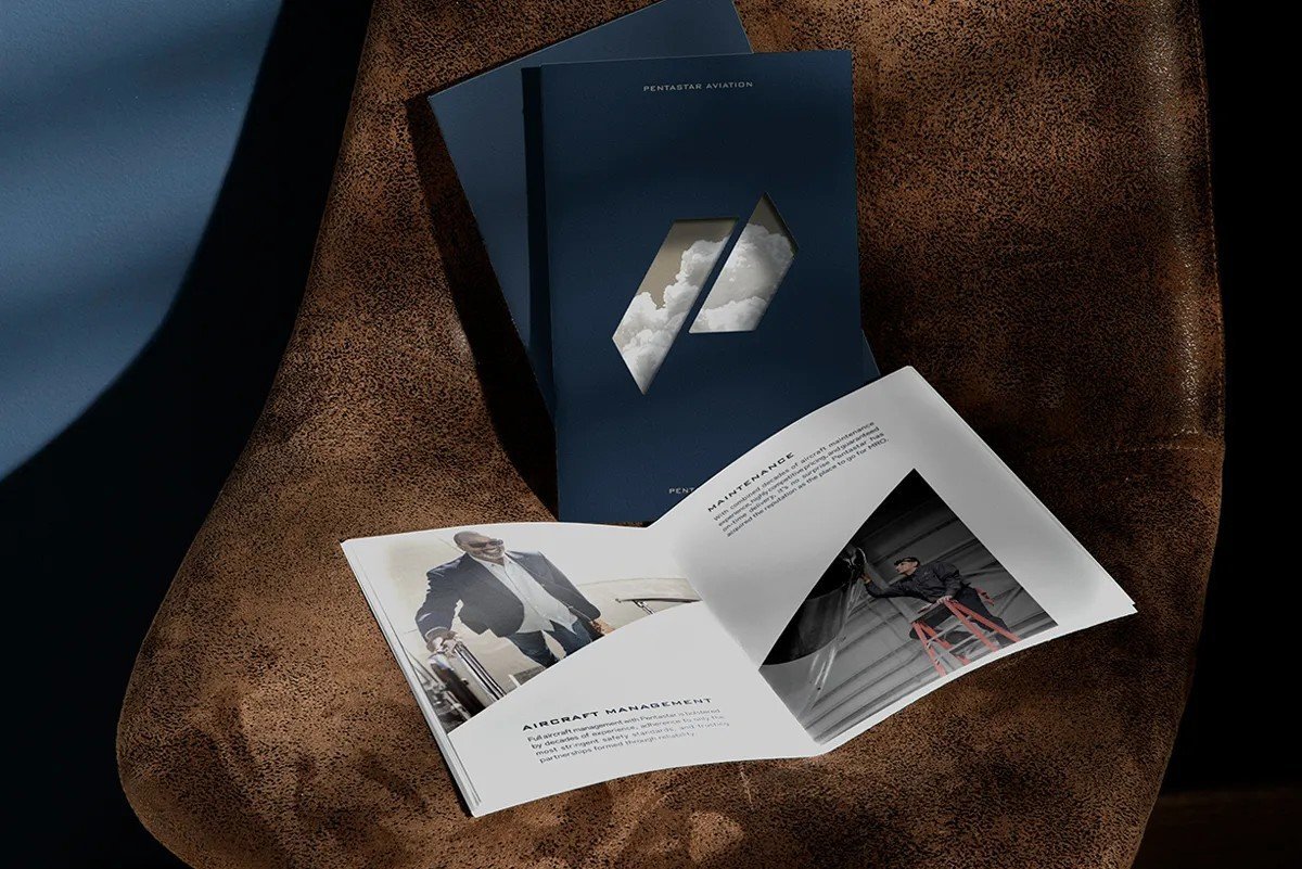
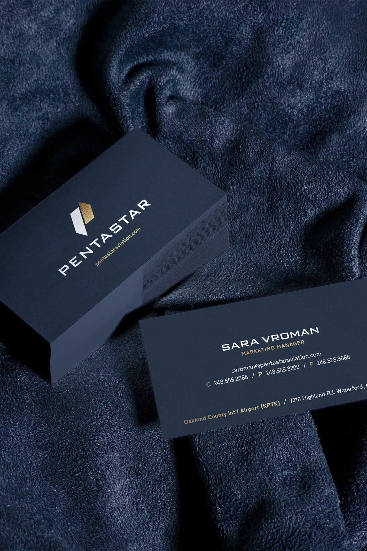
Brochures and business cards translate the system into tactile pieces. Navy stocks, gold foil-style marks and generous white space let the photography lead.
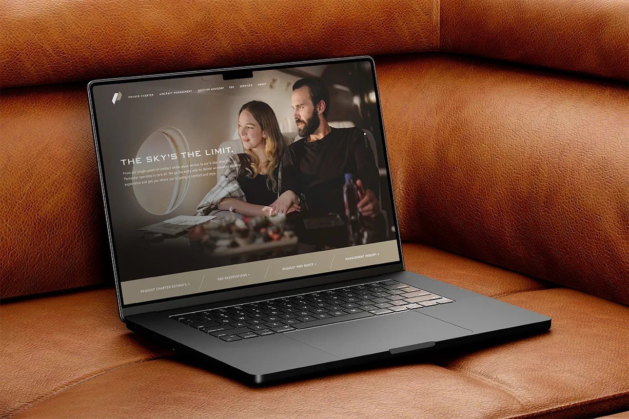
A digital front door to match the cabin.
The new website puts lifestyle photography first and lets the identity frame it, positioning Pentastar as a premium experience rather than a list of services. Rich imagery, dark tones and clear pathways guide charter, management and maintenance audiences to the right place.

Owning the moment of arrival.
An original shoot replaced generic stock with Pentastar's own aircraft, people and clients, giving the brand a library no competitor can copy. Custom photography of real crew, aircraft and clients does more to signal premium than any tagline.
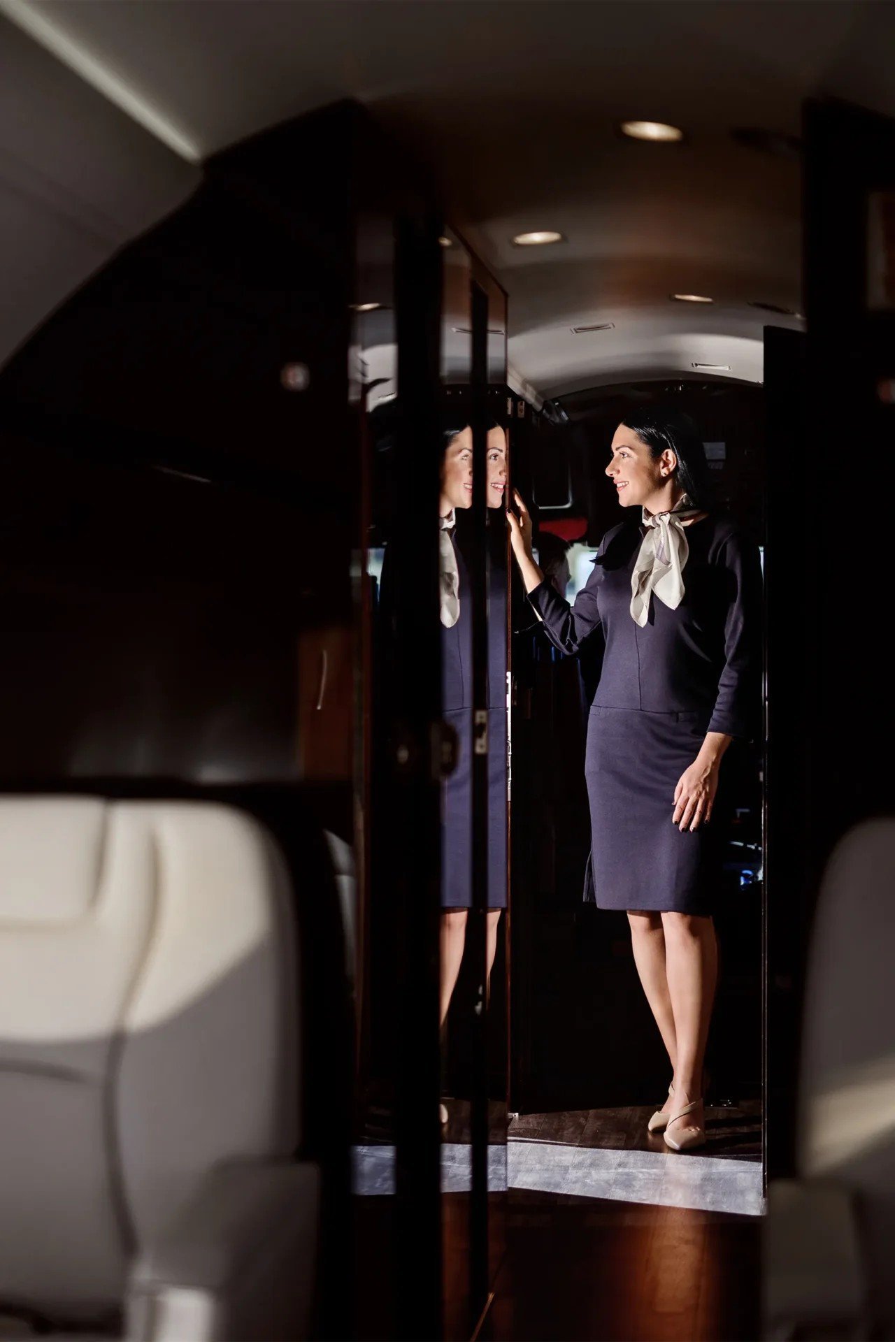



A rebrand that reads as service made visible.
Logo first, cascade second, owned imagery throughout. A system private aviation buyers can trust at a glance.
Want a brand that reads premium at a glance?
Book a Growth AuditPentastar Aviation
Pentastar Aviation. A 60th year that looks the part.
A 15-month brand transformation from logo to every touchpoint, taking a 60-year private aviation operator from a reputation built on service to a visual identity that matches it.
A reputation on the ground. A visual identity to match it in the air.
Pentastar Aviation reached its 60th year with a reputation built on service, yet its visual identity no longer reflected the premium experience clients received on the ground and in the air. The milestone created the right moment for a complete reset.
A 15-month programme began with the logo and cascaded outward into photography, print, digital and every customer-facing detail. The goal: make Pentastar unmistakable in a category where most operators look alike.
A mark built for forward motion.
Two parallel, angled forms in navy and gold suggest lift and acceleration while staying calm and controlled. Wide-tracked capitals give the wordmark an architectural, aviation-grade presence that holds at any scale.
Private aviation looks the same everywhere you look.
Lookalike operators
Most private aviation brands lean on the same stock photography, the same navy palette and the same tagline tropes. The brief was to stand apart without raising its voice.
Discretion as the price of entry
Luxury buyers value trust and discretion over flash. The identity had to feel confident and calm, not loud or performative, and had to earn its premium through restraint.
A 60th year worth marking
Tying the launch to the anniversary gave the change a story, an internal rallying point and a natural PR moment the company could own.
Quiet luxury, engineered.
The refreshed identity borrows its cues from the cabin itself: deep navy, warm metallic gold and soft neutral leathers. The result feels confident rather than flashy, matching the discretion private aviation clients expect.
Every detail, carried through.
Brochures and business cards translate the system into tactile pieces. Navy stocks, gold foil-style marks and generous white space let the photography lead.
A digital front door to match the cabin.
The new website puts lifestyle photography first and lets the identity frame it, positioning Pentastar as a premium experience rather than a list of services. Rich imagery, dark tones and clear pathways guide charter, management and maintenance audiences to the right place.
Owning the moment of arrival.
An original shoot replaced generic stock with Pentastar's own aircraft, people and clients, giving the brand a library no competitor can copy. Custom photography of real crew, aircraft and clients does more to signal premium than any tagline.
A rebrand that reads as service made visible.
Logo first, cascade second, owned imagery throughout. A system private aviation buyers can trust at a glance.
Want a brand that reads premium at a glance?
Book a Growth AuditMind Games
MIND GAMES. The strategy of chess, staged as a store.
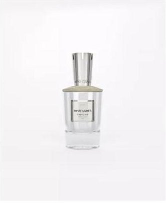
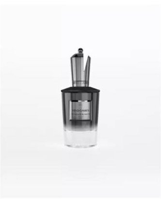
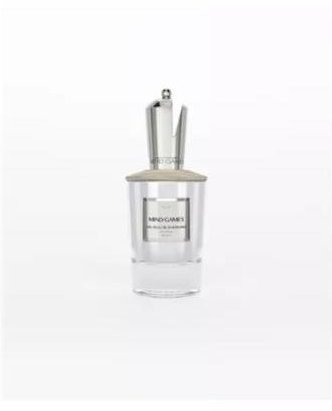
A luxury fragrance house inspired by chess, with each scent composed by a Master Perfumer and bottled as a sculptural chess piece. We built the launch destination on Shopify.

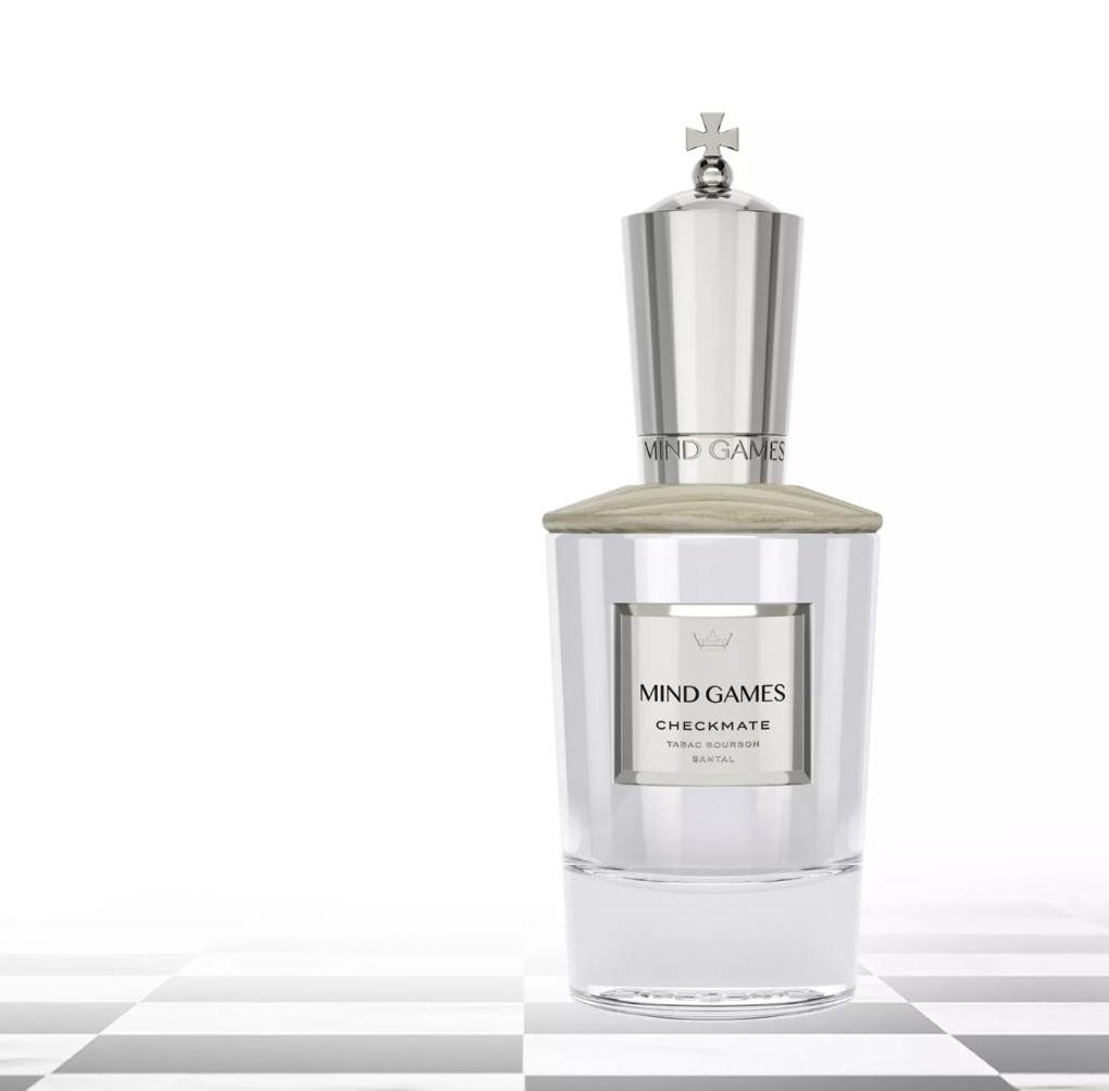
More than a fragrance store.
The site had to launch a brand nobody knew yet, explain the inspiration and craftsmanship behind each collection, and give shoppers enough information and visual context to buy fragrance online with confidence, a category people usually prefer to smell first.
Storytelling and commerce had to work as one system. Product discovery, brand education and checkout needed to flow together without diluting the exclusivity a high-end fragrance house demands.
Dense information, never overwhelming.
Product pages organise fragrance information into Description, Notes and Sustainability tabs, so detail never overwhelms the experience. The Shopify architecture moves visitors from brand story into product exploration and into purchase.
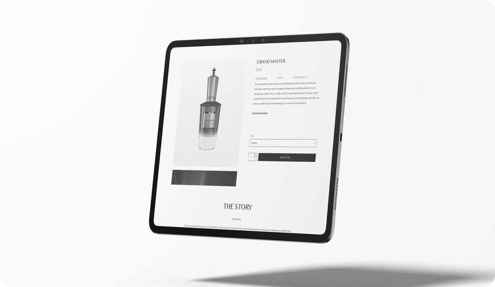
Build desire where screens cannot smell.
Fragrance resists e-commerce
People want to try a scent before they buy it. The site had to compensate with cinema, 3D product motion and clear notes-based information architecture.
An unknown name, premium prices
Launching cold at luxury price points asks for authority. The site had to prove craftsmanship through the perfumers, the bottles and the writing before it asked for the sale.
Story and shop as one
Brand narrative had to feed into tabbed product detail and discovery sets, giving new buyers both the emotion and the facts they needed to convert.


A cinematic brand film at the door.
The homepage opens on a brand film. Two players face off across a glass chessboard set with MIND GAMES bottles, putting the brand's idea of rivalry, calculation and seduction into motion within seconds.
3D product films that sell what screens cannot smell.
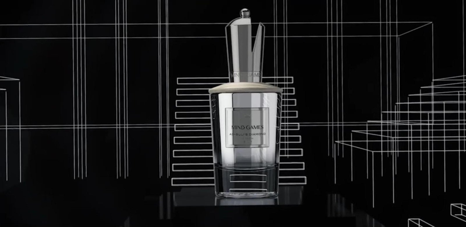
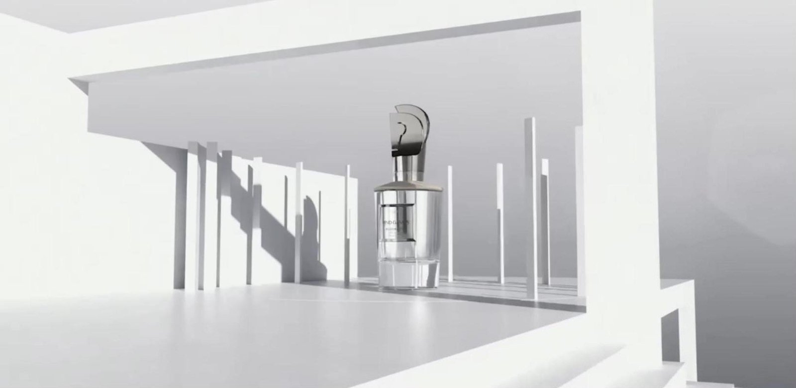
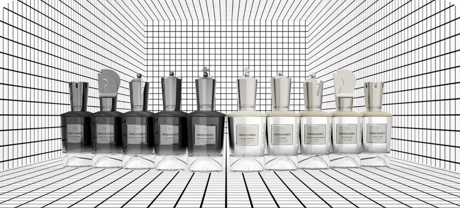
Product films stage each bottle inside architectural spaces, from wireframe grids to sunlit staircases. The motion compensates for the missing sense of smell and positions MIND GAMES as a modern upscale fragrance house.

Shop by mood, side or scent family.
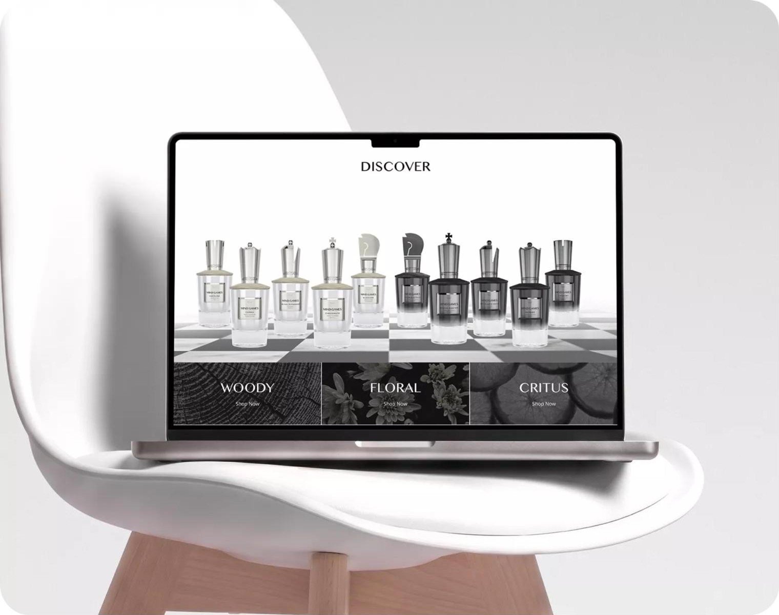
The full line-up sits on a chessboard, split into Dark and Light sides that mirror the two armies of the game. Scent-family tiles give shoppers a second, sensory way into the range.
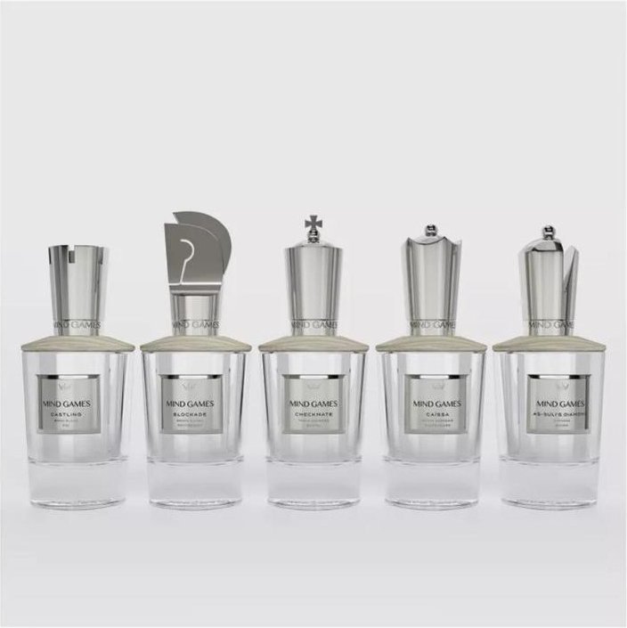
Every piece has a role.
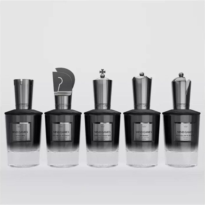
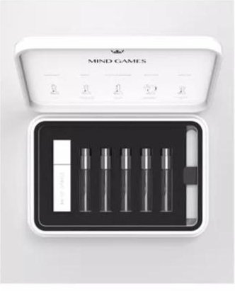
The Extrait de Parfum listing presents each scent with its chess name and three-word olfactive profile, alongside Light and Dark discovery sets that lower the barrier to a first purchase.
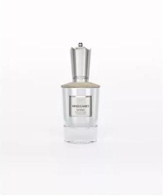
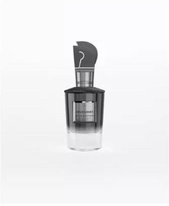
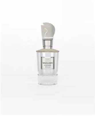
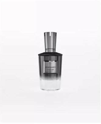
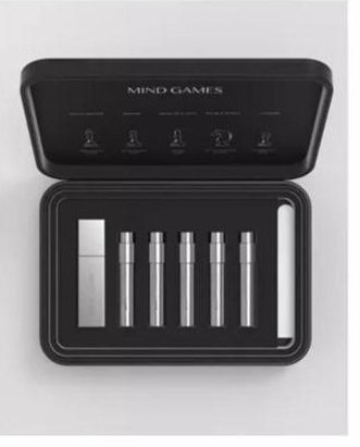
The noses behind the collection.
A dedicated Perfumers page credits each nose by name, adding the authority and provenance luxury buyers look for before they commit.






A launch as considered as the product.
Storytelling, luxury design and intuitive shopping, built as one system on Shopify.
Want a store that sells before it ships?
Book a Growth AuditKamet
Kamet. An Indian single malt, told as a story.
A premium Indian single malt built around provenance, with a label drawn from the mountains, villages, birds and folklore of the land that grows its barley.
A category built on molasses. A malt built on provenance.
In India, whisky's dominant style is distilled from molasses rather than malted grain, producing a thick, sweet spirit. Kamet set out to be the opposite: a single malt that celebrates where it comes from.
The name borrows from Mount Kamet in Uttarakhand, one of the country's highest peaks. The grain is indigenous six-row barley grown in the Himalayan foothills, fed by glacial meltwater, and distilled near Kurukshetra.
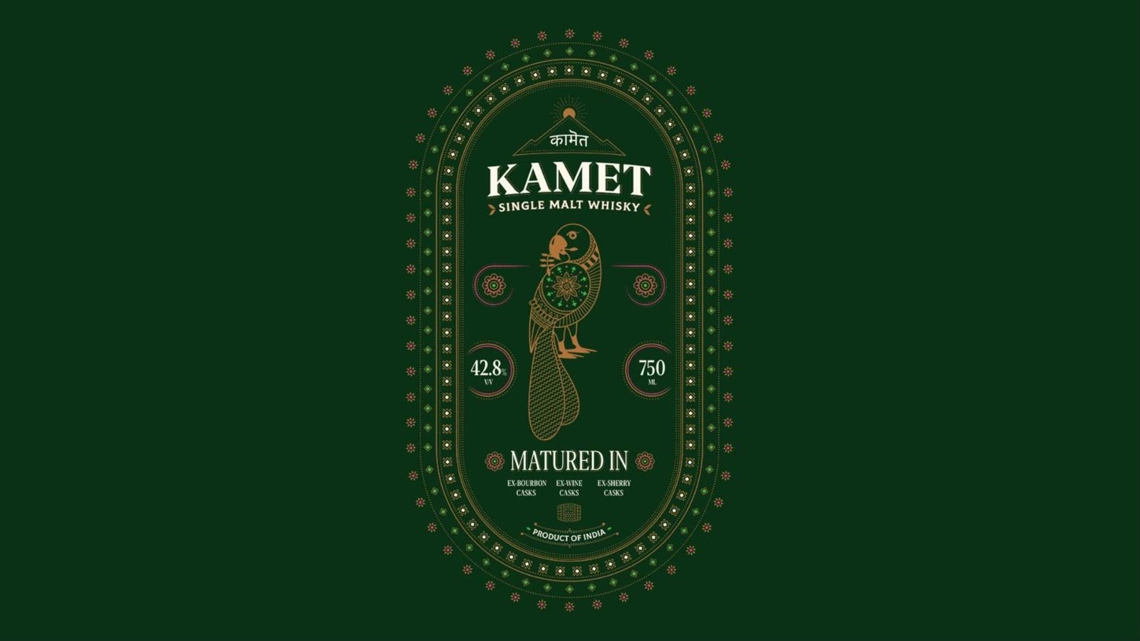
Signal Indian elegance instantly, before anyone reads a word.
Rule out borrowed Scotch cues
Tartan, crests, stags and highland hunting lodges carry Scotch's story, not India's. The brief ruled them out from the start and pushed the system toward a vocabulary of Indian craft.
Jewel tones, dense ornament
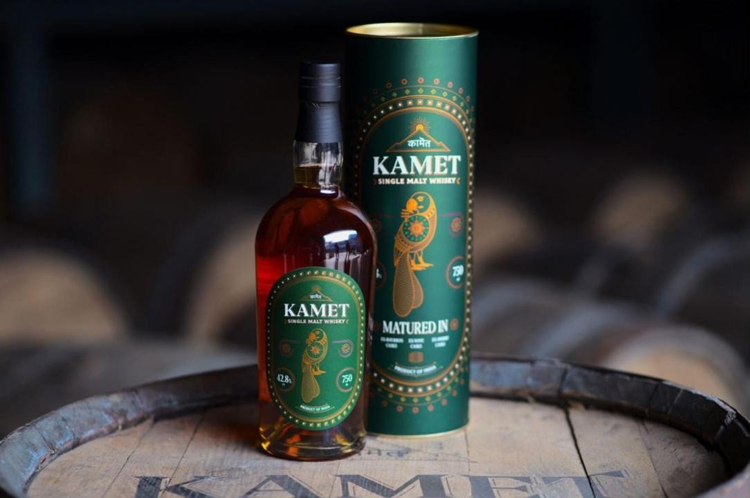
Forest green, burnished copper and temple pink took the place of highland greys and tans. Dense ornamental borders and dotted textile patterning carry the label's framing.
A storytelling character
The Indian parrot takes pride of place: messenger and fortune teller in folklore, part of everyday life around the distillery, and a cultural layer the whisky could carry on every pour.
Two scripts, one identity.
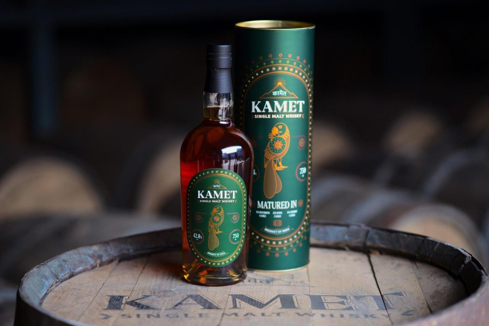
The wordmark pairs Devanagari with Latin. कामेत sits inside a mountain peak crowned by a rising sun, directly above a bold serif KAMET and the SINGLE MALT WHISKY descriptor flanked by barley leaves.
The bilingual lockup roots the brand in India while staying fully legible to international shelves, which is exactly the duality a world-stage Indian malt needs.
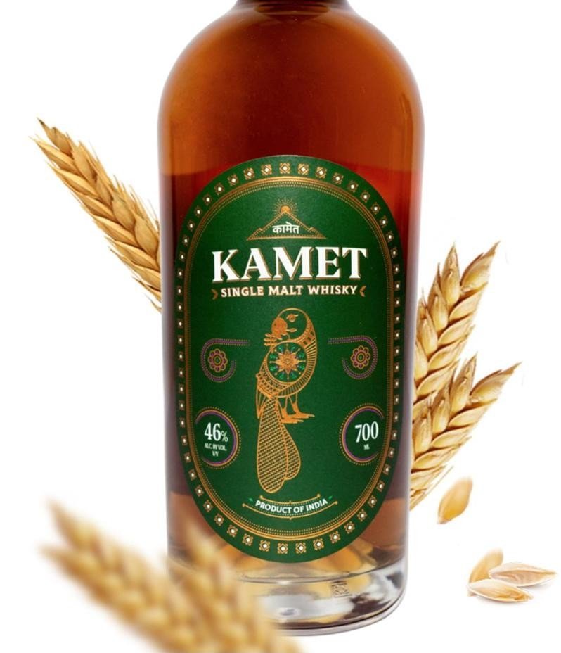
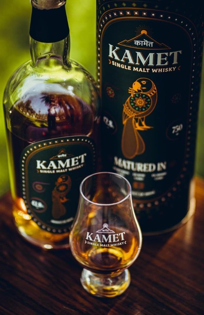
The parrot: messenger, fortune teller, storyteller.
The Indian parrot takes pride of place on the label. In mythology and folk tradition it carries messages and foretells fortunes, and it remains part of everyday life in the villages around the distillery near Kurukshetra.
Making the parrot the hero pushes the product beyond flavour. Every pour arrives with a cultural layer, giving the drinker a narrator and the brand a character it can carry across packaging, glassware and communication.

Copper stills. Three cask types. One Indian barley.
Distilled from local six-row barley
Kamet is distilled from indigenous six-row barley in copper pot stills, grown in the Himalayan foothills and fed by glacial meltwater. The grain, not the import story, becomes the premium cue.
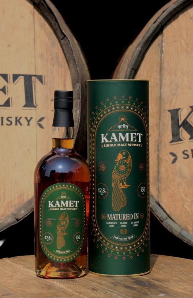
Matured across three cask types
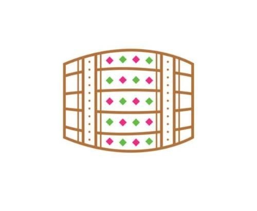
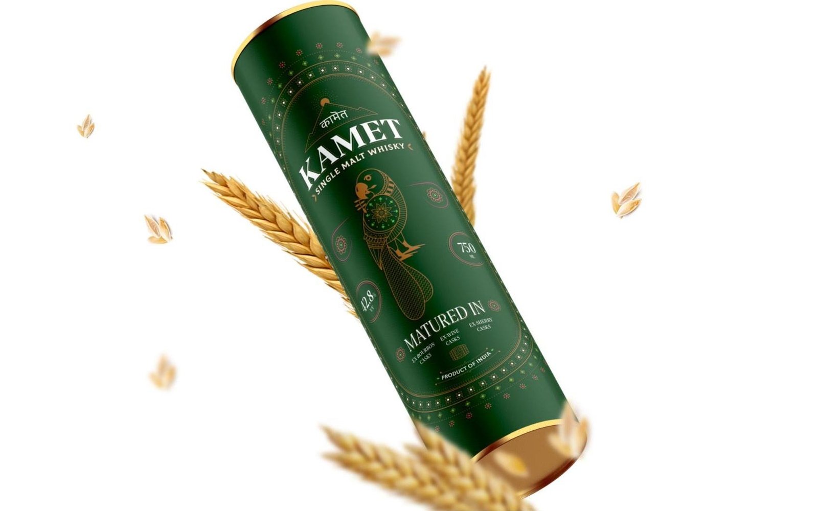
The whisky then matures across ex-bourbon, ex-wine and ex-sherry casks. The back of the label and the canister make that process visible with a bespoke barrel icon built from the same diamond patterning as the borders.
Carried onto glassware and gift
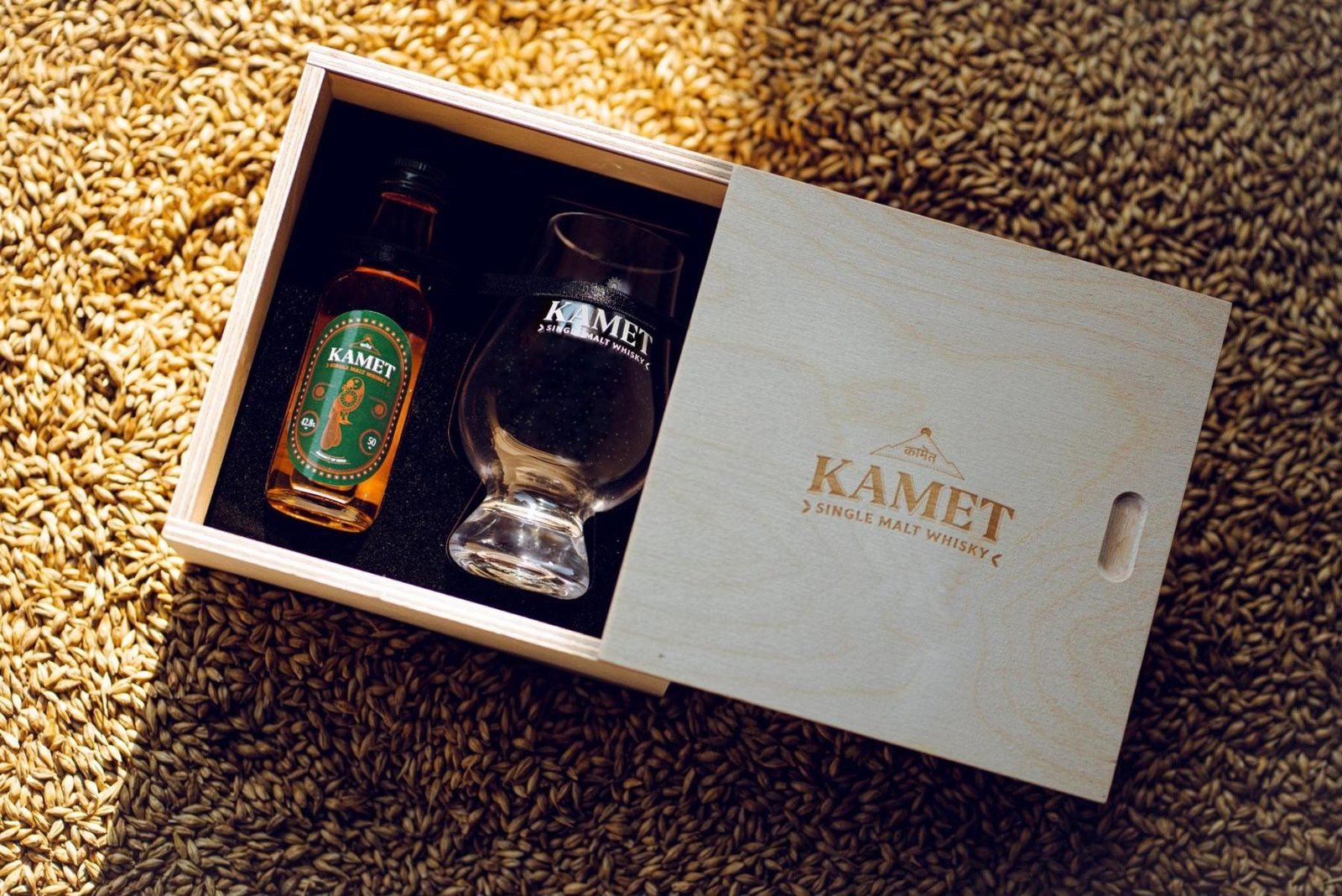
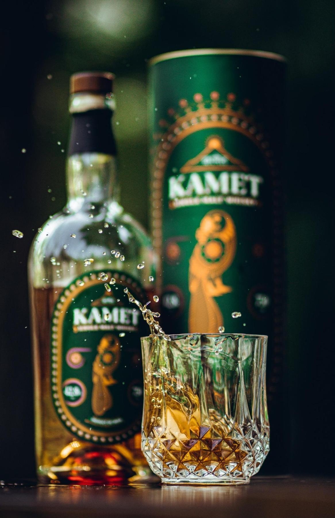
A branded gift box, cask-side imagery and glassware carry the parrot and the mountain mark forward, so opening the bottle feels like stepping into the narrative.
A brand world worth living in
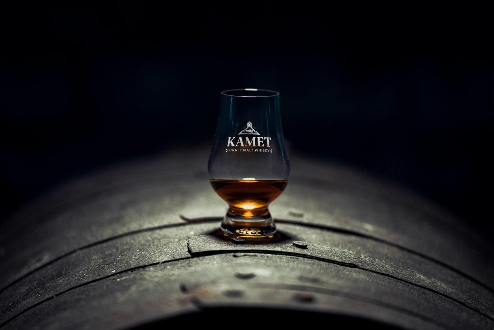
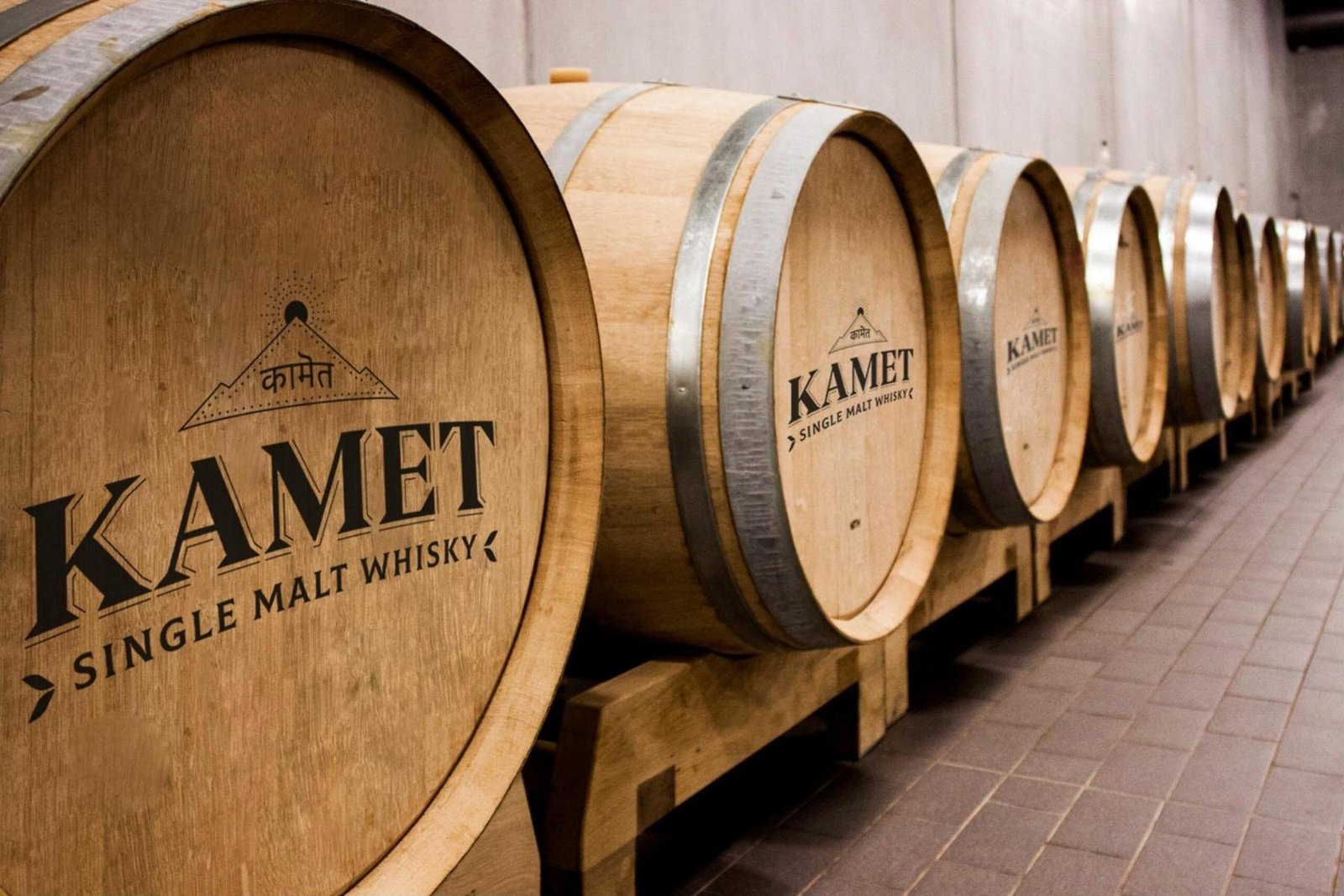
From barrel end-caps in the warehouse to the glencairn tasting glass, the system turns provenance into packaging the drinker can hold.
This is not a label. It is a story.
A forgotten Himalayan peak, a historic battleground, six-row barley and a parrot to tell the tale.
Want a label that reads as authentically yours?
Book a Growth AuditJin Jiji
Jin Jiji. An Indian craft gin for the global shelf.
A premium Indian dry gin designed to wear its origin proudly, with packaging that uses the gin's botanicals and India's ornamental traditions as a visual language fluent anywhere.
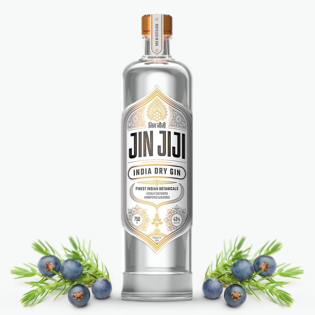
An Indian gin that earns its place on the world map.
Peak Spirits set out to capture the richness and diversity of Indian botanicals in every sip, and needed packaging with the same ambition: unmistakably Indian at first glance, yet fluent in the visual language of premium international spirits.
The answer became a label that wears its origin proudly, turning the gin's ingredients and India's ornamental traditions into a premium identity.
A label grown from the land.
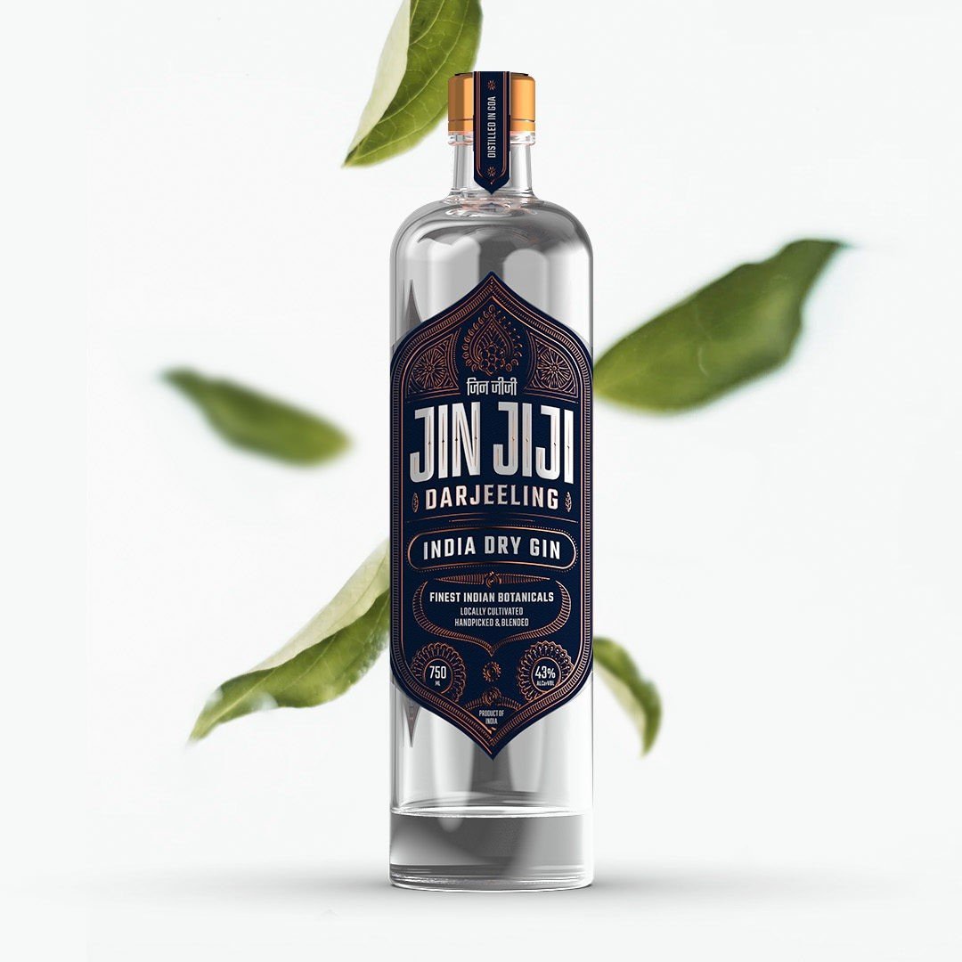
The front label sets the wordmark inside an ornate, symmetrical frame of botanical line work in warm metallic tones. The white field keeps the pack clean and lets the clarity of the gin show through the glass.
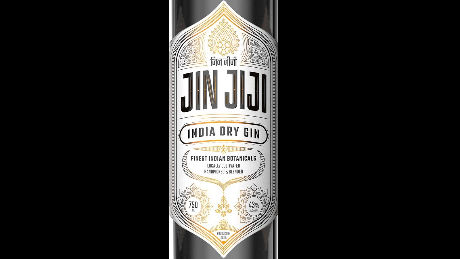

Devanagari meets Latin.
The bilingual logo lockup sits at the heart of the label. Devanagari and Latin letterforms share one unit, giving Jin Jiji a voice that belongs to India and still travels comfortably to any market.
Ten botanicals, ten emblems.
The spirit is copper pot distilled in Goa. Translating each ingredient into a motif lets the label explain the liquid without extra copy and gives the brand an ownable visual vocabulary.
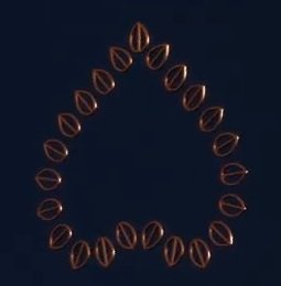

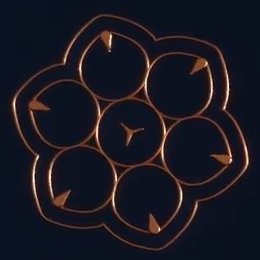








Borrow nothing from European gin. Build an Indian vocabulary.
Origin as the premium cue
Rather than borrowing the visual codes of European gin, the pack makes Indian heritage the luxury signal and gives the brand a reason to stand out on an international shelf.
Ingredients as identity
Turning botanicals into motifs creates an ownable vocabulary that explains the product at a glance and rewards the drinker who looks closer.
A system, not a single label
The same architecture of frame, motifs and bilingual wordmark flexes across white and dark editions, leaving Peak Spirits room to extend the range.
A darker expression.
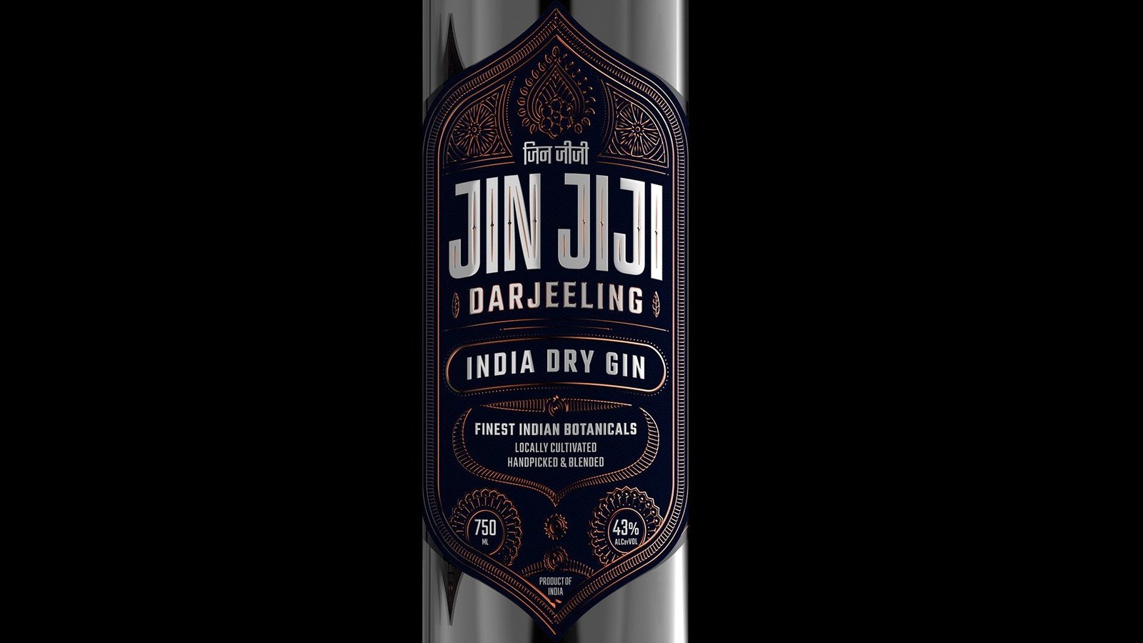
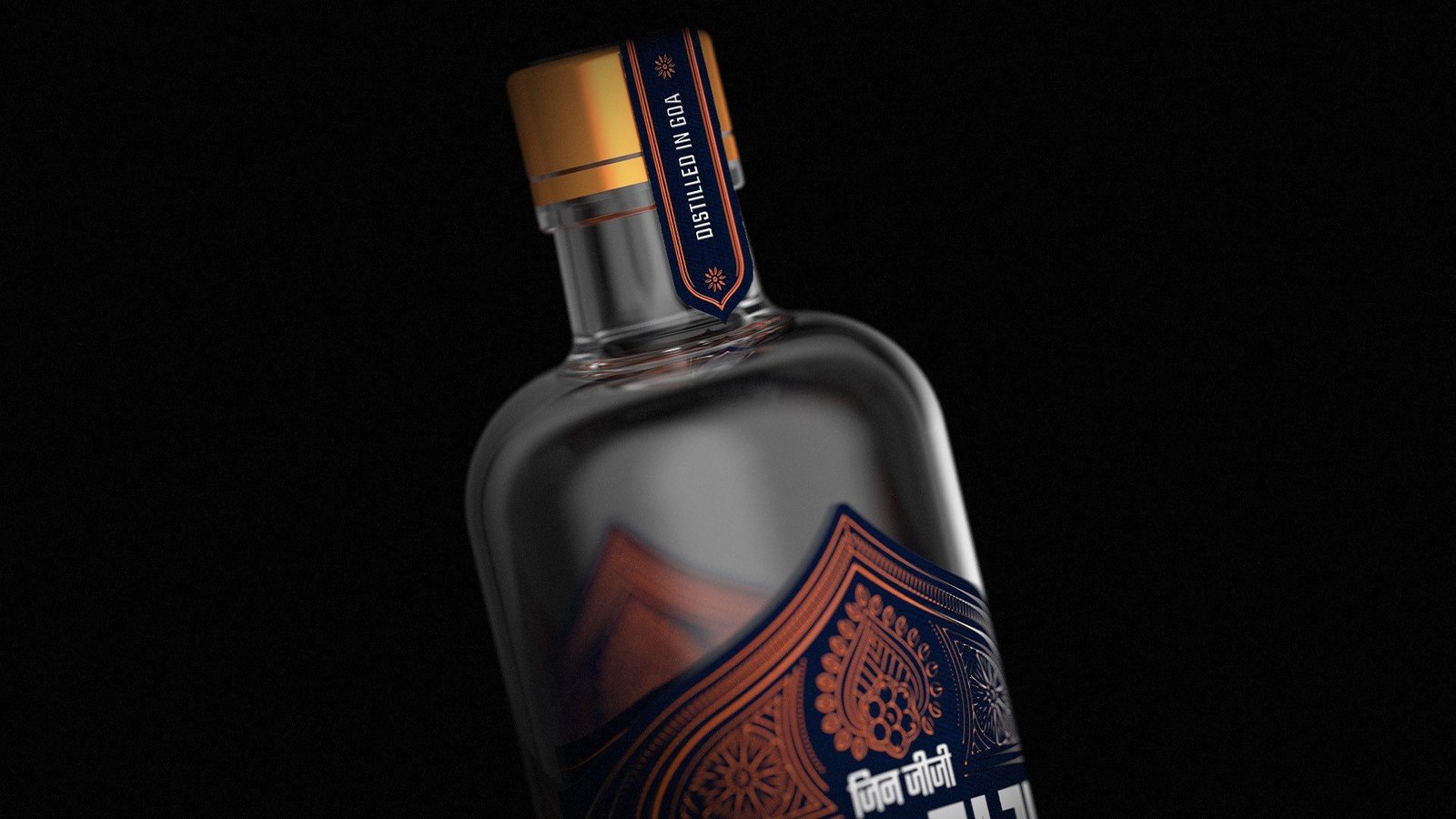
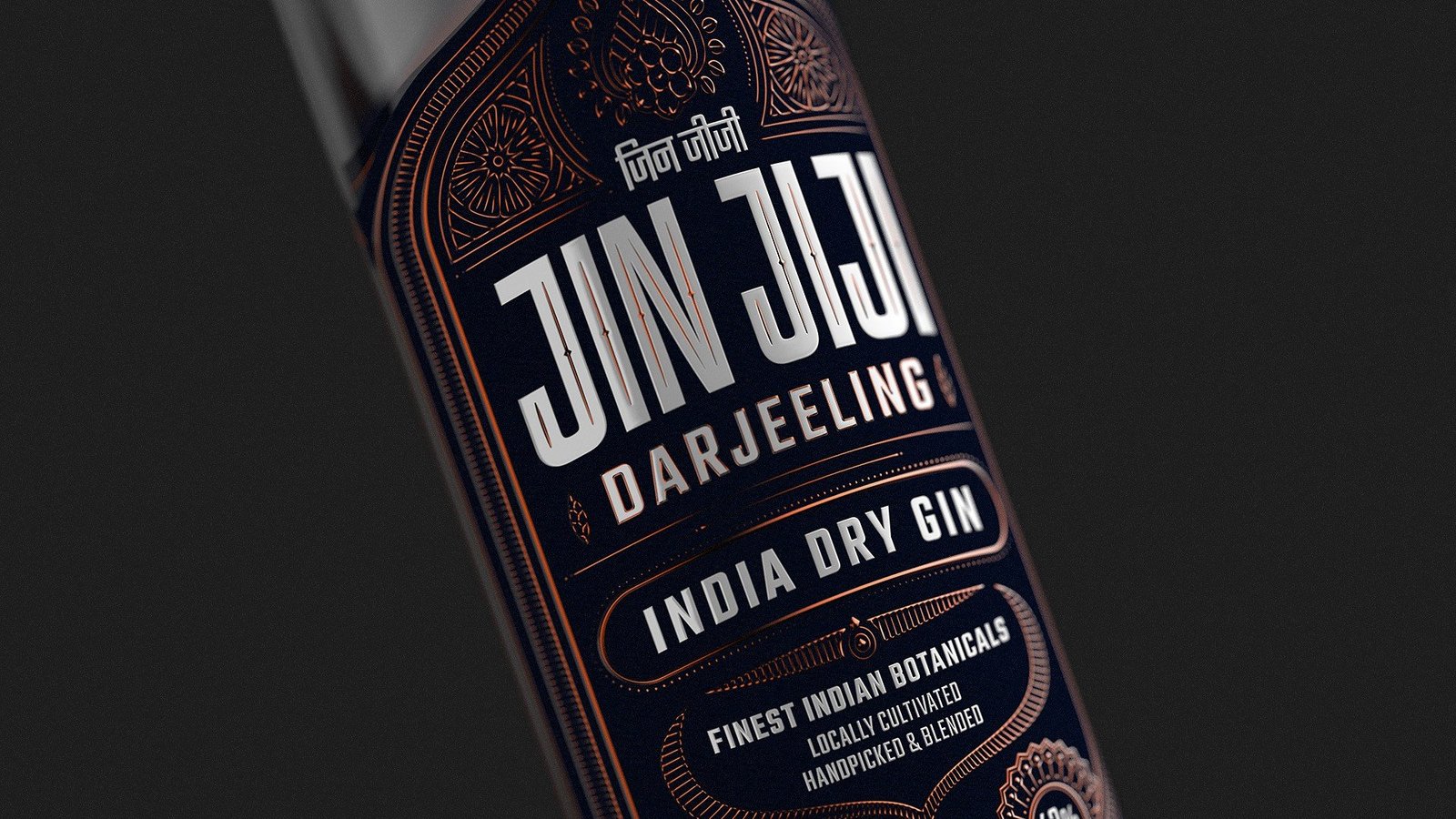
A second edition flips the palette to deep midnight with copper detailing. The Darjeeling variant keeps the same architecture of border, motifs and wordmark, showing the system can stretch into a range without losing identity.
Built for the back bar.
Bold, centred typography keeps the name legible from across the room, while the fine detailing does its work up close. The system is designed to work equally hard on a crowded shelf and in hand.
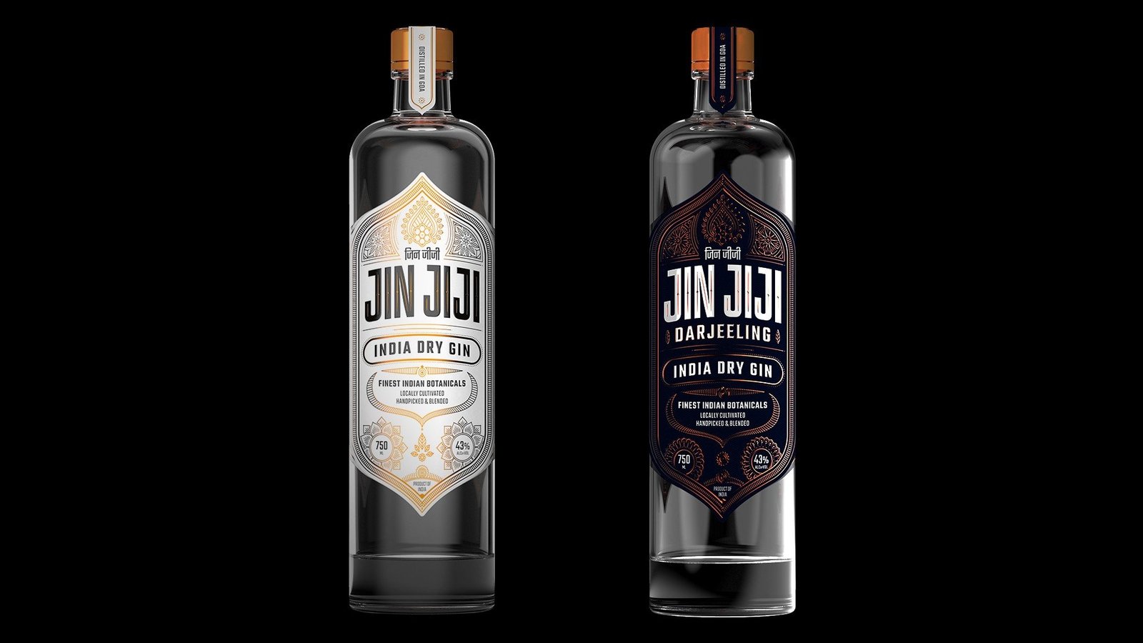
Two editions, one design language.
Side by side, the white and dark editions share one design language, ready to grow into a family of Indian craft spirits.
A packaging system that doubles as a brand asset.
The label does the work on the shelf and leaves room to grow the range without starting over.
Want a pack that wears its origin proudly?
Book a Growth AuditBira 91 light
Bira 91 Light. The zero guilt beer.
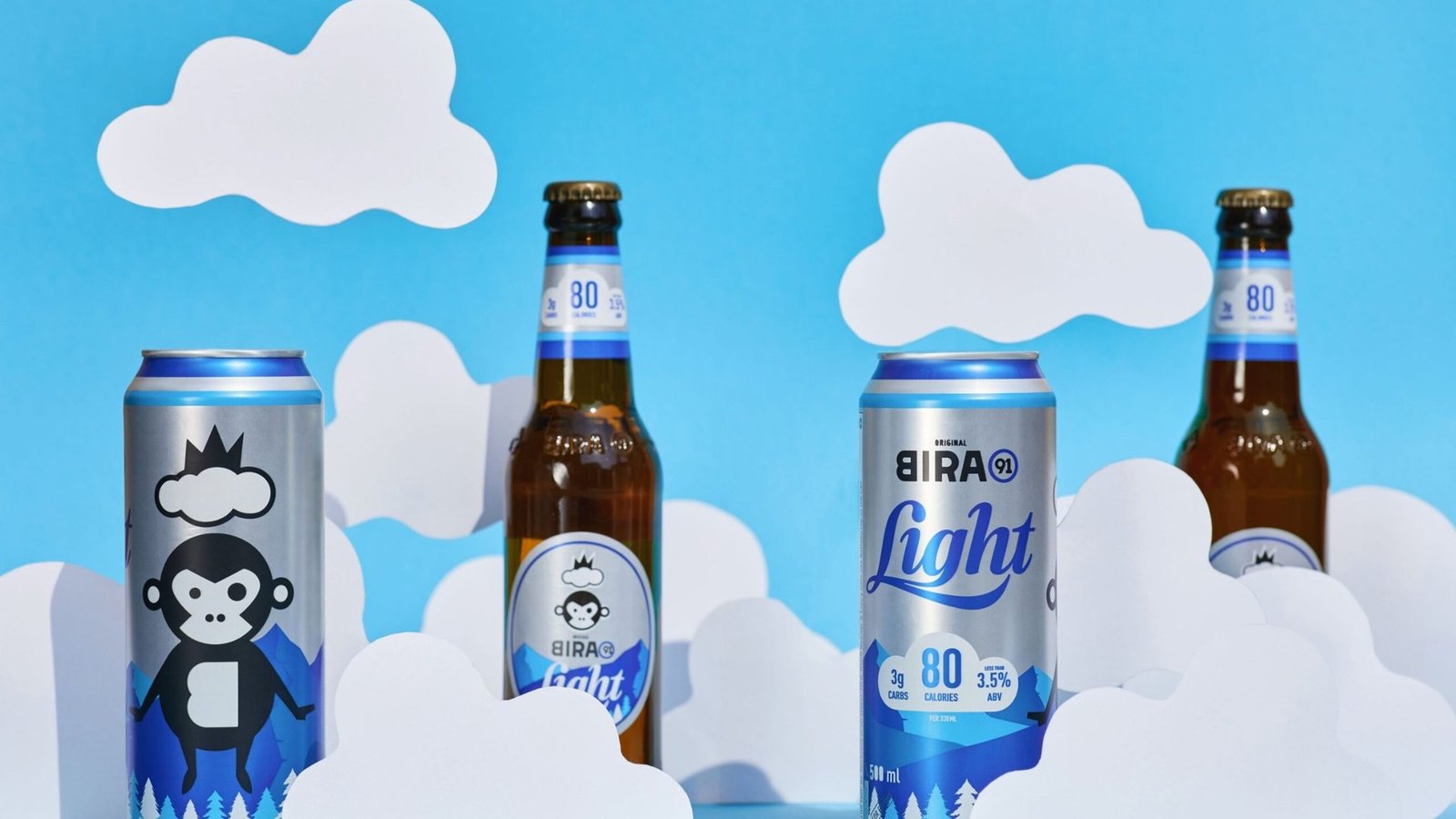
A reformulated light lager built for drinkers with active lifestyles, repositioned from low alcohol to low guilt, with a pack that puts the calorie promise on the front.
A cold beer that fits an active life.
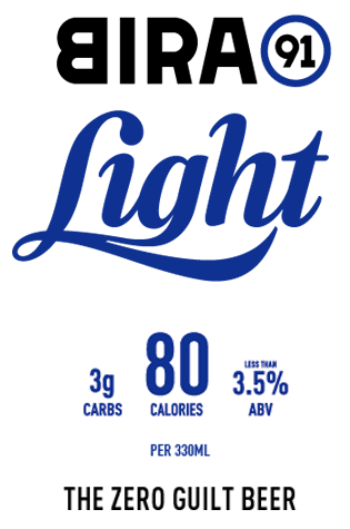
For a generation that counts the calories in everything it eats and drinks, beer comes with a familiar worry: the beer belly. Bira 91 Light removes the trade off. At 80 calories and 3 g of carbs, it carries fewer calories than a glass of champagne, a glass of wine or even a banana.
The positioning moves the brand from low alcohol to zero guilt, reframing beer as a crisp, refreshing pleasure rather than an indulgence to be rationed.
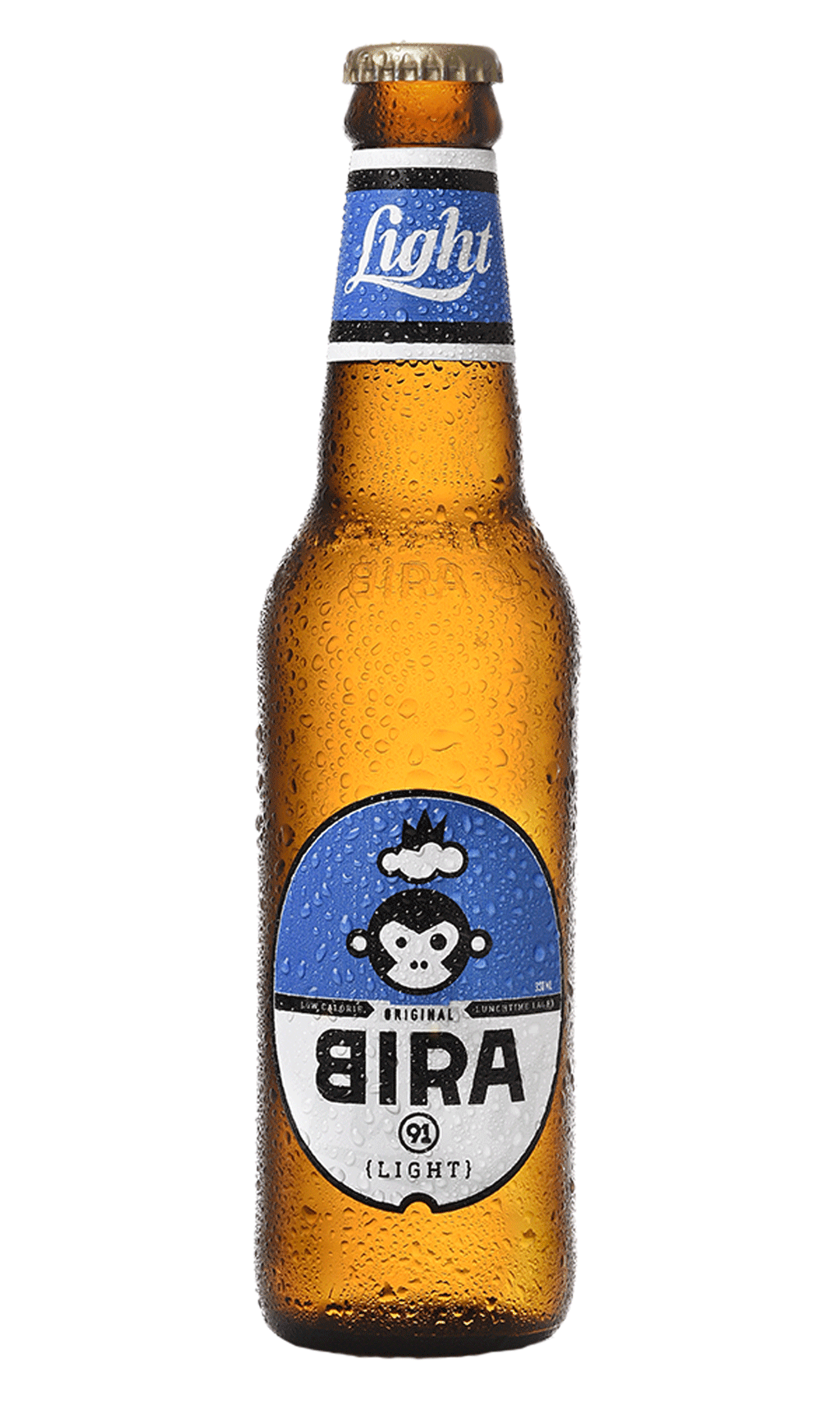
The light beer category had come to mean one thing: low alcohol.
Low alcohol as default
Light beer in India has long been read as a compromise, a weaker brew for people who do not really want a beer. That read limited the audience and the price.
A health conscious drinker
A new generation treats calories and carbs as the primary filter. Beer sits awkwardly in that filter, and the pack had to answer it on the shelf, not in a tagline.
A promise worth leading with
The reformulated product was genuinely different. The old pack buried that difference. The new one had to make the calorie and carb story obvious at a glance.

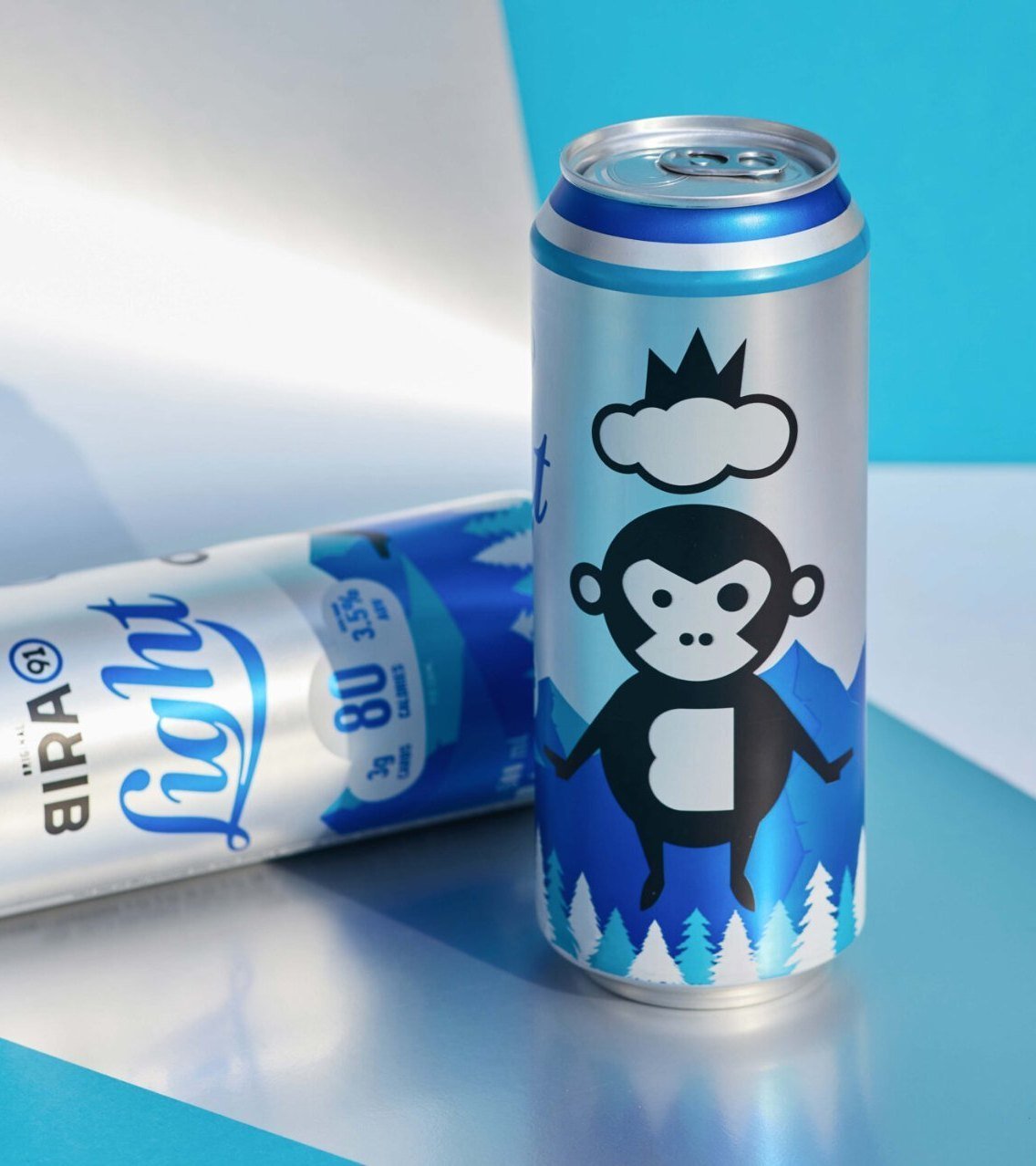
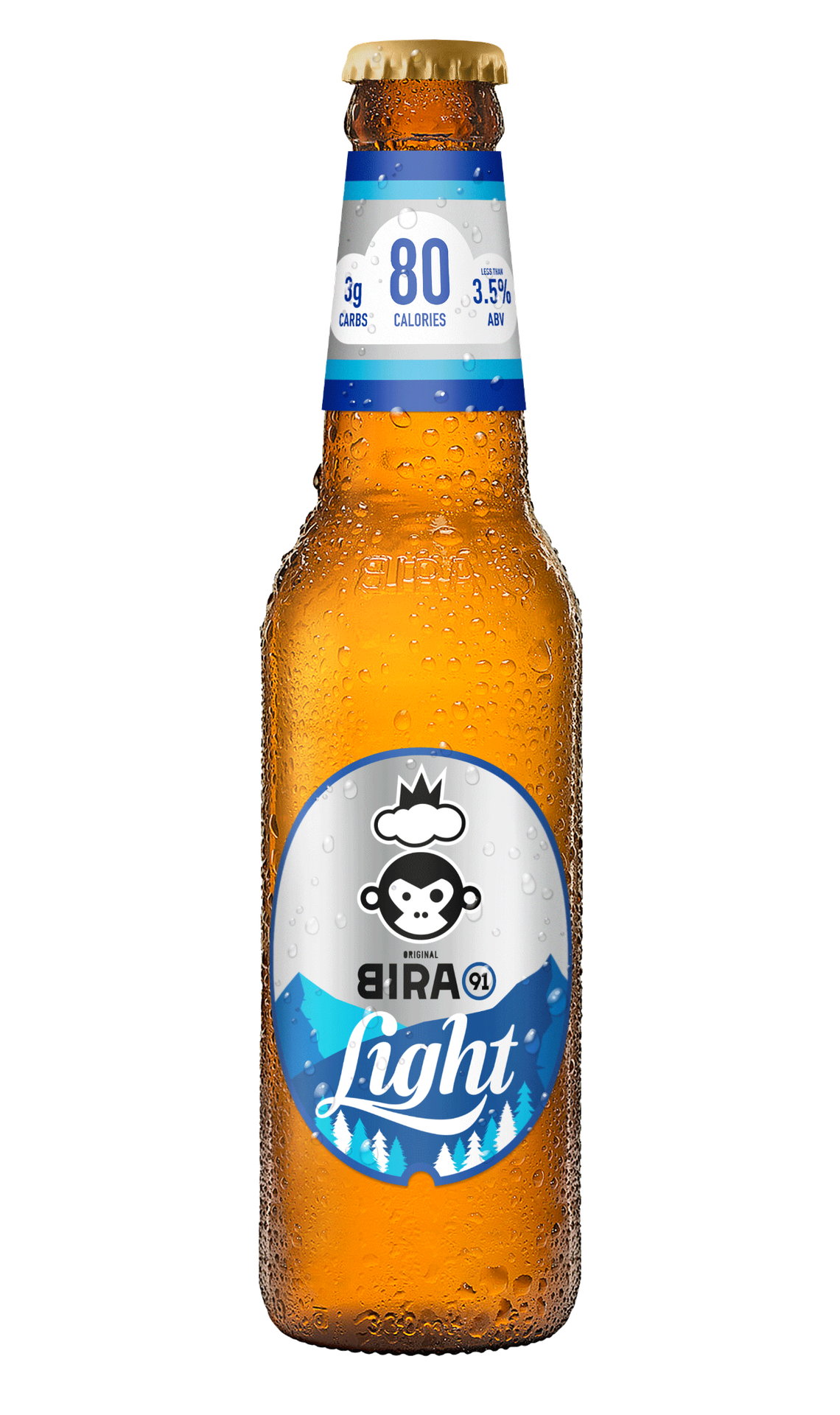
A pack that tells the lightness story at a glance.
Reimagined cloud unit
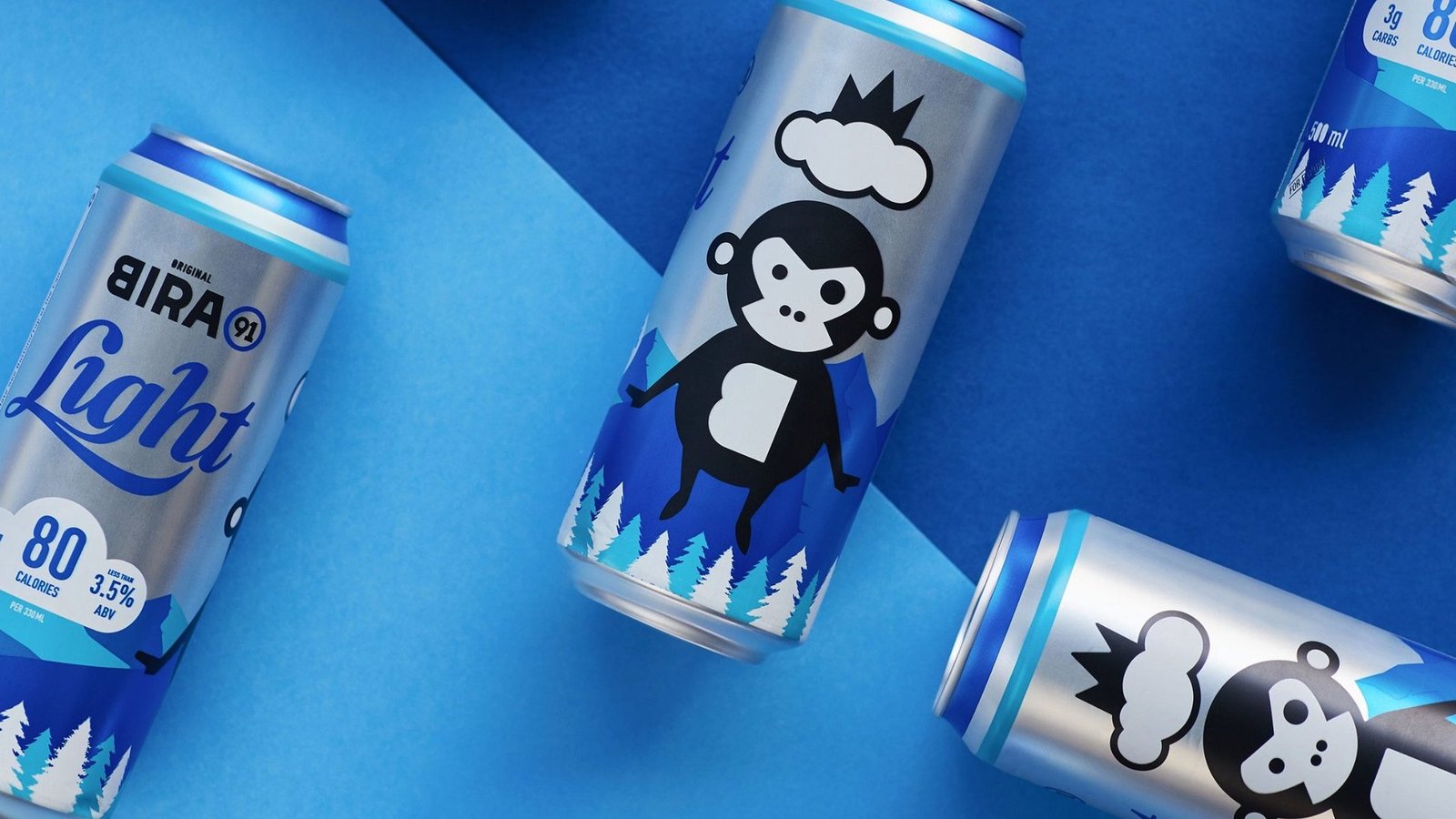
The brand cloud now carries the calorie and carb numbers directly, putting the core promise on the front of pack rather than inside a nutrition panel on the back.
Silver base, instant signal
A silver base replaces the saturated colour of the old pack, flagging a low calorie offering at first glance and separating Light from the rest of the Bira line.
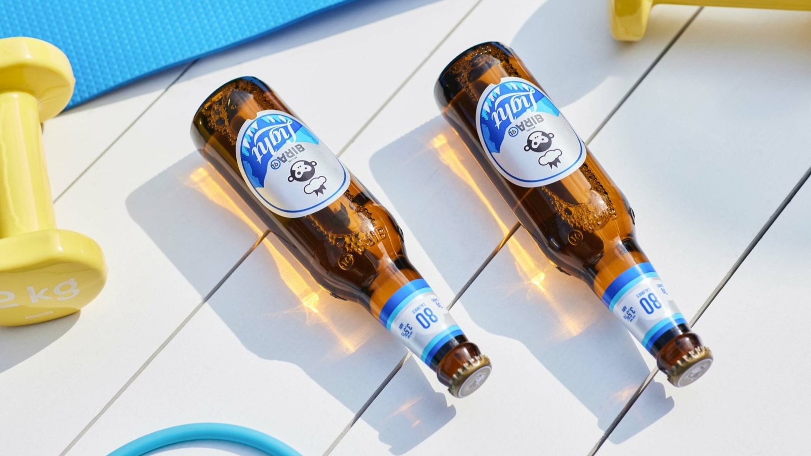
Mascot sailing on a cloud
The Bira monkey sails over the mountains on a cloud, completing the lightness and freshness story in a visual language that extends across pack, film and social.

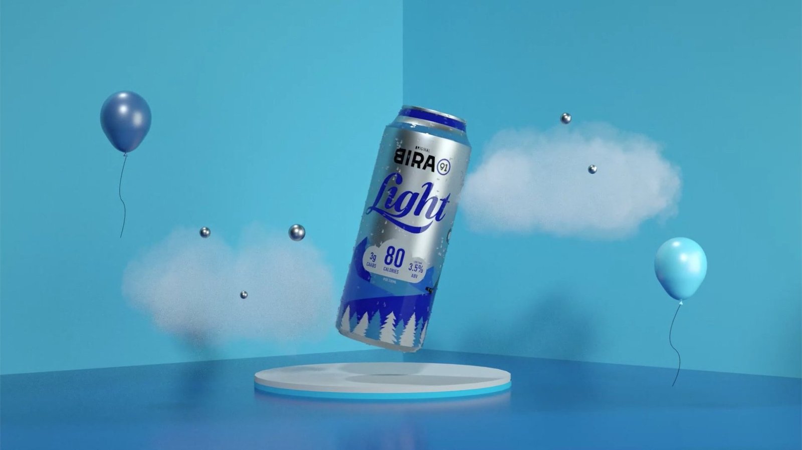
A world that extends to film
The packaging story carries straight into motion. The cloud, the mountains and the mascot become a world the brand can animate across campaign films, social and in-trade.

Only 80 calories. That is less than a banana.
Every piece of communication leads with the calorie and carb promise, turning a nutrition fact into the hook. Short-form social content puts the comparison front and centre.
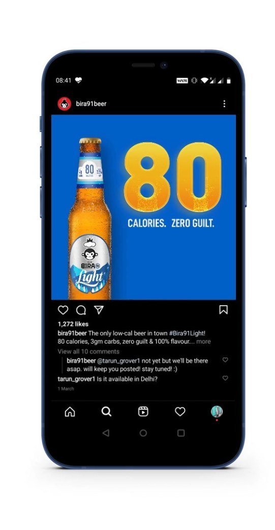
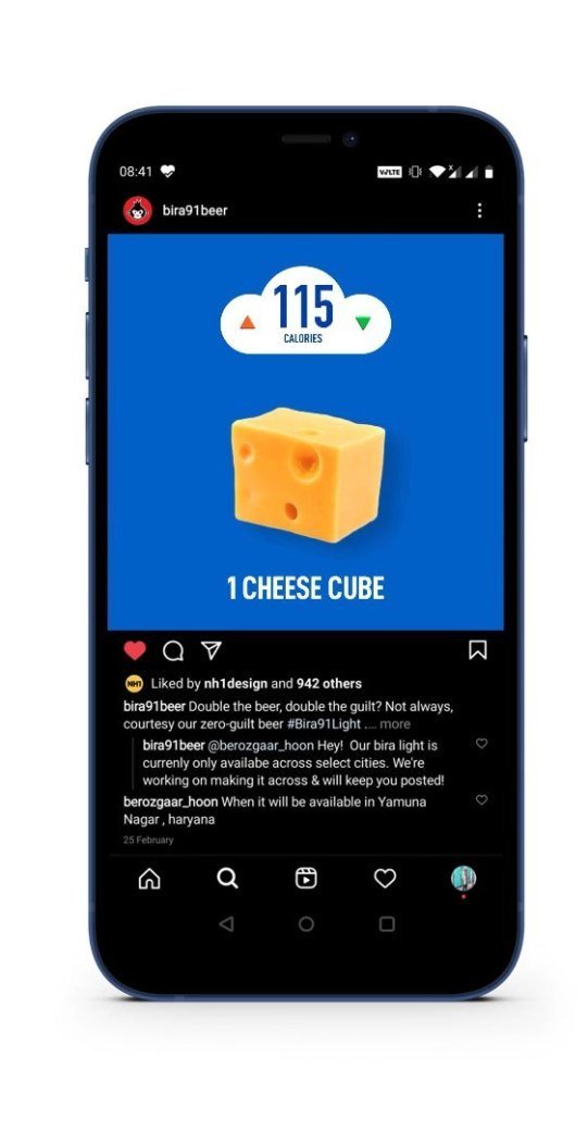
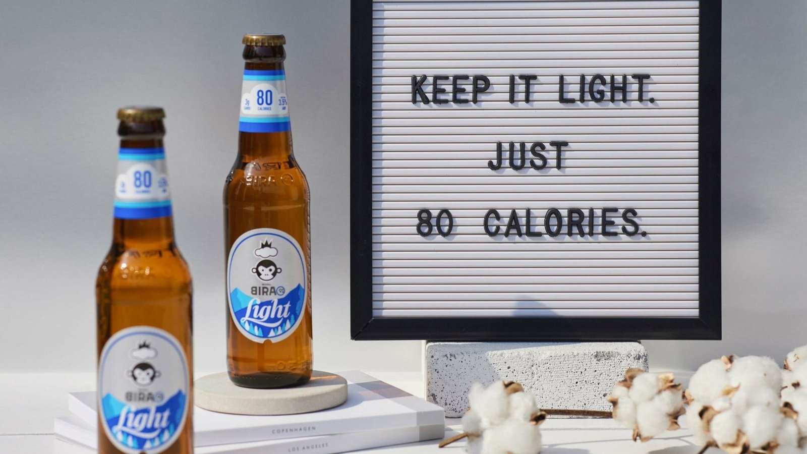
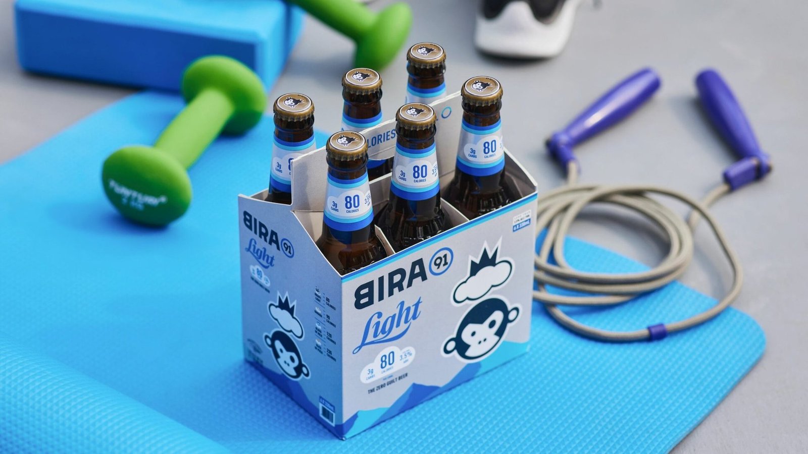
Photography built around the active life the product was made for.

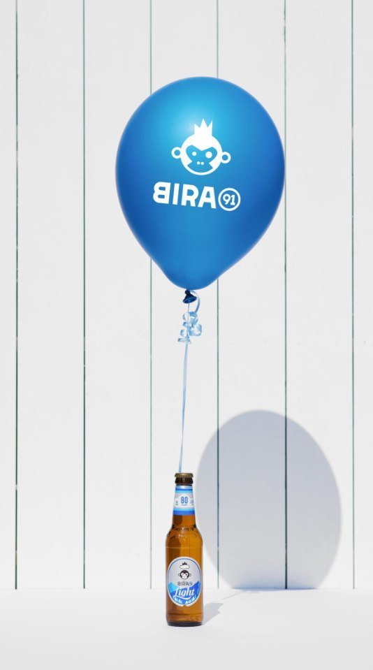


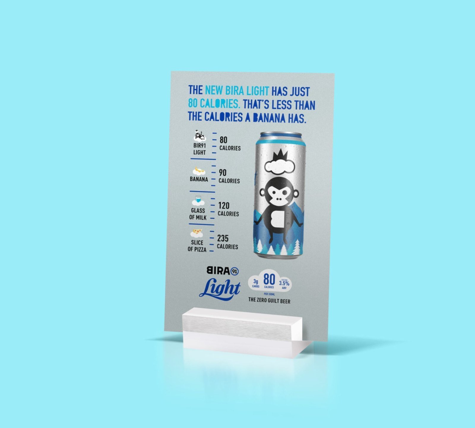
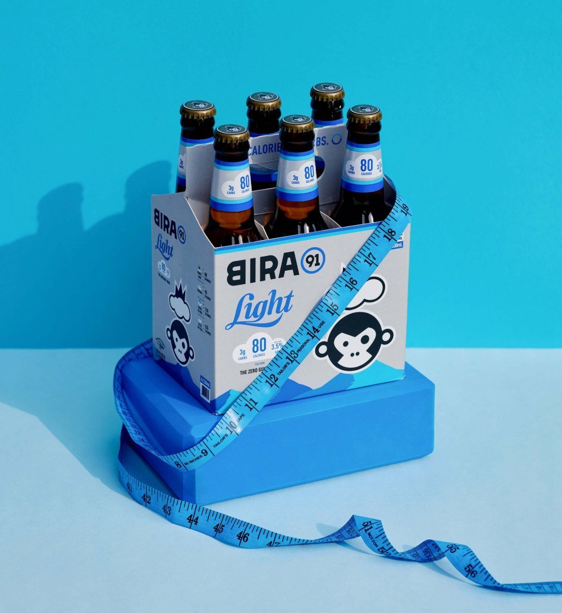
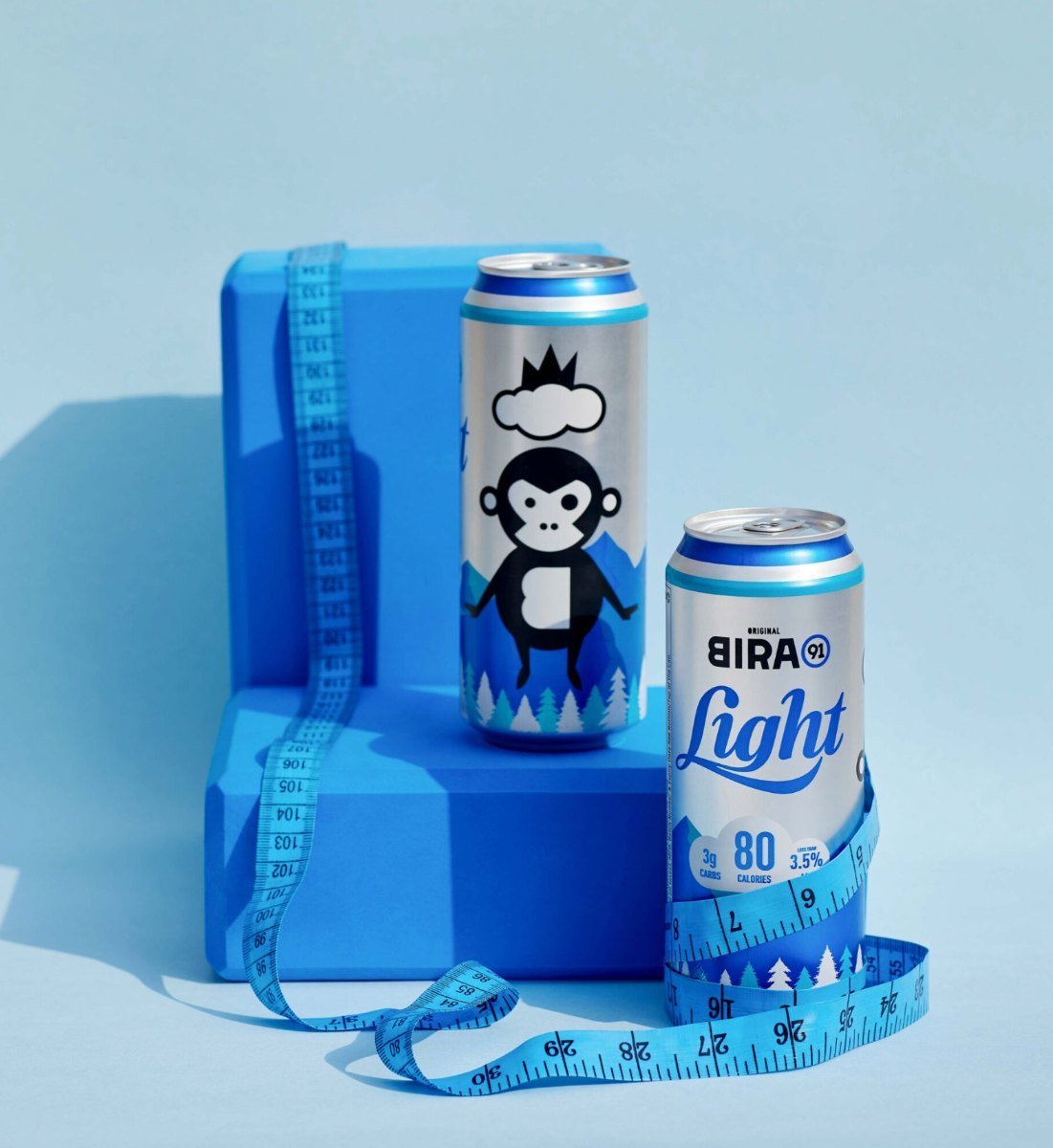
A light beer repositioned around one provable promise.
The pack, the positioning and every piece of communication now lead with the same calorie and carb promise.
Want a brand that sells itself on the shelf?
Book a Growth AuditRama eiko
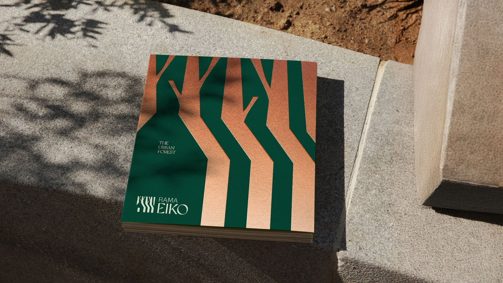
Raipur's first urban forest, named for splendour and eco.
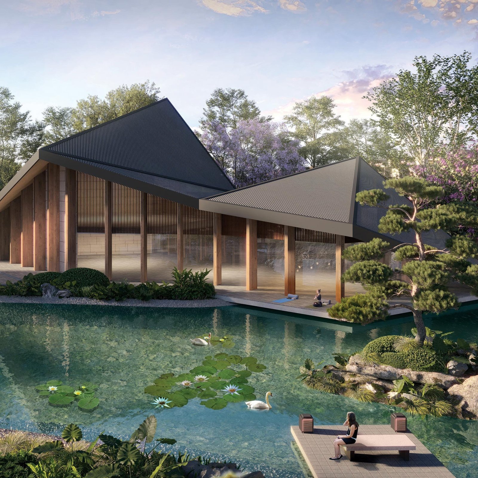
Rama Group needed a brand for a 50-acre residential sanctuary with seven acres of biodiversity set aside. We built the name, the positioning and the launch communication that reframed luxury around calm, sustainability and connection to nature.
Acres of urban forest sanctuary.
Acres set aside for biodiversity.
Offerings: Plots & Villas, Luxury Floors, Eiko Street.
Name holding luxury and nature in one word.
A land parcel that could become a lifestyle brand.
Rama Group came to us with a 50-acre site in Shankar Nagar, Raipur, and a conviction that the project should lead with its forest, not its finishes. Seven acres were already set aside for biodiversity. The land was ready. The brand was the gap.
The brief was to find one name that could carry three offerings and one platform that could translate from brochure to billboard without losing its calm.
A category where luxury and nature compete for airtime.
The market treats luxury and nature as different pitches.
Either a tower with a view, or a villa with a lawn. Few projects hold both at the same time. We needed a name and platform that could.
Three offerings, one site, one brand to connect them.
Plots and villas, luxury floors, and Eiko Street for retail. Each line needs its own identity, without any drifting from the parent.
Raipur has not seen an urban forest category before.
First-mover means the brand itself has to teach the category. The platform had to lead with meaning, so the city understood what Eiko stood for.
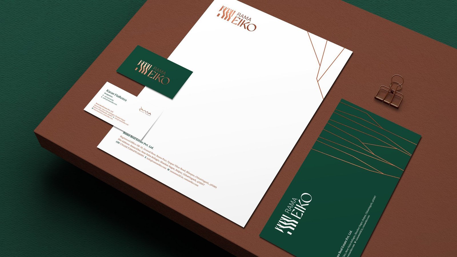
One monogram, three offerings.
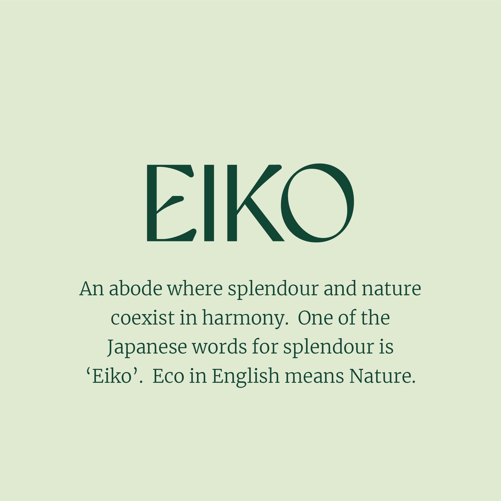
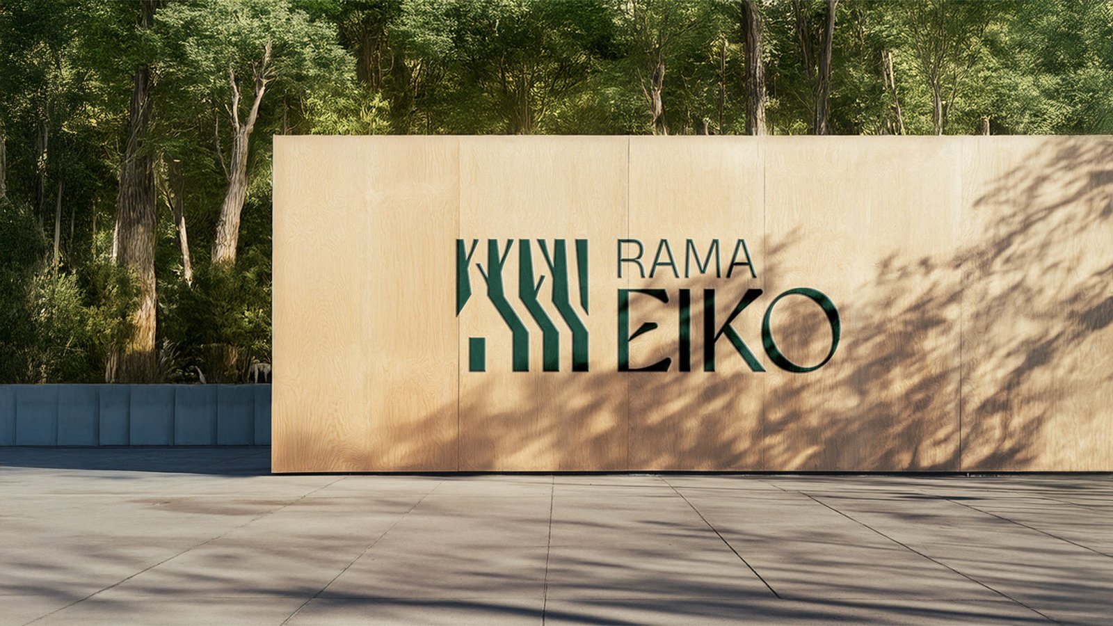
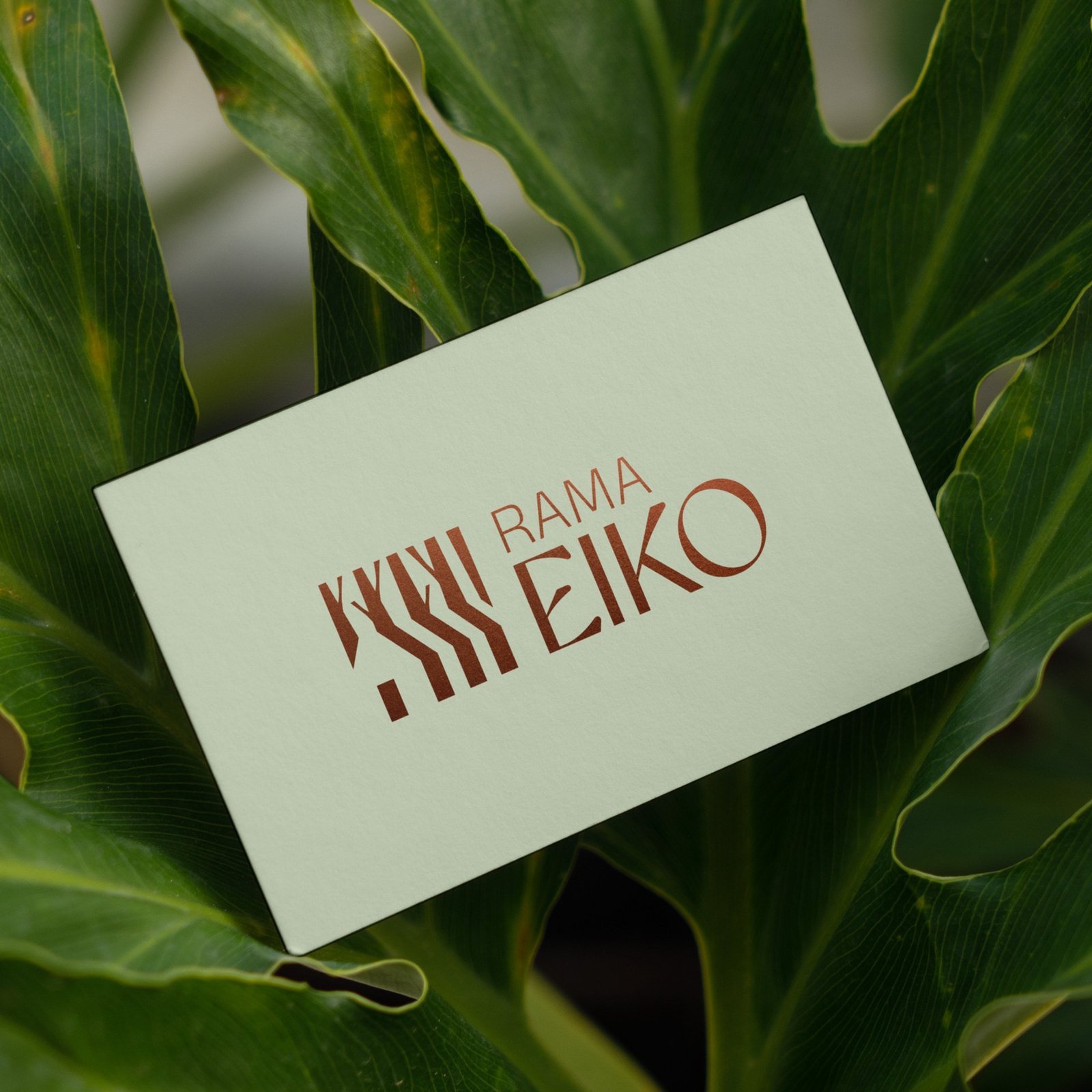
The name: Eiko
Eiko is a Japanese word for splendour, and it carries a natural echo of "eco". One word holds both halves of the promise: luxury and nature. The name is grounded in a real product truth: seven of the project's 50 acres are set aside for biodiversity.
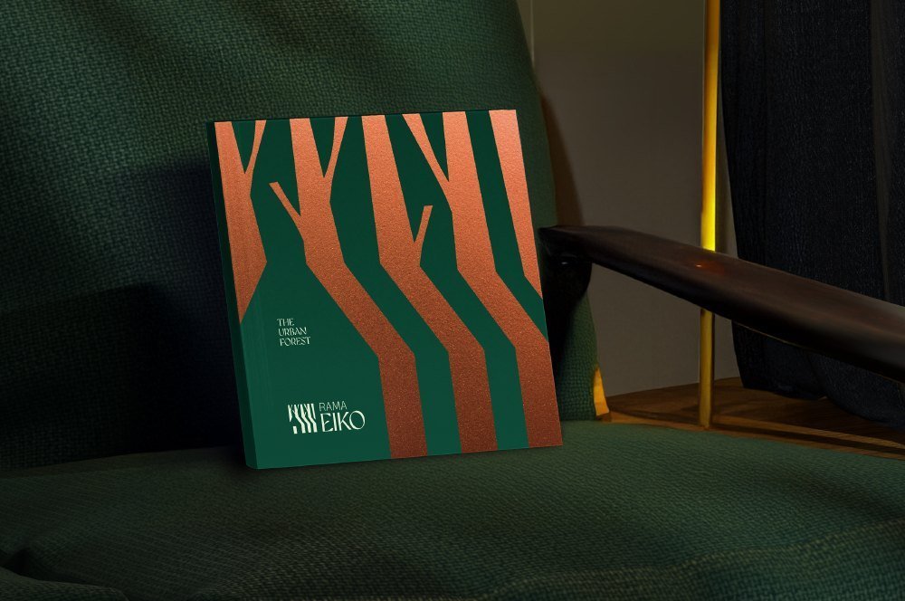
The positioning: The Urban Forest
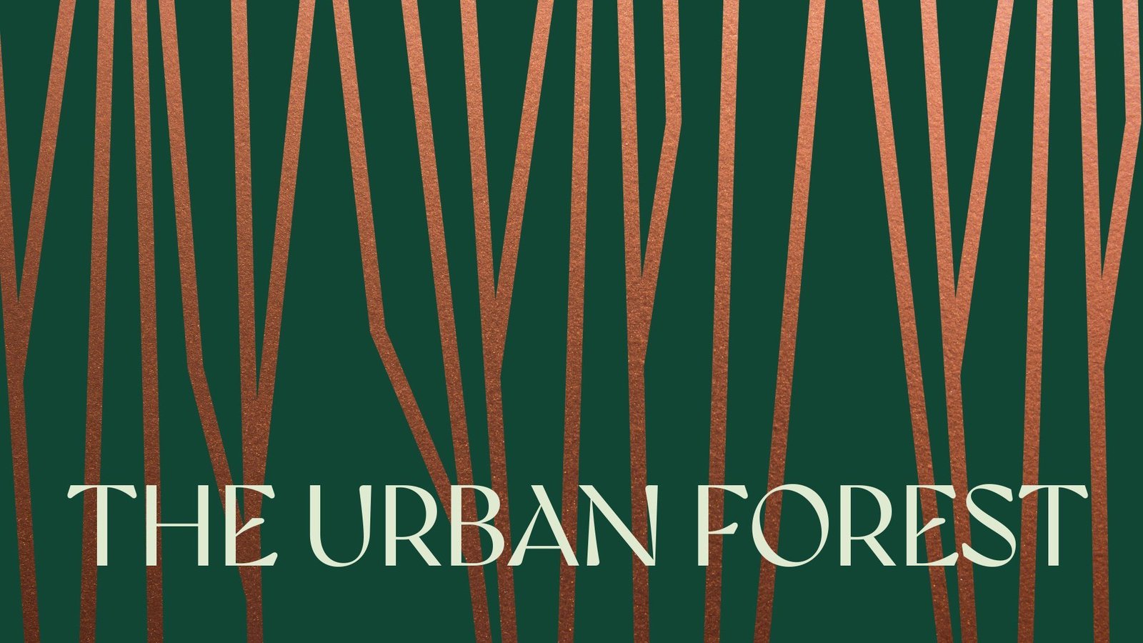
Raipur's first urban forest sanctuary. The platform draws on Japanese minimalism and Shinrin-yoku, the practice of forest bathing. Luxury is reframed around calm, sustainability and connection to nature.
Brand architecture: three offerings under one mark
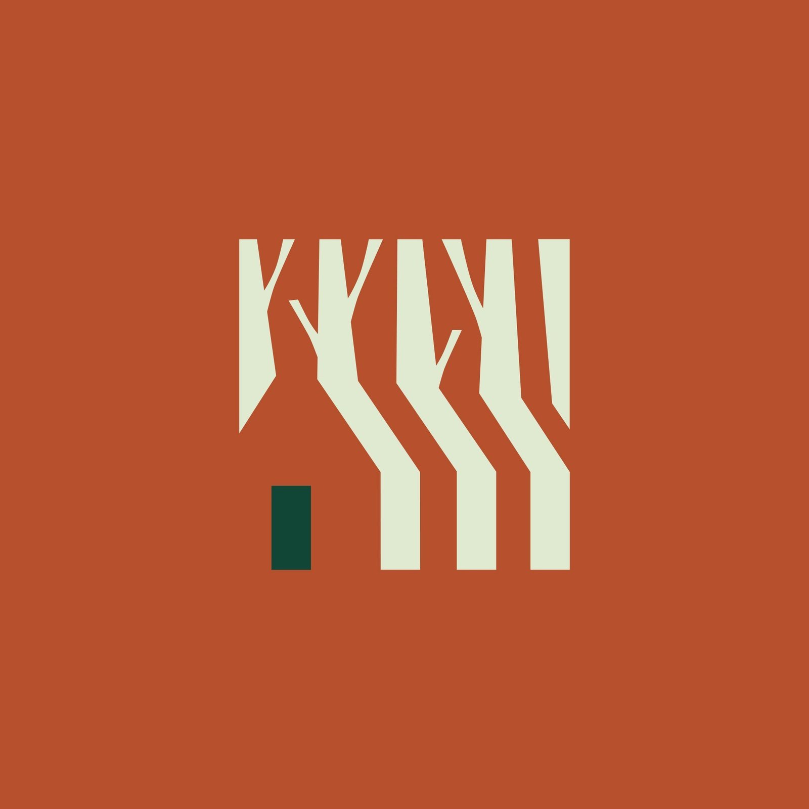
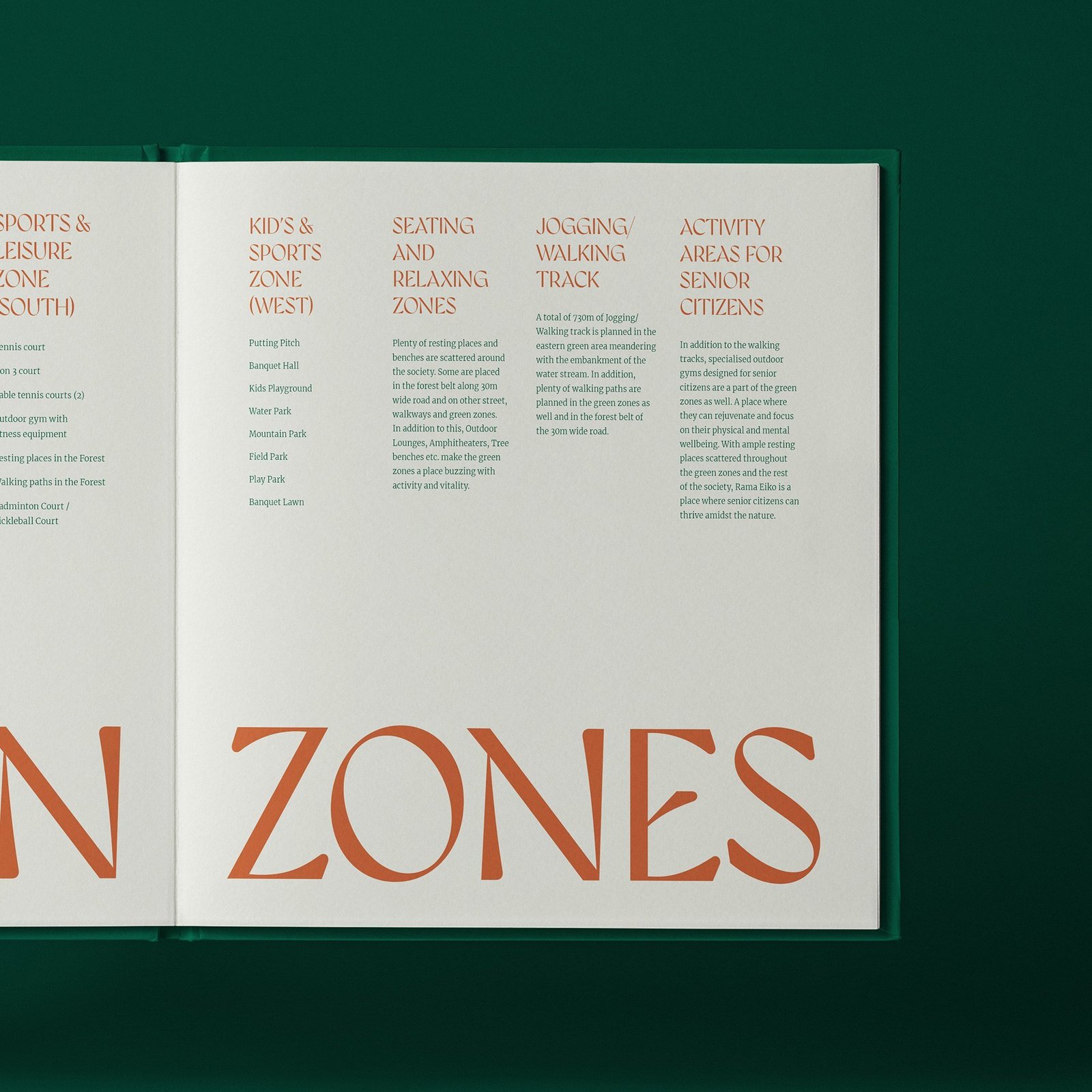
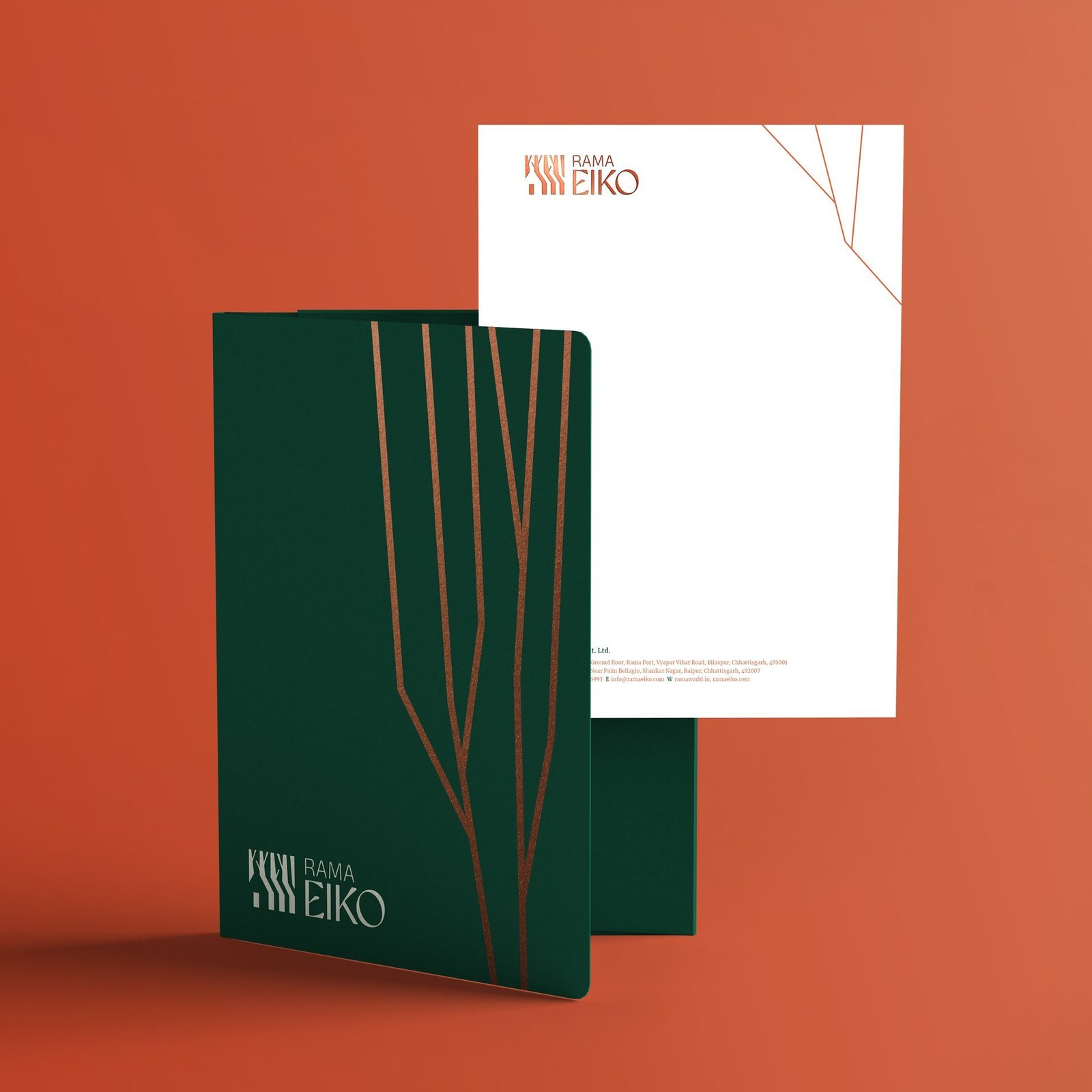
The tree-trunk monogram flexes into a family of marks. Plots & Villas starts from the forest floor. Luxury Floors spans 1.86 acres of greens. Eiko Street is the retail destination inside the forest.
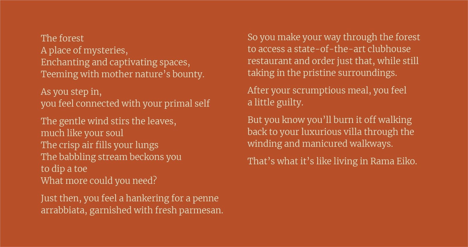
Launch communication
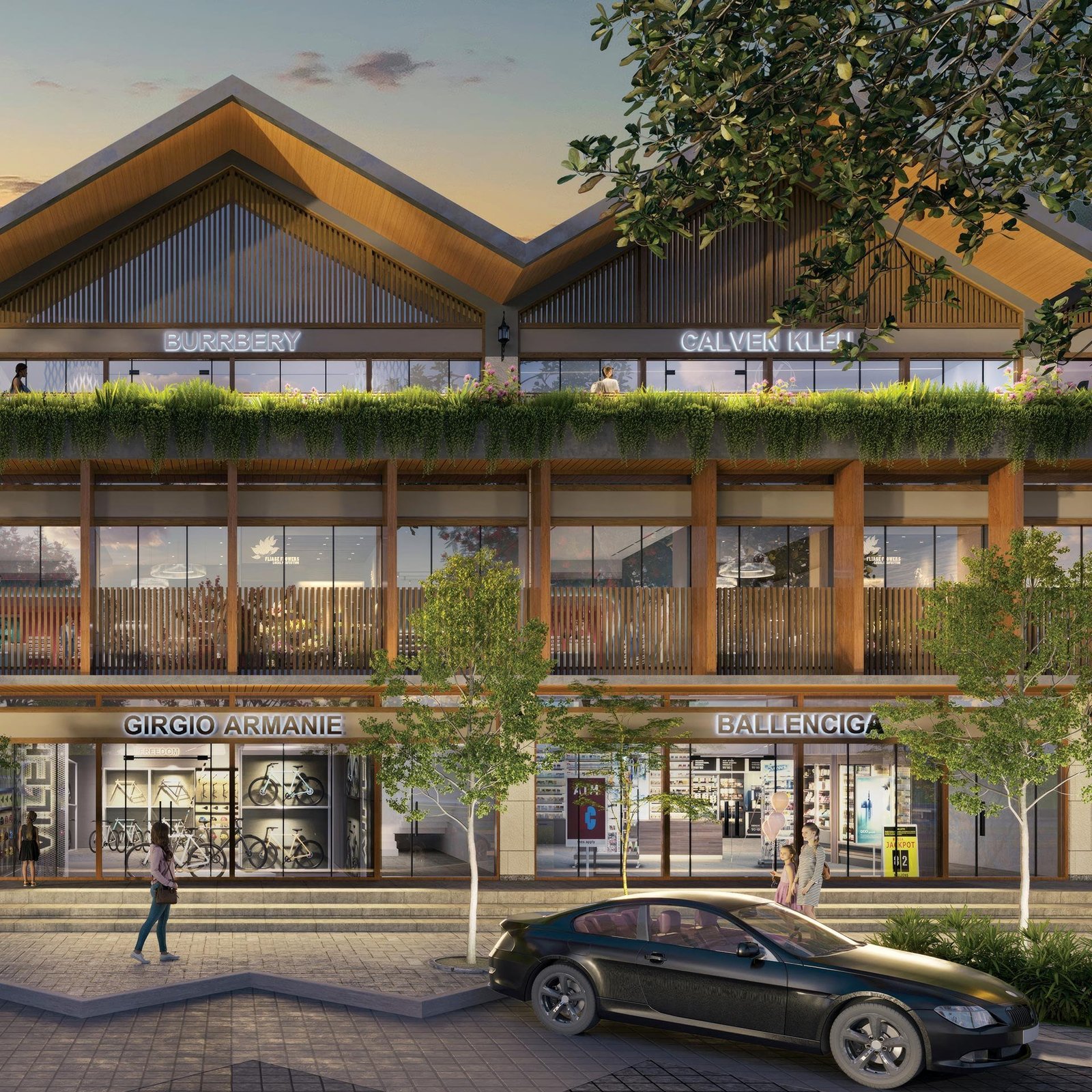
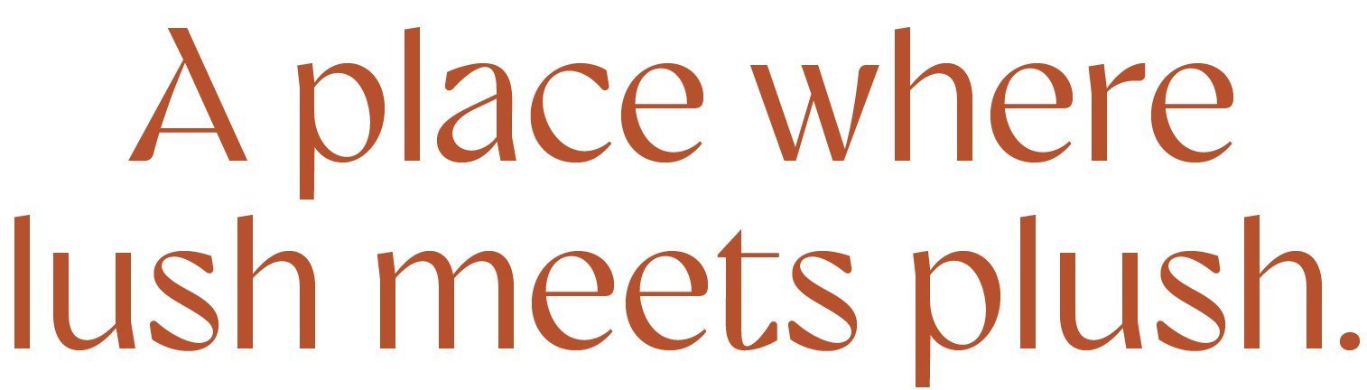
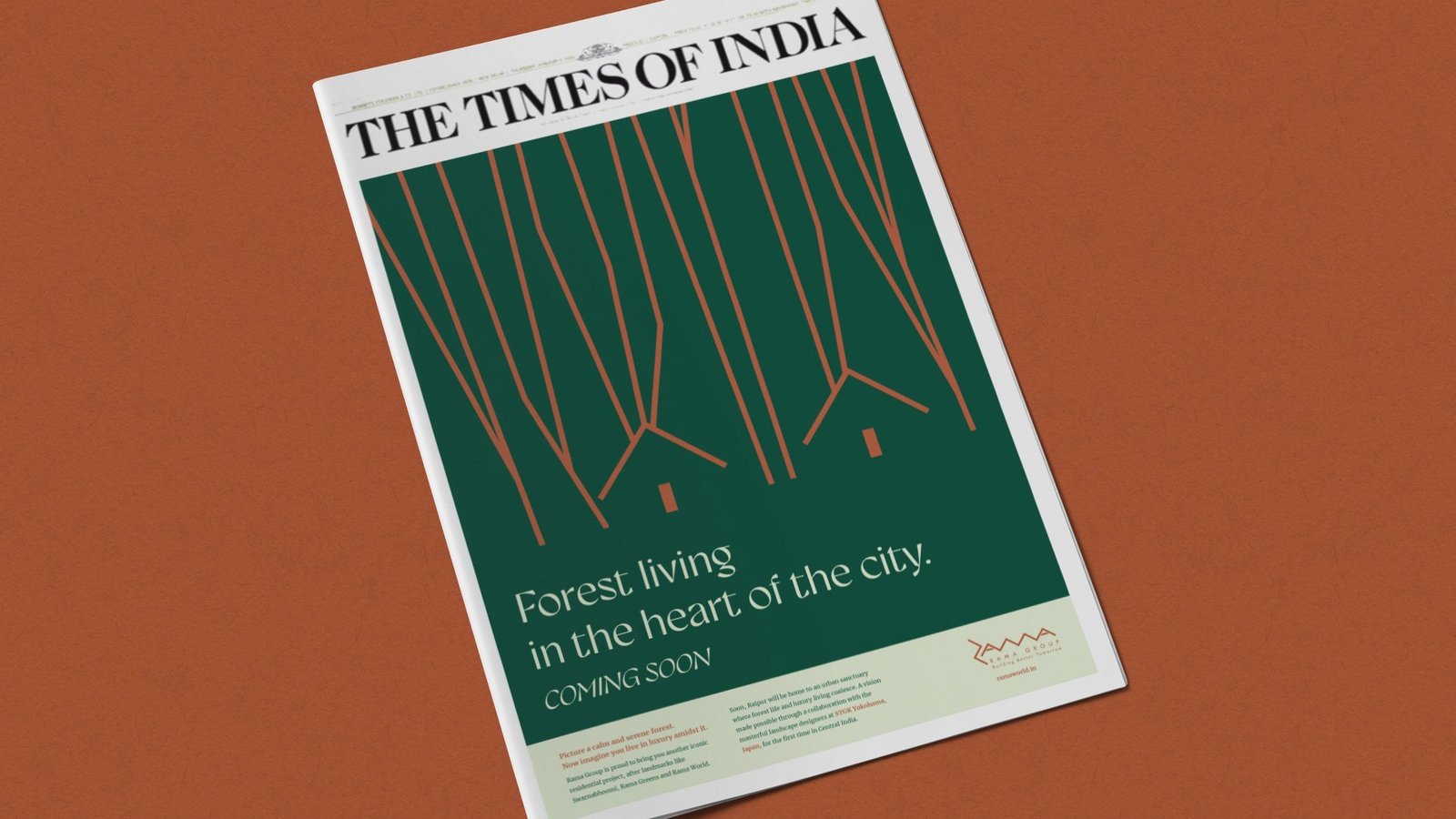
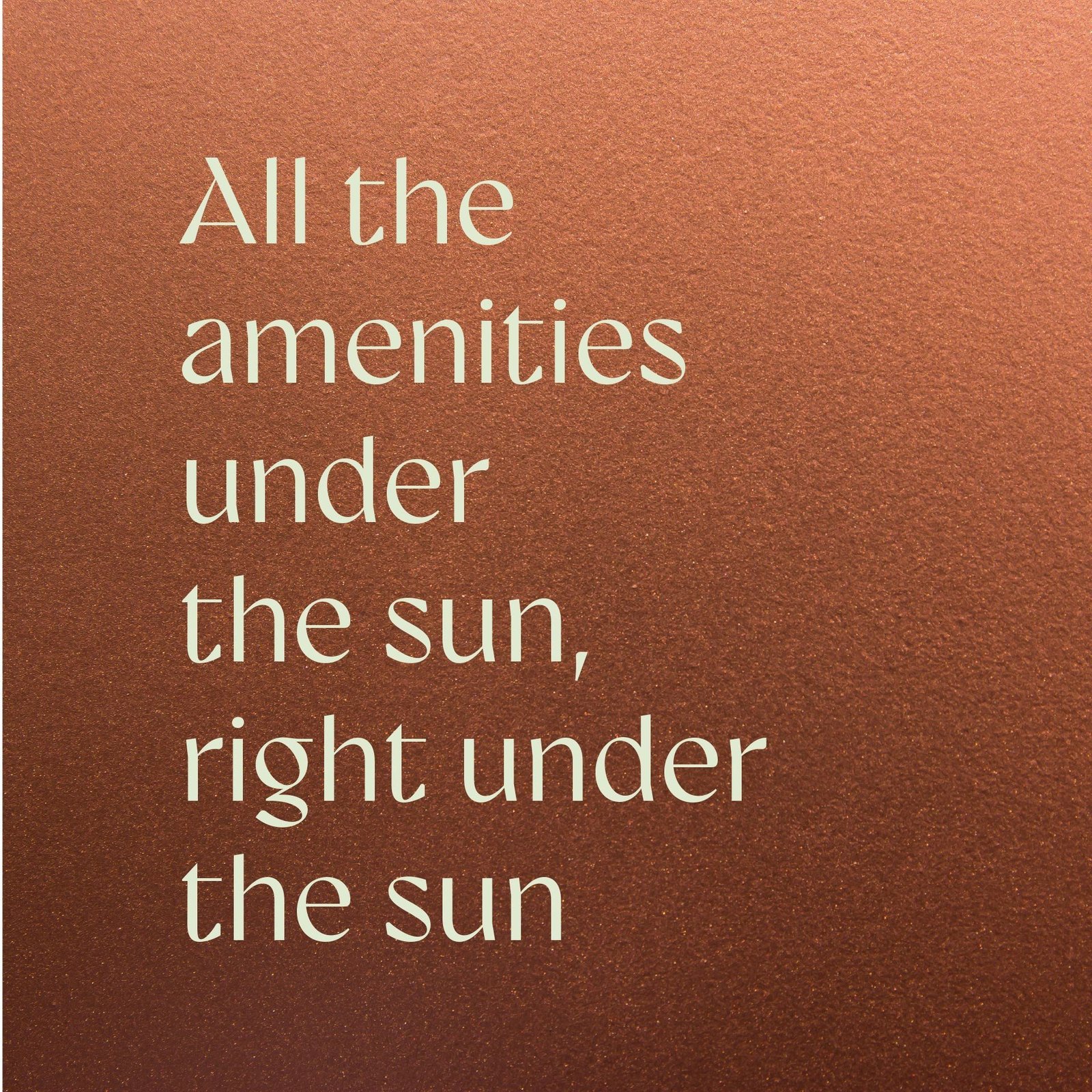
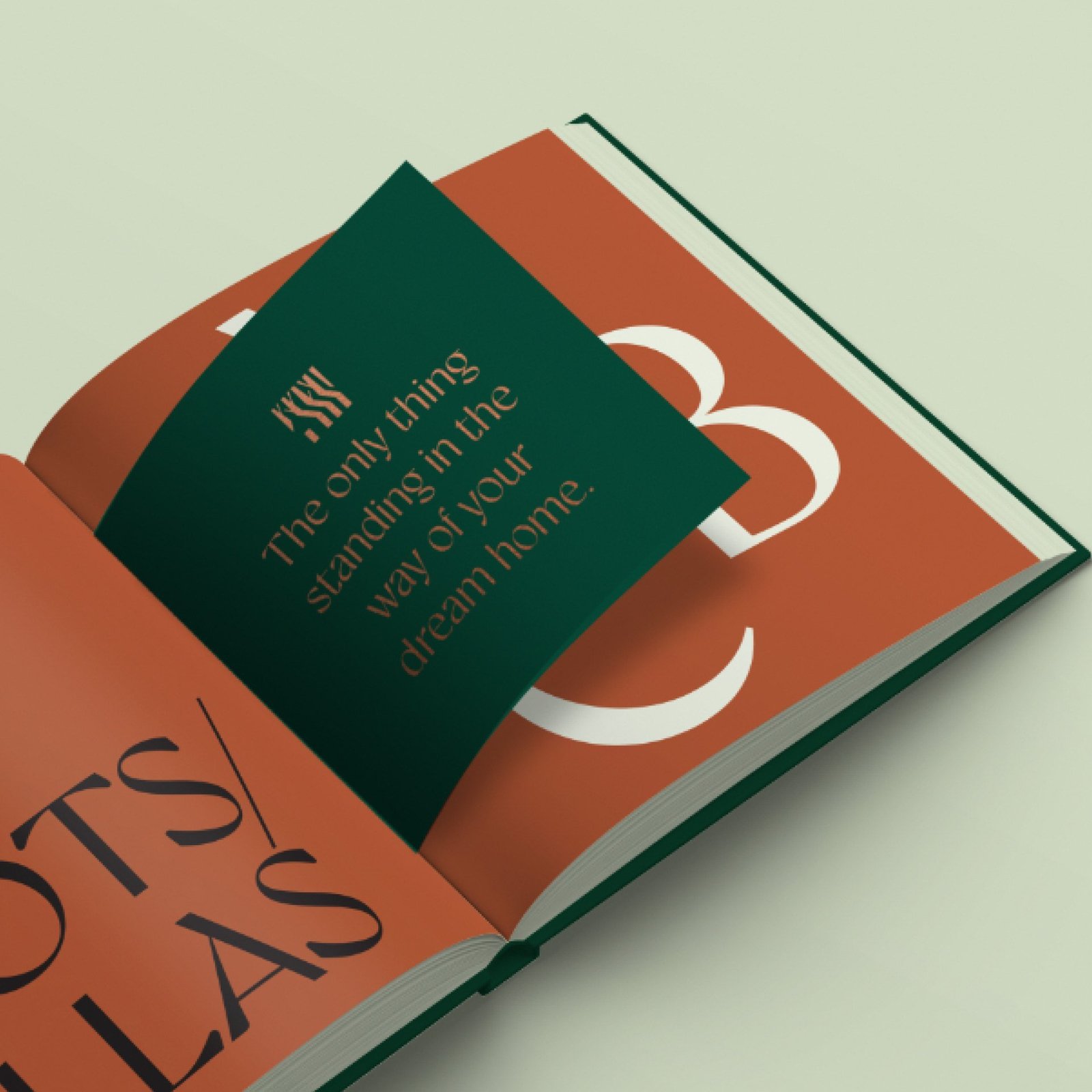
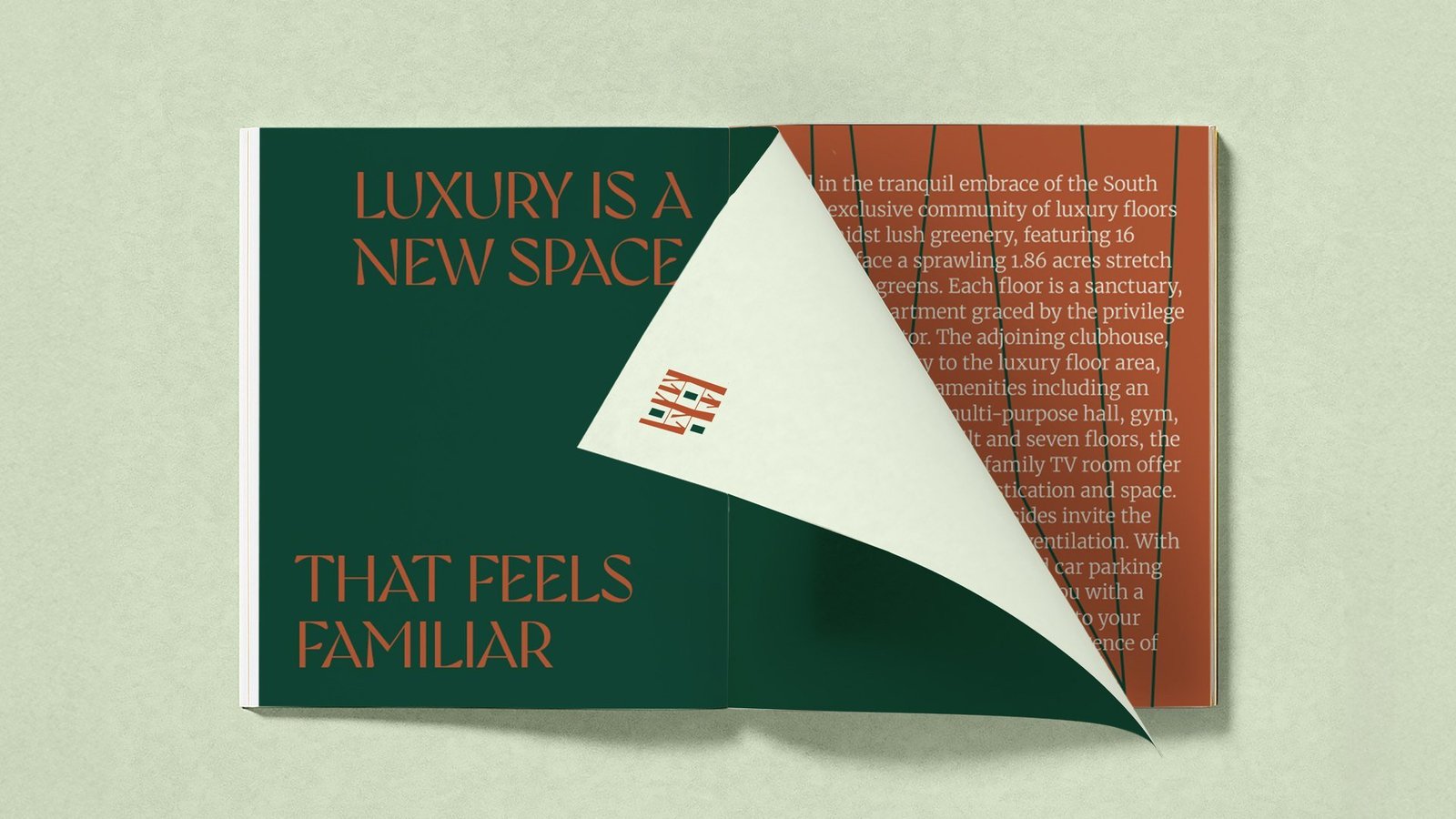
Across advertising, out of home and brochure, the platform line leads. A place where lush meets plush. All the amenities under the sun, right under the sun. One voice, three product lines, one city to teach.
A single system, carried across every touchpoint.
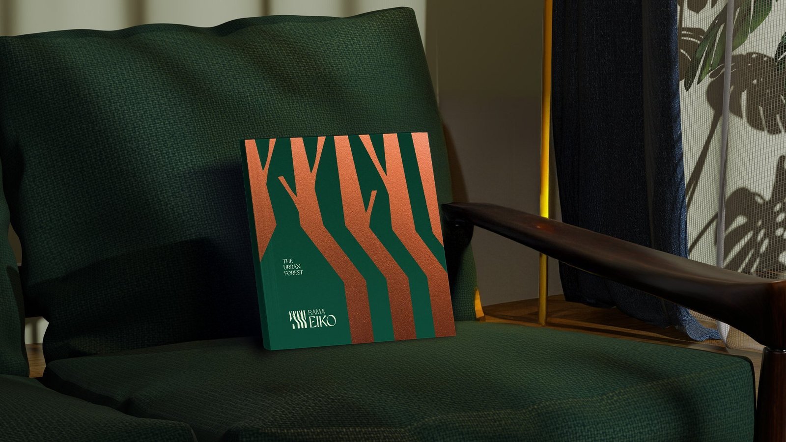
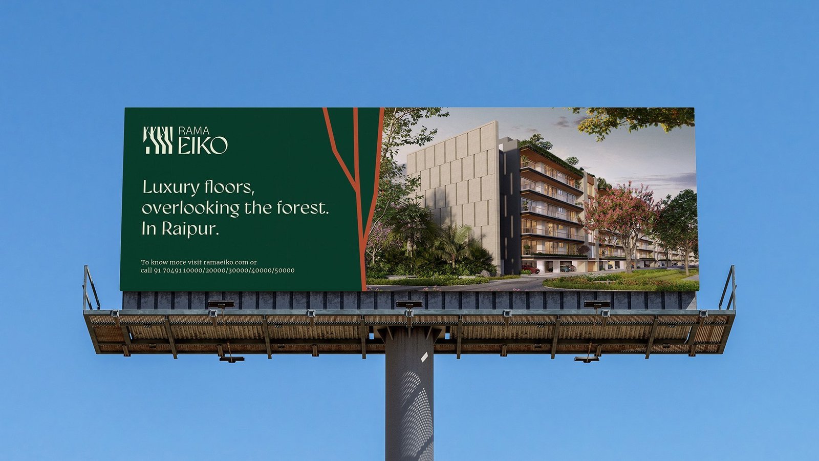
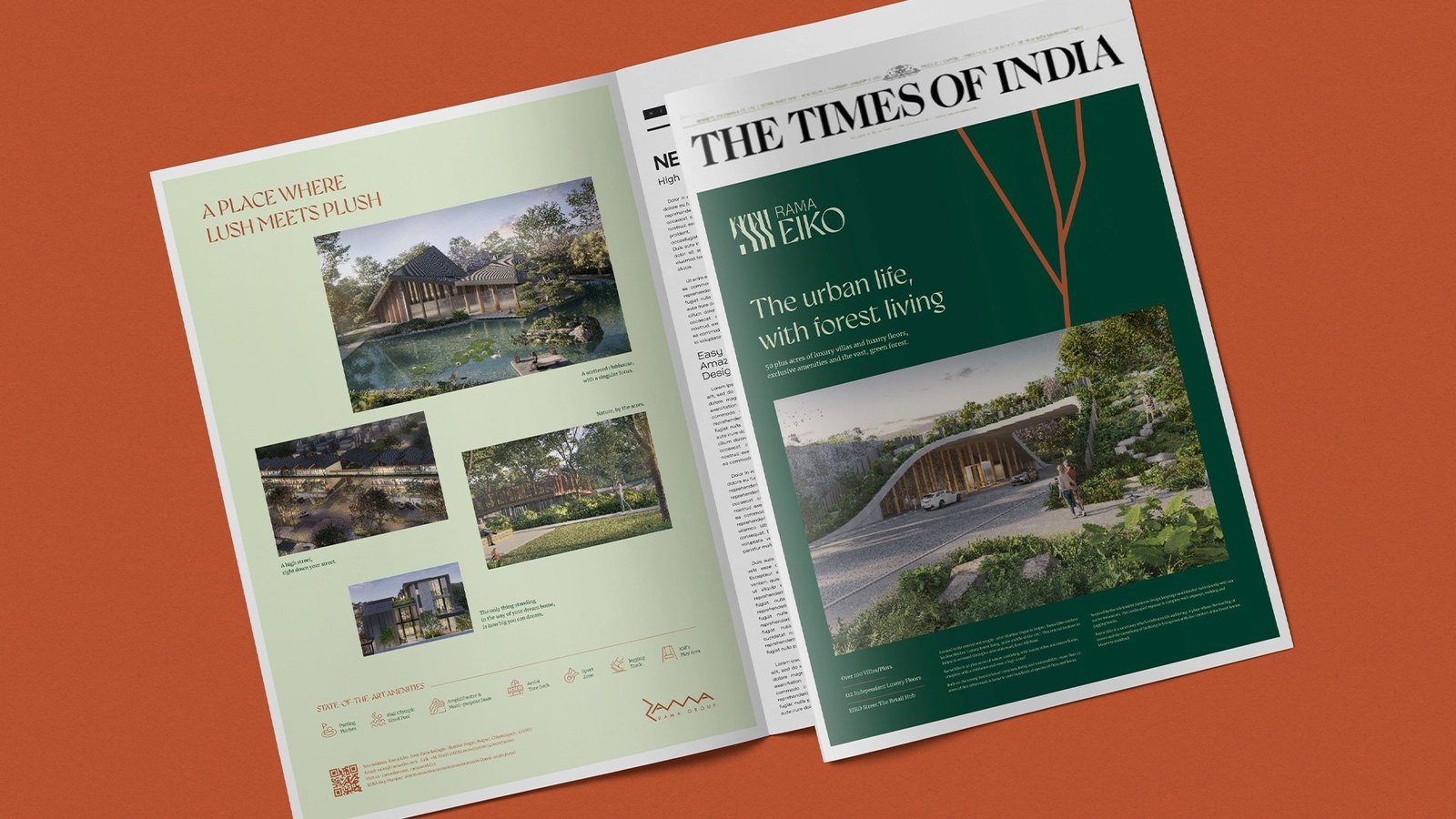
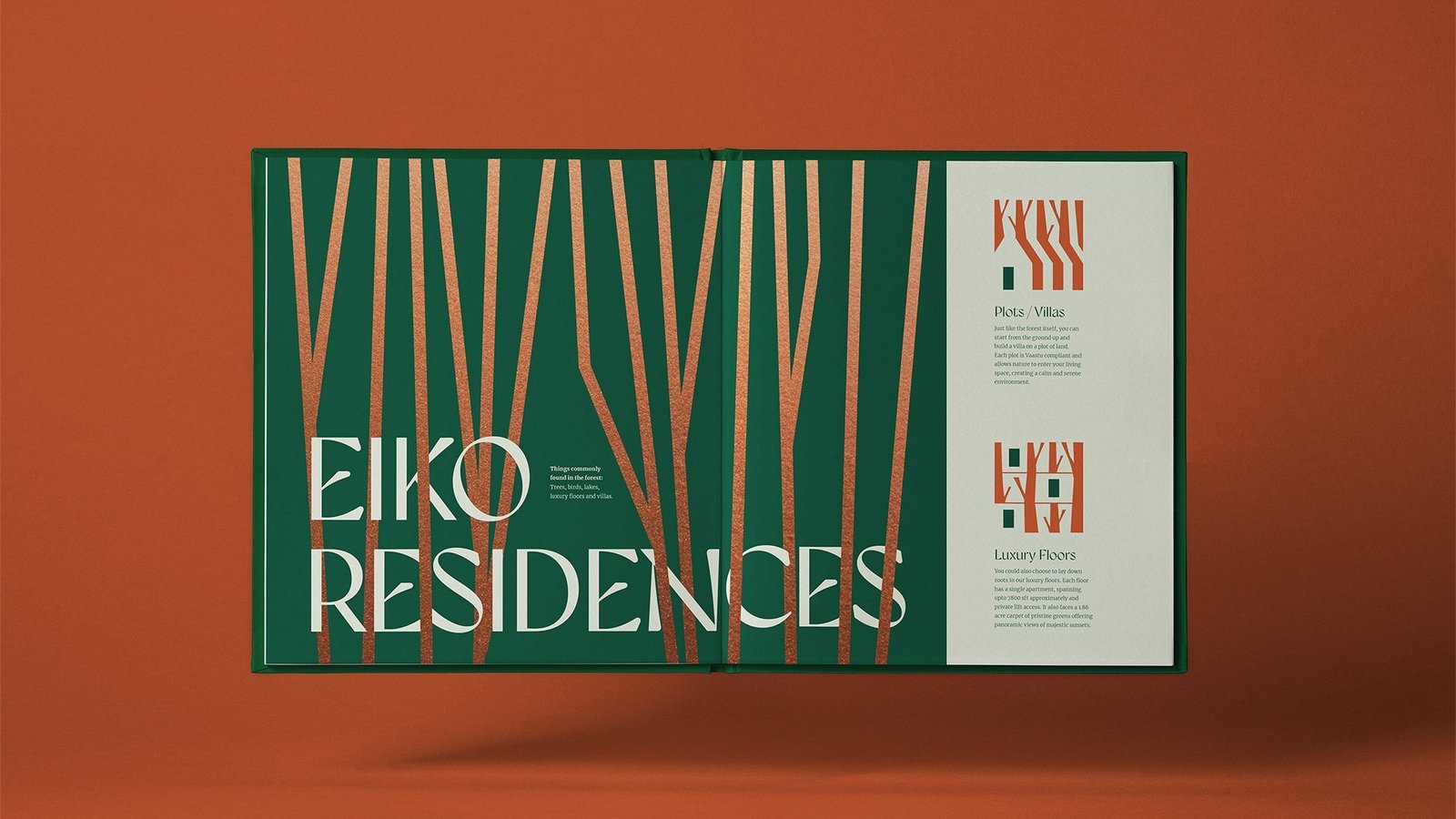
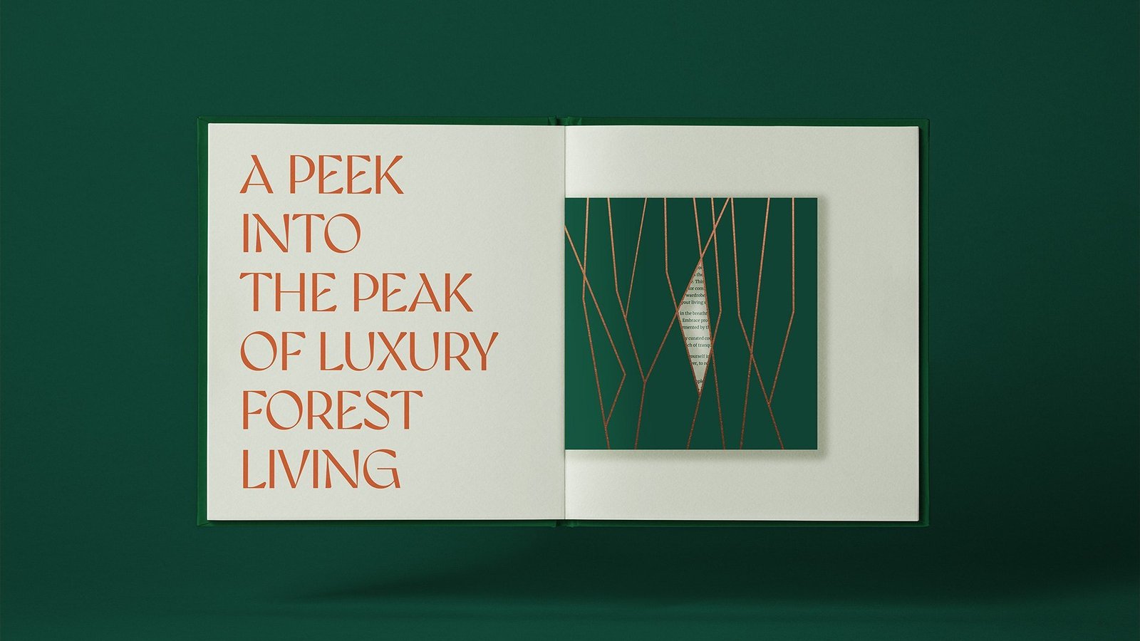
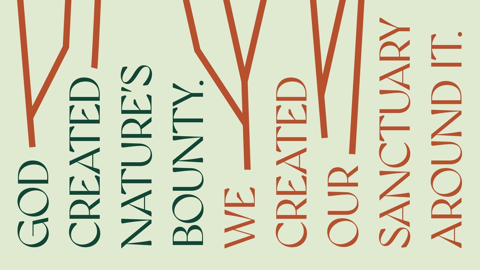
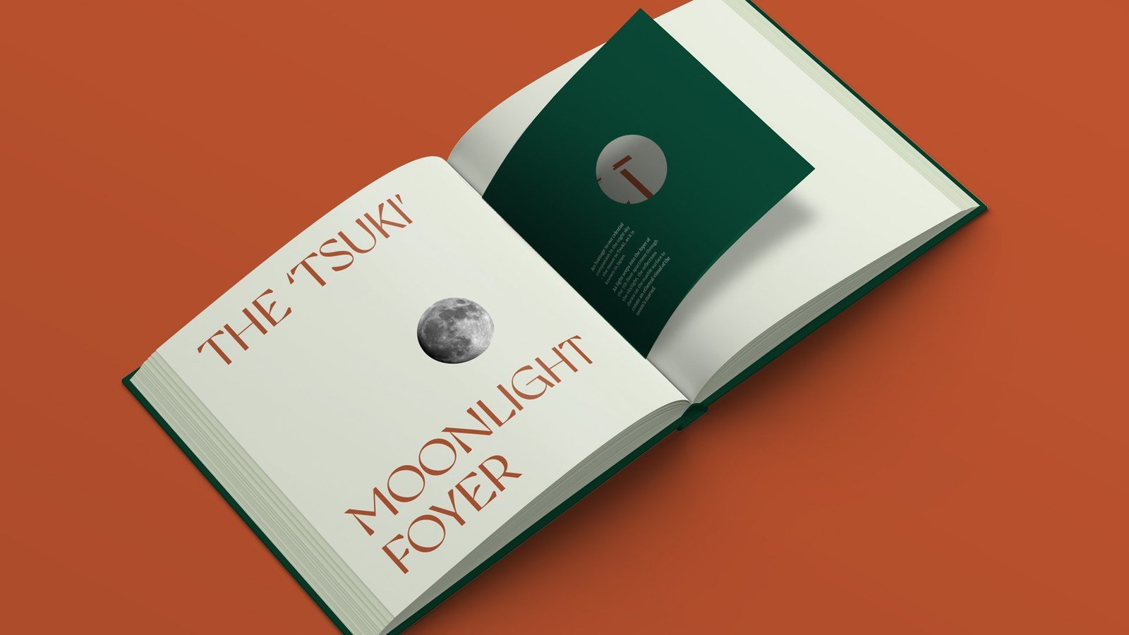

From a project brief to a brand with voice.
Have a project worth a brand of its own?
We find the one truth about the product that nobody else is leading with, name it, and build the system that carries it from brochure to hoarding.
See the full Real Estate practice.
One Golden Mile
A boutique address, built for stature and growth.
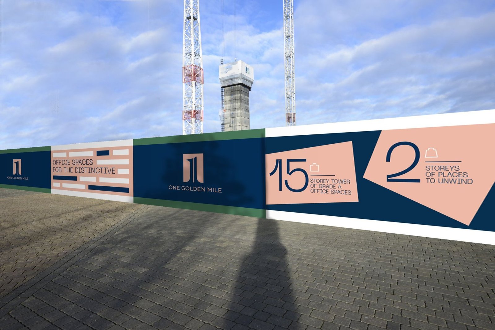
A mixed-use office and retail development in Kokapet, the premier business district of West Hyderabad. We named it, built the identity, and designed the editorial that carried the brand from brochure cover to site hoarding.
Acre plot, boutique scale by design.
Sides open, light and air across the floor plate.
Parking basements, built for scale of use.
Storeys high, with rose-gold detailing throughout.
A commercial address for big business and ambitious startups.
Kokapet is the premier business district of West Hyderabad, and the field is crowded. One Golden Mile had to be both quietly boutique and visibly ambitious: the address a founding team would pick to signal where they are headed.
The product gave us the raw material. A two-acre plot, three sides open, four parking basements, fifteen storeys. The brand had to turn those numbers into a name, a mark and an editorial system that read as a destination.
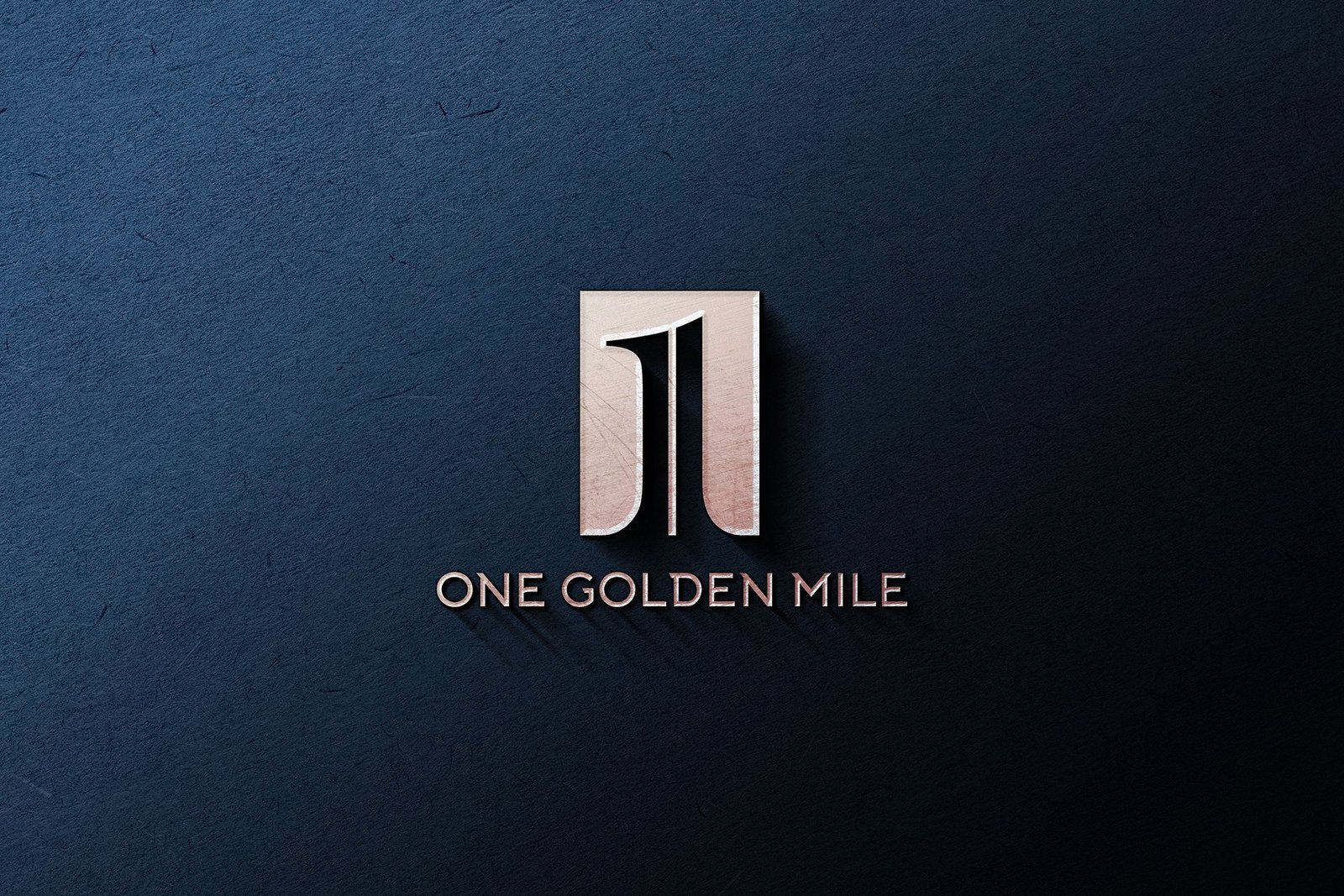
A boutique address, in a district built for scale.
The project came to us without a name.
No name means no identity, no brochure, no hoarding story. The naming had to come first and set up everything downstream in one word.
Small plot, big ambition.
Two acres in a district of larger plates. The brand had to argue that the address is more intentional than its neighbours, not smaller than them.
Office and retail, under one roof.
The system had to hold both tenancies. Flexible enough for a flagship retail unit downstairs, calm enough for a corporate tenant upstairs.
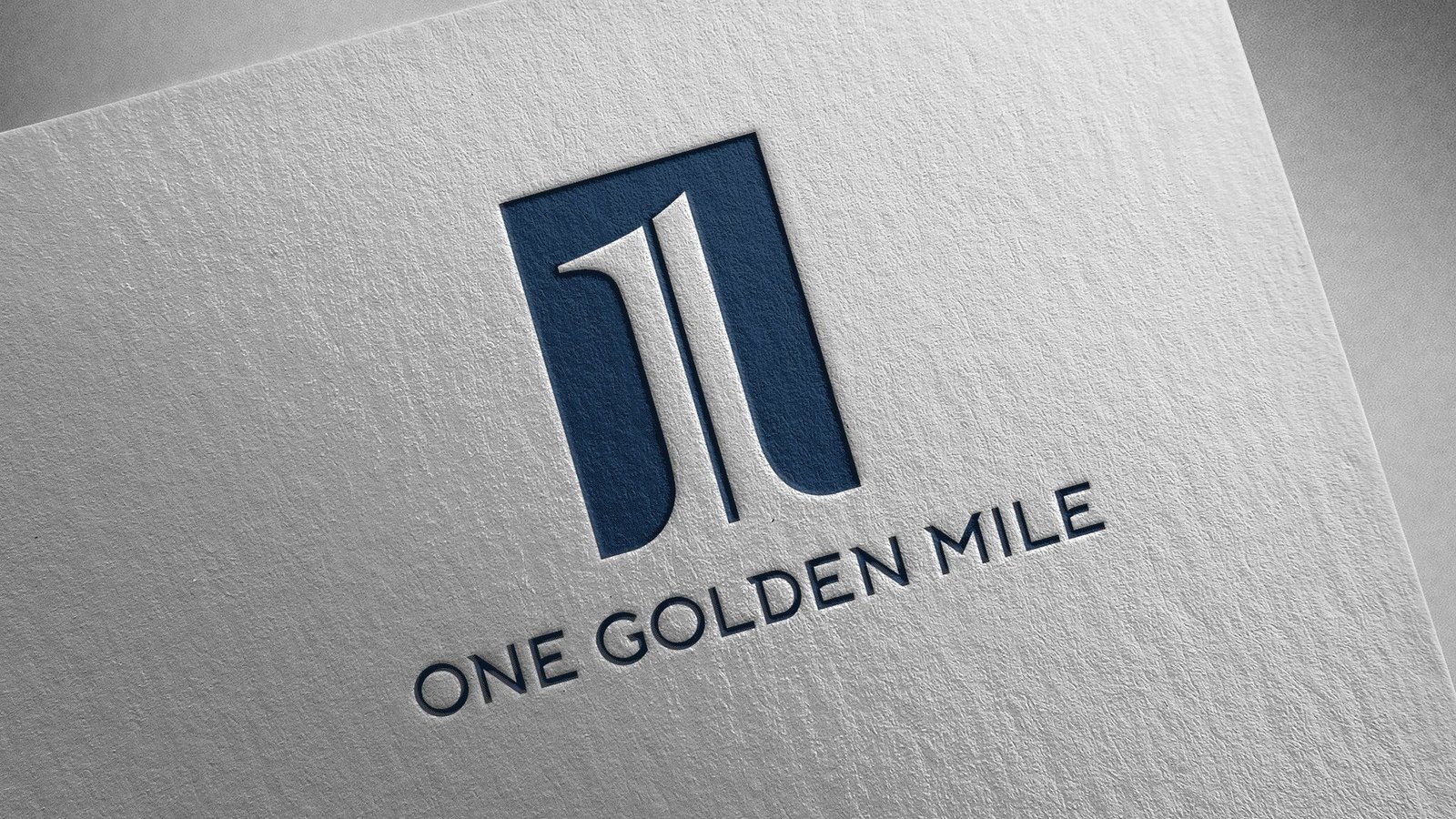
One monogram, carried from brochure cover to business card.
Naming: One Golden Mile
The name sets expectations before the brochure opens. One. Singular, boutique, intentional. Golden. The rose-gold accent that runs through the architecture. Mile. A destination, not a corner. The name does half the brand's work on its own.

Identity: a mark built to signal stature
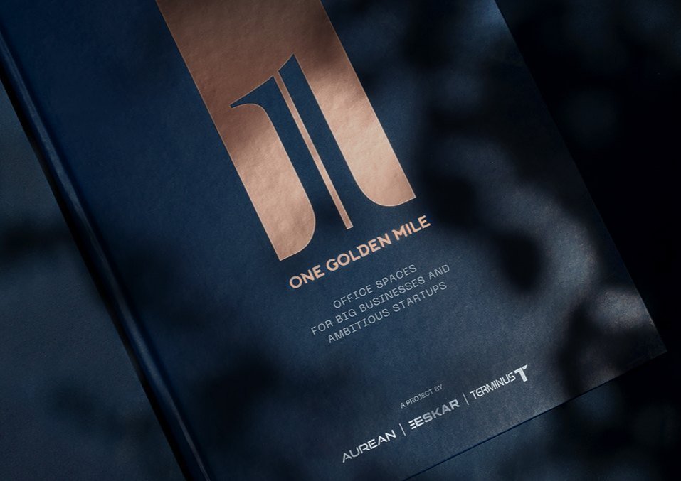
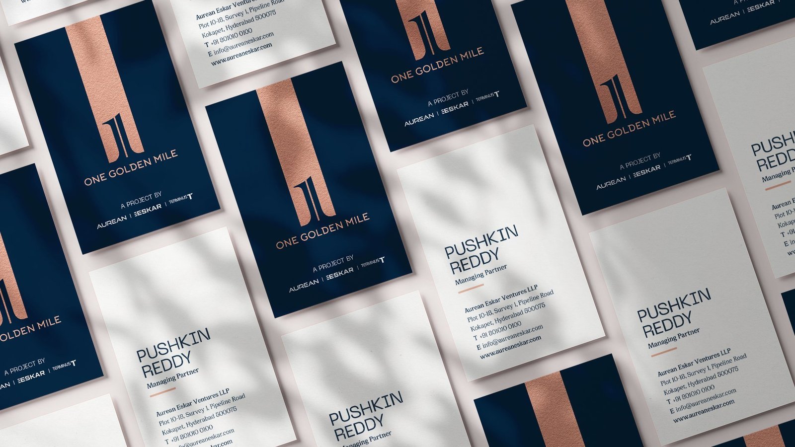
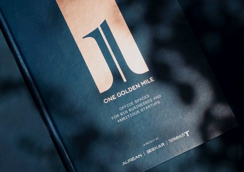
The monogram, set in rose gold on a deep navy field, rises as two vertical forms from a shared base, divided by a striking central stripe. That stripe becomes the brand's most useful asset across the entire brochure.
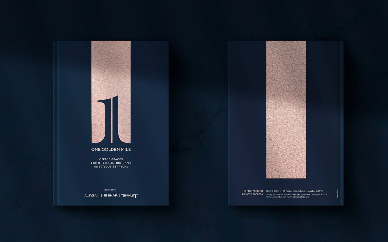
Editorial: a brochure that behaves like the building
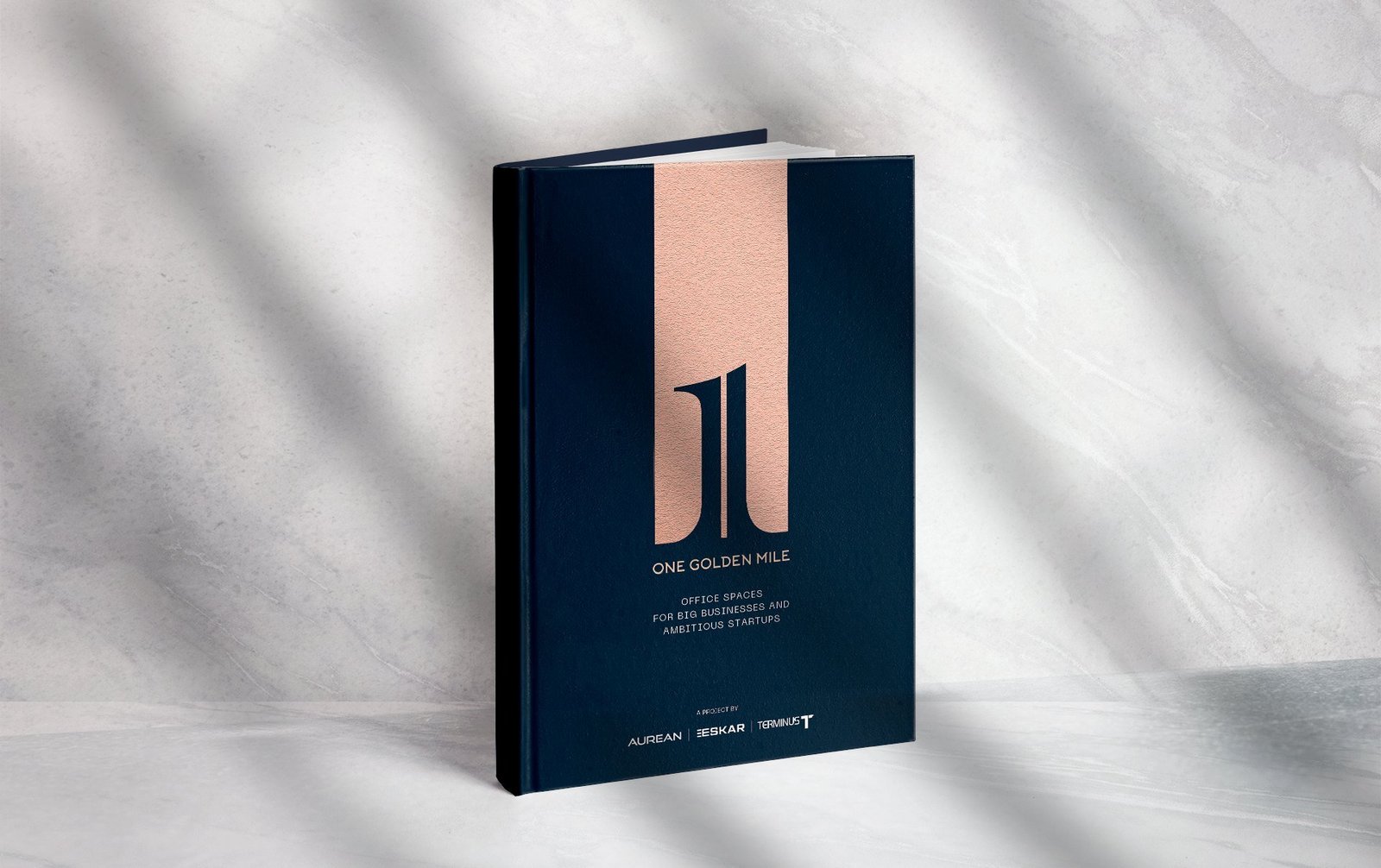
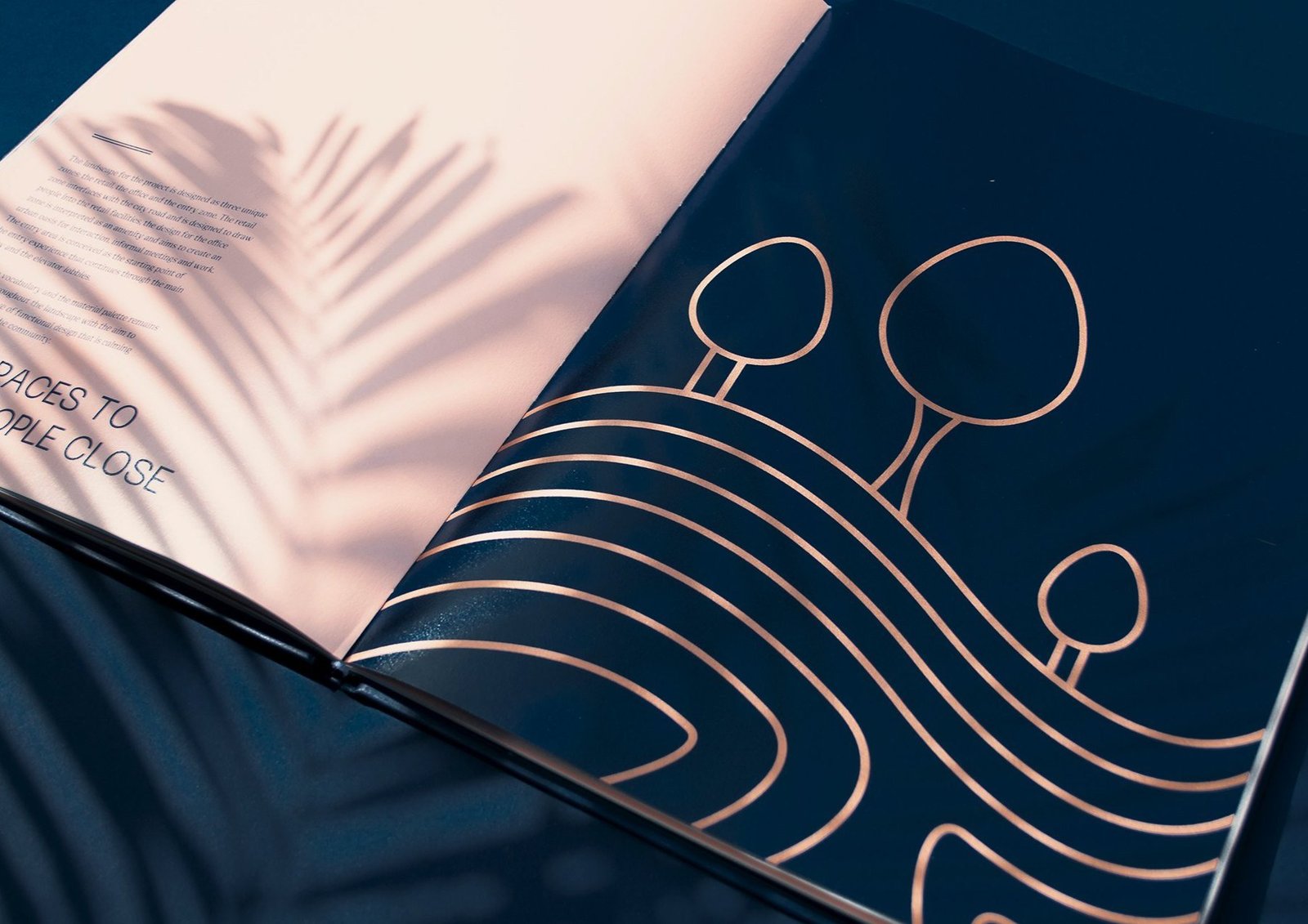
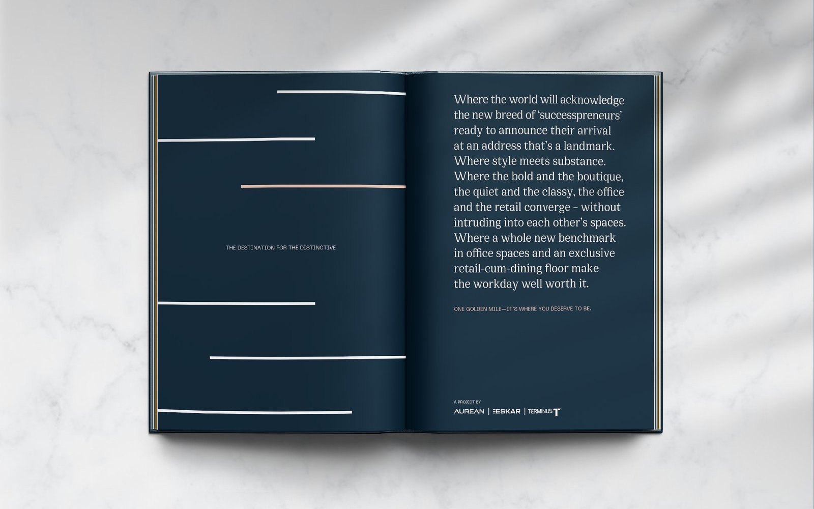
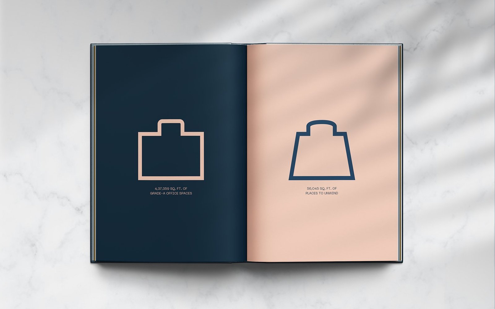
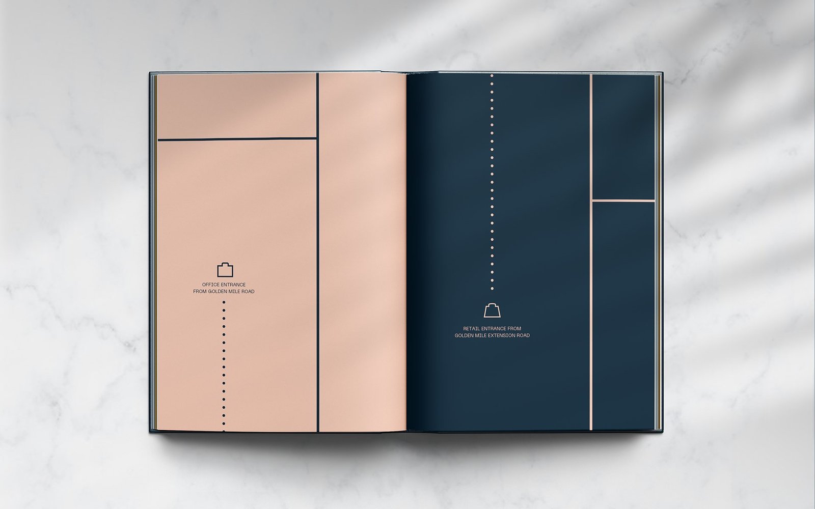
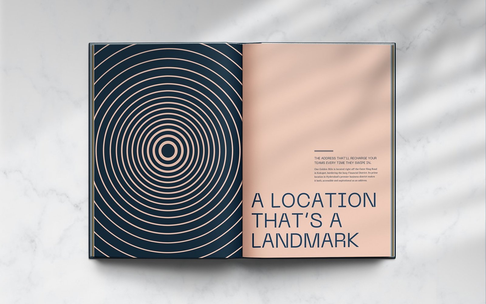
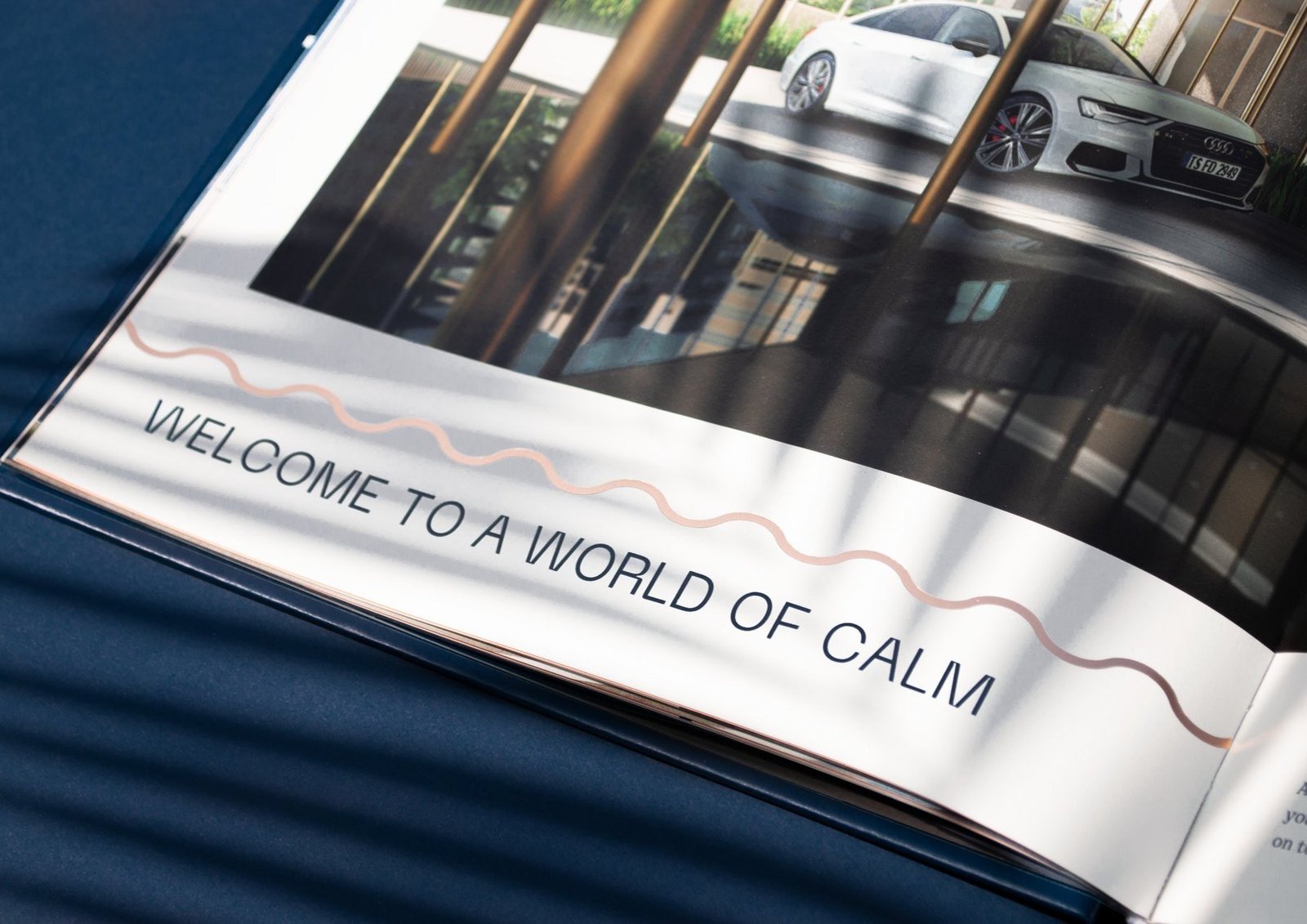
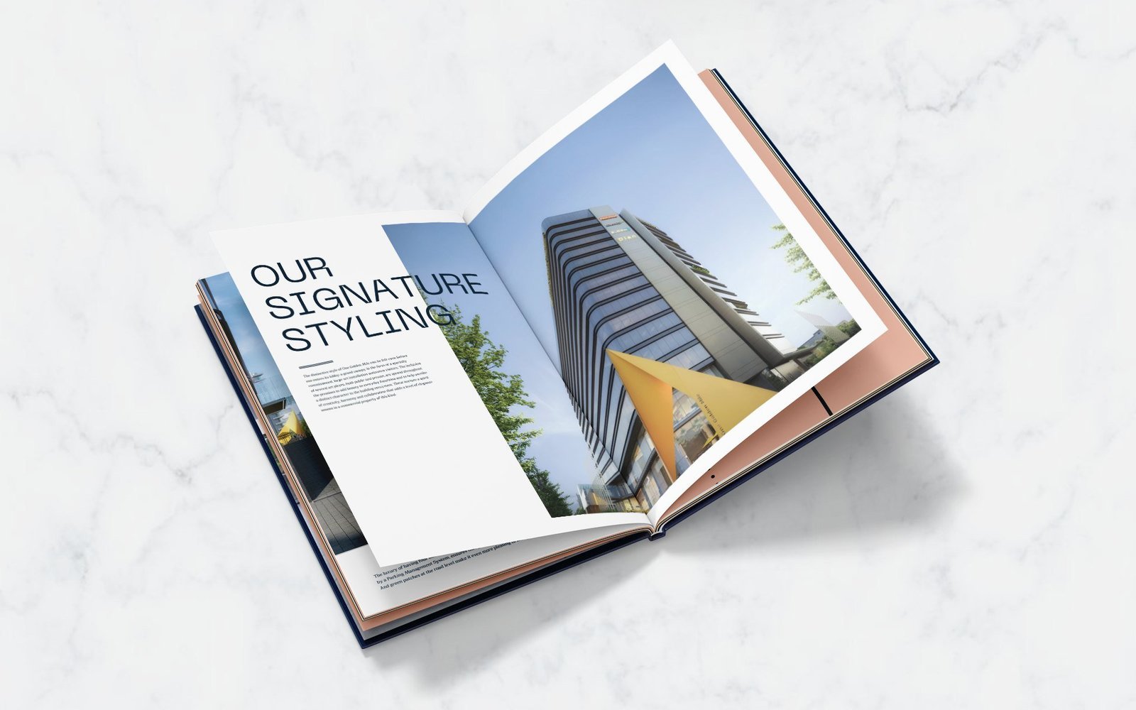
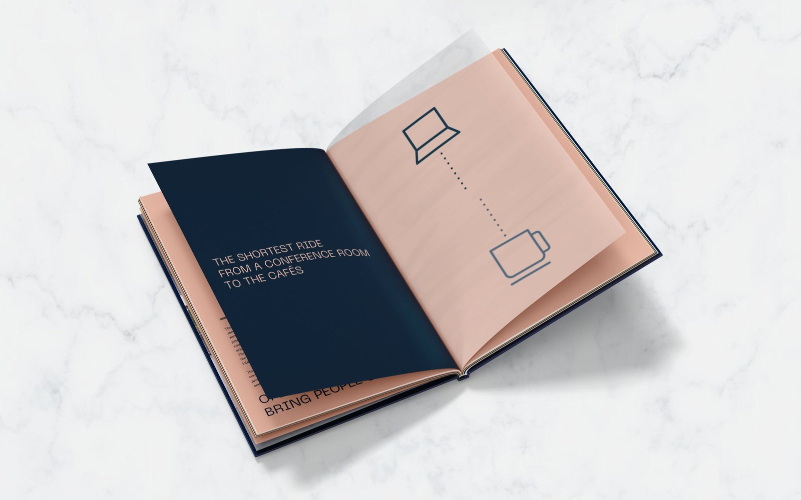
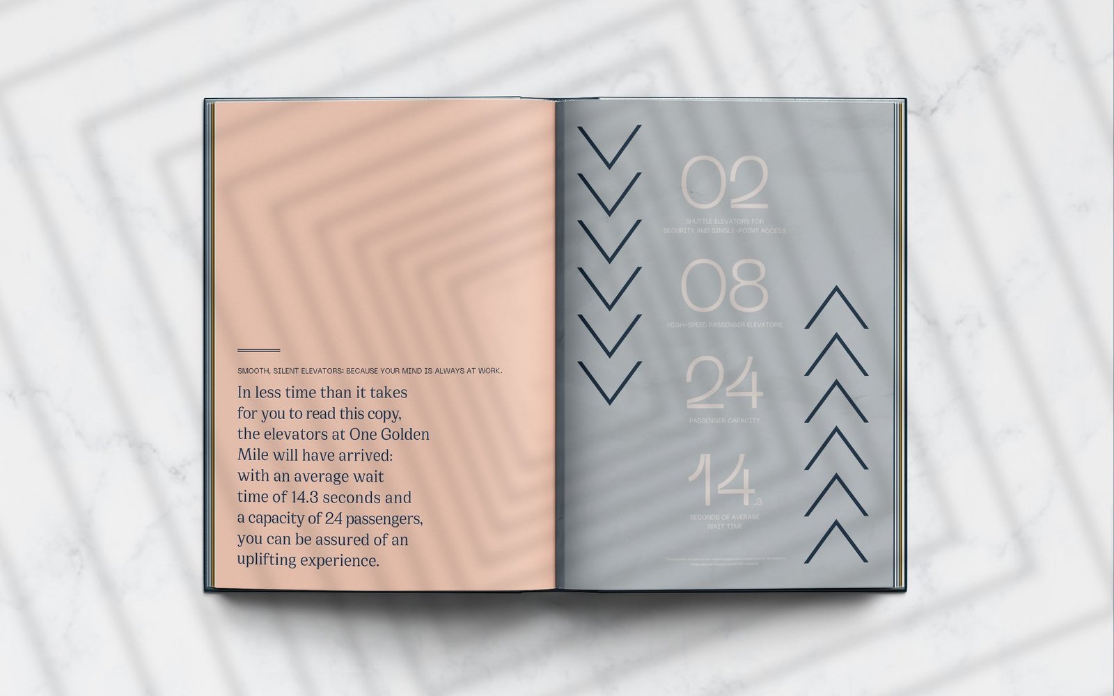
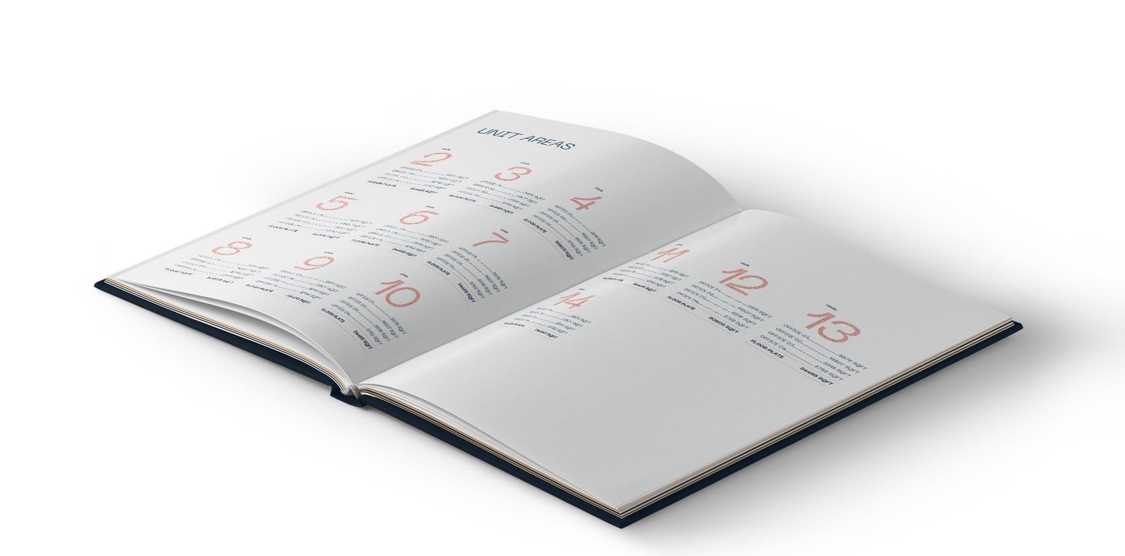
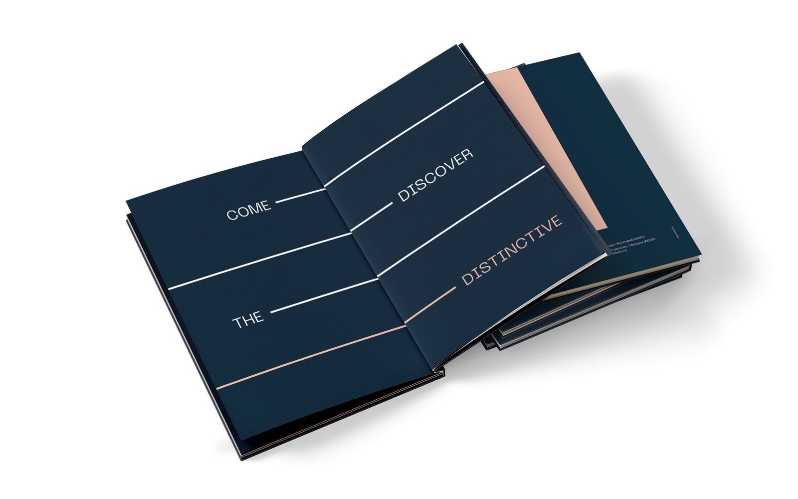
A navy hardbound volume with a rose gold monogram and a full-height stripe running down the cover. Inside, the stripe organises every spread, separating text from imagery, framing section openers.
Hoarding, stationery and the brand in the world
On site, the hoarding puts the navy field, the monogram and oversized numerals to work. Vertical business cards carry the navy and blush split. The address has presence long before the building is complete.
A single system, carried across every touchpoint.


From a project brief to a brand with voice.
Have a project worth a brand of its own?
We find the one truth about the product that nobody else is leading with, name it, and build the system that carries it from brochure to hoarding.
See the full Real Estate practice.
My Home Grava
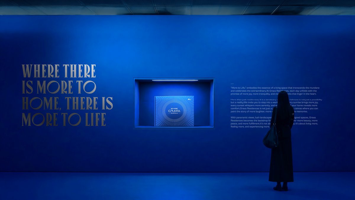
Where there is more to home, there is more to life.
Grava Residences launched into a market where every brand competed on scale. My Home Group needed a platform that stood apart without shouting louder. We repositioned luxury from possession to experience, and built the collateral that carried the idea.
Pillars: space, vistas, landscape.
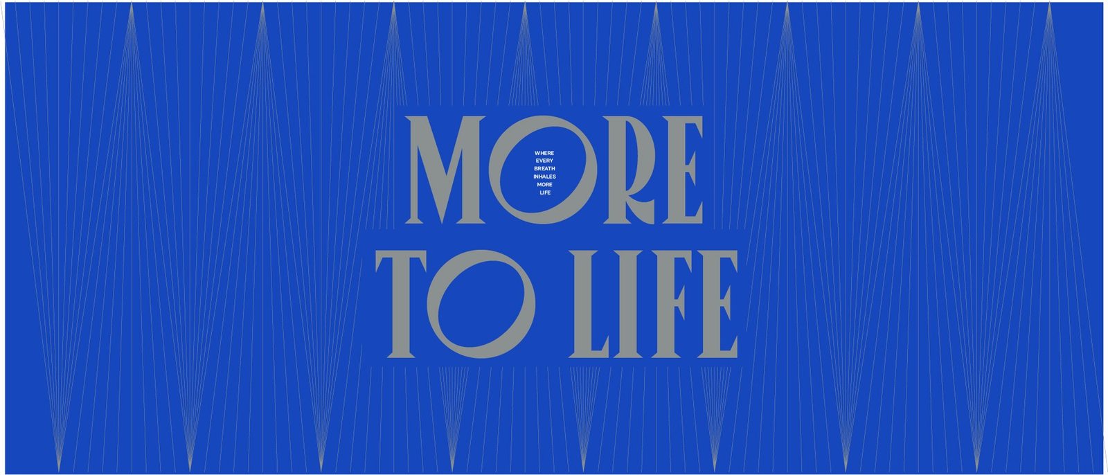
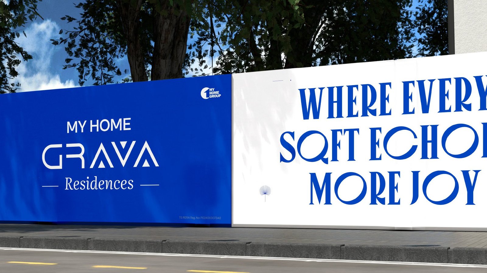
Line that leads every surface: More to Life.
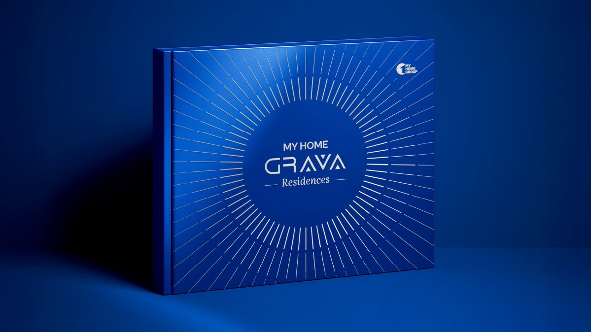
Brochure editions: cobalt, gold, silver.
Workstreams held under one brand platform.
A product worth more than the square footage it sells.
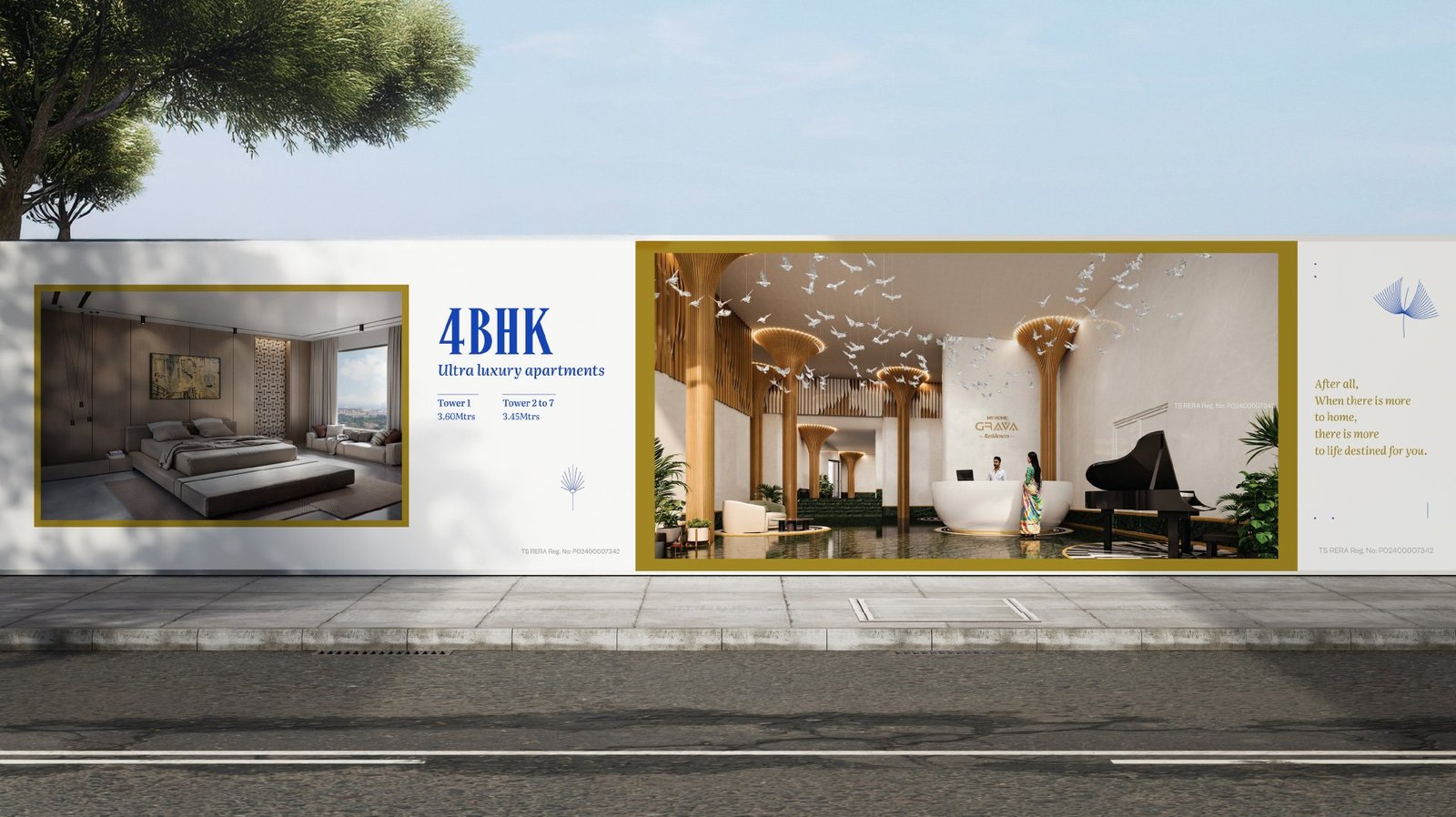
Grava Residences entered a market where nearly every launch competes on the same claims: bigger towers, grander lobbies, longer amenity lists. The product itself offered spacious residences, panoramic vistas and carefully crafted landscapes.
The old positioning sold square footage. We rewrote it to sell what that space makes possible. Space to live, gather, grow. Vistas as an everyday luxury. Landscape as an extension of the home.

Every launch sells scale. Nobody sells feeling.
The luxury field reads as one long specification sheet.
Height. Lobby. Amenity count. Every buyer sees the same chart, and nobody wins memory. We had to make the brand a feeling, not a figure.
Brochures that read as asset lists, not stories.
Specifications are what buyers eventually compare. Stories are what they first remember. The old collateral had the chart, not the opening page.
Positioning, brochure and advertising on different clocks.
One team wrote the line, another built the book, a third ran the OOH. The idea diluted at every handoff. We held all three under one roof.
One idea, held with quiet confidence.
The reposition: possession to experience
Grava stops selling square footage and starts selling what that space makes possible. More to Home. More to Life. Three pillars sit under the line: space as room to live, vistas as a daily luxury, landscape as an extension of the home.
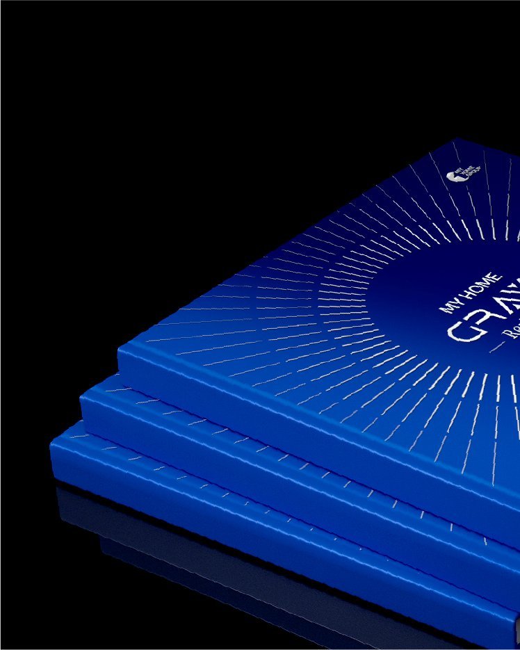
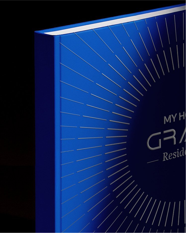
Identity in cobalt, gold and silver
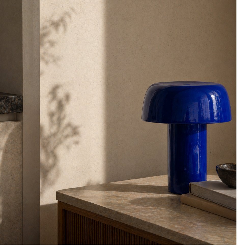
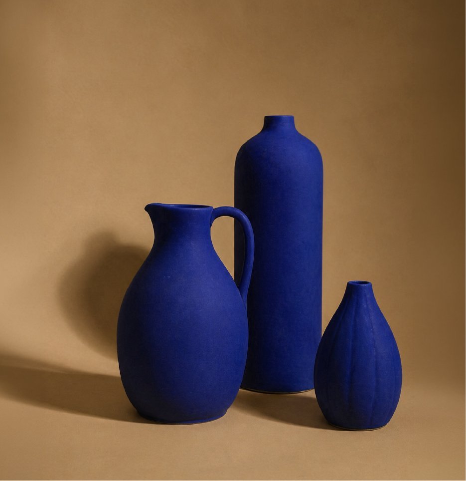
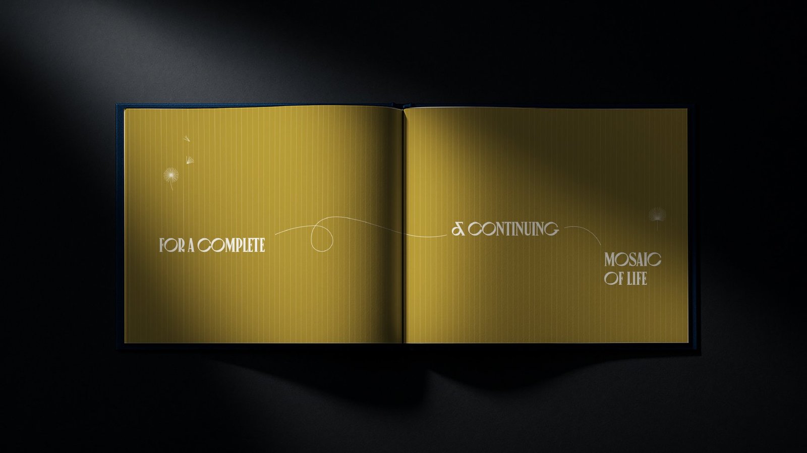
A single line, set in a tall display face, becomes the signature of the brand. Cobalt blue carries the authority. Gold sits as the accent of restraint. Silver fills the quiet space between them.
Brochure as a reading experience
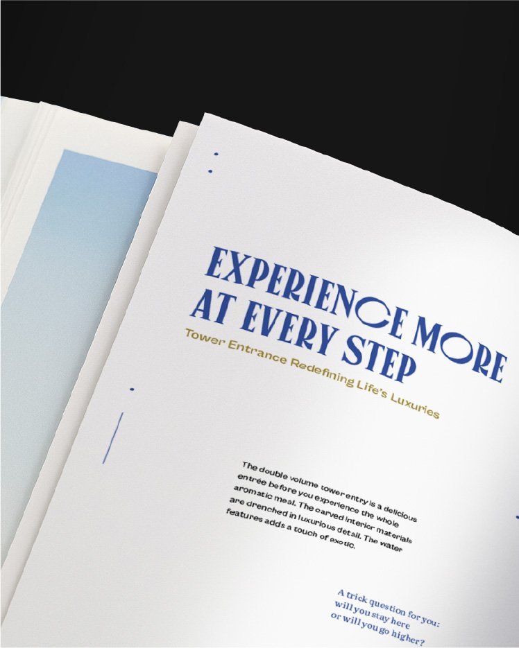
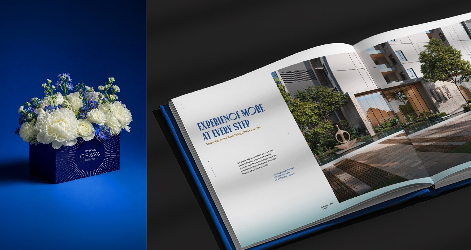
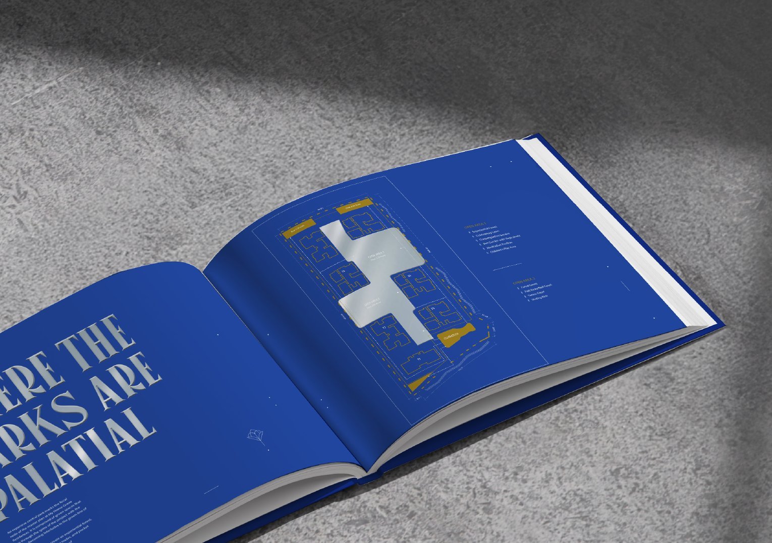
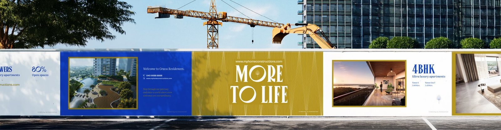
The brochure translates More to Life into a slow, considered reading experience. A manifesto opens the book. Spreads pair architecture with poetic headlines. Three editions, a presentation box and a welcome kit turn sales collateral into an object buyers want to keep.
Advertising: lead with feeling, not scale
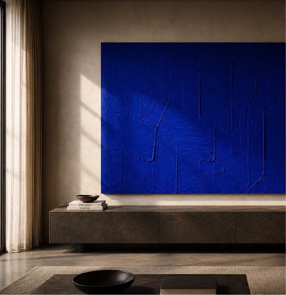
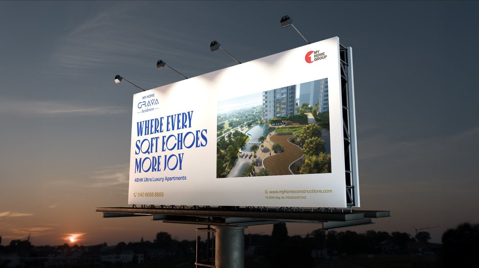
Out of home carries the same calm confidence into the city. Billboards and site hoardings lead with feeling rather than scale, backed by the cobalt identity and generous views of the residences.

A single system, carried across every touchpoint.



From a project brief to a brand with voice.
Have a project worth a brand of its own?
We find the one truth about the product that nobody else is leading with, name it, and build the system that carries it from brochure to hoarding.
See the full Real Estate practice.