

Key takeaways
- Website design for lead generation means designing every element to guide visitors toward one clear action.
- Nine elements do most of the work: value proposition, calls to action, forms, trust signals, speed, mobile layout, navigation, landing pages and contact options.
- Each page should have one main goal and one main call to action.
- Fewer form fields and visible proof usually reduce hesitation.
- Test one change at a time and judge results over weeks, not days.
What is website design for lead generation?
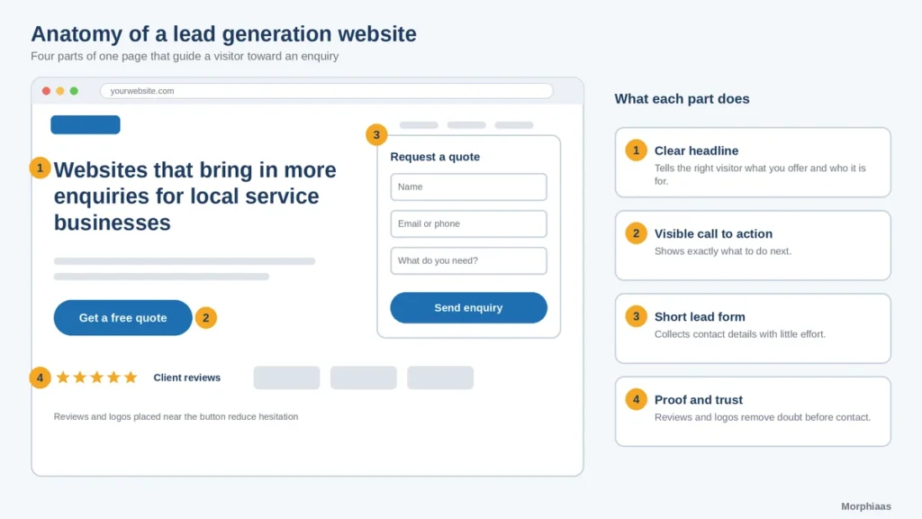
A normal website explains what you do. A lead generation website goes one step further: it persuades the right visitor to act. That means the design, the words and the technical setup all point the same way.
The approach rests on a simple idea. Every visitor carries questions: Is this for me? Can I trust them? What happens if I reach out? Good design answers those questions before the visitor has to ask, and then offers an easy way to move forward.
Why does design affect lead conversion?
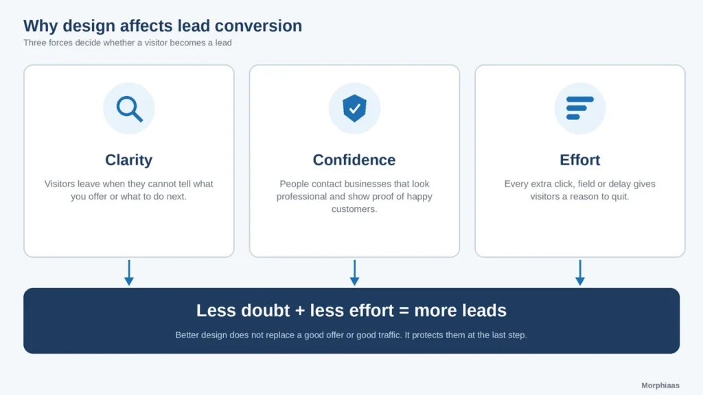
Three forces shape that decision:
- Clarity. Visitors leave when they cannot tell what you offer or what to do next.
- Confidence. People contact businesses that look professional and show evidence that others have been happy.
- Effort. Every extra click, field or delay gives visitors a reason to quit.
Better design does not replace a good offer or good traffic. It makes sure those investments are not wasted on the last step.
Which website design elements turn visitors into leads?
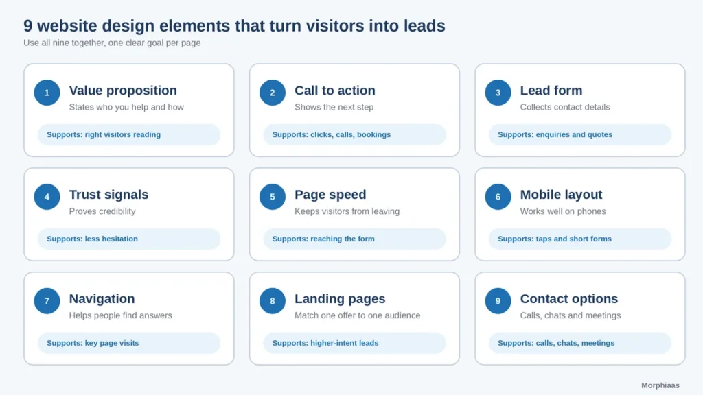
Element | What it does | Lead action it supports |
|---|---|---|
Value proposition | States who you help and how | Keeps the right visitors reading |
Call to action (CTA) | Shows the next step | Clicks to forms, calls and bookings |
Lead form | Collects contact details | Enquiries and quote requests |
Trust signals | Proves credibility | Reduces hesitation before contact |
Page speed | Keeps visitors from leaving | Higher chance of reaching the form |
Mobile layout | Works on phones | Taps, calls and short forms |
Navigation | Helps people find answers | Moves visitors to key pages |
Landing pages | Match one offer to one audience | Focused, higher-intent conversions |
Contact options | Offers more ways to reach you | Calls, chats and meetings |
The nine website design elements in detail
1. A clear value proposition above the fold
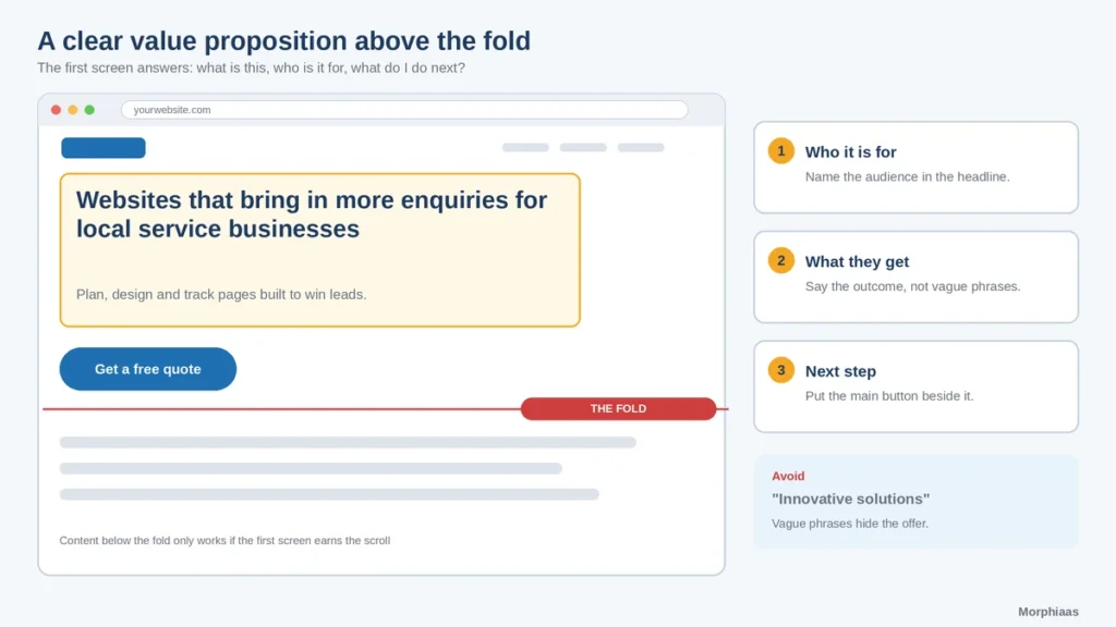
The first screen should tell visitors what you do, who it is for and why it matters, in a headline and one supporting line. Avoid vague phrases such as “innovative solutions”. Say what the visitor gets: “Websites that bring in more enquiries for local service businesses.” Put the main call to action beside it.
2. Calls to action that are visible and specific
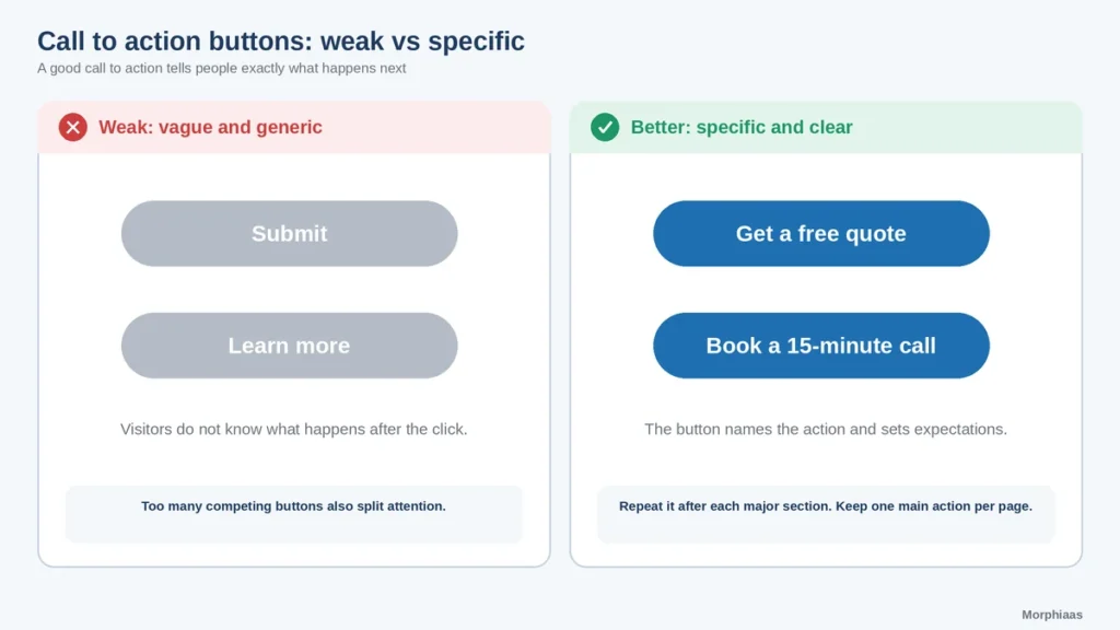
A call to action tells people exactly what happens next. “Get a free quote” or “Book a 15-minute call” works better than “Submit” or “Learn more”. Use a button color that stands out from the page, repeat the call to action after each major section and keep one main action per page. Too many competing buttons split attention.
3. Short, friendly lead forms
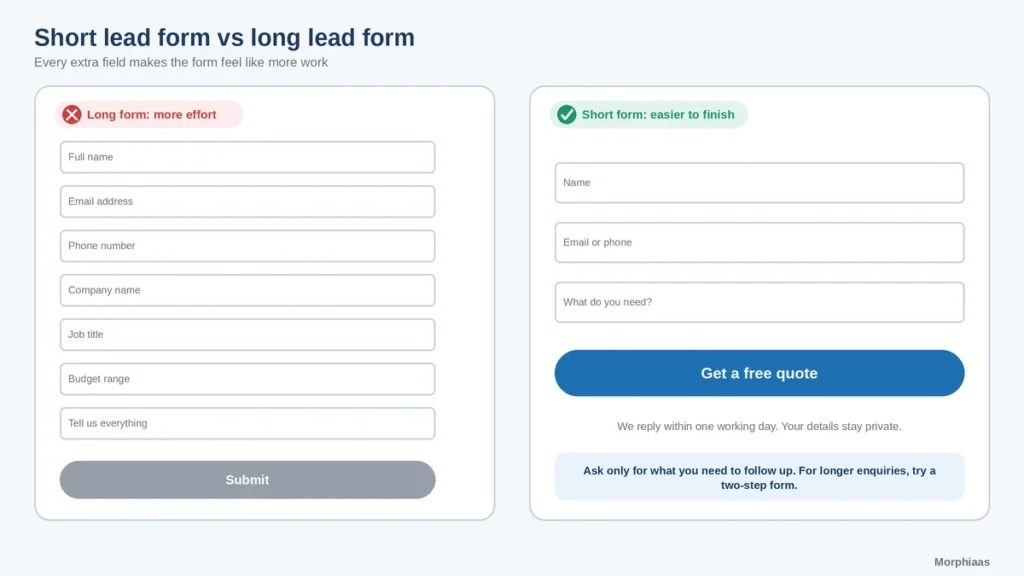
Every field you add makes the form feel like more work. Ask only for what you need to follow up, usually a name, an email or phone number and one qualifying question. Use clear labels, show errors in plain language and confirm what will happen after submission. For longer enquiries, a two-step form can feel lighter.
4. Visible trust signals
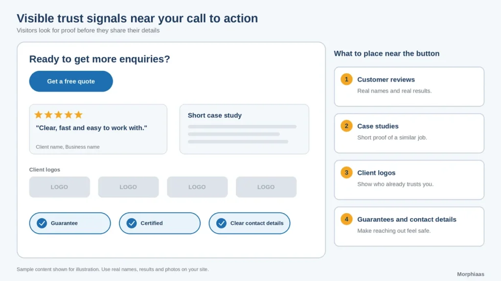
Visitors look for proof before they share their details. Place customer reviews, client logos, short case studies, certifications, guarantees and clear contact information near your calls to action. Use real names, real results and real photos. If you cannot show a number you can verify, show a short quote instead.
5. Fast loading and a stable layout
Slow pages lose visitors before they see your message. Compress images, limit heavy scripts and keep the layout from jumping while it loads. Google’s guidance on Core Web Vitals explains the loading, interactivity and visual stability measures worth checking, which you can read at web.dev’s Core Web Vitals overview.
6. A mobile-first layout
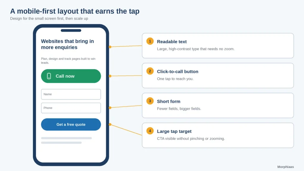
Many visitors will reach your site on a phone, so design for the small screen first. Use readable text, large tap targets, short forms and a click-to-call button. Check that the call to action stays visible without pinching or zooming.
7. Simple navigation and visual hierarchy
A visitor should find the main service pages in one or two clicks. Keep the menu short, use plain labels and show one clear path to your contact page. Use size, spacing and contrast so the eye reaches the headline first, then the proof, then the call to action.
8. Dedicated landing pages
A general home page serves many audiences. A landing page serves one. Create a separate page for each main offer or campaign, match the headline to the ad or search that brought visitors there, and remove menu links that lead away from the goal. Focus raises relevance, and relevance raises conversions.
9. Easy ways to get in touch
Not everyone wants to fill in a form. Offer a phone number, a chat option, an email address or a booking calendar alongside the form. Show business hours and expected response time, so visitors know what to expect.
How should a lead generation page be structured?
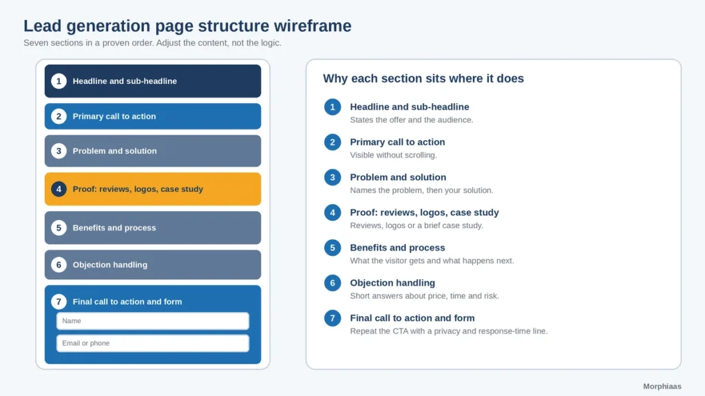
Use this order as a starting point:
- Headline and sub-headline that state the offer and the audience.
- Primary call to action visible without scrolling.
- Short explanation of the problem and your solution.
- Proof: reviews, logos or a brief case study.
- Benefits and process: what the visitor gets and what happens next.
- Objection handling: a few short answers about price, time and risk.
- Final call to action and form, with a reassurance line about privacy and response time.
The same structure works for a service page, a campaign page or a product enquiry page. Adjust the content, not the logic.
Why choose Morphiaas for website design for lead generation?
- Conversion-focused planning. We start with your audience, offer and goals, then design each page around the action you want.
- Design, copy and tracking together. Layout, messaging, forms and analytics are planned as one system. [Confirm and list the exact services offered.]
- Clear reporting. You see which pages bring leads, what changed and what we recommend next. [Confirm reporting format.]
- Room to grow. If you also sell online, our team can support your store, from product pages to checkout and growth marketing for Indian shoppers.
- Honest advice. If a few targeted fixes will do, we say so before proposing a full redesign.
Explore the rest of our work on the Morphiaas website, or ask for a review of your current pages and where they lose visitors.
Frequently asked questions
What is website design for lead generation?
It is the practice of designing a website so that its layout, copy and forms guide visitors toward becoming leads. Each page has one main goal, a clear call to action and enough proof to make contacting you feel safe. The aim is to convert more of your existing traffic.
Which website element has the biggest impact on leads?
There is no single answer, because it depends on your site. A clear headline and a visible call to action are the most common starting points. Test one change at a time, such as the headline, the form length or the proof placement, and let your own data show what matters most.
How many fields should a lead form have?
Ask only for what you need to follow up. For a first enquiry, a name, an email or phone number and one short question is often enough. Longer forms can work for high-value services, but test them against a shorter version and compare the number and quality of leads.
How long does it take to see more leads after a redesign?
Some changes show within a few weeks once enough visitors have seen the new pages. Smaller sites may need longer to gather meaningful data. Results depend on your traffic, offer and market, so no honest agency can promise a fixed number or date.
Should I redesign my website or hire an agency?
You can fix basics yourself, such as headlines, buttons, forms and speed, with a few hours and a clear plan. An agency helps most when you need strategy, design, copy and tracking handled together, or when you manage several pages, campaigns or an online store.