


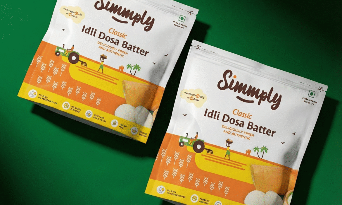
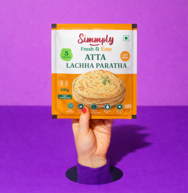
Young Indians don't buy convenience food out of laziness. They buy it to resolve a tension: eat like their mother cooked, without the time their mother had. Every section dissolves the guilt and amplifies the flex. "Cut the pack. Pour & Cook. Serve & Flex" isn't a process. It's permission.
Lushlands
Not built space. A natural habitat.
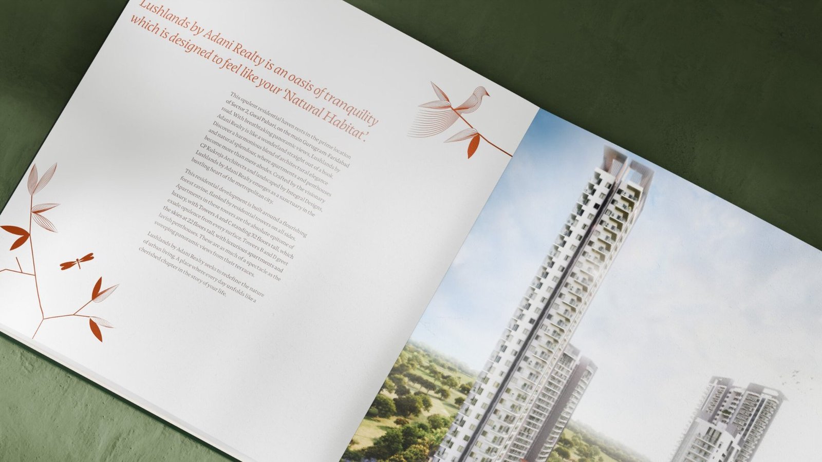
Adani Realty's Lushlands needed a brand that separated it from category conventions of scale and spectacle. The land already held the brand. We built the positioning, identity and brochure that let it speak.

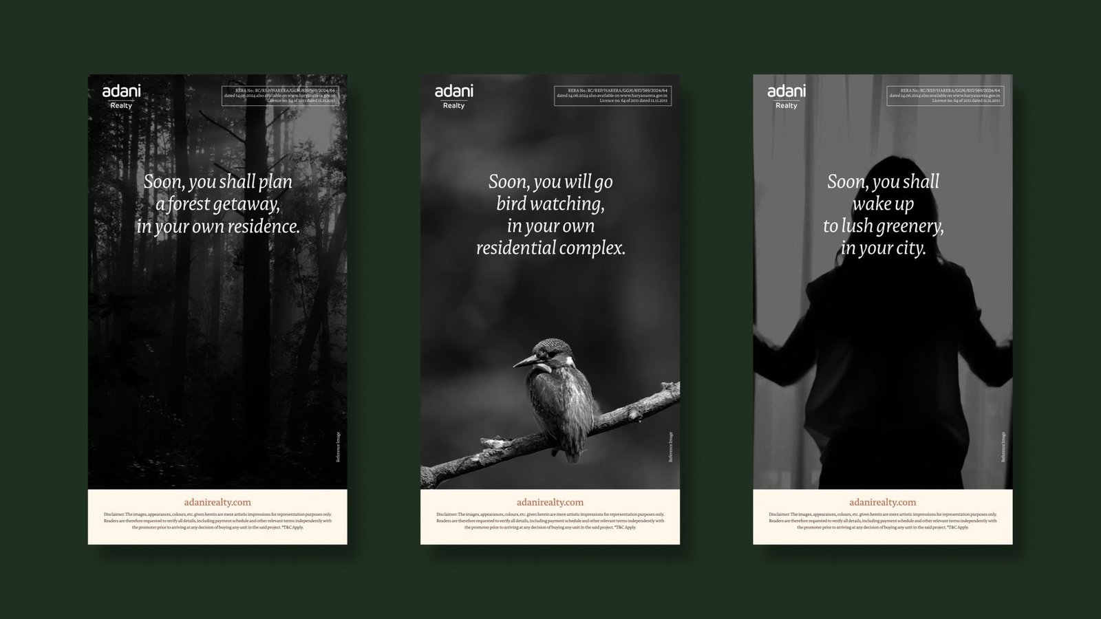
Platform line carried across every touchpoint.
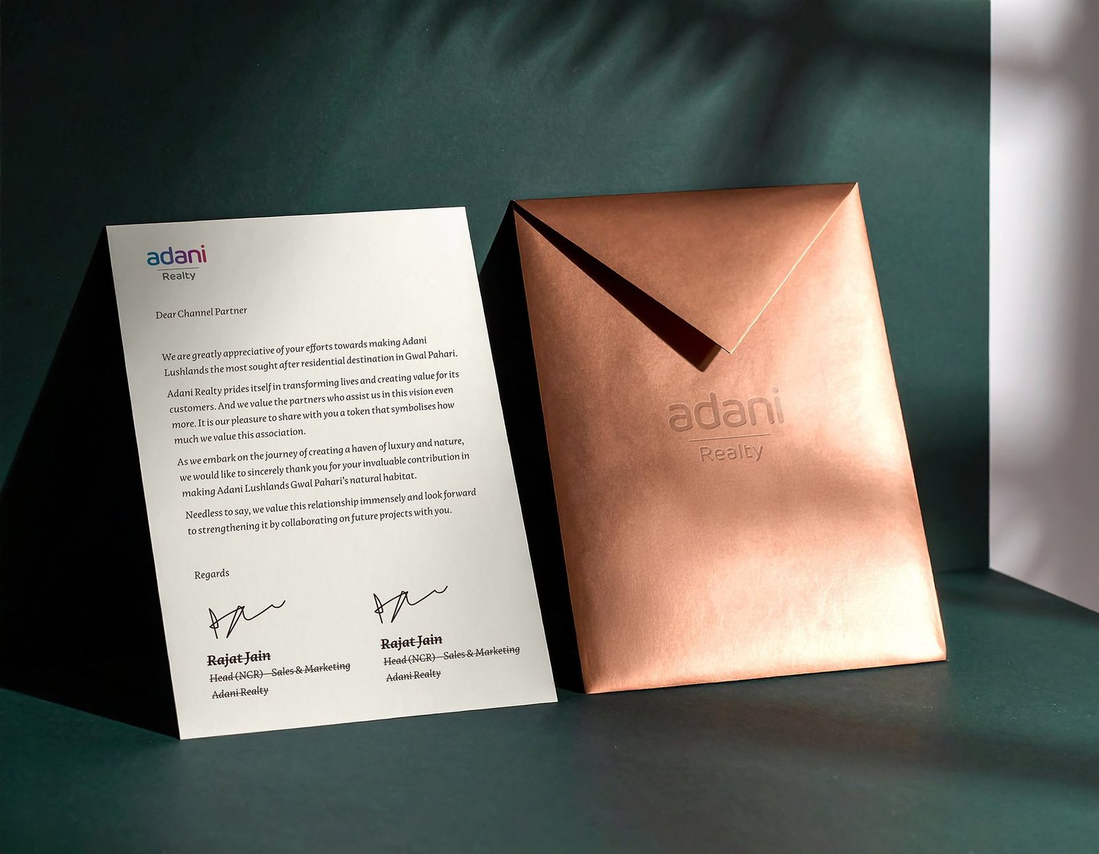
Workstreams held under one brand world.
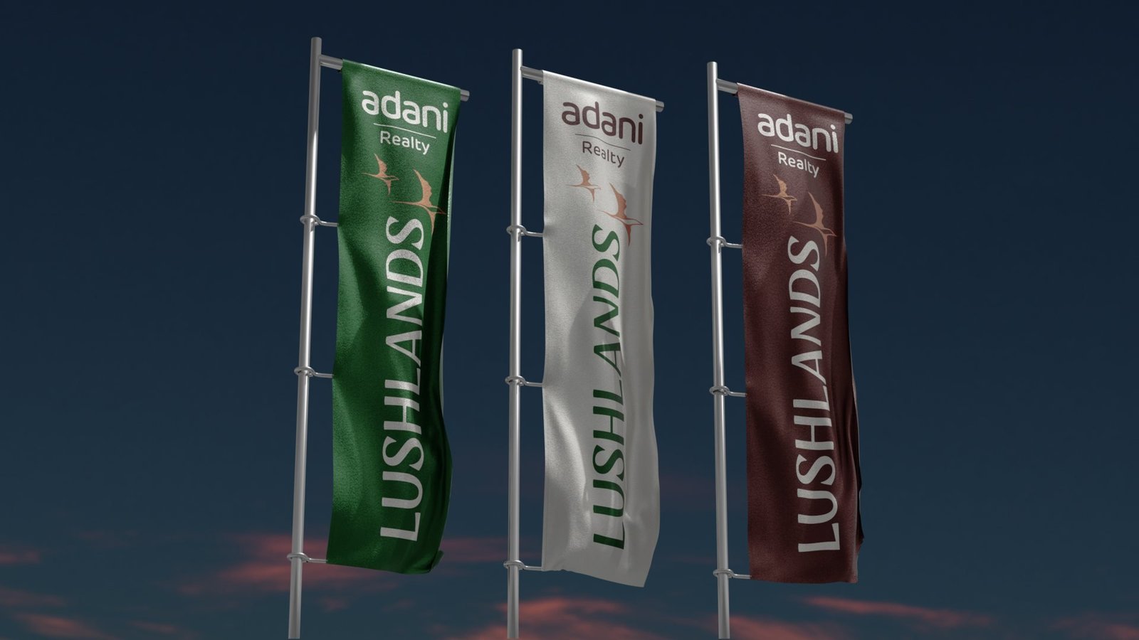
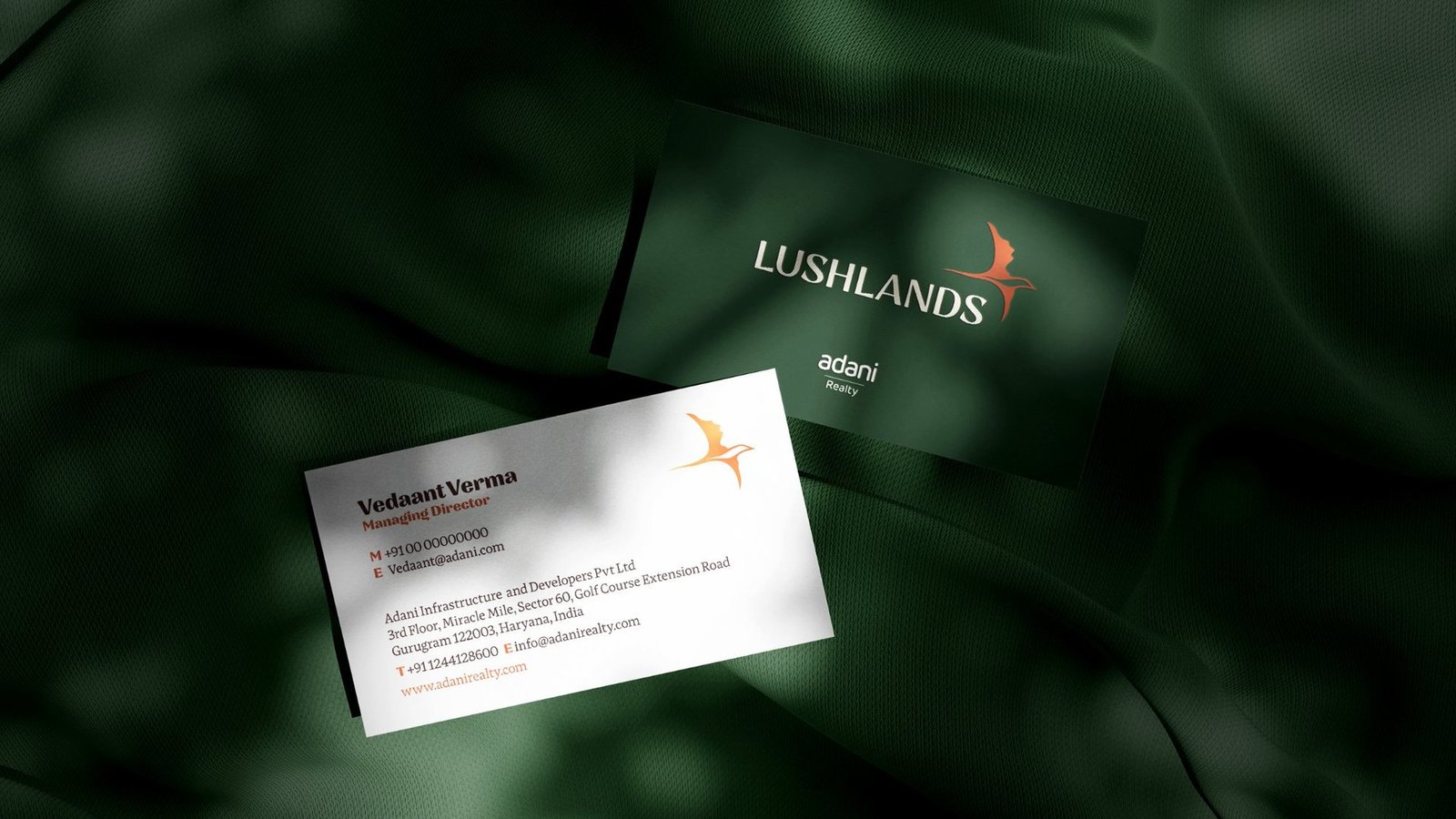
Signature colours that do all the heavy lifting.
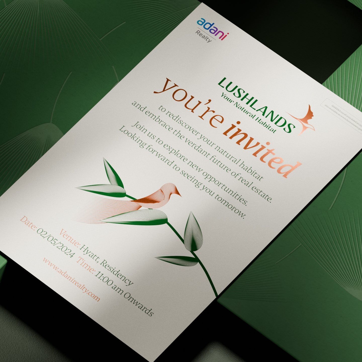
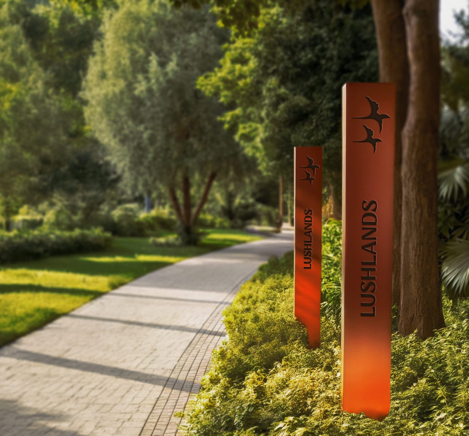
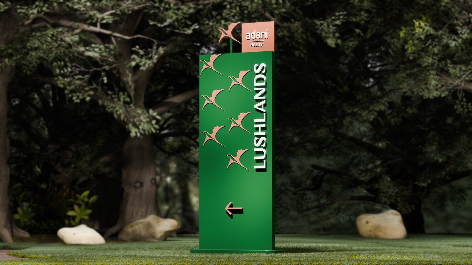
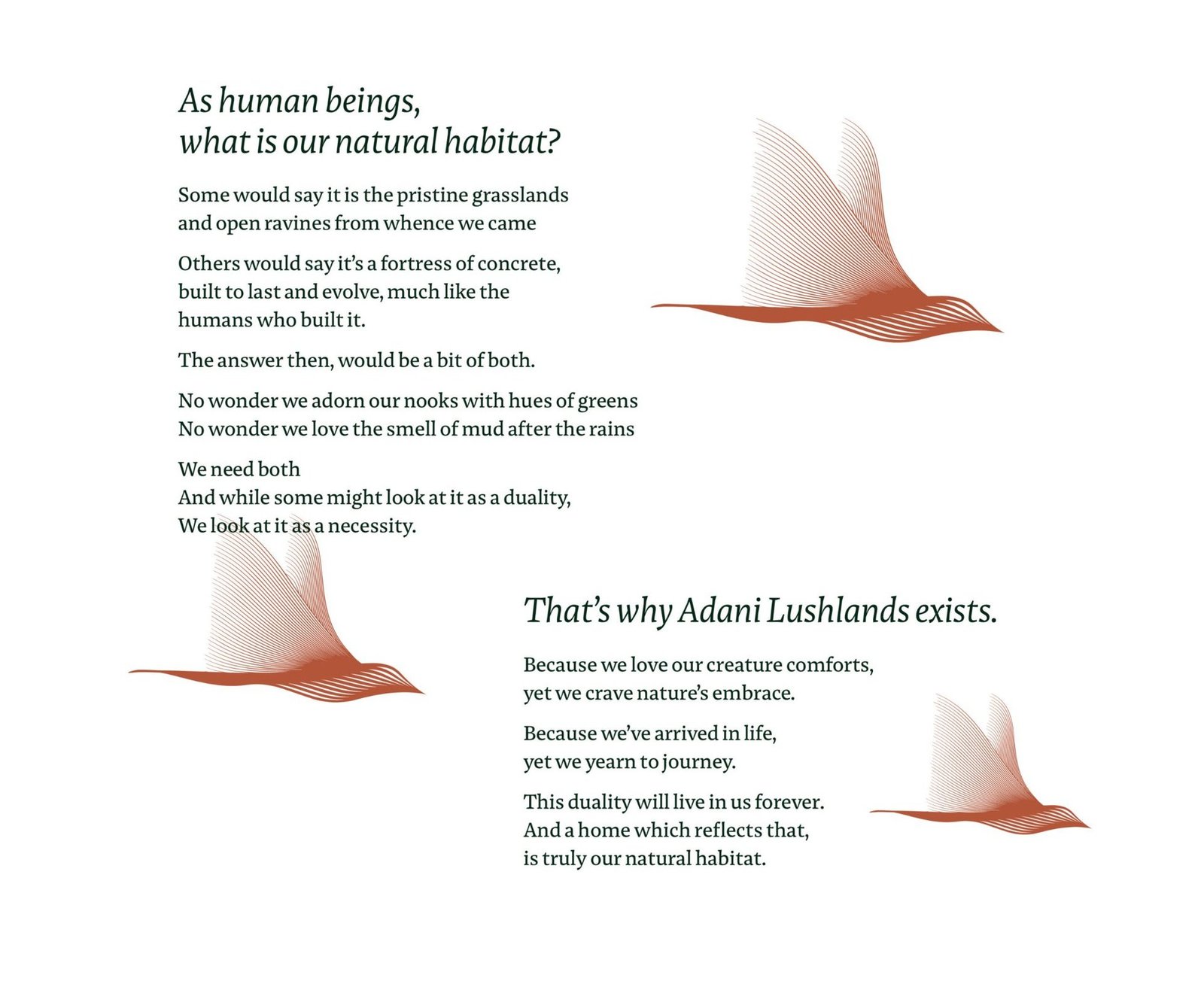
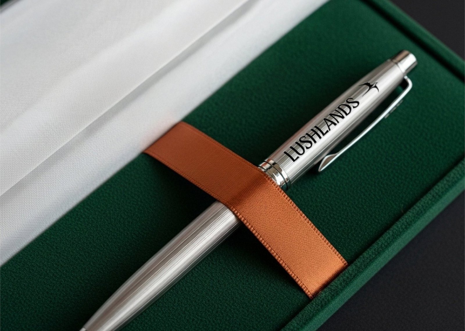
Bird in flight, the recurring mark of the brand.

Adani Realty needed a residence brand that read as sanctuary, not spectacle.
Lushlands was never imagined as a typical residential project. The brief was for a brand that could sit alongside Adani's scale without inheriting its volume, and speak to a homeseeker who wants sanctuary rather than show.
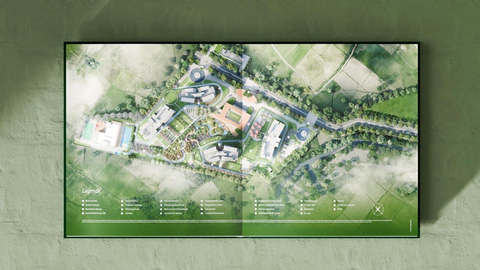
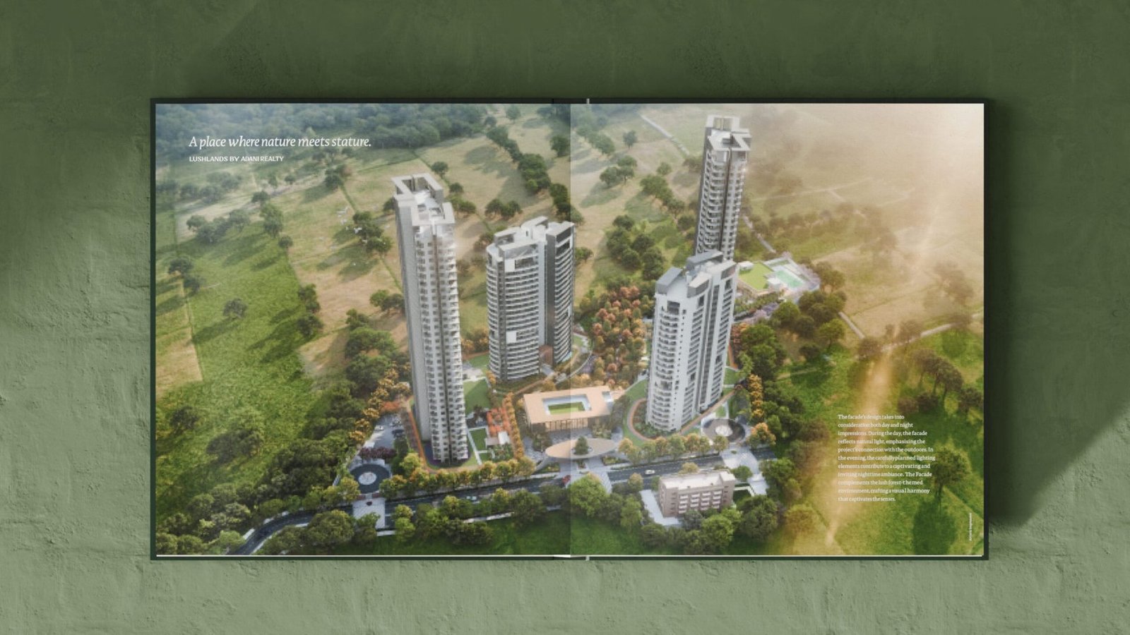
The insight came from the site itself: a forested ravine, flowing water, tiered greens and the hush of trees. The land already held the brand. The job was to find the one positioning that would let it speak.
The luxury category has run out of new words.
Every launch competes on scale and skyline.
Lobbies, towers, amenity lists. The industry's standard play is to shout louder. Lushlands needed to do the opposite without losing presence.
Nature was in every brochure, led by none.
"Lush greens" is a line everyone writes. The land here was closer to a sanctuary than a landscape. The brand had to name the difference.
Launch collateral reads like a sales deck.
Specifications first, feeling second. For a brand built around calm, the brochure had to behave like a walk through the land, not a product sheet.
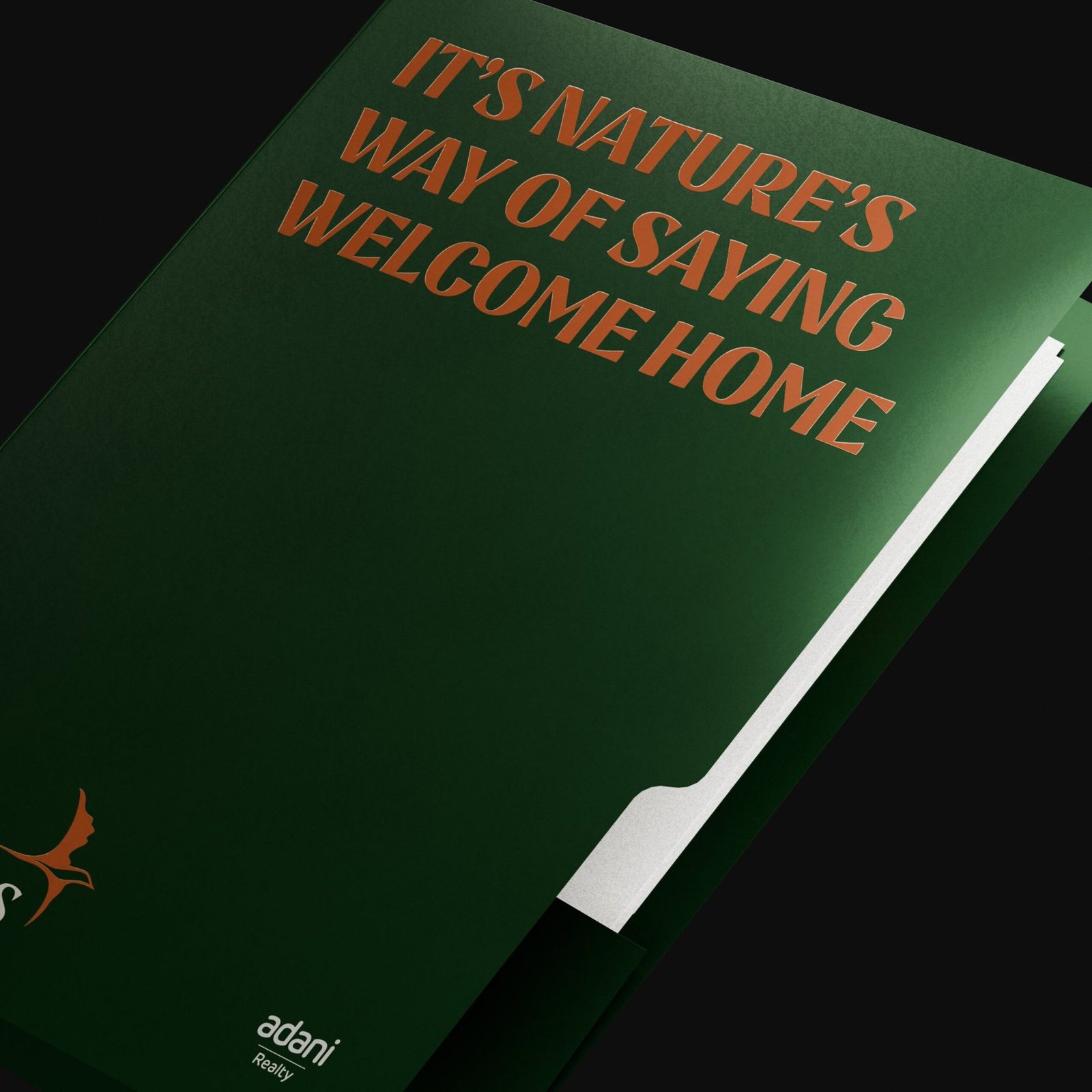
A visual language that was grown, not constructed.
Positioning: Your Natural Habitat
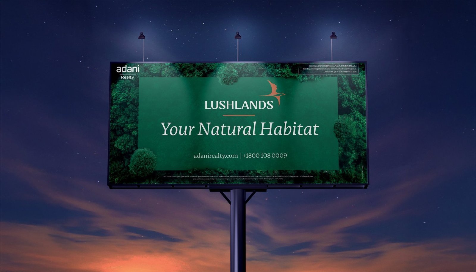
Not just built space, a natural habitat. The line reframes luxury around reconnection rather than excess, and gives the brand a voice that holds without raising. It leads every touchpoint from brochure cover to site hoarding.
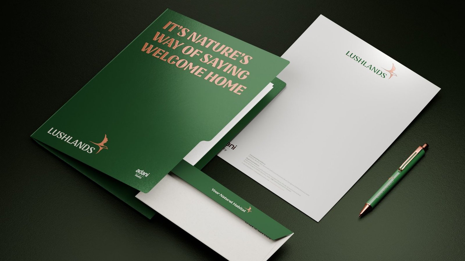
Identity: deep forest green, burnished copper, a bird in flight
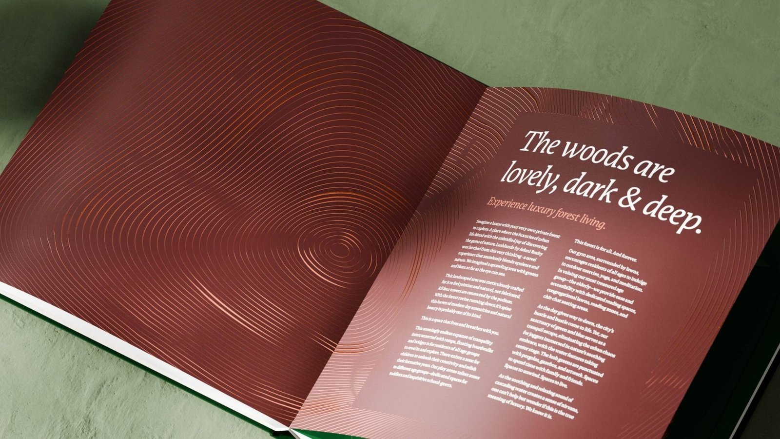
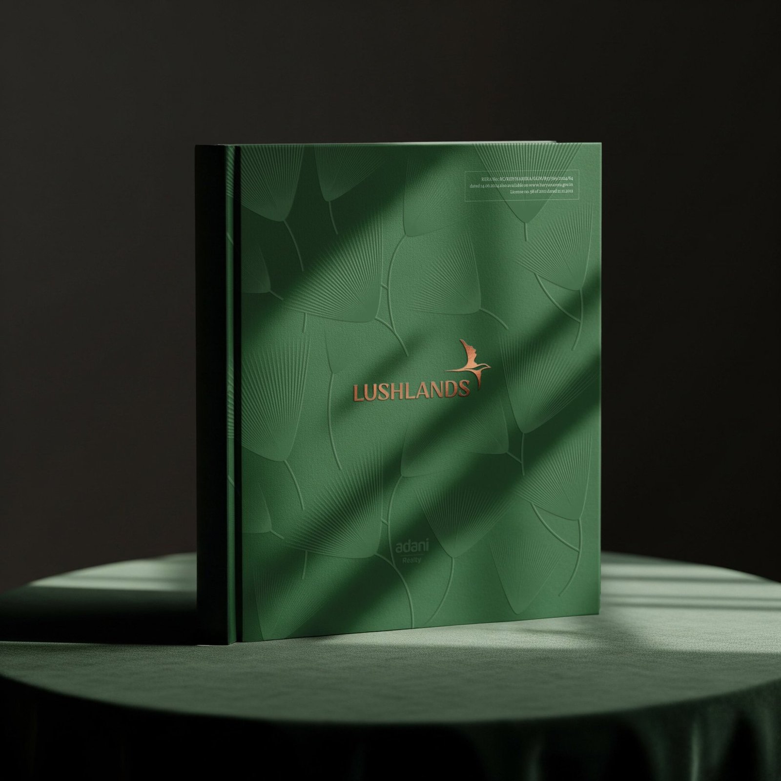
Every element mirrors the experience of walking through the space: layered, quiet, elevated. Deep forest green carries the canopy. Burnished copper brings warmth and earth. A bird in flight marks a place where nature still moves freely.
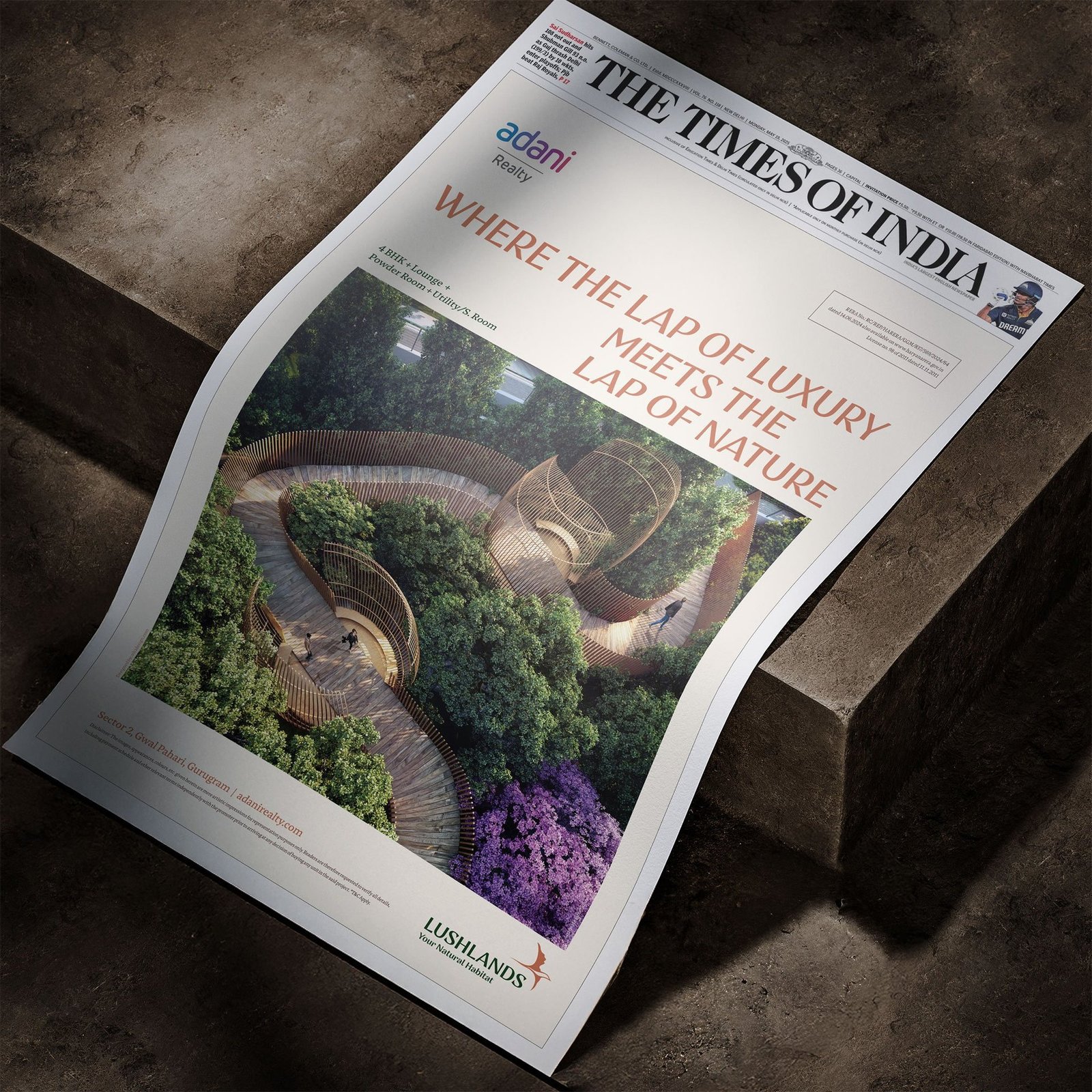
Brochure as a walk through the land
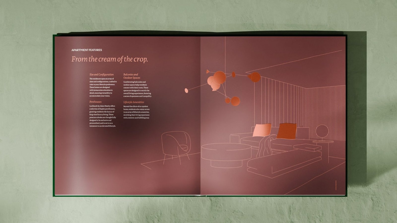
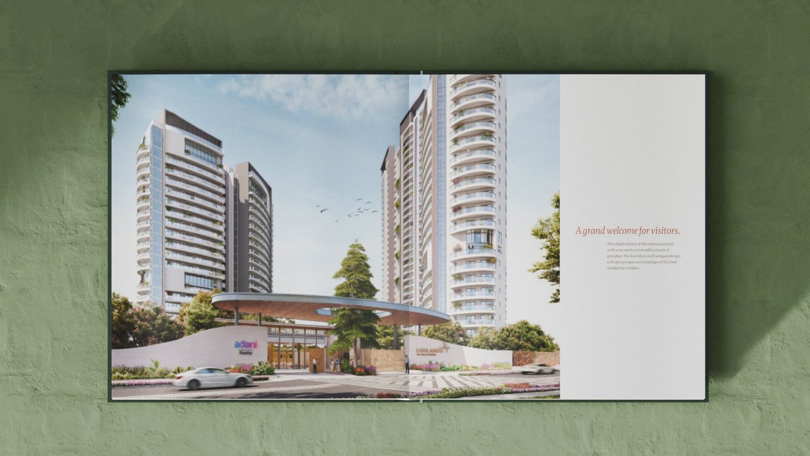
Rather than a catalogue of specifications, the brochure unfolds like a walk through Lushlands. Botanical patterns, line-drawn architecture and copper accents pace the reader from first impression to final page.
Launch communication: taking the habitat to the city
Across out-of-home, invitations and press, the platform line leads. Dark skies, green canopies and the copper bird let Lushlands stand apart in a crowded real-estate media landscape without once needing to shout.
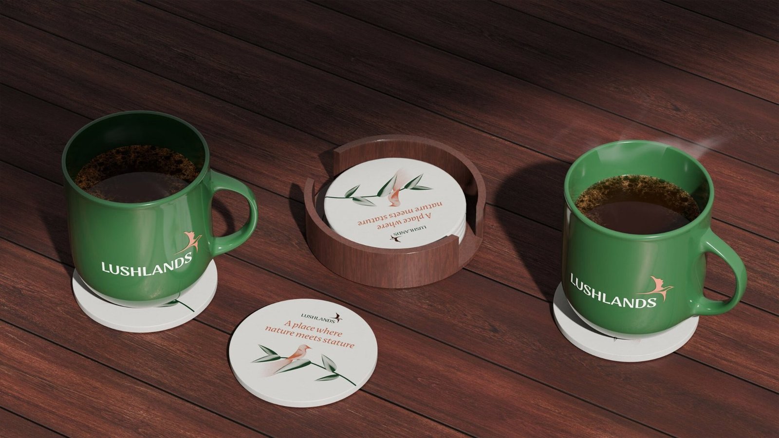
A single system, carried across every touchpoint.


From a project brief to a brand with voice.
Have a project worth a brand of its own?
We find the one truth about the product that nobody else is leading with, name it, and build the system that carries it from brochure to hoarding.
See the full Real Estate practice.
Kalpataru Vista
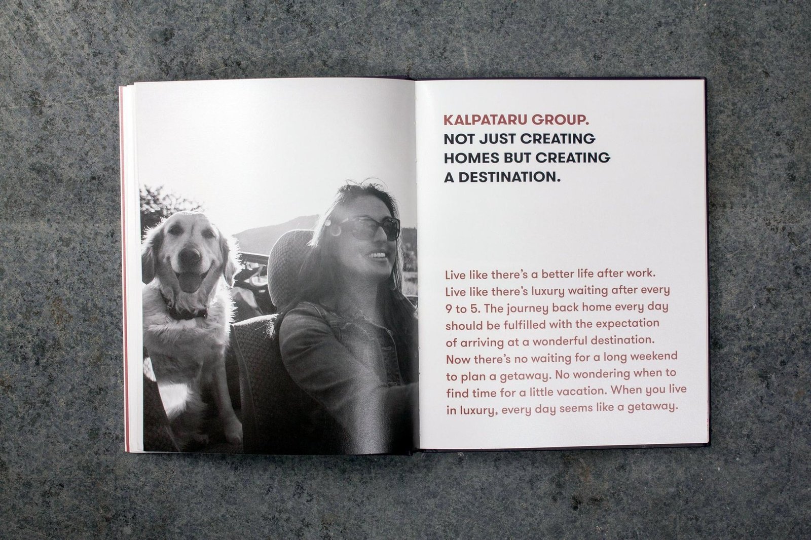
Not a home. A getaway for life.
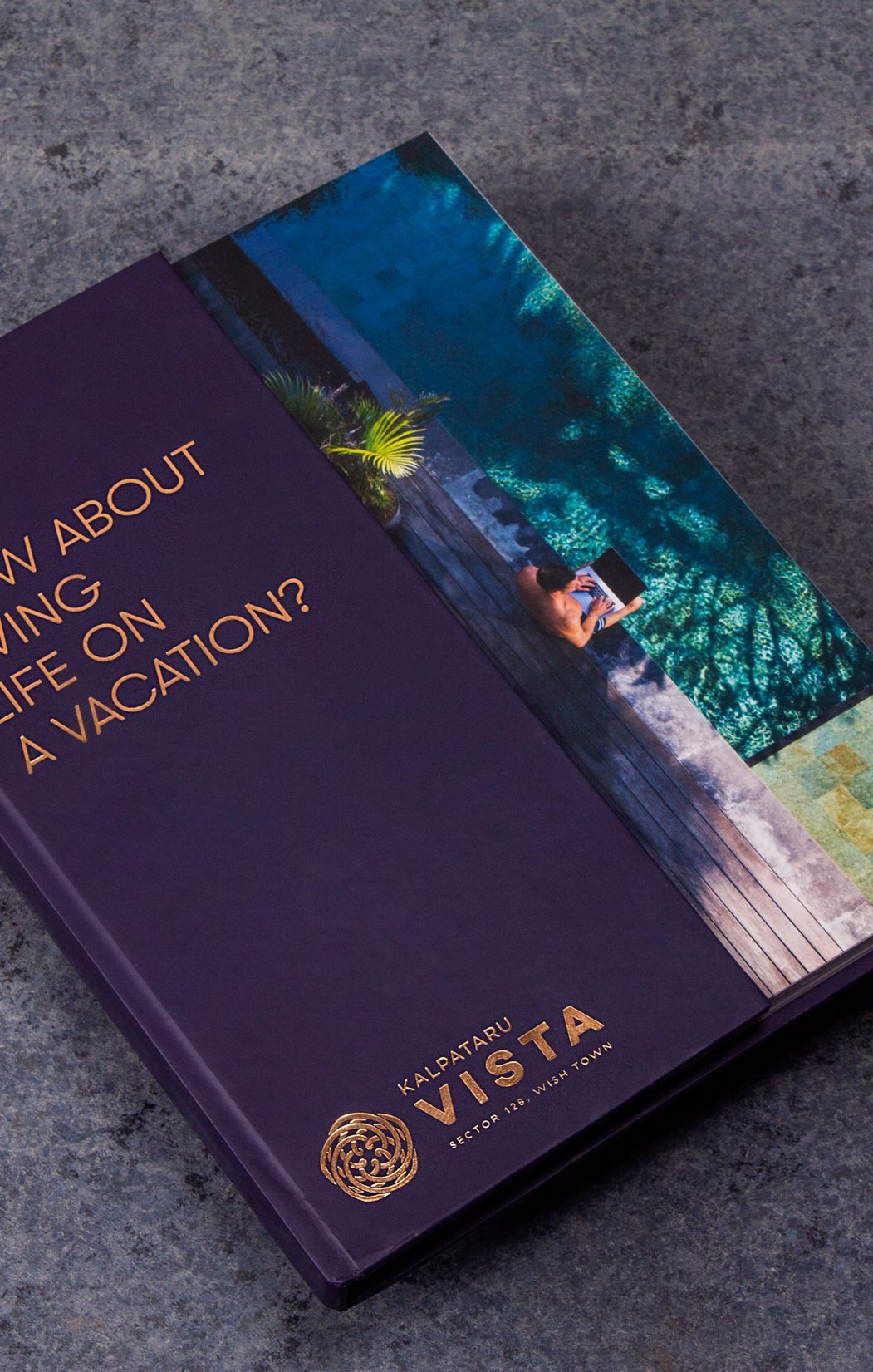
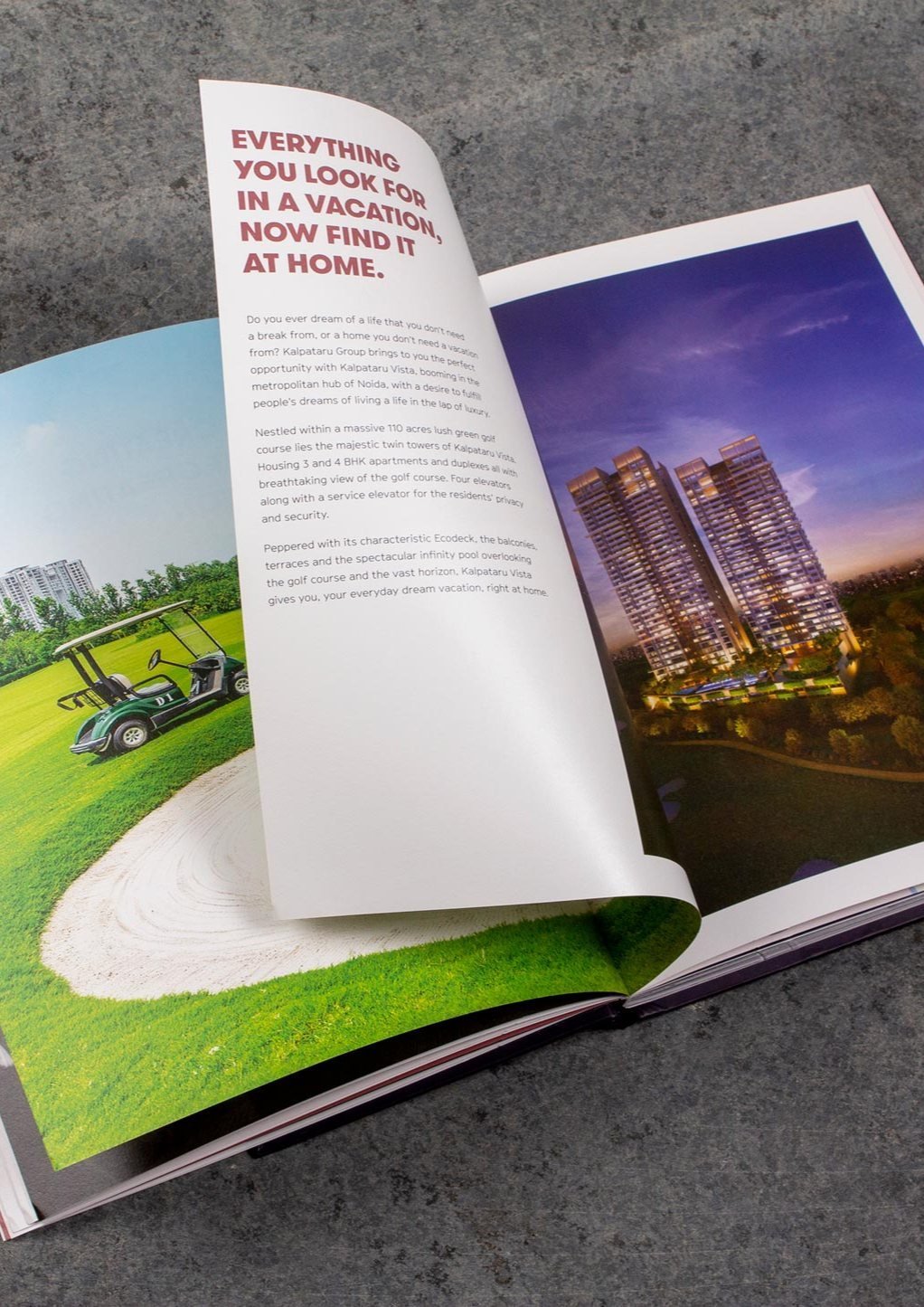
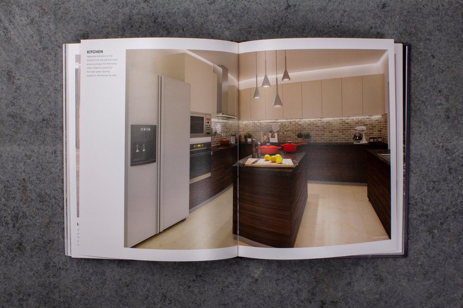
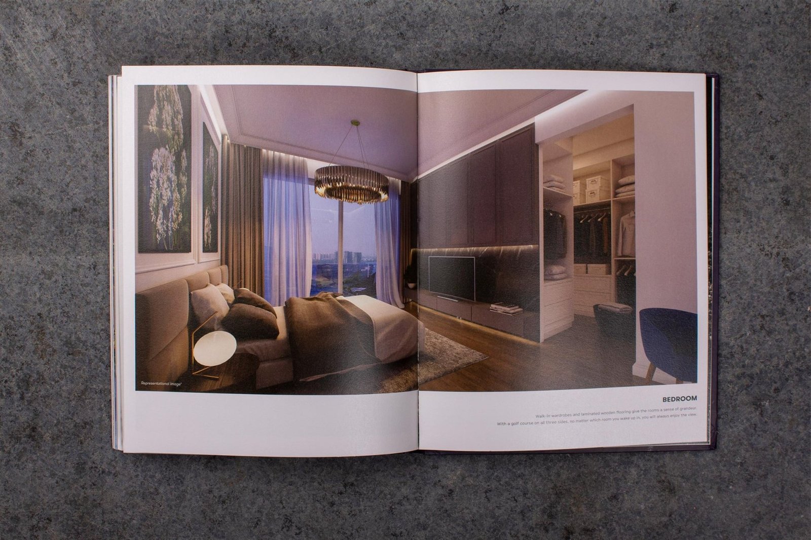
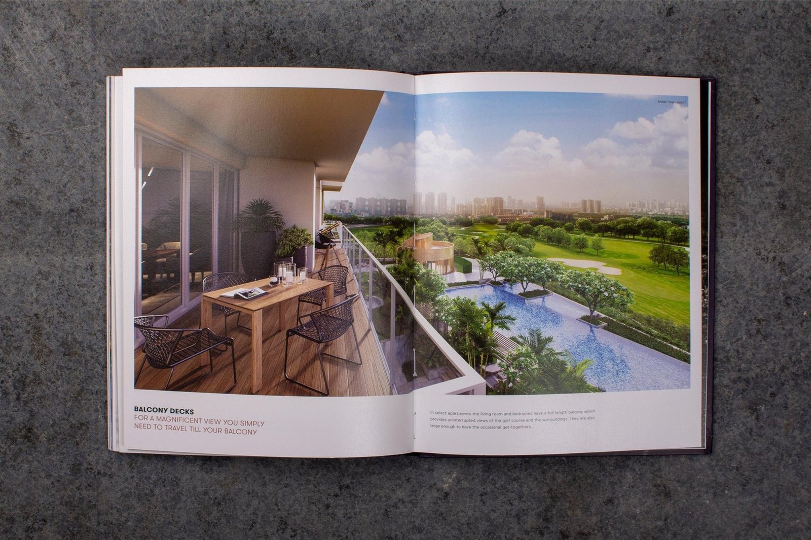
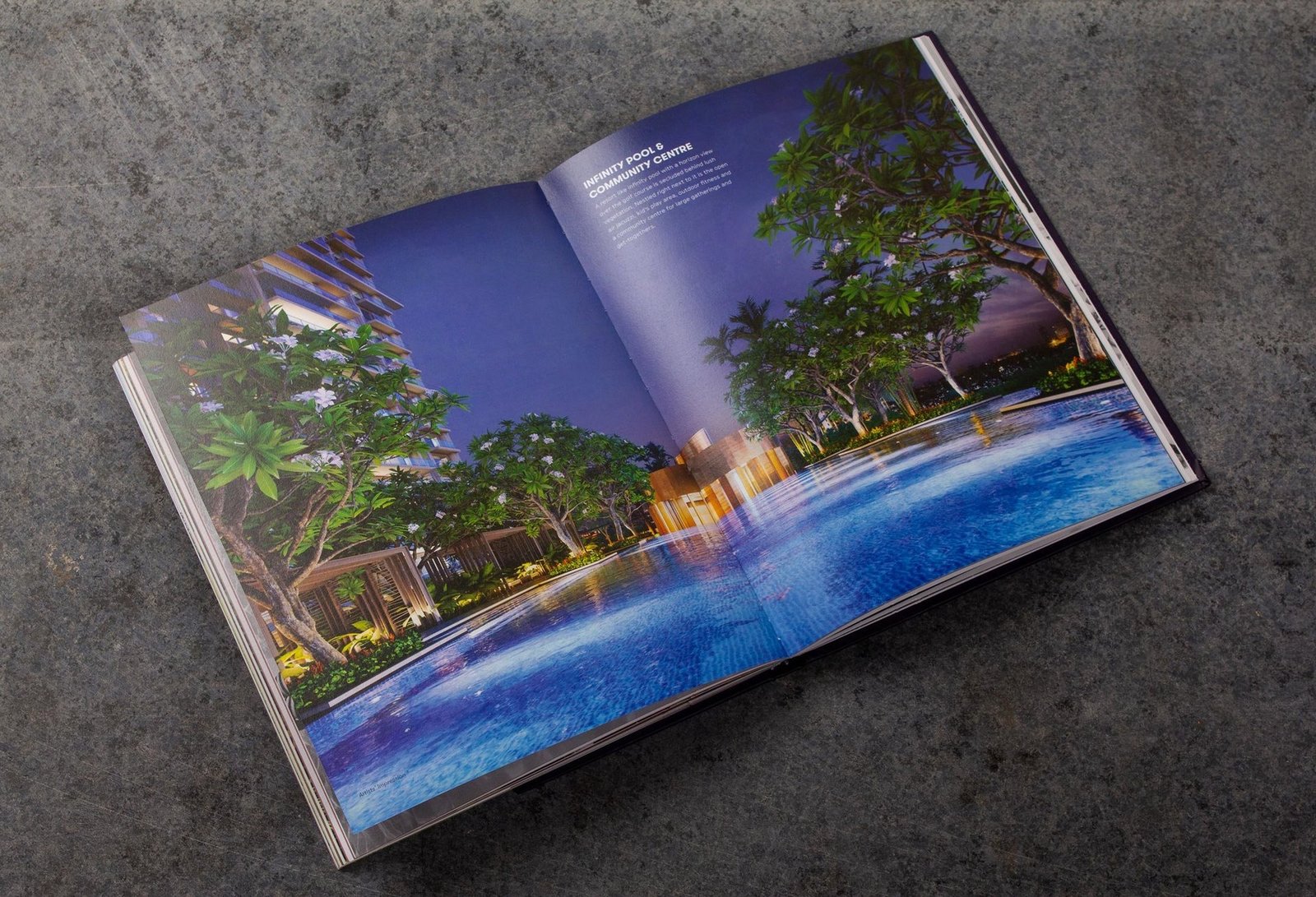
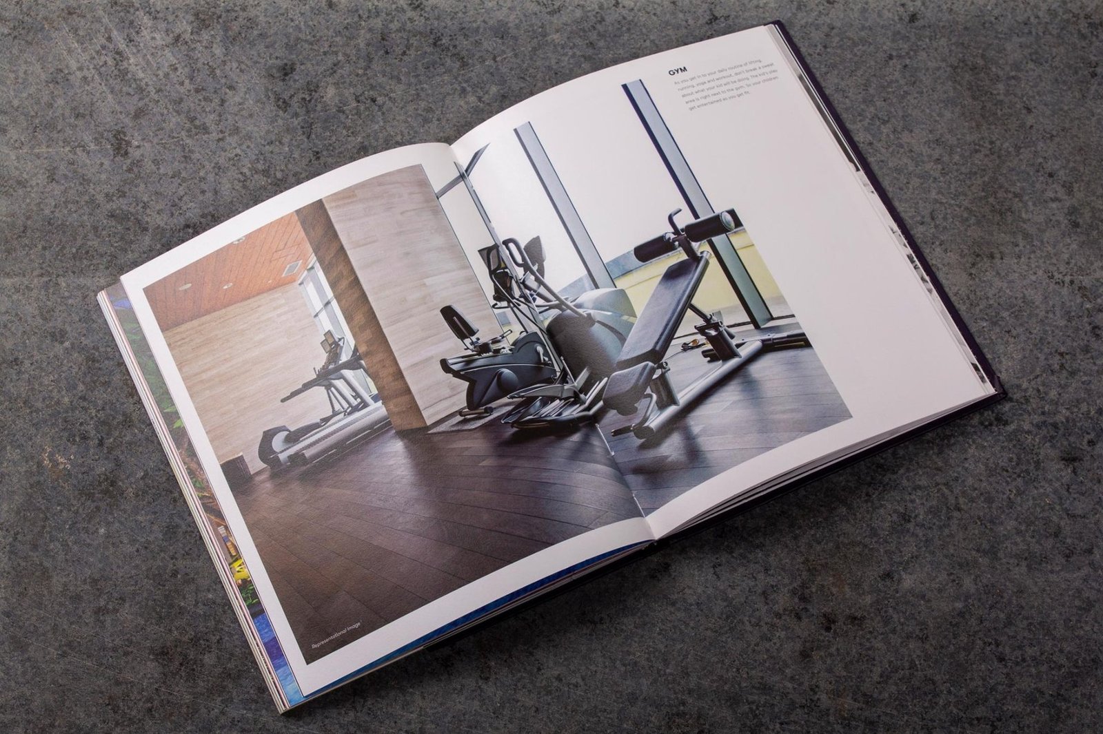
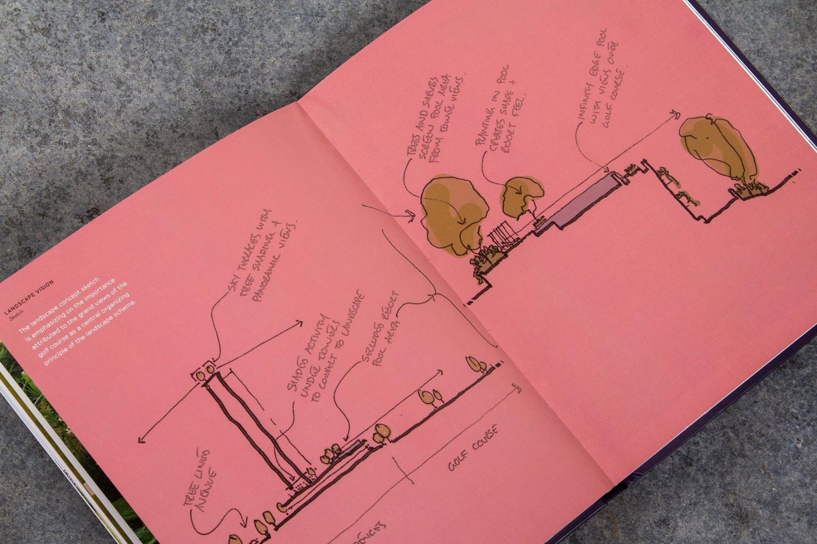
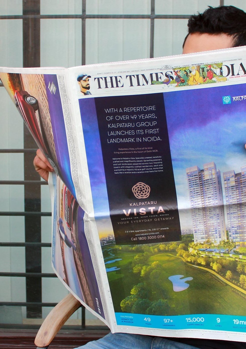
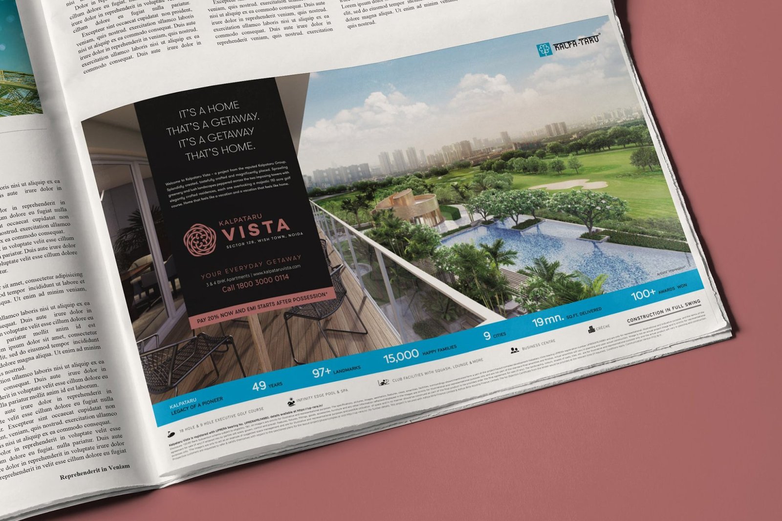
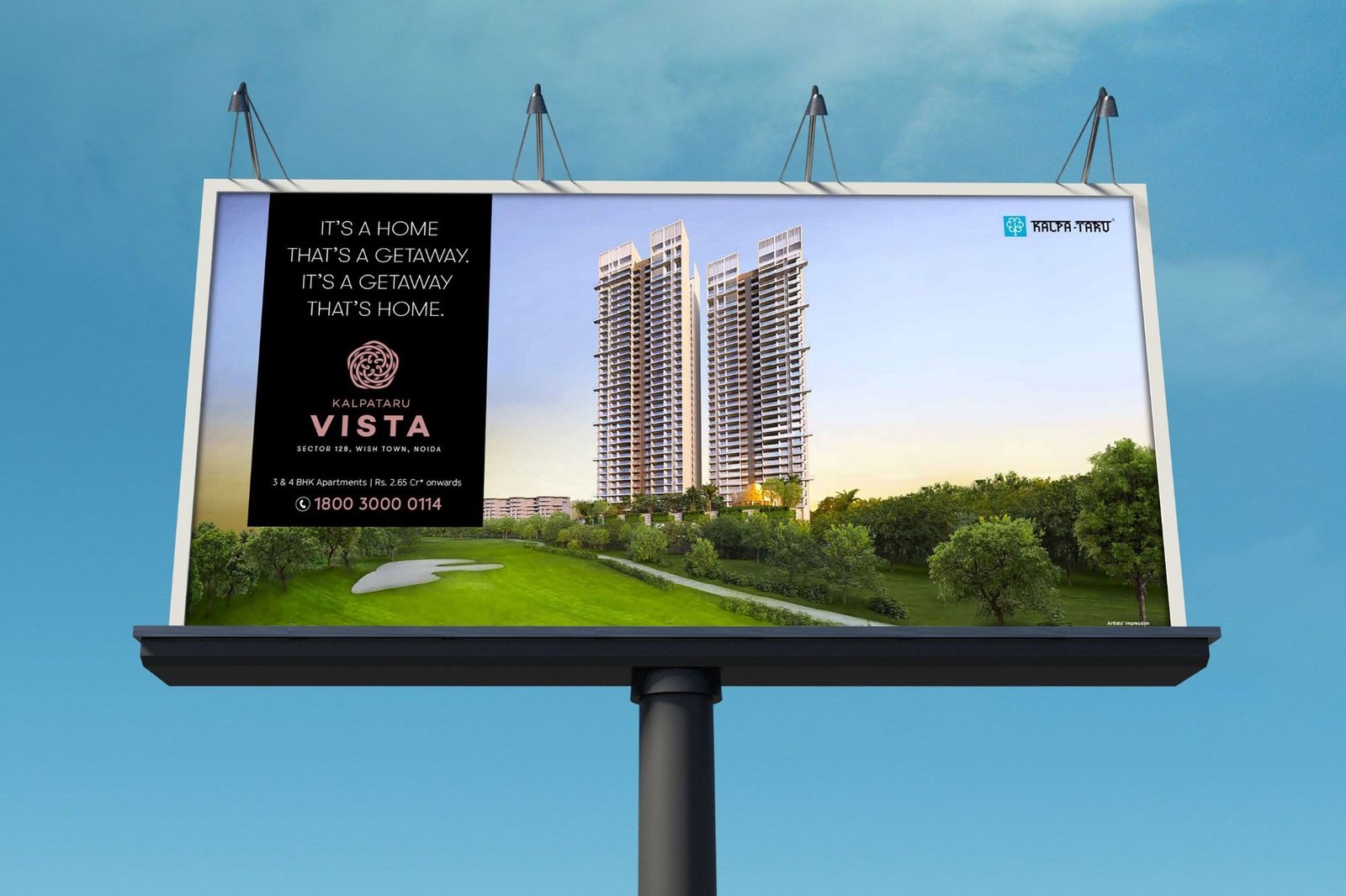
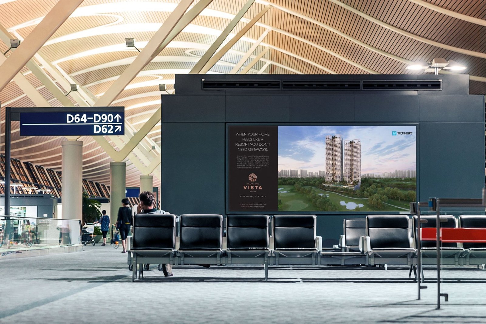
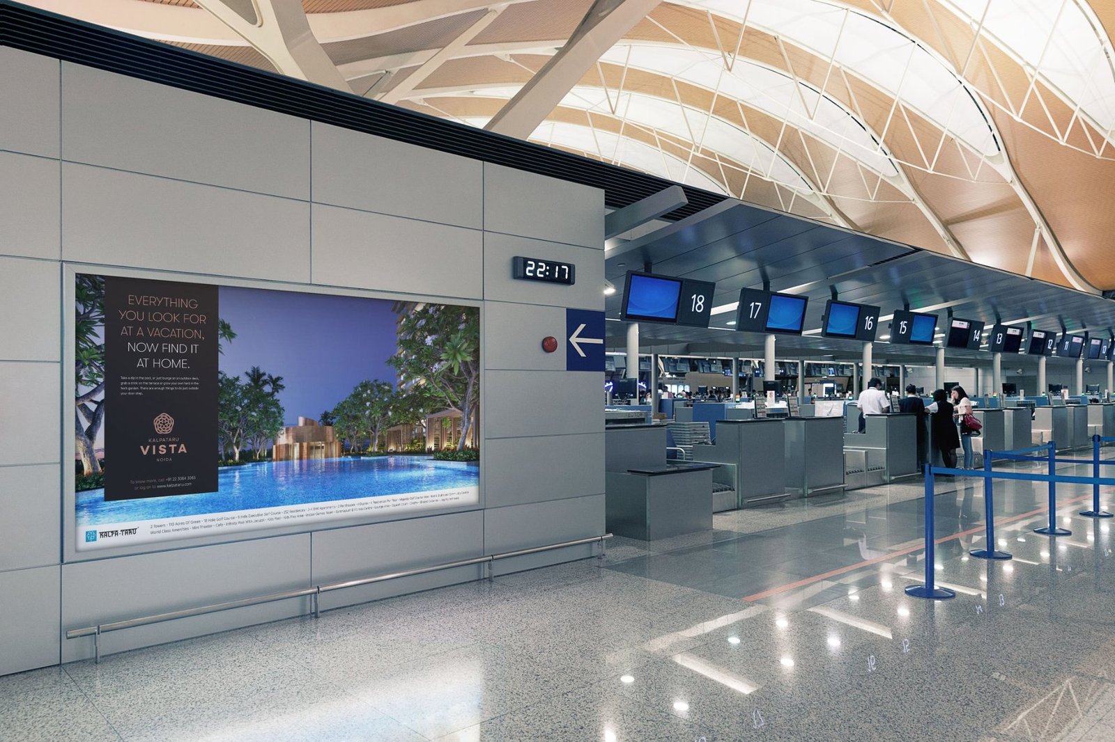
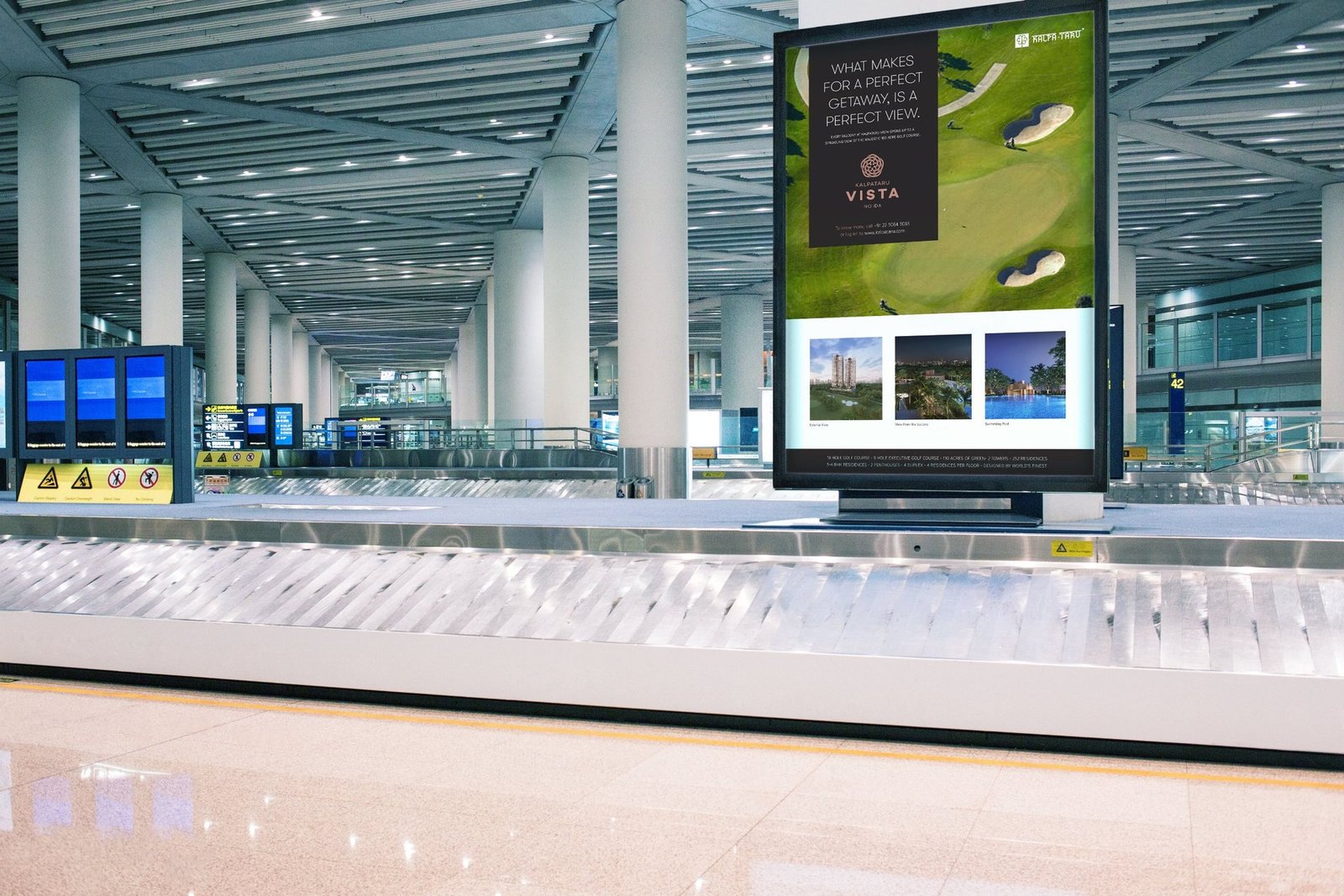
Kalpataru Group's first residential launch in Noida sat beside one of India's most renowned golf courses. The product was built. The positioning was not. We branded Kalpataru Vista as The Everyday Getaway and ran it from newspaper jacket to airport display, holding one line across every exposure.

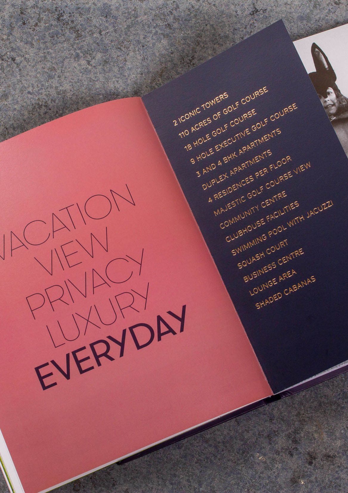
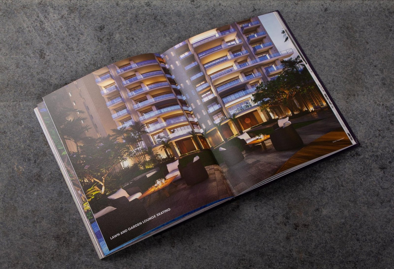
Iconic towers framing the development.
Acres of golf course and landscape in view.
Residences per floor across 3 and 4 BHK layouts.
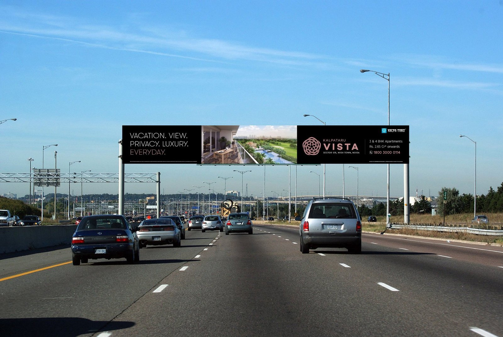
Line carried from newspaper jacket to airport gantry.

Kalpataru's first Noida launch, next to a landmark golf course.
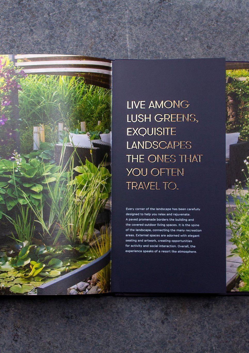
The strongest asset in the brief was the site: residences nestled amongst the finest landscaping, with a lush golf course across the fairway. The nearest neighbours sit on the far side of manicured greens.
In a market where density is rising and open ground is shrinking, space and privacy are the new benchmarks of luxury. We built the positioning around that shift, then carried it into every touchpoint.

Luxury launches that all talk about the same amenities.
Every launch competes on the same claims.
Bigger towers, grander lobbies, longer amenity lists. A buyer scrolling three brochures cannot tell them apart. We had to break the pattern without raising the volume.
The strongest asset was almost invisible in the brief.
The project sits next to a landmark golf course, with privacy and open ground that money cannot easily replicate. The old collateral mentioned it. The new brand had to lead with it.
Press, outdoor and airport ran as separate campaigns.
Newspaper jacket on Sunday, billboard on Tuesday, airport the week after. Without one line connecting them, the exposures do not compound.

The Everyday Getaway, held with discipline.
The insight: space is the new luxury
In a world of increasing density, open space and privacy are becoming the benchmarks of luxury. Vista enjoys splendid isolation. The nearest neighbours are on the far side of manicured fairways and greens.

The positioning: a home that feels like a vacation
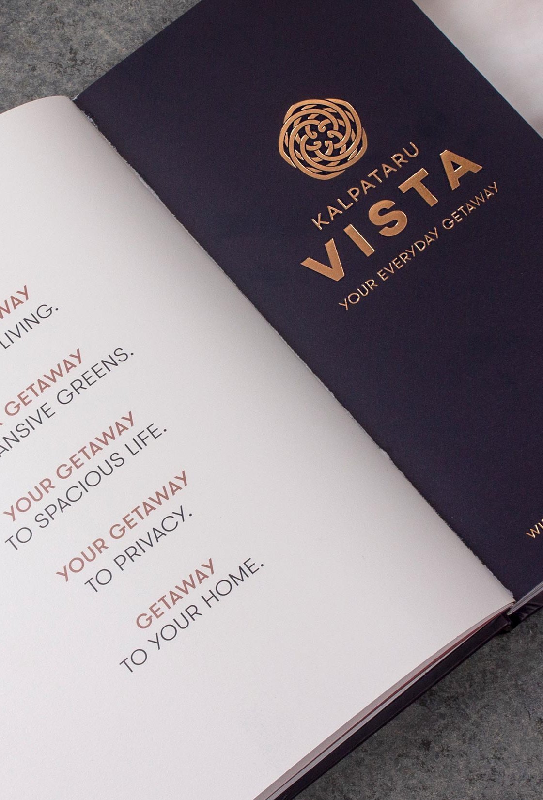
We positioned Vista as a home that feels like a vacation, and a vacation that feels like home. The idea took the name The Everyday Getaway. Simple enough to live on a billboard, specific enough to mean something inside the brochure.

Identity and brand book
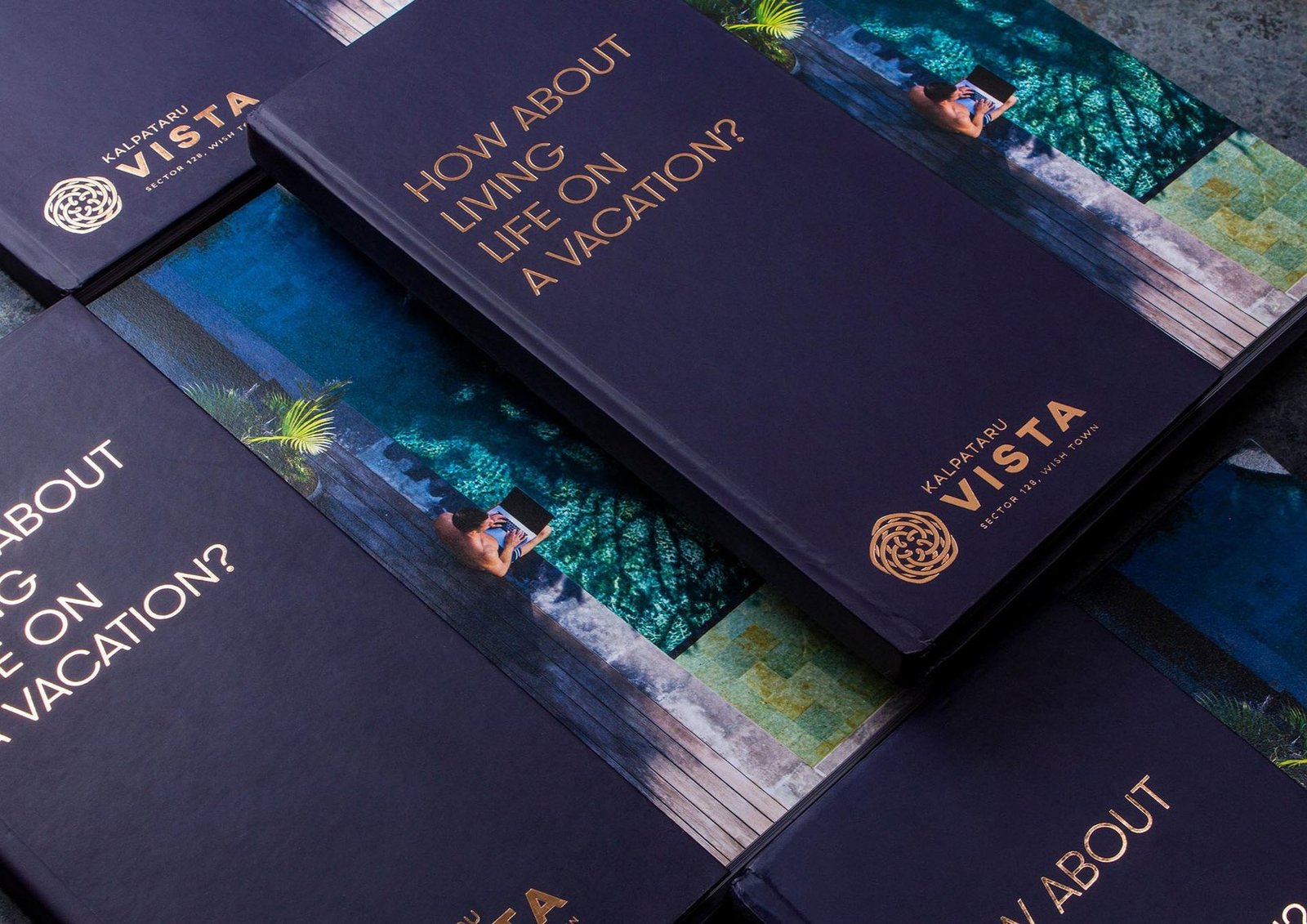
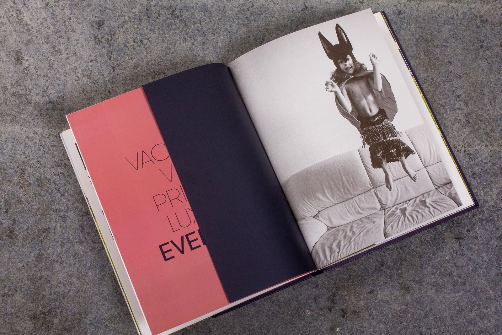
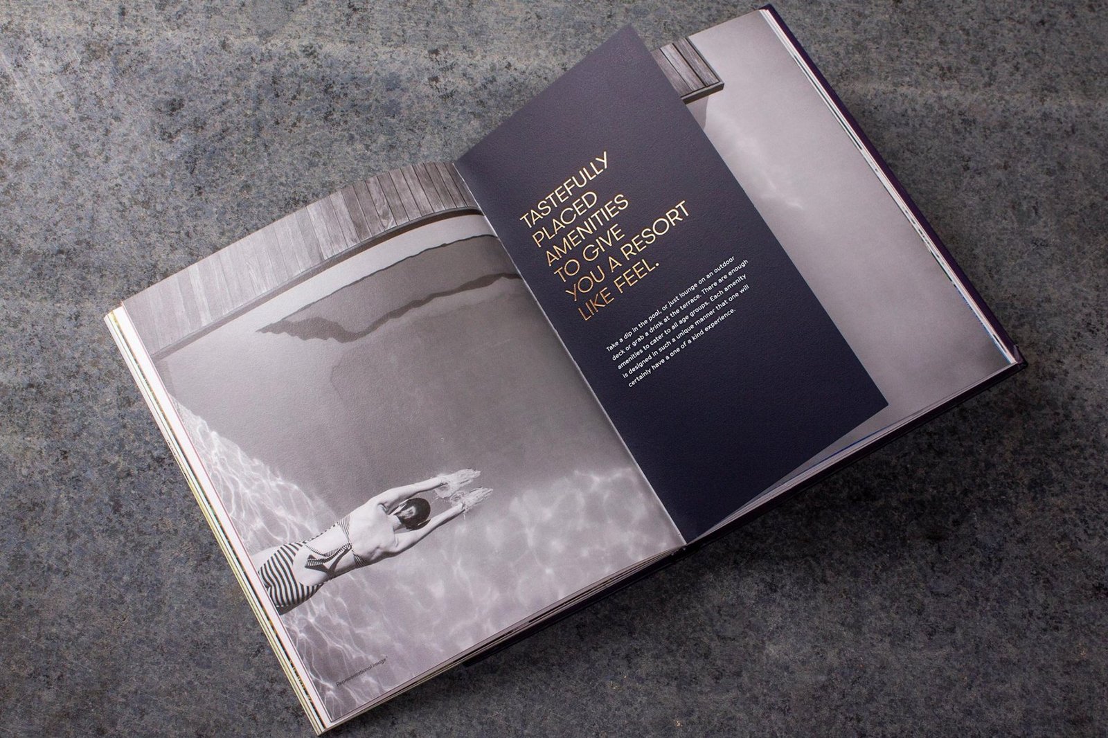
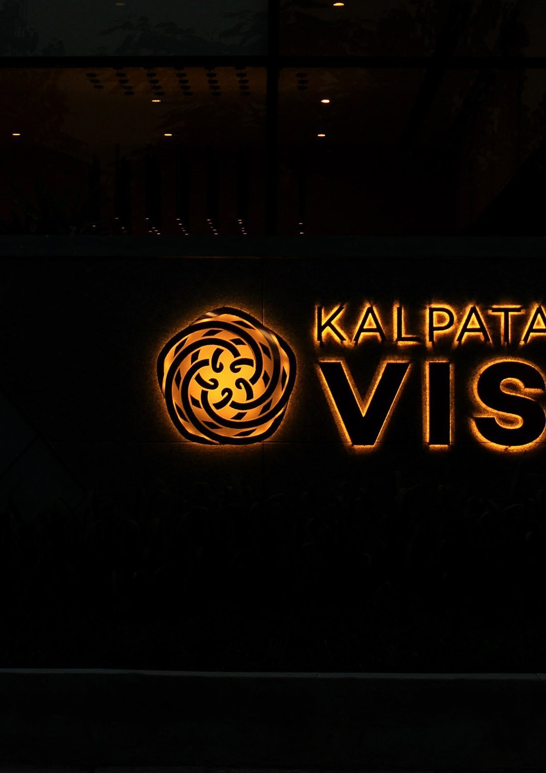
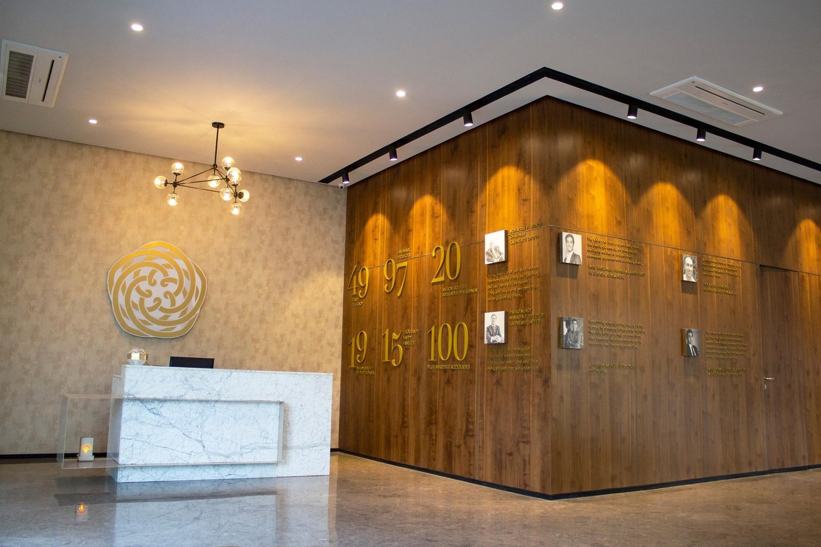
Deep navy and gold with a coral accent. A rose emblem drawn as a monogram. A coffee-table brand book that reads like a lifestyle title, not a sales brochure. Every touchpoint carries the same quiet confidence.

Own every touchpoint on the way to the getaway
Newspaper jackets, press ads, billboards, expressway gantries, airport displays, site hoarding, sales office. One line everywhere. Vacation. View. Privacy. Luxury. Every day.

A single system, carried across every touchpoint.
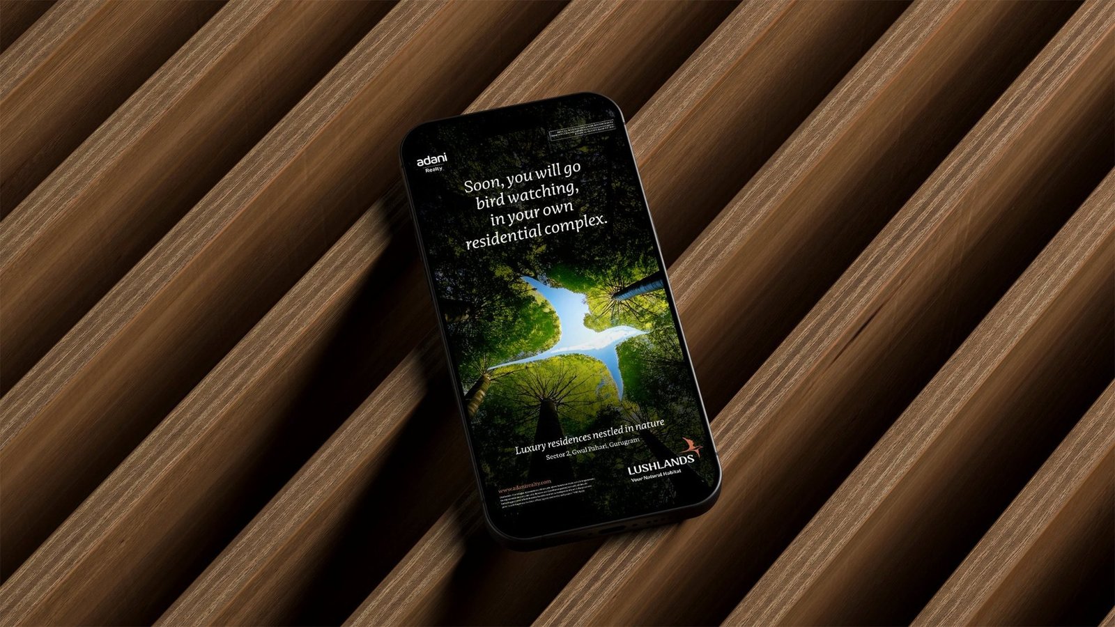


From a project brief to a brand with voice.
Have a project worth a brand of its own?
We find the one truth about the product that nobody else is leading with, name it, and build the system that carries it from brochure to hoarding.
See the full Real Estate practice.
Avara on Alton
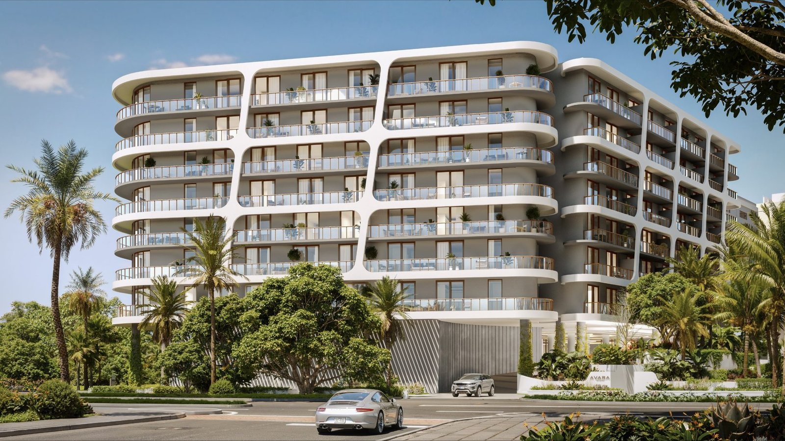
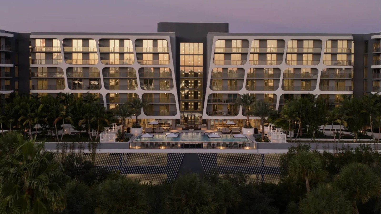
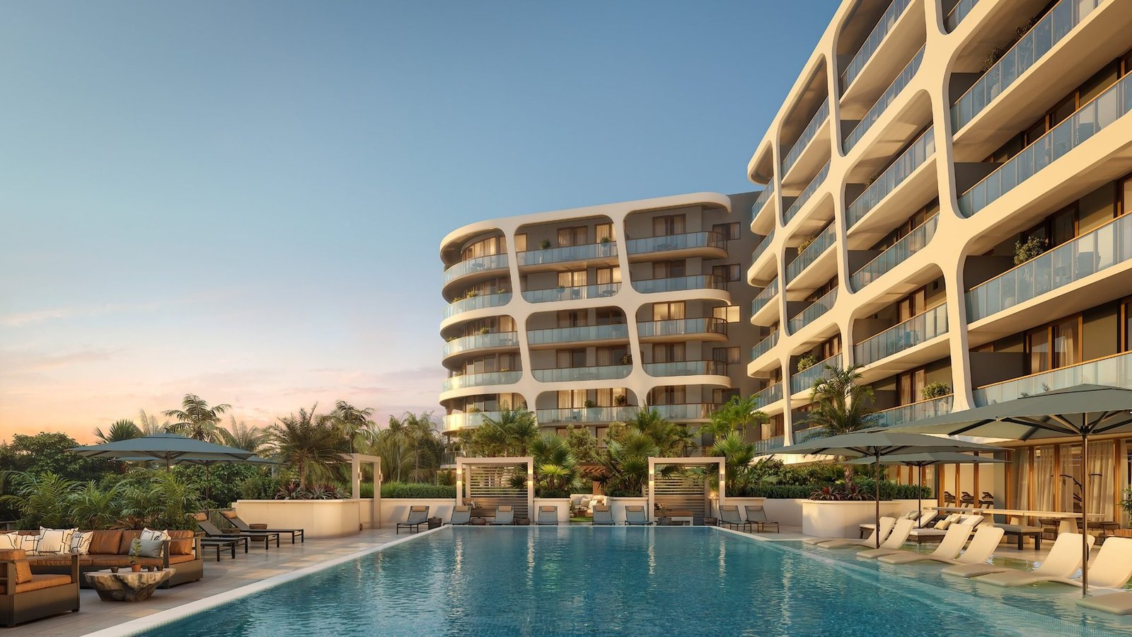
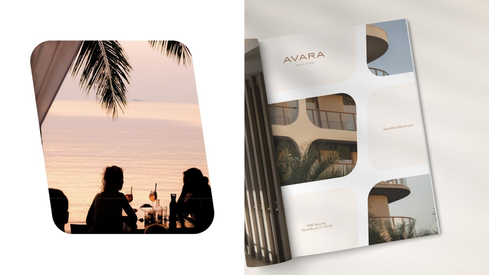
A Miami Beach rental, built as a design-led address.
Mast Capital brought us in to brand a luxury rental residence in Miami Beach. We ran the full arc: discovery, positioning, naming, visual identity, print and digital collateral, and the signage that fronted the construction site. The result reads less like a rental listing and more like an address with a point of view.

Workstreams held under one brand platform.
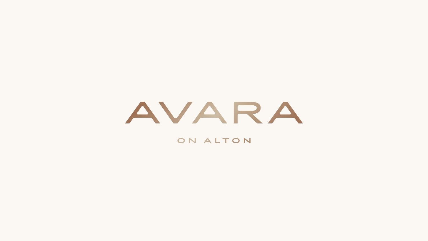
Short, soft, international name buyers remember.
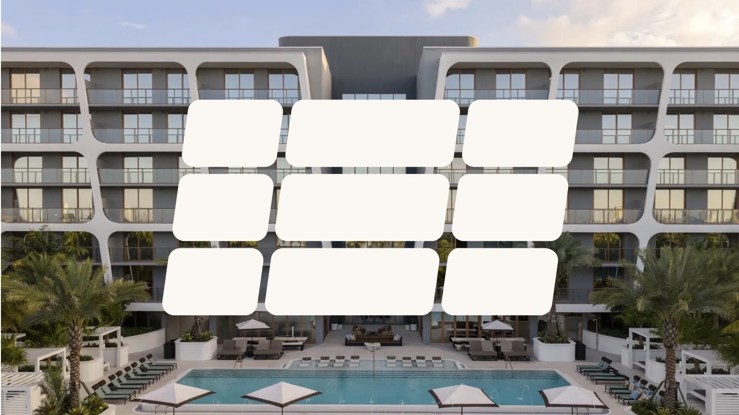
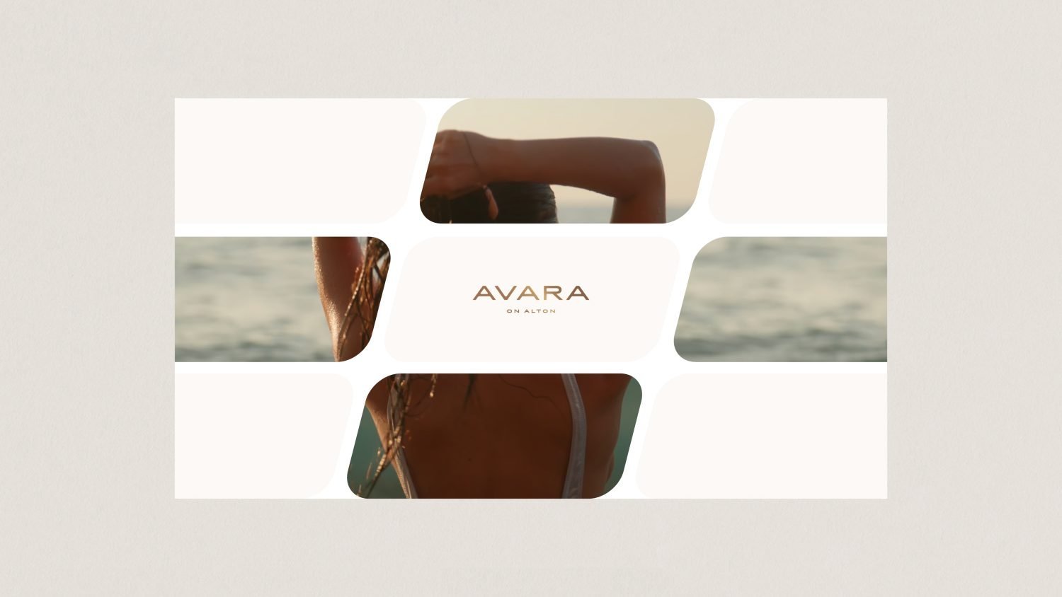
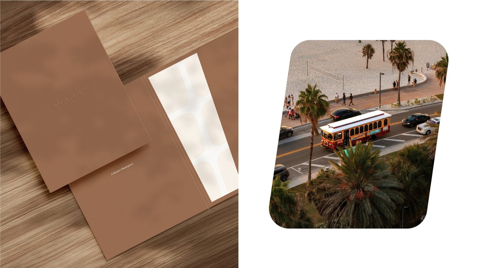
Framing motif pulled from the building's own facade.
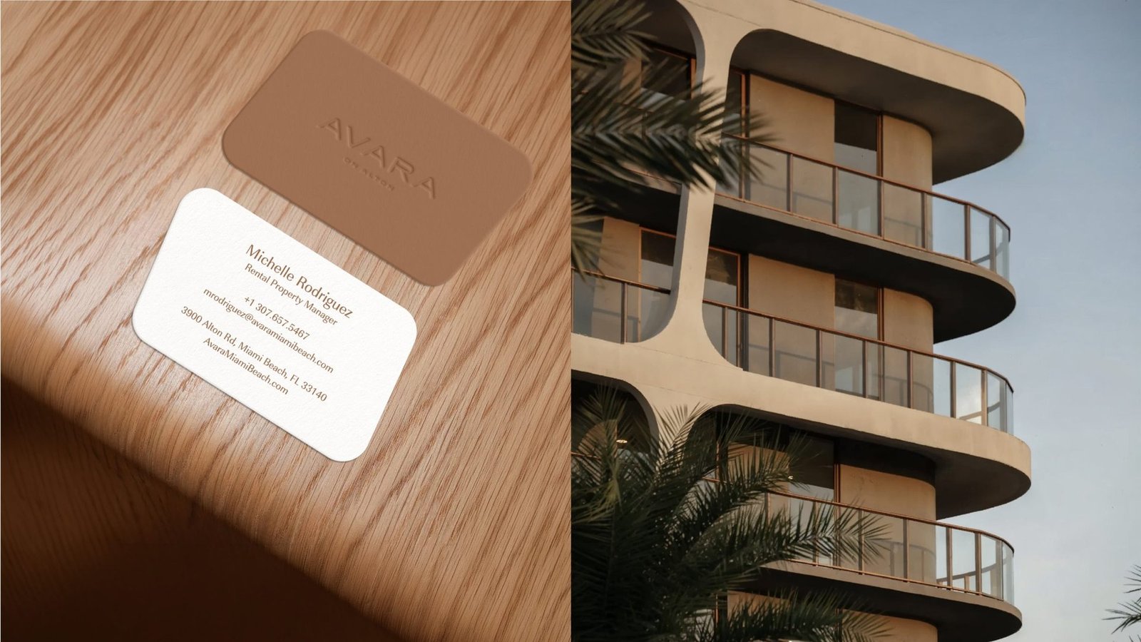
Palette tones: cream, copper, sand, ink.

Mast Capital brought us in to make a rental feel like an address.
Avara on Alton is a luxury rental residence in Miami Beach, a market with real estate's loudest competition. The brief was simple to state, hard to execute: a brand that frames Avara as a sophisticated, design-led home rather than a rental you move through.
The character of the city, its culture, creativity and easy, sunlit pace, had to live inside the identity. Every touchpoint, from the signage on the site fence to the brochure in a leasing office, had to feel like one object.

A rental, in a market where rentals get skimmed, not remembered.
Rentals rarely earn the brand treatment of ownership stock.
Buyers browse quickly. Floor plans and amenity lists blend together. A rental has to work harder to be remembered than a condo.
Miami Beach is crowded with hotel-feel brands.
Palm-leaf gradients and sans-serif wordmarks everywhere. The city's design IQ demanded something quieter and more intentional.
Strategy, naming and collateral usually live in different hands.
The result is a brand that splinters. We ran all five streams in one room so the signage, brochure and ad speak with one voice.

One name, one motif, one palette.
Discovery, positioning and the name
Discovery first, name last. The positioning places Avara as a design-led home rather than a rental, drawing its tone from Miami Beach's culture and creative energy. Avara: short, soft, easy to say in any language.

A wordmark drawn from the building
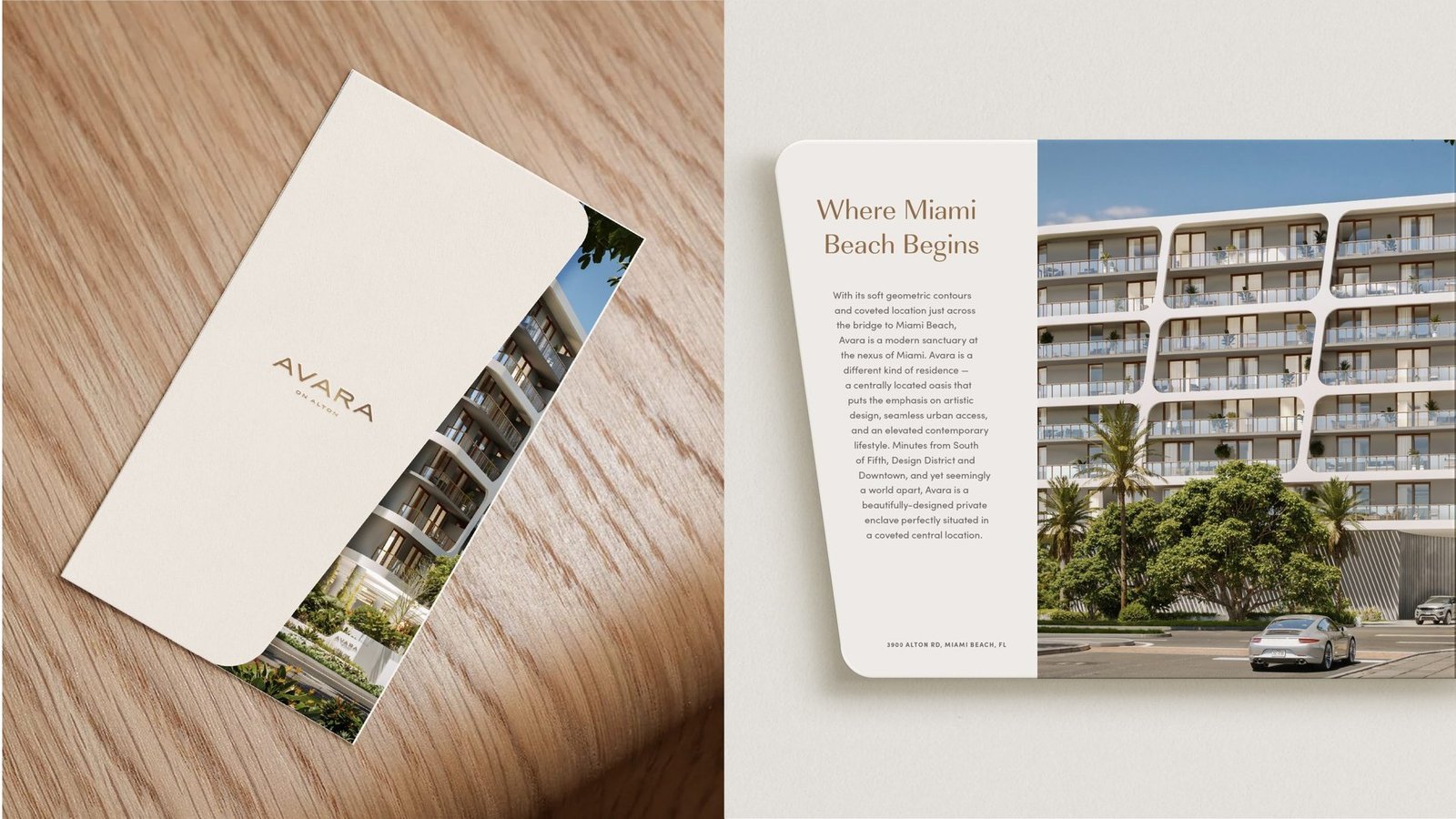
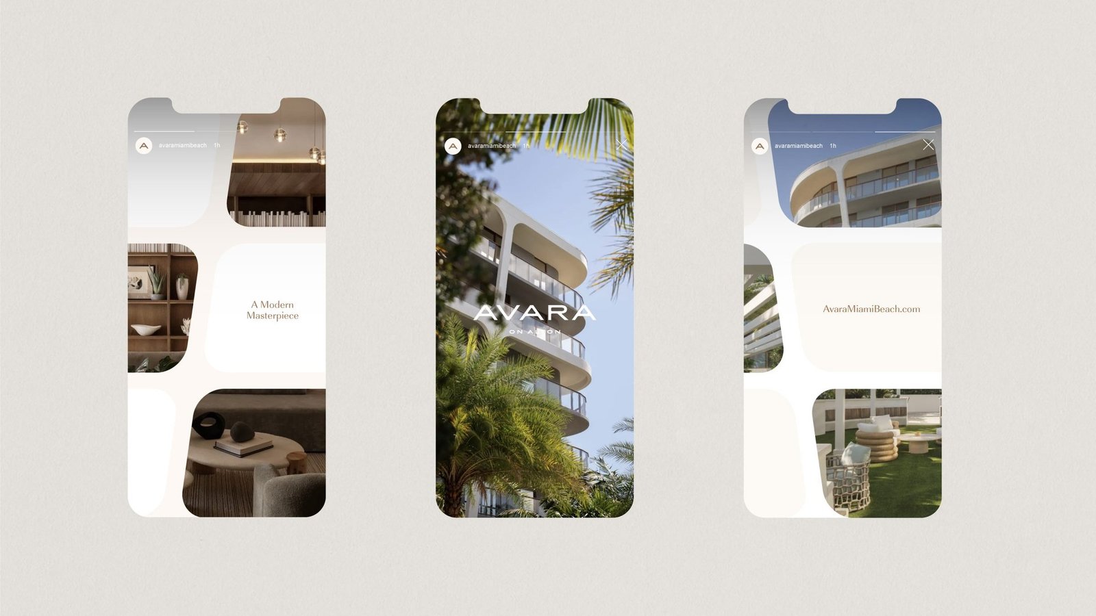
The identity takes its cue directly from the architecture. The facade's sculpted, rounded window frames become a cropping device that recurs across photography, print and screens.

A palette the lobby could live inside
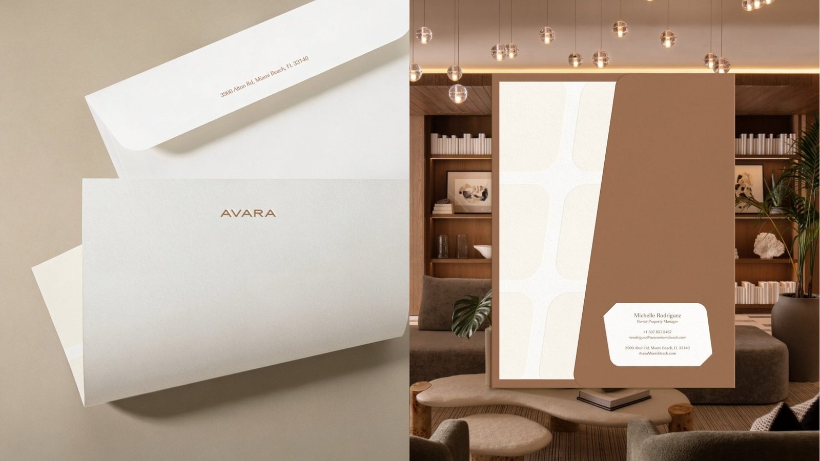
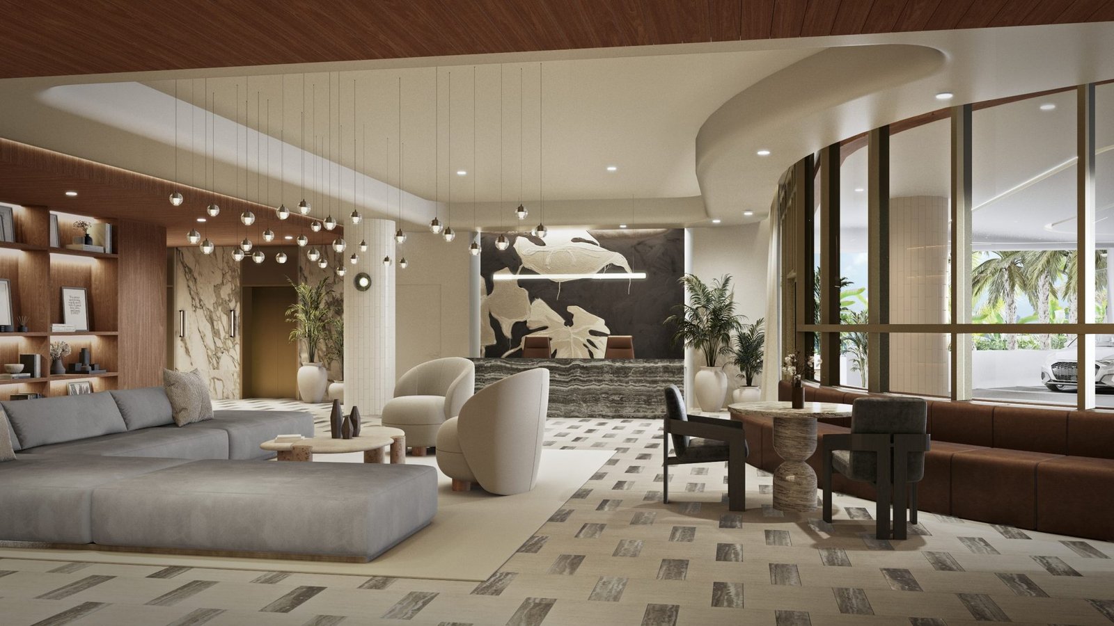
Warm cream, copper brown and soft sand. The palette echoes sand, timber and the building's pale curves. Copper card stock pairs with cream envelopes, carrying the brand on paper into the experience on site.

Collateral, marketing and site signage
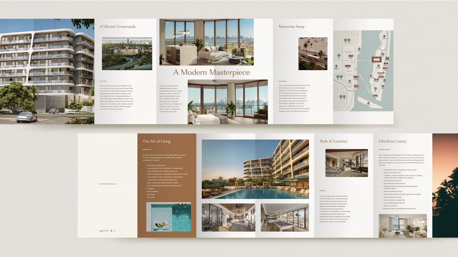
Brochure, floor plan sheets, business cards, stationery, envelopes. Lifestyle advertising and mobile templates. Site signage for the Miami Beach construction fence. One motif, every surface.

A single system, carried across every touchpoint.
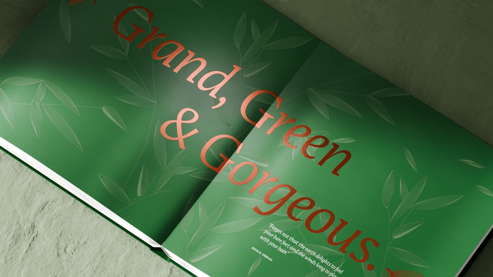


From a project brief to a brand with voice.
Have a project worth a brand of its own?
We find the one truth about the product that nobody else is leading with, name it, and build the system that carries it from brochure to hoarding.
See the full Real Estate practice.
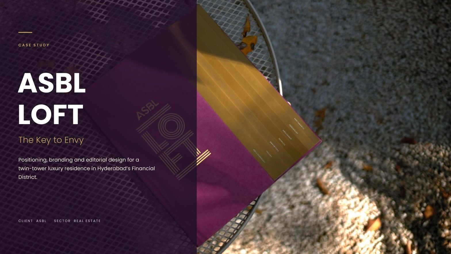
Asbl Loft
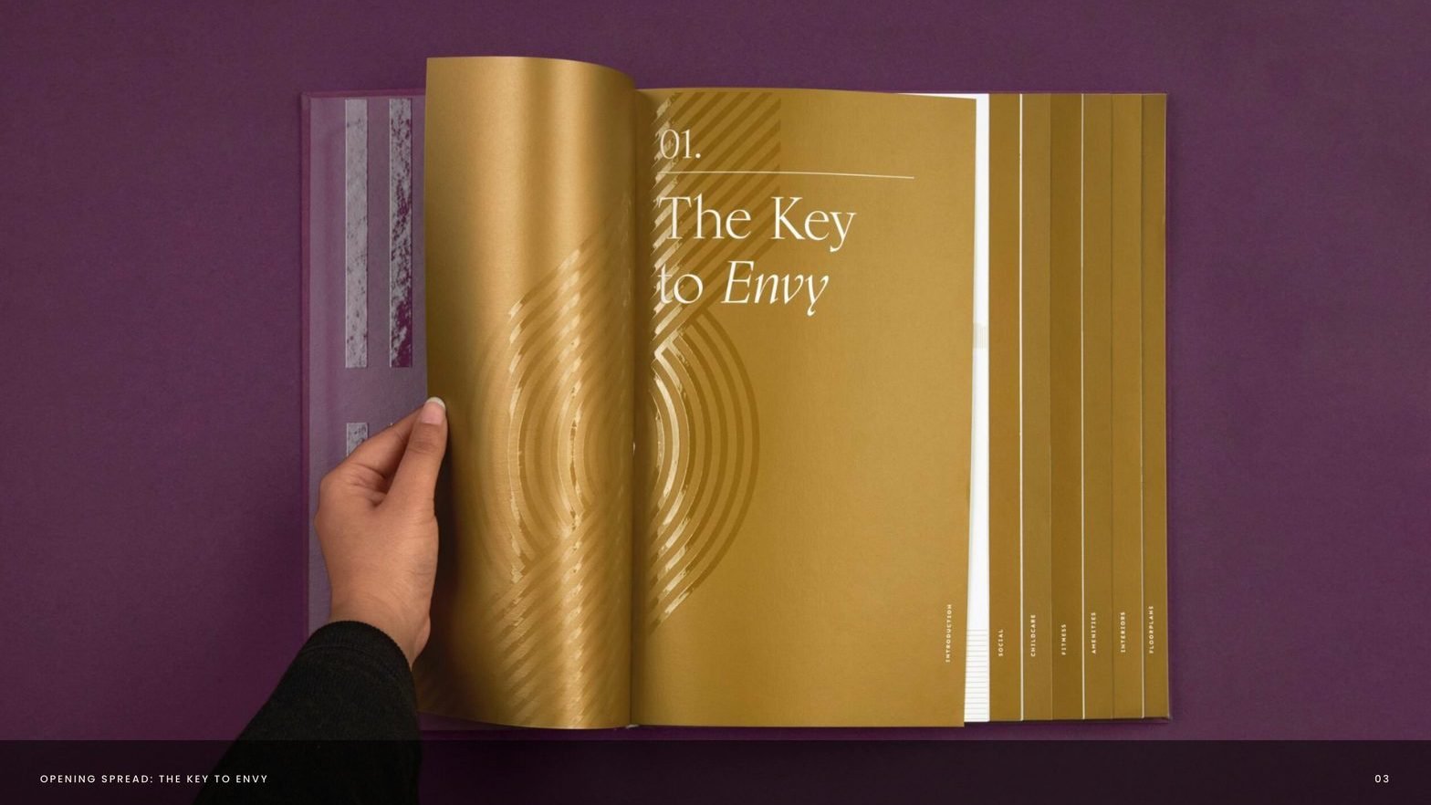
A twin-tower address, repositioned as the key to envy.
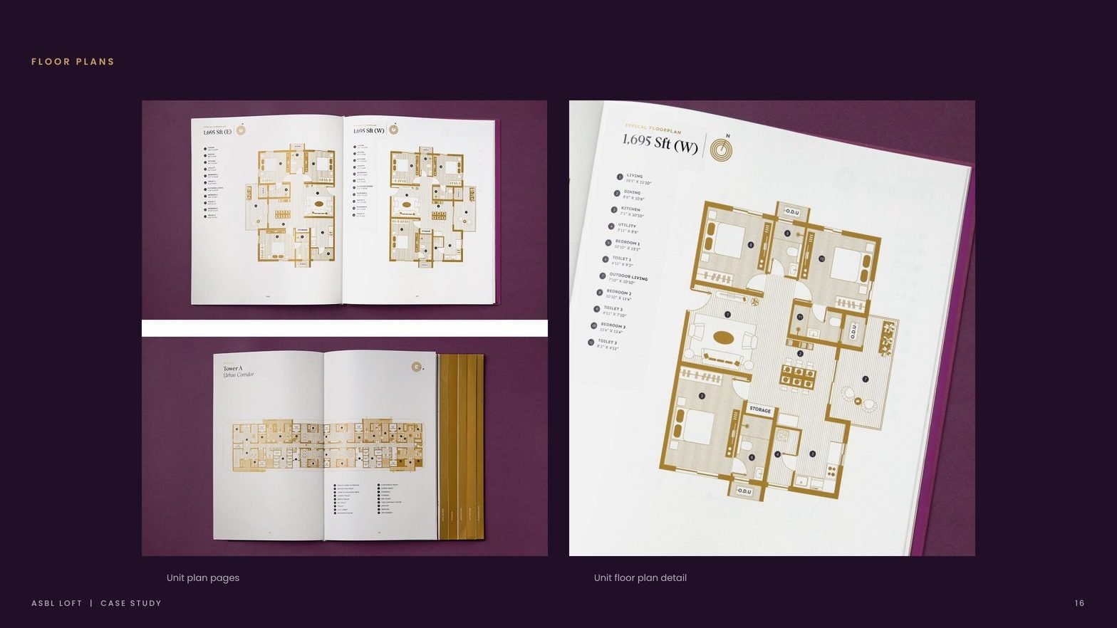
ASBL Loft sits in Hyderabad's Financial District, surrounded by the city's IT and finance addresses. The product was ready. The brand was the gap. We built the positioning, identity and brochure that turned a G+45 twin-tower residence into a landmark buyers want to be seen inside.

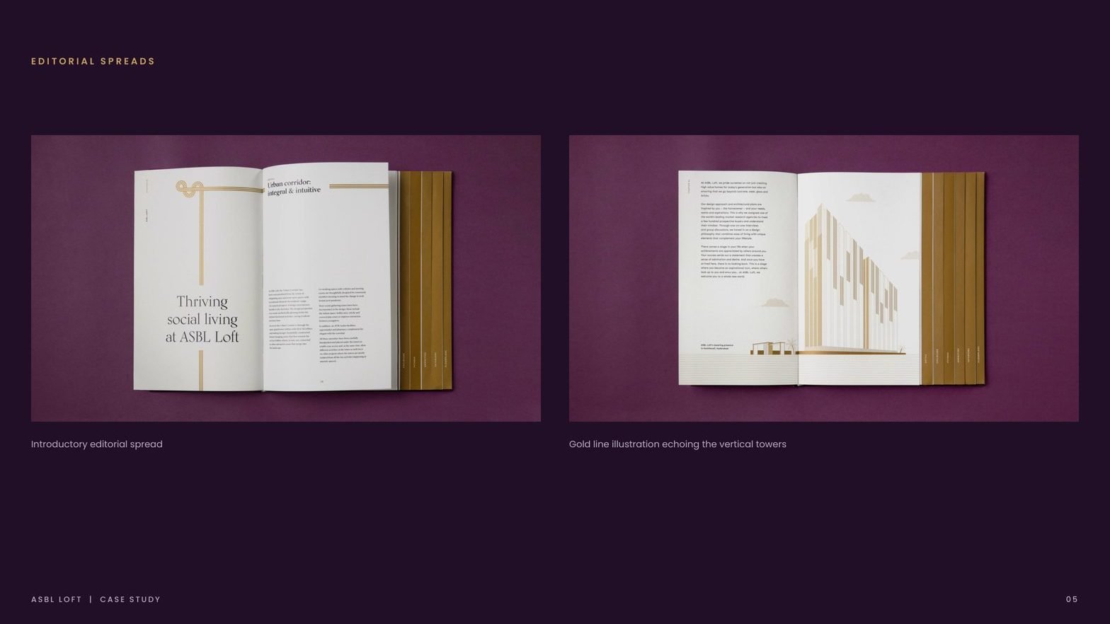
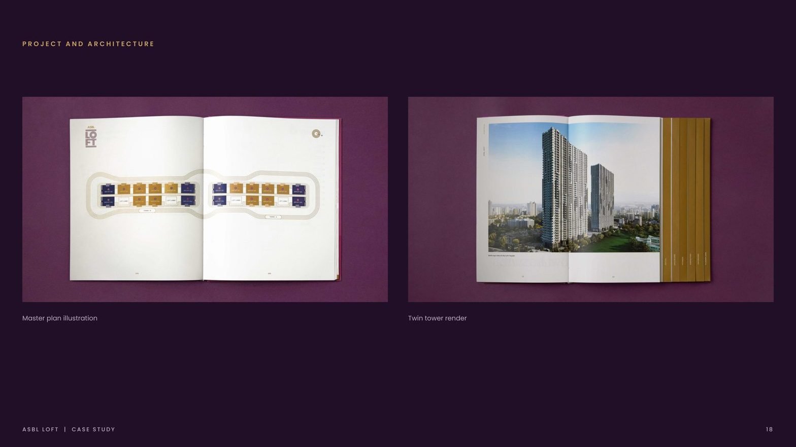
Towers framed as one landmark on the Hyderabad skyline.
Storeys, with a brochure that reads like an editorial title.
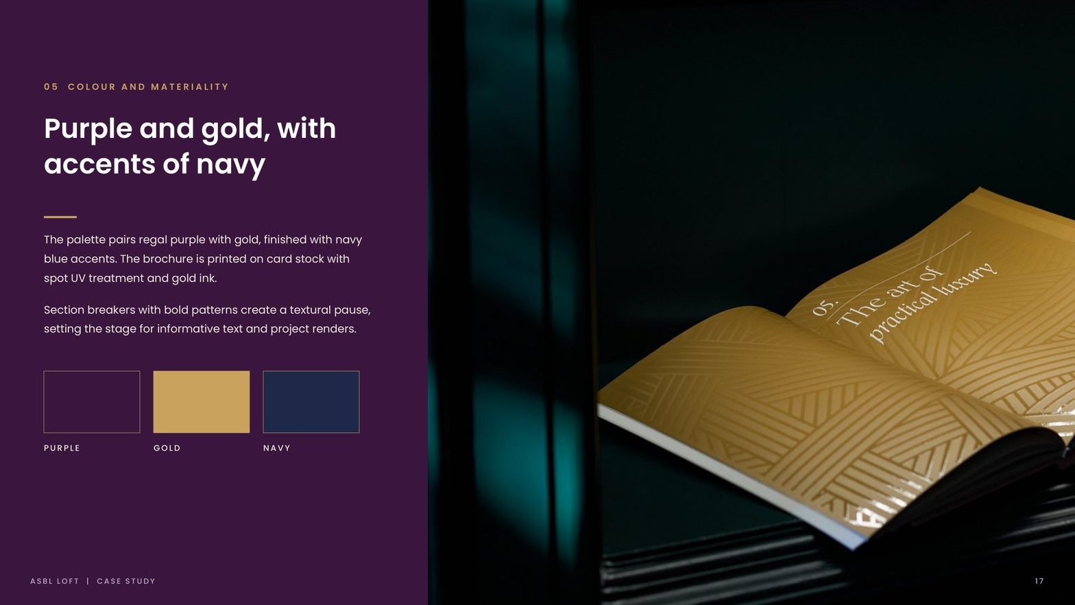
Palette discipline: regal purple, gold and navy accents.
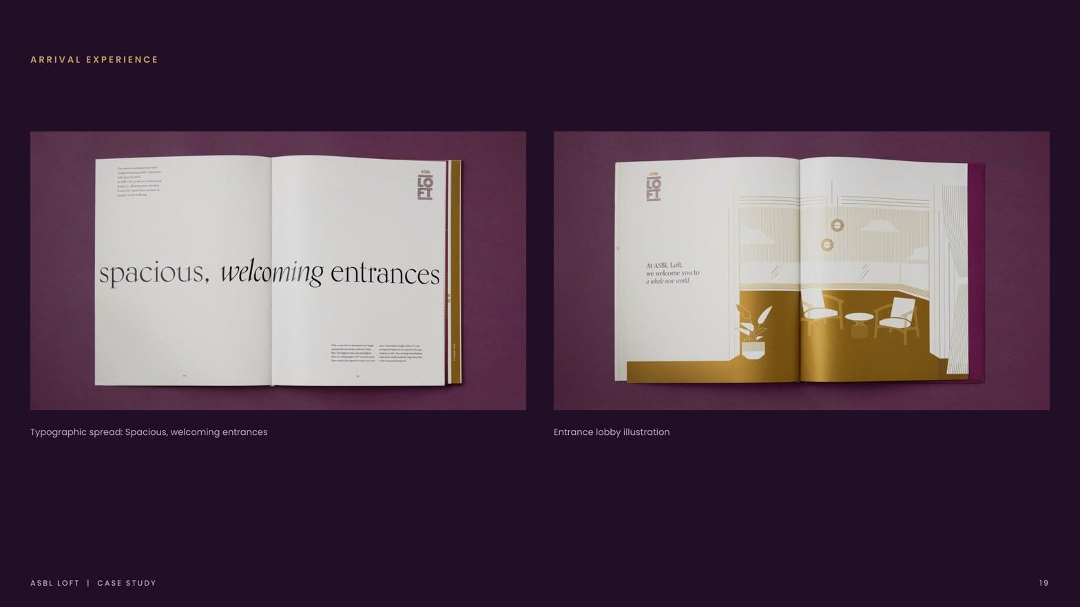
Positioning line that carries every single touchpoint.

ASBL builds for Hyderabad's working elite. The brand had to match.
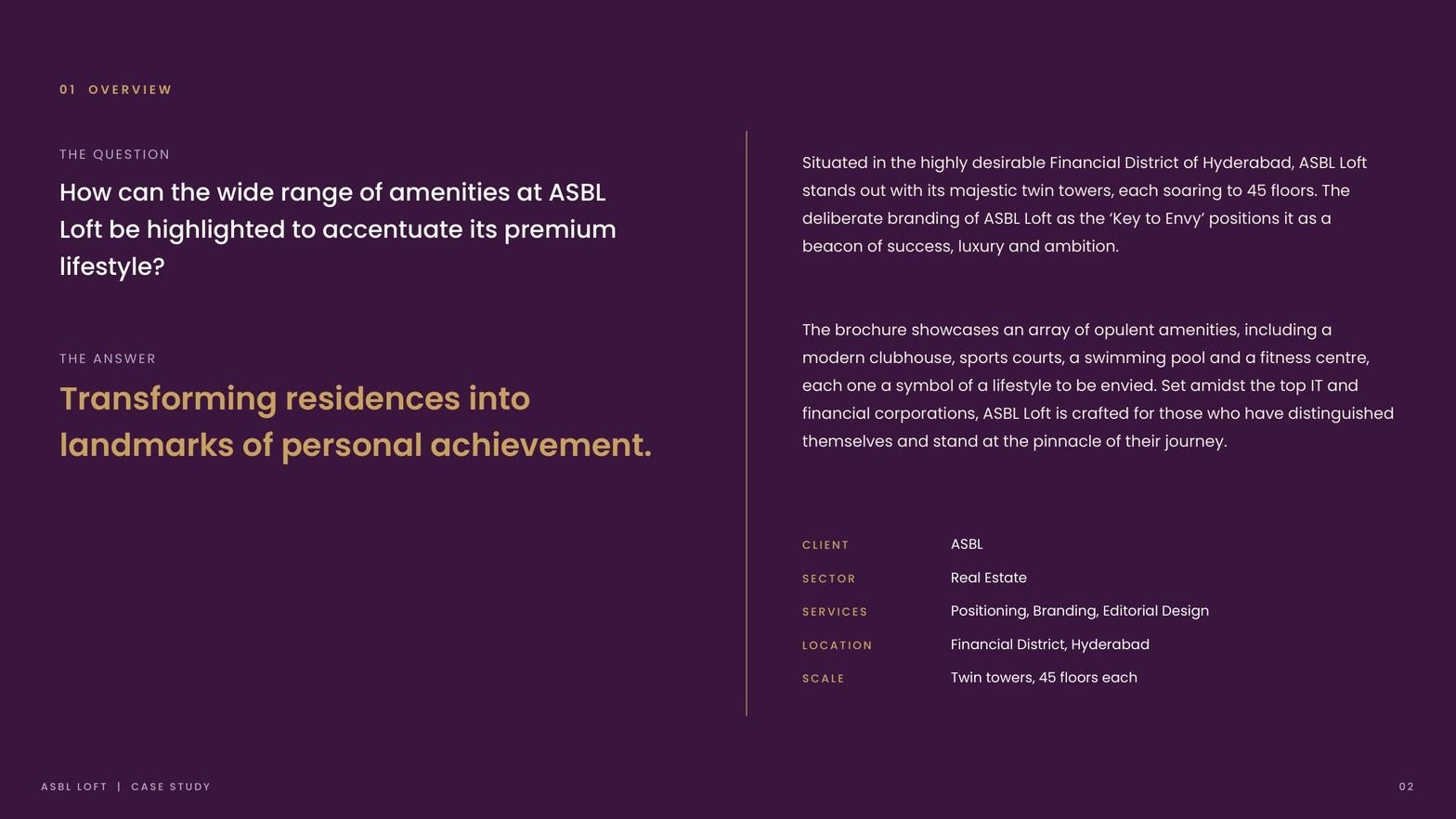
Situated in the highly desirable Financial District, ASBL Loft stands out with its majestic twin towers, each soaring to 45 floors. The buyer is a professional at the top of their journey, surrounded by India's leading IT and financial corporations.
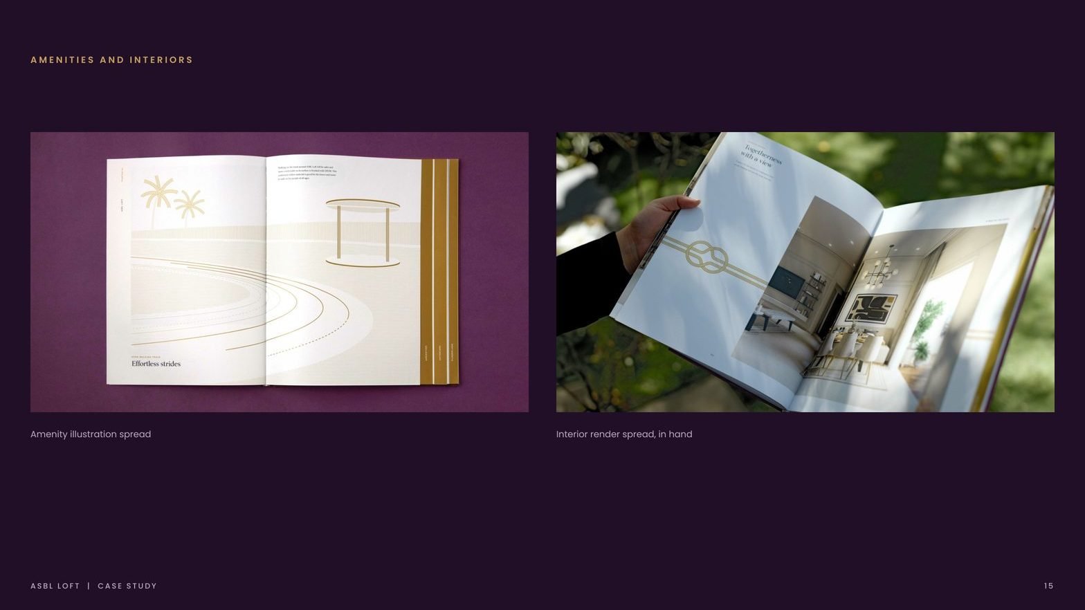
The product was premium. The communication was not. The brochure, identity and site collateral needed to look like they belonged in the same world as the amenities: modern clubhouse, sports courts, swimming pool, fitness centre.

In a district of luxury launches, every brochure looks the same.
Every luxury launch promised the same amenity list.
Clubhouse, pool, courts, lobby ran the room. Nothing in the collateral told buyers why this project, this tower, this address.
The sales story stopped at square footage.
A home became a line item: 3 BHK, 4 BHK, plot area. Nothing in the brand positioned the purchase as the moment a career becomes a landmark.
The editorial system did not match the architecture.
A G+45 twin-tower landmark needed collateral with verticality, rhythm and restraint. The old assets were horizontal, generic and loud.

One line, carried from brochure cover to site signage.
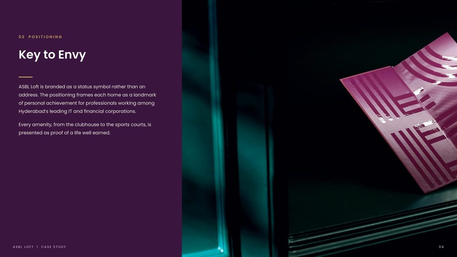
Positioning: The Key to Envy
We branded the address as a status symbol rather than a floor plan. Every amenity, from the clubhouse to the sports courts, is presented as proof of a life well earned. The single line sits on every touchpoint, from brochure cover to site signage.

Identity drawn from verticality
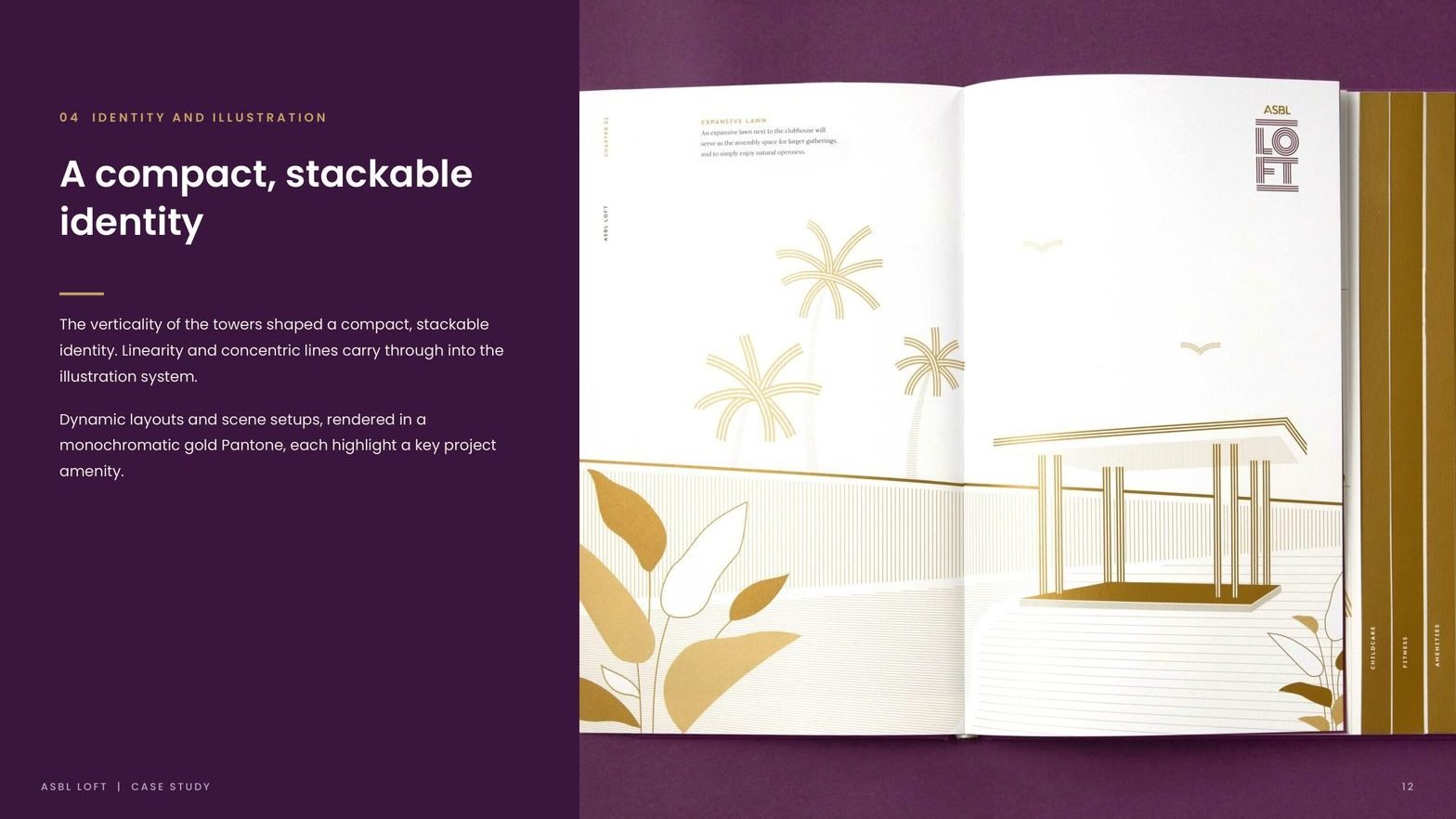
The twin towers shaped a compact, stackable wordmark. Linearity and concentric lines carry through into the illustration system. The identity scales from monogram on a stationery piece to a ten-foot gold Pantone on the sales office wall.

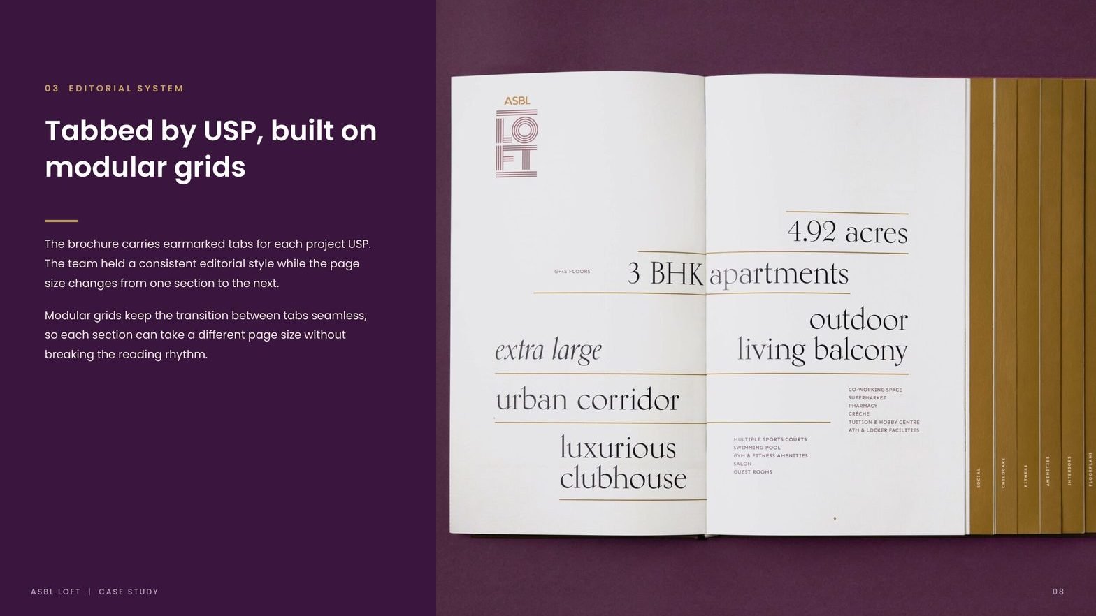
Editorial system, tabbed by USP
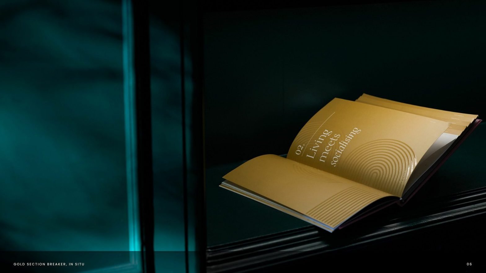
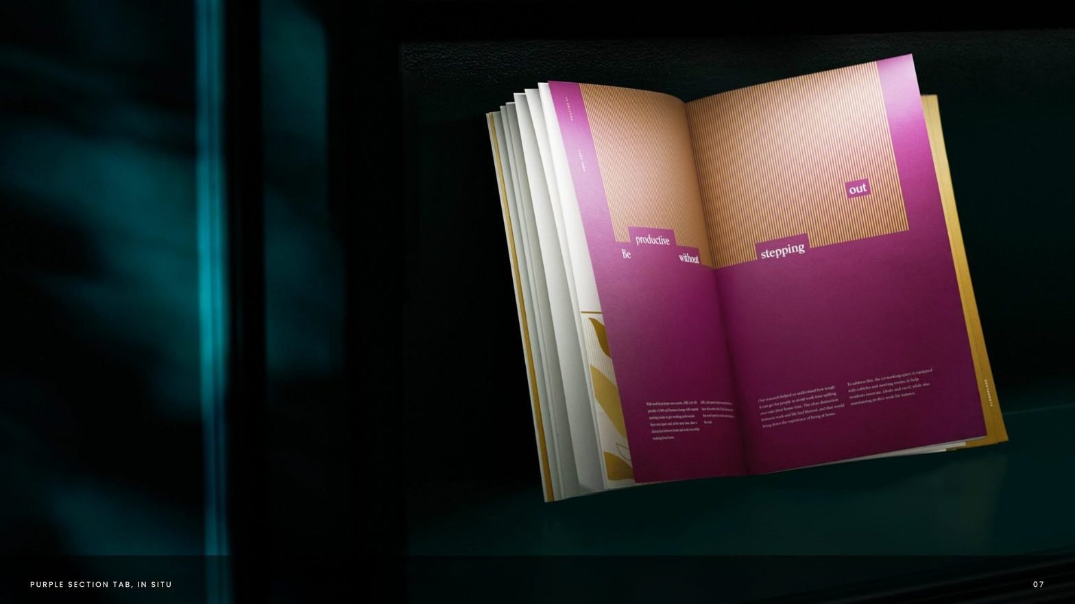
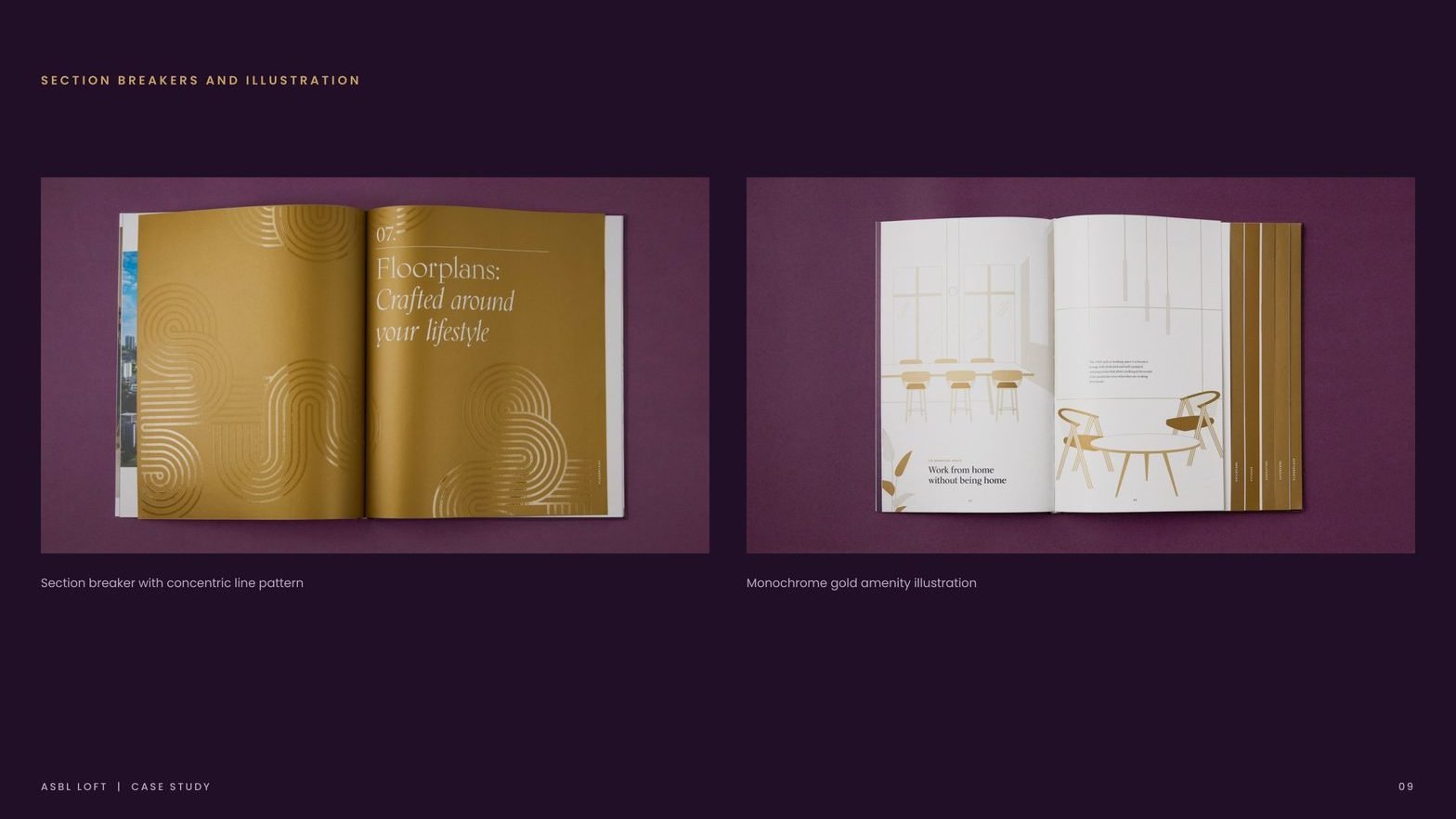
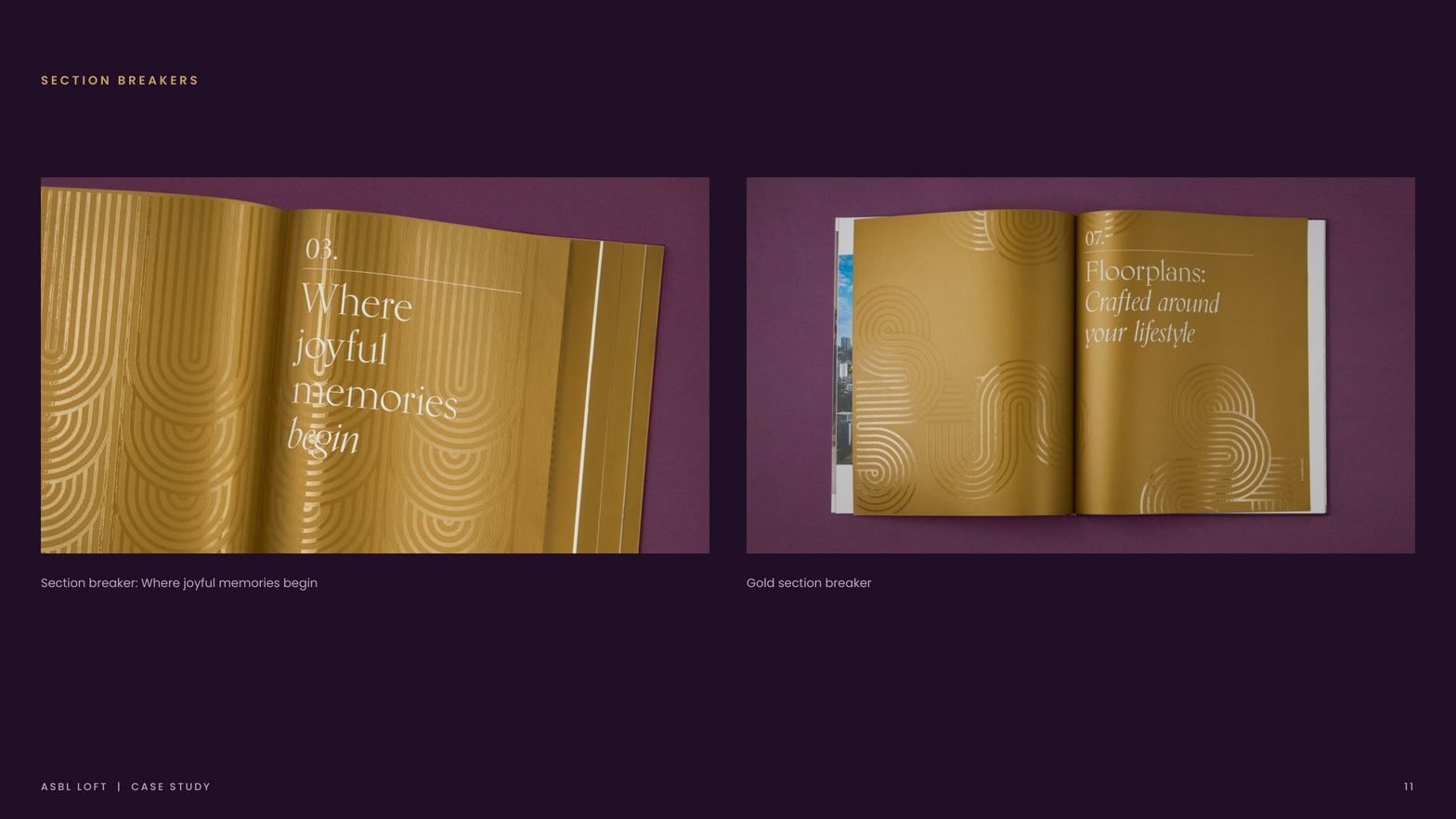
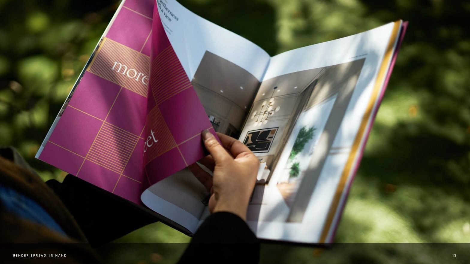
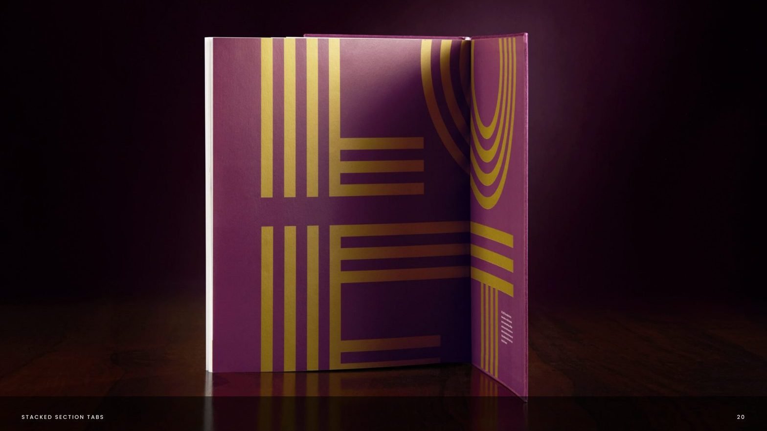
The brochure carries earmarked tabs for each project USP. Page size changes section to section while modular grids keep the reading rhythm intact. Section breakers in bold pattern work give the book a textural pause.

Palette and print discipline
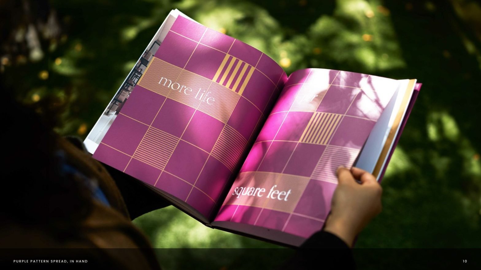
Regal purple, gold and navy accents. Card stock with spot UV treatment and gold ink. Dynamic layouts rendered in a monochromatic gold Pantone, each highlighting a key project amenity.

A single system, carried across every touchpoint.
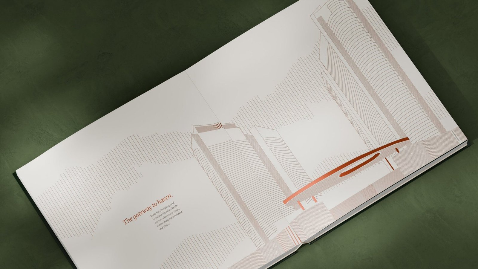


From a project brief to a brand with voice.
Have a project worth a brand of its own?
We find the one truth about the product that nobody else is leading with, name it, and build the system that carries it from brochure to hoarding.
See the full Real Estate practice.
Codinova
Case Study · Website Design & Development
A website engineered like their software.
Codinova builds AI-powered platforms and cloud-native products for global clients. Morphiaas designed and built the digital presence that finally matches the caliber of their engineering.
Client
Codinova
Industry
B2B Software & IT Services
Deliverable
Full Website Design & Build
Stack
WordPress · Elementor
Live At
codinova.com
Designed, written, and built by Morphiaas
Service lines given a dedicated story
Conversion funnels: clients and talent
Live client testimonials integrated as proof
The Client
World-class engineering deserved a world-class front door.
Codinova is a Noida and Delhi based engineering firm delivering AI-enabled SaaS, product engineering, and cloud-native development for clients across Europe and the US. Their work wins six-figure contracts, yet their old website said none of it. Enterprise buyers landing on the site saw a generic services page, not the firm that ships intelligent platforms at scale. Codinova brought Morphiaas in to fix that gap end to end.

AI-Enabled SaaS
GenAI chatbots, intelligent knowledge systems, and process automation.

Product Engineering
MVP to full-scale launch with speed, precision, and user centric design.

Cloud-Native Development
Containerized, serverless architecture on AWS, Azure, and GCP.

Software Development
Modern web, mobile, custom APIs, and enterprise systems.

Digital Transformation
Legacy modernization and operations automation for the enterprise.

Innovation Labs
Rapid prototyping across GenAI, Web3, IoT, and Edge.
The Challenge
Six-figure engineering. A template grade website.
Undersold
The site hid the caliber
Codinova competes with global engineering firms, but the old site read like a local vendor. CTOs evaluating partners judged the code by the cover, and the cover lost deals before a single call.
Unclear
No story, no structure
Services, capabilities, and proof were scattered without hierarchy. A visitor could not answer the only question that matters in ten seconds: what does this firm do, and why them.
Dead ends
Nowhere to convert
No clear paths to contact, no talent funnel, no reason to act. Traffic arrived, looked, and left, taking pipeline and hiring candidates with it.
What Morphiaas Built
Positioning first. Pixels second. Performance always.
01
Positioning and narrative
Before a single screen was designed, we rebuilt the story. “Engineering for Scale, AI for Edge” became the spine of the site: a message that speaks to CTOs and product leaders in their own language and puts AI capability, not generic IT services, at the front of the brand. Every section that follows earns its place in that narrative.
02
Design and experience
A clean, engineering-grade visual system: confident typography, generous spacing, custom service imagery, and interactive sections built for scanning, not reading. The services carousel, tech arsenal, culture pillars, and client testimonials from Ruxbury, Gourministeriet, and Flextribe give an enterprise buyer proof at every scroll depth.
03
Build, conversion, and speed
Shipped on WordPress and Elementor with performance discipline: optimized WebP assets, lean scoped styling, and fast paint on every device. Two conversion systems run through the whole page, a contact flow for buyers and a full application funnel with resume upload for talent, because Codinova grows on both clients and engineers.
The Results
Same company.
A different first impression.
Toggle between the old site and the one we shipped.
| Deliverable | Scope | Outcome |
|---|---|---|
| Brand narrative & messaging | Positioning, copy, section architecture | One story from hero to footer |
| Homepage design & build | Hero, services, culture, tech arsenal, testimonials | Enterprise-grade first impression |
| Conversion systems | Contact flow + careers funnel with resume upload | Two growth engines, buyers and talent |
| Content engine | Blog architecture for technical insights | SEO surface that compounds |
| Performance build | WebP assets, optimized Elementor delivery | Fast paint on every device |
[Role], Codinova
Your work is world-class. Does your website say so?
Morphiaas designs and builds digital experiences that win the deal before the first call.
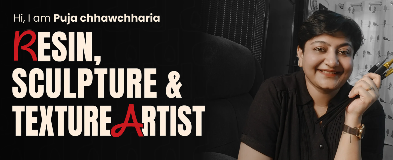
Red Art By Pooja
Case Study · Education & Creator Commerce
Red Art by Puja turned a portfolio page into a
course-selling machine.
A self taught sculpture artist with 10,000+ students needed a website that sells while she teaches. Morphiaas rebuilt redartbypuja.com around one job: converting art lovers into enrolled students.
Client — Red Art by Puja
Industry — Online Art Education
Window — 90 days post-launch
Scope — Website Design · Conversion Copy · SEO · WhatsApp Funnel
Course enrollments, 90 days post-launch
Source: WooCommerce orders — VERIFY
Qualified WhatsApp leads from the site
Source: WhatsApp Business — VERIFY
Visitor-to-enrollment conversion rate (from 0.9%)
Source: GA4 — VERIFY
Mobile load time (from 6.8s)
Source: PageSpeed Insights — VERIFY

The client
Puja Chhawchharia is the artist behind Red Art. A Company Secretary turned entrepreneur turned self-taught sculpture painter, she built a following of over 10,000 students across eight course verticals: texture art, sculpture painting, 3D floral mesh, Mandala Lippan mosaic, impasto, moon texture, and resin workshops. Brands like Amazon, Grab, and BRLO have collaborated with her. Her business runs on live Zoom batches and WhatsApp conversations.
The challenge
Traffic without transactions
Instagram sent thousands of profile visitors, but the old site gave them nowhere to go. No clear course architecture, no pricing logic, no reason to act now.
Eight courses, zero hierarchy
Every course competed with every other course. Visitors browsed, got overwhelmed, and left to “think about it” on WhatsApp, where half the conversations went cold.
Invisible on search
Students searching “sculpture painting course India” or “texture art online class” never found her. The category demand existed; the site captured none of it.
What Morphiaas built
A conversion-first course architecture
Eight scattered offerings became a guided path: hobby, income, teach. Each course page sells one outcome, shows student work as proof, and ends in a single enrollment action.
Copy built on buyer psychology
“Learn the Art. Build the Business.” reframed the purchase from hobby spend to income skill. Social proof counters, brand logos, and batch scarcity moved decisions from someday to today.
A WhatsApp funnel that closes
Every page routes warm intent into a pre-filled WhatsApp conversation with Puja. The site qualifies; she closes. High-touch sales at scale, without a sales team.
Technical SEO and speed
Course-intent keywords mapped to dedicated pages, structured data for courses and reviews, compressed media, and load times cut to under two seconds on mobile.
The results
First 90 days after launch versus the 90 days before.
Puja Chhawchharia · Founder, Red Art by Puja
Your website should be your best salesperson.
Morphiaas builds websites that are accountable to revenue, not compliments.
Simmply Foods
Case Study · FMCG / Ready-to-Cook
Teaching a parota to speak Gen Z
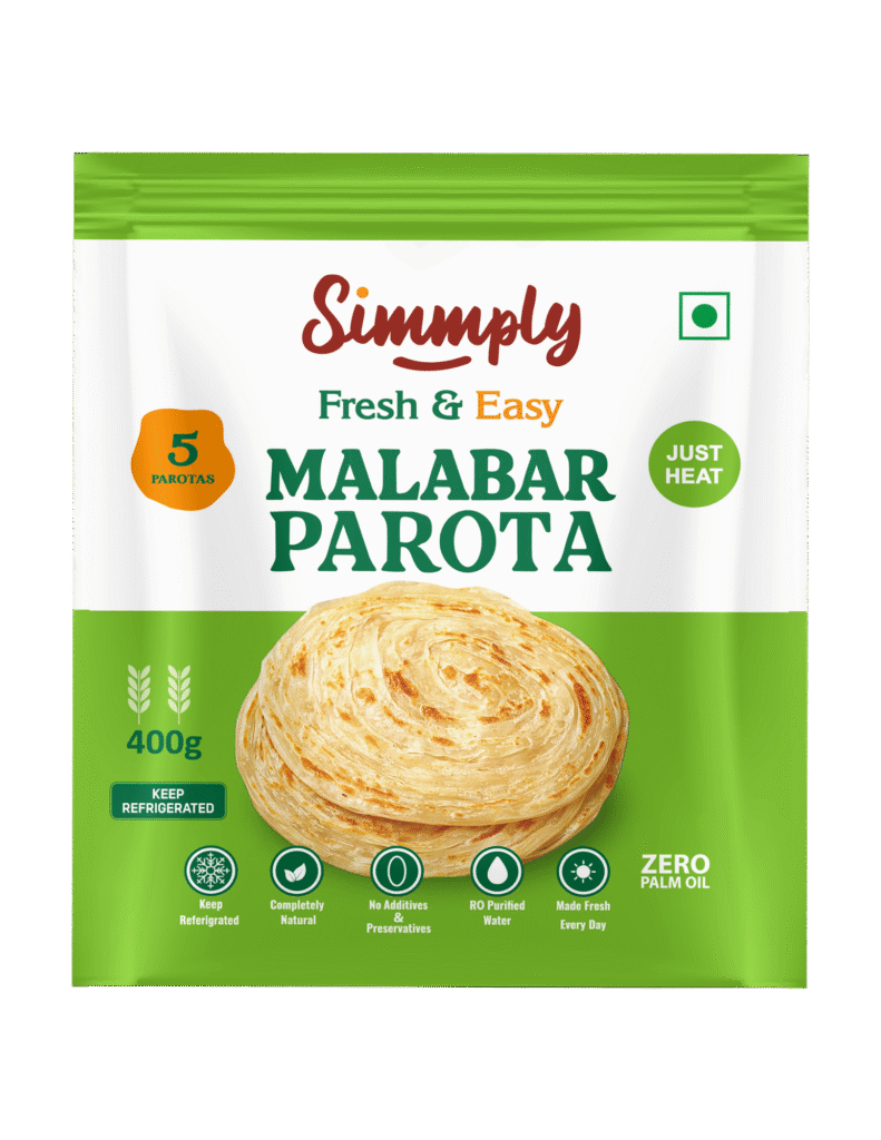
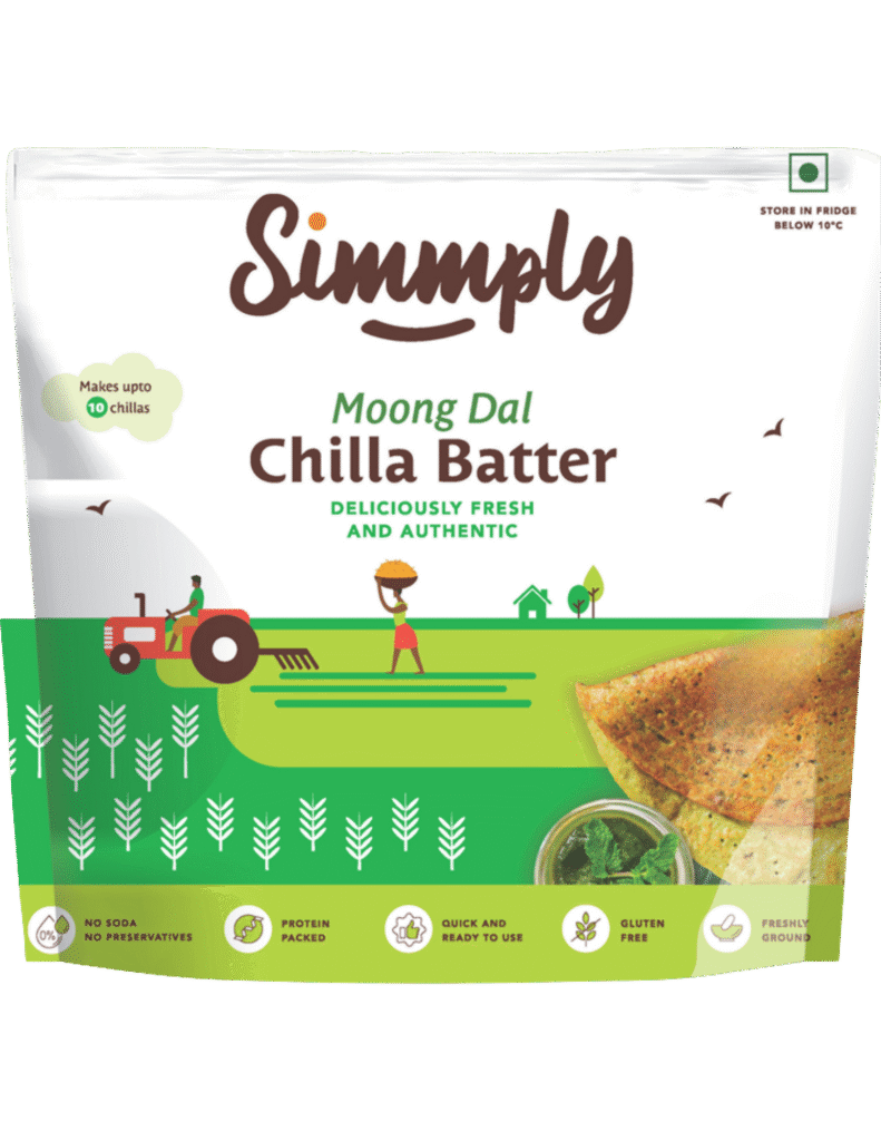
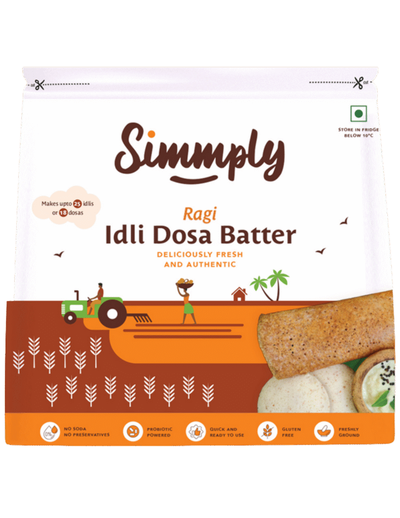
Simmply Foods had a great product and zero digital presence. We built their first-ever website, gave the brand a voice young India recognises as its own, and wired every page straight into Blinkit and Zepto carts.
Brand Positioning
Website Design & Development
Conversion Copywriting
Quick-Commerce Funnels
Client
Simmply Foods
Industry
Ready-to-Cook FMCG
Market
India · Quick Commerce
Scope
Zero-to-One Digital Launch
01 · The Challenge
Invisible in a ten-minute market
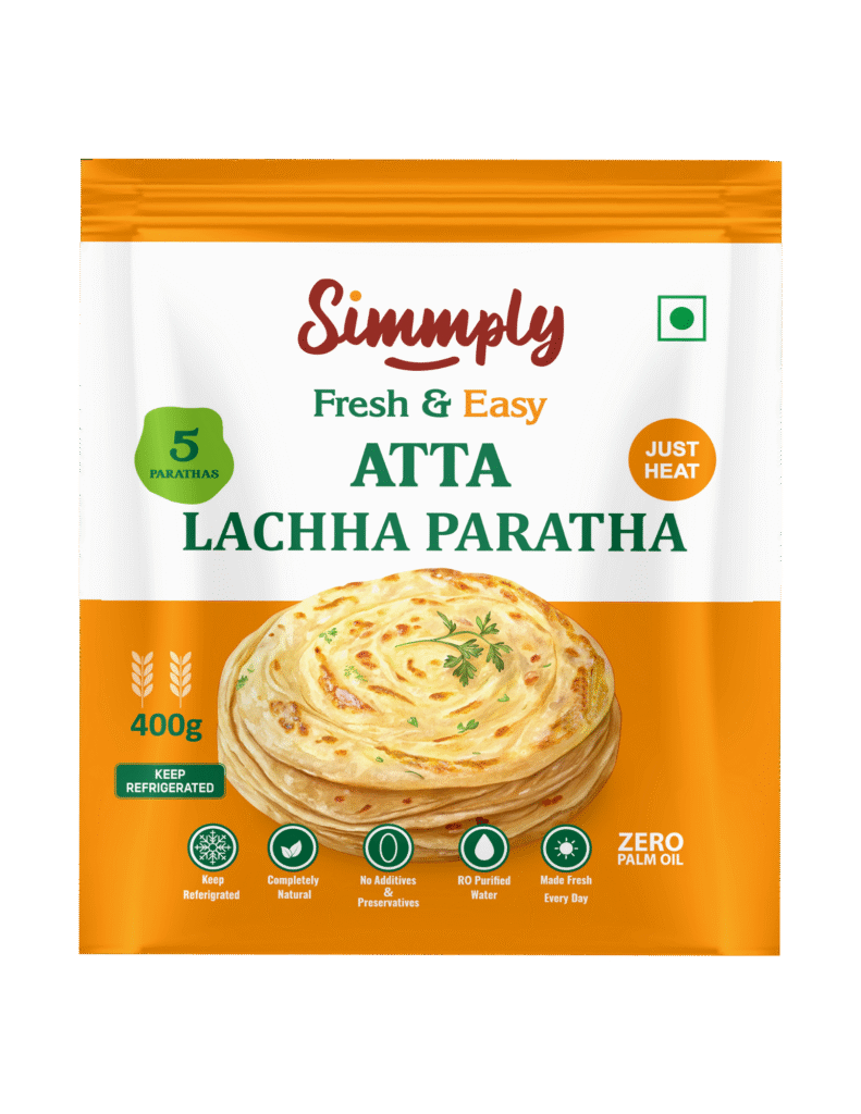
Simmply Foods makes fresh, preservative free lachha parotas and stone ground batters, ready in under four minutes. What they didn’t have was a website.
No storefront, no story, no path from craving to cart. In a category where Blinkit and Zepto decide winners inside a ten minute delivery window, being invisible online meant being invisible, full stop.
The deeper problem was positioning. Ready-to-cook food in India reads as either lazy or unhealthy, and the category default is frozen, preservative heavy, and marketed to nobody in particular.
Simmply’s real buyer, the hostel student, the first job millennial, the gym goer who wants protein without a grinder, had never been spoken to directly.

We didn't build a food website. We built a personality.
The copy runs on the same code switching Hinglish its audience thinks in. Products became characters: the Lachha-licious Paratha, the Ragi Rockstar, the Moody Moong Dal Chilla. Food brands describe ingredients. We made the ingredients describe a lifestyle.
Every product card routes into Blinkit and Zepto deep links, collapsing craving-to-cart to a single tap. Real customer voices sit exactly where purchase hesitation peaks. Health reassurance fires exactly where the guilt objection does not buried in an About page.
WordPress and Elementor tuned for mobile-first quick-commerce traffic, with full pixel and GTM instrumentation. Every rupee of downstream ad spend is attributable from launch day.

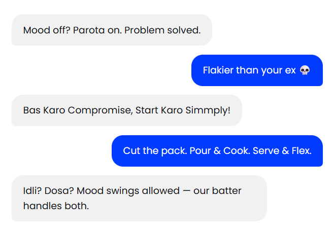
Actual copy from the live site
03 · The Voice
Copy that reads like a group chat, sells like a salesman
Gen Z wants clean eating. Millennials want convenience. The website’s job was to say “why not both” in a language neither audience could scroll past. Testimonials stayed in the customer’s real voice Hinglish, emojis and all because polished English testimonials on a parota brand would read as fake to the exact people they’re meant to convince.
The site did what most never manage: it sold.
Retail listings show a product. The website shows a brand young India recognises as its own. From zero digital presence to a measurable quick-commerce sales engine.
03 · The Voice
Copy that reads like a group chat, sells like a salesman

Lachha-licious Paratha
The spiraled stunner

Malabar Magic Parota
Layers on layers on layers

Moody Moong Dal Chilla
Protein-loaded breakfast

Ragi Rockstar Batter
Calcium-packed powerhouse
The Takeaway
You can't out-discount your way into a
Gen Z kitchen. You have to out-relate
everyone else in it.
For a D2C food brand, the website is what it really is: the first bite.
Ready to launch yours?
Rishta Foods
Case Study · D2C Food & Beverage · Rishta Foods
Fresh batter.
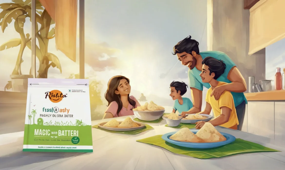
Rishta Foods sells stone ground idli-dosa batter and coconut chutney to homes that don’t have three hours to soak and grind. We rebuilt their website for Gen Z, young moms and office-goers, then rebuilt their paid media around it. In 120 days, monthly traffic grew 4.3× while the cost of a click fell by more than half.
Monthly link clicks
Dec ’25 → Mar ’26
Meta cost per click
₹0.26 → ₹0.11
Peak monthly CTR
vs ~0.9% industry avg
Google Ads ROAS
up from 3.9×
The brand
A traditional product. A very untraditional buyer.
Rishta Foods makes village style idli-dosa batter, multigrain and barnyard millet variants, and coconut chutney powder no preservatives, stone-ground, sold across Blinkit, Zepto, Swiggy Instamart, BigBasket, Amazon and Flipkart.
The problem wasn’t the product. It was who the brand was talking to. The old website looked like a wholesaler’s catalogue, while the actual buyer was a 26-year-old ordering breakfast on a quick-commerce app at 11 pm.
Ads pointed at pages that didn’t convert, CPCs sat at ₹0.26–₹0.64, and Google spend returned an inconsistent 1.7–4.2× on value.
What we did
Three moves, in order.
Rebuilt the storefront
A new rishtasfoods.com aimed squarely at Gen Z, young moms and office goers: warm, fast, scannable, with one tap paths to Blinkit, Zepto, Instamart and BigBasket. Every ad now landed somewhere built to sell.
Repositioned the creative
Out went generic product shots. In came hooks written for the feed “idli mini pizza,” “jumbo dosas for higher cravings,” “good mornings begin with great batter.” Food that scrolls like a snack, backed by psychology-driven testing across 31 campaigns.
Compounded the media
Winners got budget, losers got killed weekly. As creative relevance climbed, Meta’s auction rewarded us: every month cheaper than the last, every month bigger than the last. Google Search and Performance Max were rebuilt on the same conversion signals.
Watch the auction fall in love with the creative.
Real account data, 31 campaigns. Slide through four months: spend rose 1.8× results rose 4.3×.
Every rupee started returning seven.
Search + Performance Max, rebuilt on real conversion signals. Cost per click fell from ₹0.64 to ₹0.23 while CTR climbed from 6.77% to 11.24% and return on ad spend nearly doubled.
Return on ad spend by month. November's dip is where we took over and restructured; the rebuild paid for itself within one cycle.
Numbers straight from Ads Manager.
| Campaign | Month | Spend | Link clicks | CPC | CTR |
|---|---|---|---|---|---|
| Final sales campaign | Mar '26 | ₹20,211 | 2,30,209 | ₹0.09 | 34.27% |
| Final sales campaign – 2 | Mar '26 | ₹17,401 | 1,88,968 | ₹0.09 | 31.48% |
| Final sales campaign | Jan '26 | ₹9,709 | 93,853 | ₹0.10 | 29.66% |
| Final sales campaign | Dec '25 | ₹10,312 | 83,001 | ₹0.12 | 23.42% |
| Final sales campaign – 2 | Feb '26 | ₹7,541 | 46,200 | ₹0.16 | 22.06% |
| Post: "From yummy idli mini pizza…" | Mar '26 | ₹568 | 937 | ₹0.61 | 8.98% |
For context: the average CTR for food & beverage ads on Meta sits near 0.9–1.5%. These campaigns ran at 20–35× that benchmark, month after month.
8.4M
Impressions across Meta + Google
1.18M
Clicks to the brand
₹0.09
Best monthly CPC cheaper than a rubber band
31
Campaigns tested, scaled or killed
Your brand could be the next case study.
Rishta got a website their buyers actually use and media that gets cheaper as it scales. That’s the Morphiaas model: psychology driven creative, revenue accountable execution.
Latinos Unidos Autos
Case Study — Car Dealerships
Latinos Unidos Autos sold 30 cars in March.
Then 80 in April.
We took over the ad account on March 28, 2026. One full month later, the dealership had moved 80 cars a 167% jump off $3,392 in ad spend. That’s $42 of advertising per car sold. Every ad number below is pulled straight from Meta Ads Manager. No brochure math.
Case Study — Car Dealerships
Latinos Unidos Autos sold 30 cars in March.
Then 80 in April.
We took over the ad account on March 28, 2026. One full month later, the dealership had moved 80 cars — a 167% jump — off $3,392 in ad spend. That’s $42 of advertising per car sold. Every ad number below is pulled straight from Meta Ads Manager. No brochure math.
Leads in the first 34 days
Blended cost per lead
vs $34.15 auto benchmark
Cars sold in April
first full month
Ad spend per car sold
01 – The situation
A dealership with demand it couldn't reach
Latinos Unidos Autos serves a bilingual community buyers who research in Spanish, negotiate in English, and get ignored by dealership advertising written for neither. In March 2026 the lot was moving 30 cars a month on walk-ins and word of mouth. Paid social was an afterthought: no funnel, no language strategy, no lead system feeding the sales floor.
The ceiling wasn’t inventory and it wasn’t the sales team. It was that nobody had built a machine to put the right car in front of the right buyer, in the right language, before a competitor did.

A bilingual lead engine, live in 72 hours
Split the funnel by language, not just audience
Separate English and Spanish MOFU lead-gen campaigns with creative written natively in each not translated. Different hooks, different objection handling, same offer.
Optimize each campaign for leads — nothing else
Every dollar went to lead objectives. No blended traffic campaigns, no vanity reach. The English campaign alone pulled a 4.72% CTR triple what most dealership ads manage.
Kill losers fast, feed winners faster
One website destination variant underperformed on day one. It was cut and its budget reallocated inside 72 hours. The account never carried dead spend into a second week.
Thirty-four days, month by month
Campaign by campaign, from the account
| Campaign | Spend | Leads | CPL | CTR |
|---|---|---|---|---|
| MOFU Lead Gen — English | $856.52 | 170 | $5.04 | 4.72% |
| MOFU Lead Gen — Spanish (video) | $899.26 | 76 | $11.83 | 3.14% |
| MOFU Lead Gen — Spanish (statics) | $840.55 | 71 | $11.84 | 2.03% |
| Launch sprint — March 28 kickoff | $51.89 | 7 | $7.41 | 3.66% |
Source: Meta Ads Manager, ad account "Latinos Unidos", March 1 – April 30, 2026. Cars-sold figures reported by the dealership.
The auto industry averages $34.15 per lead on Meta.
We delivered them at $10.76 and the sales floor
turned those leads into 50 extra cars in a single month.
This is a system, not a lucky month
Nothing here depended on Latinos Unidos being special. It depended on doing what most dealership marketing refuses to do: one objective per campaign, creative built for the actual buyer, and ruthless budget discipline. Every input is repeatable at any dealership with inventory to move.
If your buyers speak two languages
We build native-language funnels, not translations. The language split alone is worth a double-digit CPL reduction in bilingual markets.
If your leads go nowhere
Leads at $10.76 mean nothing without a floor that closes them. We wire lead delivery directly into your sales process so speed-to-contact stays under minutes, not days.
If your agency reports "engagement"
We report spend, leads, CPL, and cars sold. If a number can't be traced to Ads Manager or your DMS, we don't put it in a deck.
If you're spending more for less
$34.15 is what the industry accepts. It is not what the auction requires. The gap between the two is margin you're donating to Meta.
Your lot has a March. We build the April.
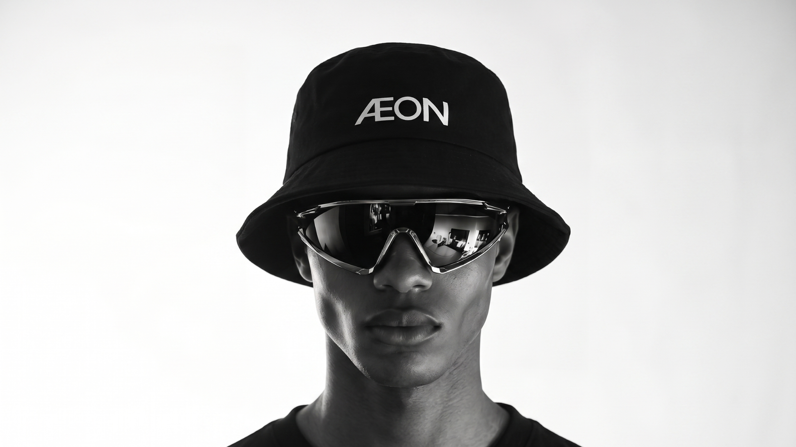
AeonClo
Case Study — Aeon · Fashion & Apparel
The same collection sat unsold for a year.
We changed everything except the clothes.
Aeon came to us in February 2026 with a collection that had not moved in twelve months and sales at near zero. Six months later, that exact collection did ten times the revenue of the month we started. Here is how.
10
×
Monthly revenue, Feb → Jul 2026
Case Study — Aeon · Fashion & Apparel
The same collection sat unsold for a year.
We changed everything except the clothes.
Aeon came to us in February 2026 with a collection that had not moved in twelve months and sales at near zero. Six months later, that exact collection did ten times the revenue of the month we started. Here is how.
10×
Monthly revenue
Feb → Jul 2026
Industry
DTC Apparel
Engagement
Website · Content · Performance
Started
February 2026
Status
6 months, ongoing
Monthly store revenue, February baseline to July
Orders in July alone. February had 16.
Monthly content views across platforms at peak
A dead collection is rarely a product problem.
Twelve months. One collection. Sales flatlined near zero. Most agencies would have told Aeon to design new clothes. We told them the truth: the clothes were fine. The machine around them was broken.
A year on the shelf, almost nothing sold
The collection had been live for a full year with sales close to zero. Sixteen orders in an entire month. Not a demand problem, a visibility and conviction problem. Nobody was seeing the clothes, and nothing on the site gave the few who did a reason to buy.
A website working against the product
The storefront read like an afterthought. No identity, no story, no reason to trust. In apparel, the website is the fitting room. Aeon's was turning people away at the door before they touched a single product.
Zero distribution
A brand nobody sees is a brand that does not exist. Aeon had no content engine, no reach, no top of funnel. The best collection in the world sells nothing to an audience of no one.
The Morphiaas Approach
We did not touch the collection. We rebuilt the machine that sells it. Three moves, in order.
Move 01 — The Storefront
A website built to convert, not decorate
We designed and shipped Aeon’s new website from the ground up: identity-first, psychology-driven, engineered around the buying decision. Same clothes, new frame. Store sessions nearly quadrupled the month it went live.
Move 02 — The Audience
Manufacture distribution at scale
We built a content engine that took the brand from invisible to 20 million monthly views across platforms. The collection nobody had seen for a year became impossible to miss. Store traffic grew fourteenfold from the February baseline.
Move 03 — The Conversion
Turn attention into orders
Attention without conversion is a vanity metric. We tightened the funnel until it paid: by July the store converted at 4.6 times the rate we inherited, and monthly revenue crossed ten times the starting point.

Drag through six months of engineered growth.
These numbers come straight from Aeon's store. Scrub the timeline and watch a dead collection come back to life, month by month.
Why It Worked
The difference is not effort. It is method.
What most agencies would have done
Blamed the collection and pitched a redesign of the product line.
Thrown ad budget at a website that could not convert it.
Posted content with no system, no volume, no compounding.
Reported impressions while orders stayed at sixteen a month.
What Morphiaas did
Diagnosed the real problem: visibility and conviction, not product. The clothes never changed. The results did.
Rebuilt the storefront first, so every visitor from day one landed on a site engineered to sell.
Built distribution as infrastructure: a content engine reaching 20 million monthly views, feeding the store fourteen times the traffic.
Measured in revenue: ten times the monthly sales of where we started, in six months, on a collection that had failed for a year.
If we can revive a collection that failed for a year, imagine what we do with yours.
Streetwear, luxury, athleisure, ethnic wear, kidswear. The products change. The system that turned Aeon around does not, and every part of it transfers.
The conversion-first storefront
We rebuild your website around the psychology of the apparel purchase: identity, trust, and the moment of decision. Aeon's traffic quadrupled the month theirs went live. Yours is engineered the same way.
The distribution engine
Twenty million monthly views did not happen by luck. It is a repeatable content system: formats, cadence, and hooks built for your brand. Attention becomes infrastructure, not a lottery ticket.
The funnel that converts attention
Aeon's conversion rate multiplied 4.6 times. We apply the same discipline to your store: every page, every product, every step between seeing and buying, tightened until the numbers move.
The diagnosis before the spend
We never assume your product is the problem. We find where the machine is actually broken, fix it in order, and only then scale. That sequence is why the growth holds instead of spiking and dying.
Your collection deserves this.
Bring us your store and your slowest-moving line. We will show you, with your numbers, exactly where the machine is broken and what it takes to fix it. No deck of platitudes. A plan.
45 minutes. Your data. Zero obligation.